

Executive Overview
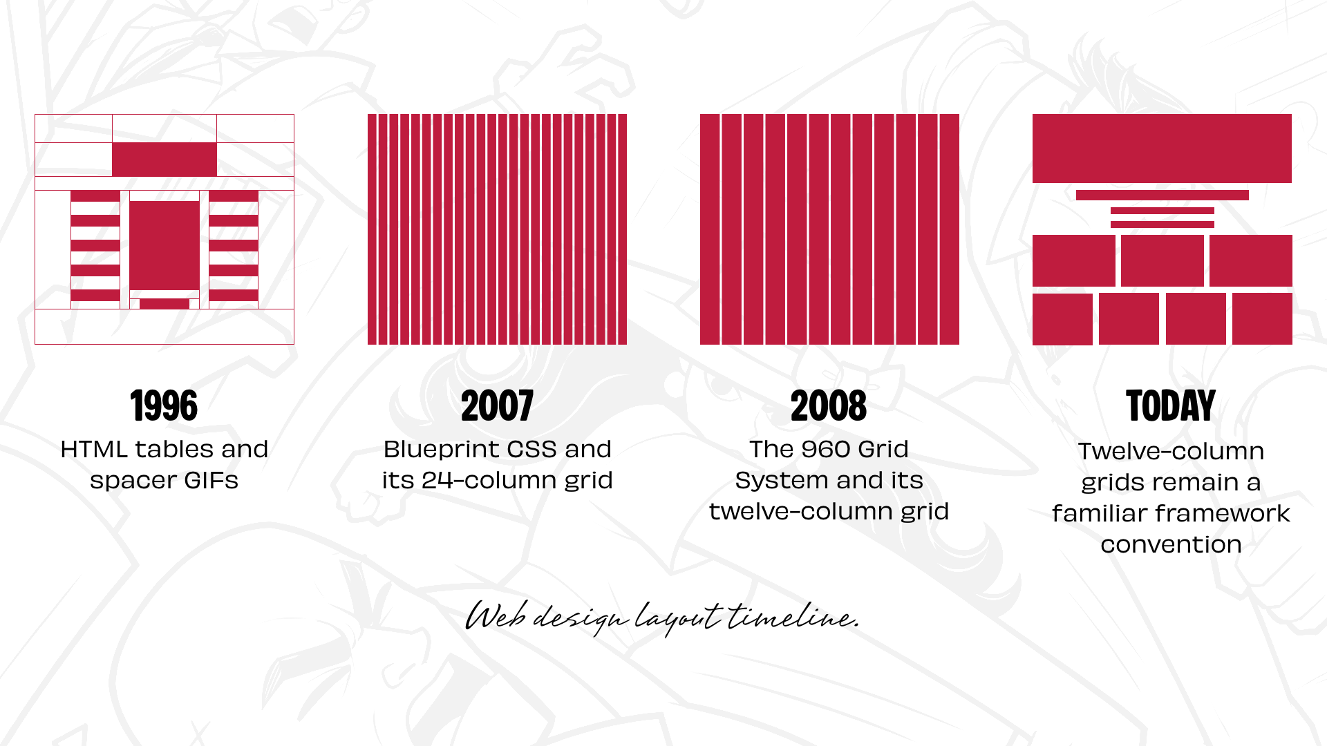
For nearly three decades, the digital design industry has operated under an implicit architectural consensus: the default structural container of the World Wide Web is the column-based grid. Tracing its lineage from the early era of HTML tables and spacer GIFs popularized by David Siegel in the 1990s, through the float-and-position hacks of the CSS 2.1 era, to the ubiquitous adoption of 12-column frameworks like Blueprint, 960 Grid System, Bootstrap, and Foundation, web layout has historically prioritized mathematical divisibility over narrative expression.
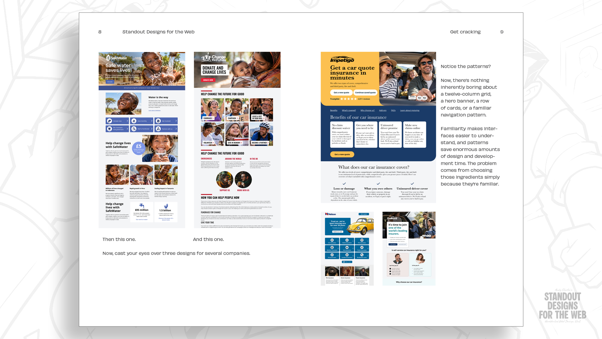
While the advent of CSS Grid revolutionized the dimensional capabilities of browsers by granting developers unprecedented layout freedom, a pervasive industry habit remains. Designers routinely instantiate a default 12-column template, squeezing unique content into standardized vertical tracks. The result is a homogenized web landscape where distinct corporate identities are flattened into predictable 2-up, 3-up, and 4-up components.
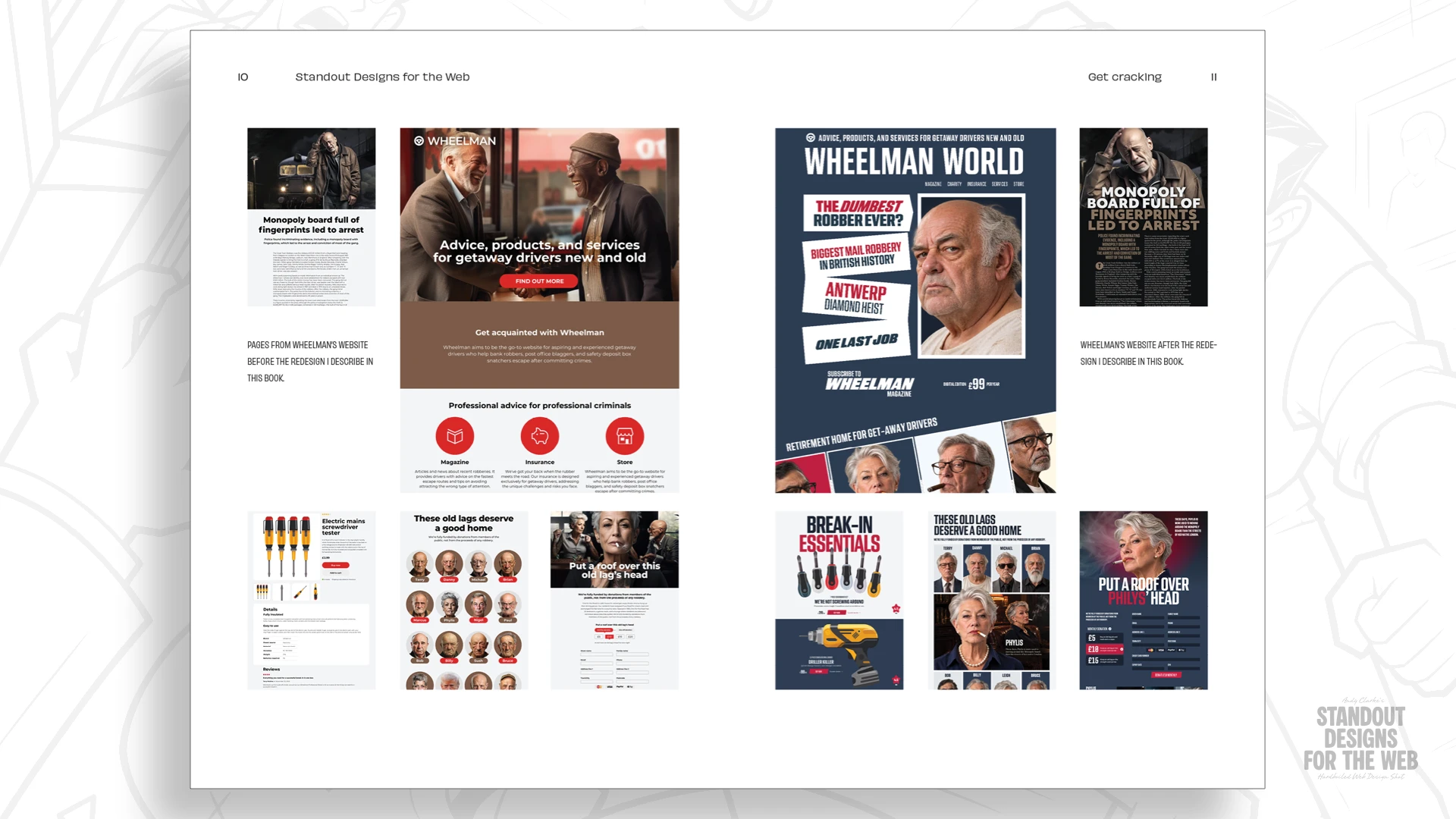
This comprehensive analysis explores the philosophical and technical shift away from default column-first thinking toward content-driven design. By examining advanced layout topologies—such as modular grids and compound grid systems—industry veterans and design theorists are challenging practitioners to stop letting mechanical familiarity dictate creative choices. Utilizing a fictional case study from the forthcoming publication Standout Designs for the Web, this report investigates how intentional typography, spatial relationships, and unconventional grid architectures can resurrect genuine character and distinct personality in contemporary web development.
Detailed Chronology: The Evolution of Web Layout Systems
To understand why the modern web struggles with layout monotony, one must trace the evolutionary milestones that brought the industry to its current procedural defaults.
Phase 1: The Wild West of Tables and Spacers (Late 1990s)
When modern web design began taking shape thirty years ago, page layout was an exercise in technical workaround. Publications like David Siegel’s Creating Killer Web Sites popularized the use of HTML tables and transparent 1×1-pixel "spacer GIFs" to force text and images into structured visual relationships. Because HTML was originally designed for academic document markup rather than graphic composition, developers had to subvert table cells to achieve multi-column newspaper-style layouts. These methods were notoriously fragile, rendering sites prone to breakage across different Netscape and Internet Explorer versions.
Phase 2: The Float and Positioning Era (2000s)
As CSS matured, floats (float: left/right) and explicit positioning (position: absolute/relative) emerged as the standard tools for layout control. Though neither system was originally engineered to handle macro-level page composition, an entire generation of designers built complex, multi-column sites using floats. Inconsistent browser implementations made this era famously frustrating, characterized by the constant need to "clear floats" and combat collapsing parent containers.
Phase 3: The Democratization of Frameworks (Late 2000s – 2010s)
Relief arrived when CSS frameworks introduced standardized, ready-made grid systems to the developer community. Blueprint CSS offered a rigid 24-column grid, while Nathan Smith’s revolutionary 960 Grid System streamlined decisions by providing dependable 12- and 16-column layout foundations.
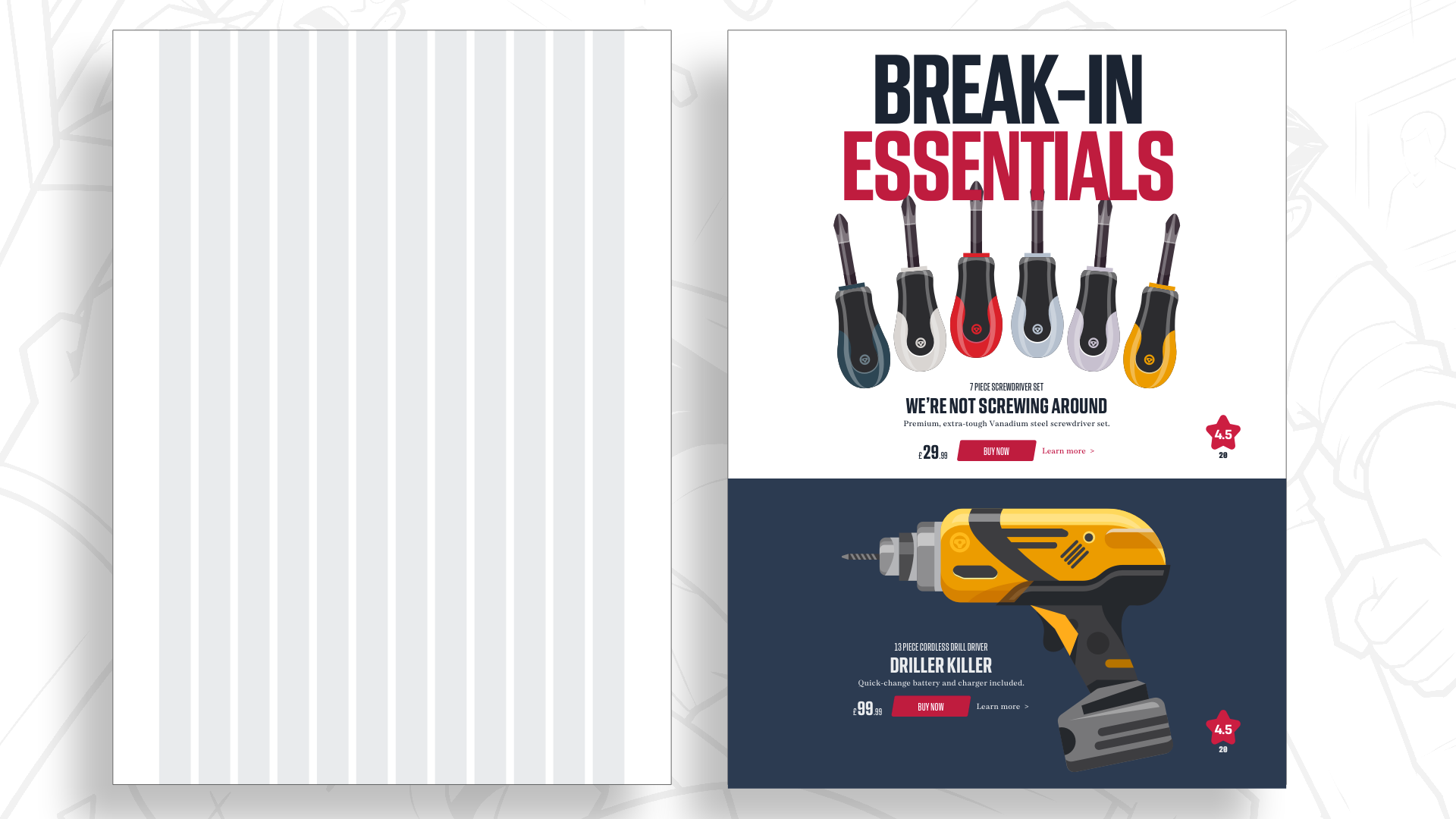
These systems quickly transformed into multi-platform giants like Twitter Bootstrap and Zurb Foundation. By standardizing layout parameters around a 12-column structure, these frameworks solved critical pain points:
- Mathematical Convenience: The number 12 can be effortlessly divided by 2, 3, 4, and 6, making it mathematically trivial to construct symmetrical half, third, and quarter page sections.
- Shared Team Mental Models: Developers and designers shared a unified vocabulary, accelerating project handoffs and wireframing phases.
Phase 4: The CSS Grid Revolution and Current Inertia
The release and universal browser adoption of CSS Grid changed everything about what was technically possible on the web. Two-dimensional layouts—handling both rows and columns simultaneously—eliminated the historical hacks of the past.
Yet, despite this technological liberation, a psychological inertia persists. Many designers continue to initiate new projects by drawing twelve equal vertical columns on a blank artboard, mapping content into them post hoc. While this yields functional designs, it frequently strips websites of unique visual tension, causing them to blur together into an indistinguishable sea of cards, modals, and uniform grid alignments.
Supporting Context & Metrics: The Case of "Wheelman"
The core argument against default 12-column usage is not that the grid itself is flawed, but that it is deployed reflexively rather than strategically. To demonstrate how practitioners can break free from this pattern, design thinkers advocate for interrogating a company’s fundamental story before establishing structural geometries.
Moving Beyond Default Choices
Every organization possesses a distinct narrative, a unique competitive advantage, and a specific behavioral personality. Layout is not merely a utility for housing data; it is an active emotional participant in the user experience. A restrained, asymmetric composition communicates sophistication and precision, whereas an energetic, chaotic layout communicates disruption and speed.
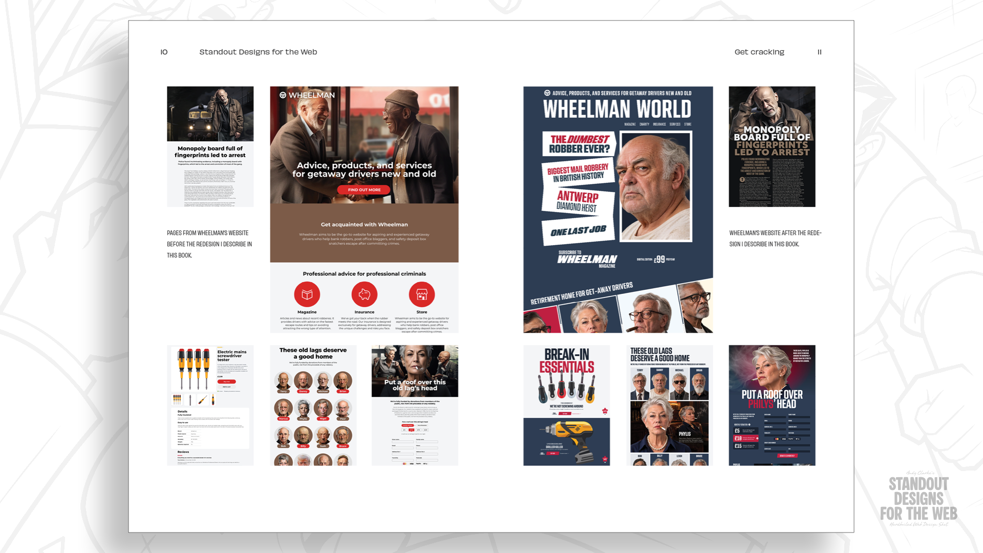
To illustrate this principle, consider Wheelman, a fictional enterprise invented to explore advanced spatial design. Wheelman operates in a high-stakes niche, offering products and services for professional getaway drivers—including specialized legal advice, robbery insurance, break-in toolkits, and an investigative print magazine.
+-----------------------------------------------------------------+
|                   WHEELMAN BRAND IDENTITY                       |
+--------------------------+--------------------------------------+
| Target Audience          | Criminal professionals               |
| Operational Tone         | Serious, professional, rebellious    |
| Design Requirement       | Trustworthy yet boundary-pushing     |
| Structural Solution      | Non-standard modular & compound grids|
+--------------------------+--------------------------------------+
Wheelman’s audience demands absolute professionalism and reliability, yet the brand itself is inherently rebellious and unconventional. If its digital storefront were constructed using a standard, generic 12-column SaaS template, it would fail to capture the gritty, calculated energy of its trade.
Starting with Content, Not Columns
When designing a landing page for Wheelman’s online shop—featuring disparate elements like oversized headlines, gritty product photography, and essential transactional components—designers must ask foundational content questions before touching a grid:
- What is the primary focal point of the user’s initial viewport?
- How do individual content modules relate to one another hierarchically?
- Can strategic whitespace be deployed to create deliberate moments of visual pause?
- How can text and imagery coalesce into an integrated narrative composition rather than floating in isolated card containers?
By answering these questions first, the designer evaluates whether a single-column reading experience, an asymmetric two-column split, or a complex multi-dimensional grid best serves the underlying message.
Advanced Layout Typologies: Modular and Compound Grids
To achieve structural variety without sacrificing organizational clarity, designers can leverage advanced architectural frameworks that reach beyond simple vertical columns.
1. Two-Column Proportional Hierarchies
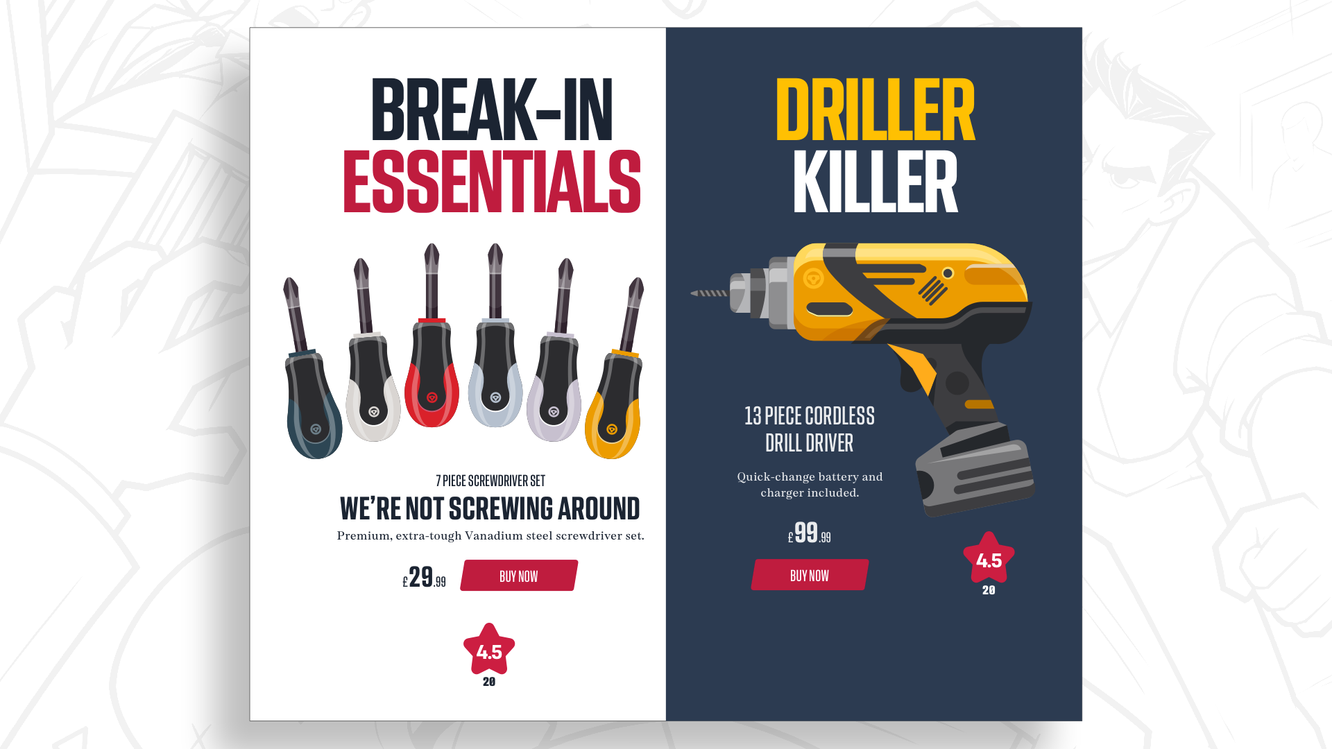
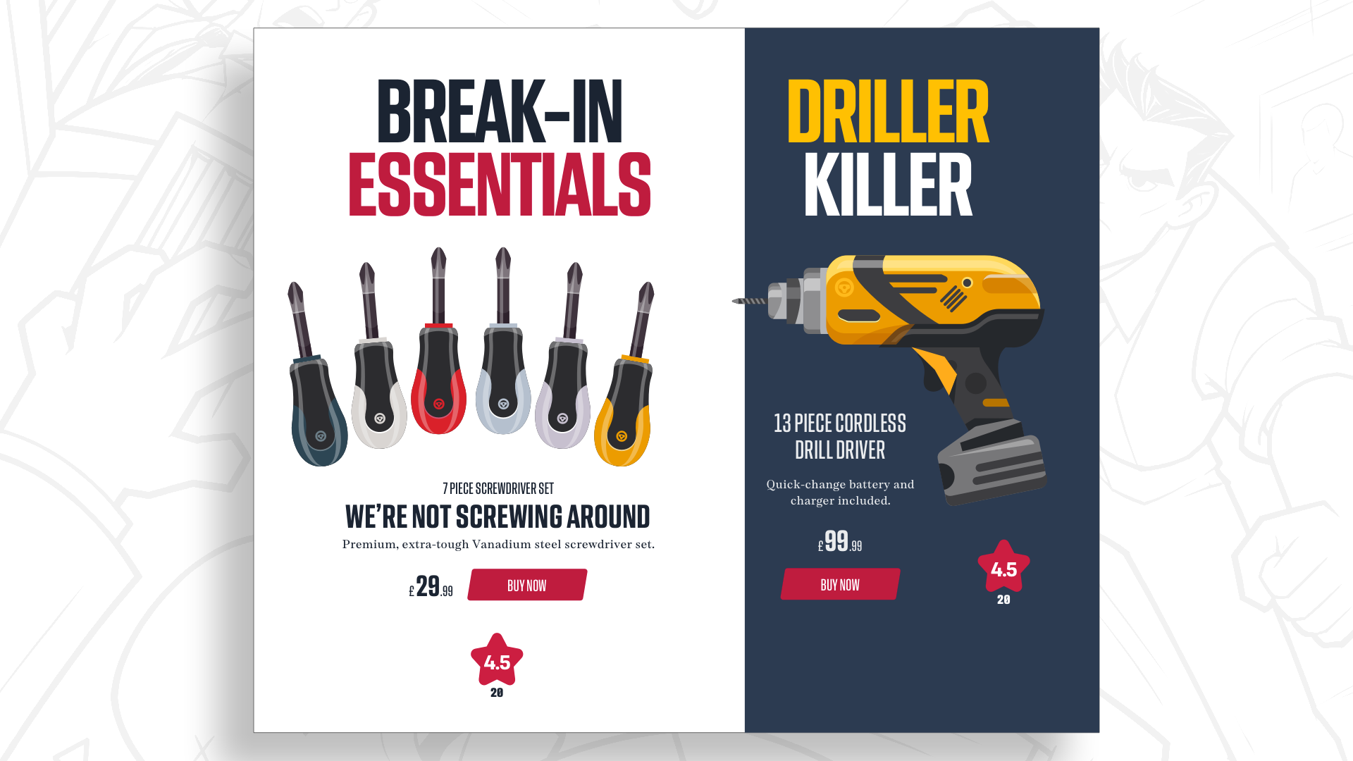
Instead of defaulting to equal-width column splits, shifting structural proportions creates immediate visual hierarchy. For instance, dividing a layout into a 2/3 and 1/3 ratio immediately commands viewer attention toward the dominant side while retaining balance across the viewport. While these proportions can be calculated using a 12-column grid (e.g., 8 spans vs. 4 spans), moving past the mental constraint of 12 vertical tracks encourages creators to think in terms of fluid proportions and dynamic spatial relationships.
2. Introducing Rows: The Power of Modular Grids
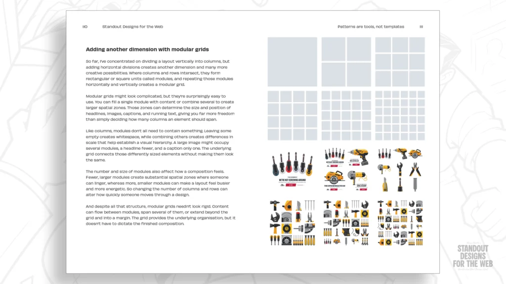
Columns divide space strictly along the vertical axis. By introducing rows into the equation, designers unlock a second dimension: the modular grid.
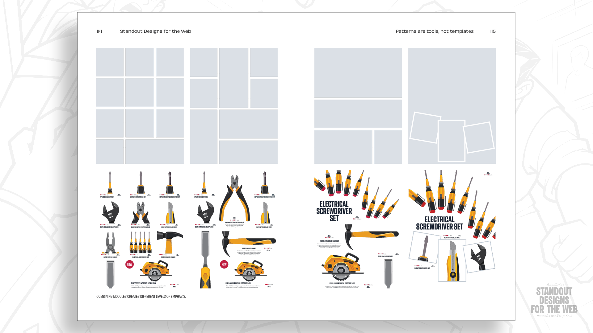
- The intersection of vertical columns and horizontal rows forms rectangular or square units known as modules.
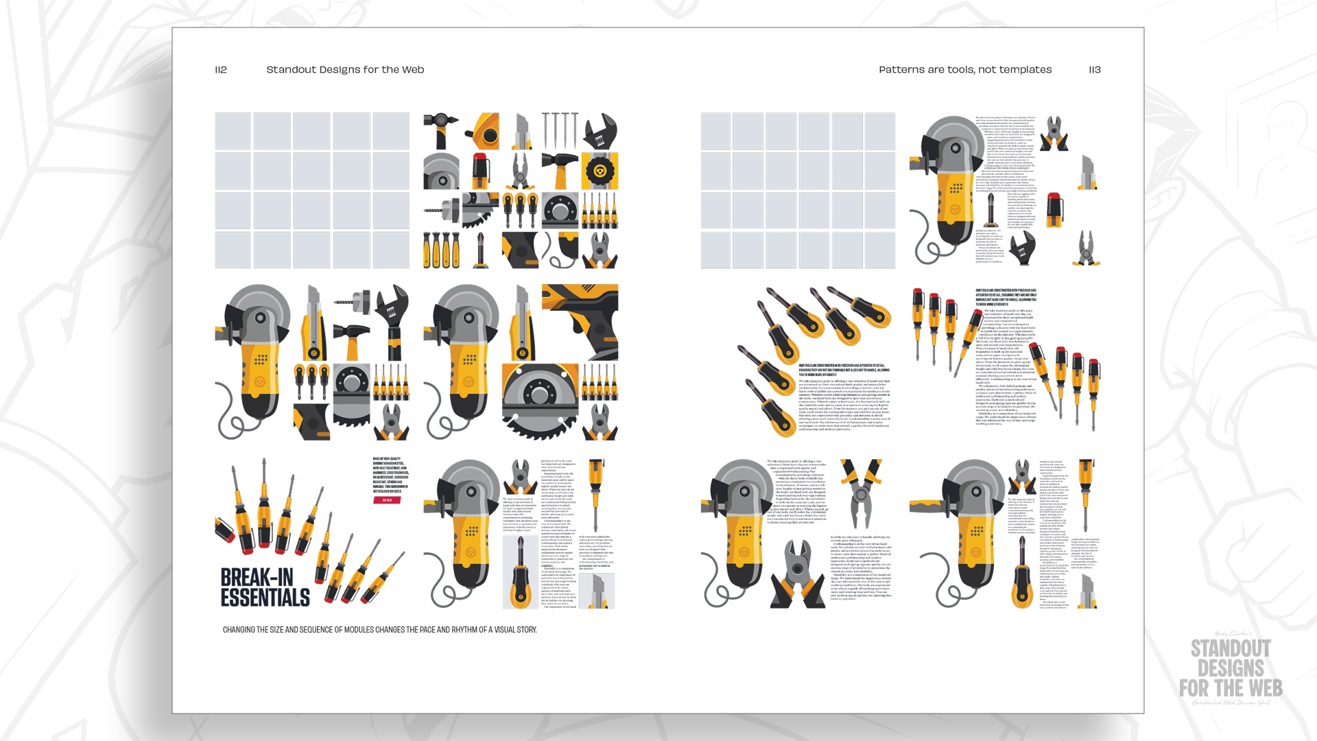
- Combining these modules creates larger spatial zones that establish clear visual hierarchy, control whitespace density, and disrupt predictable reading patterns.
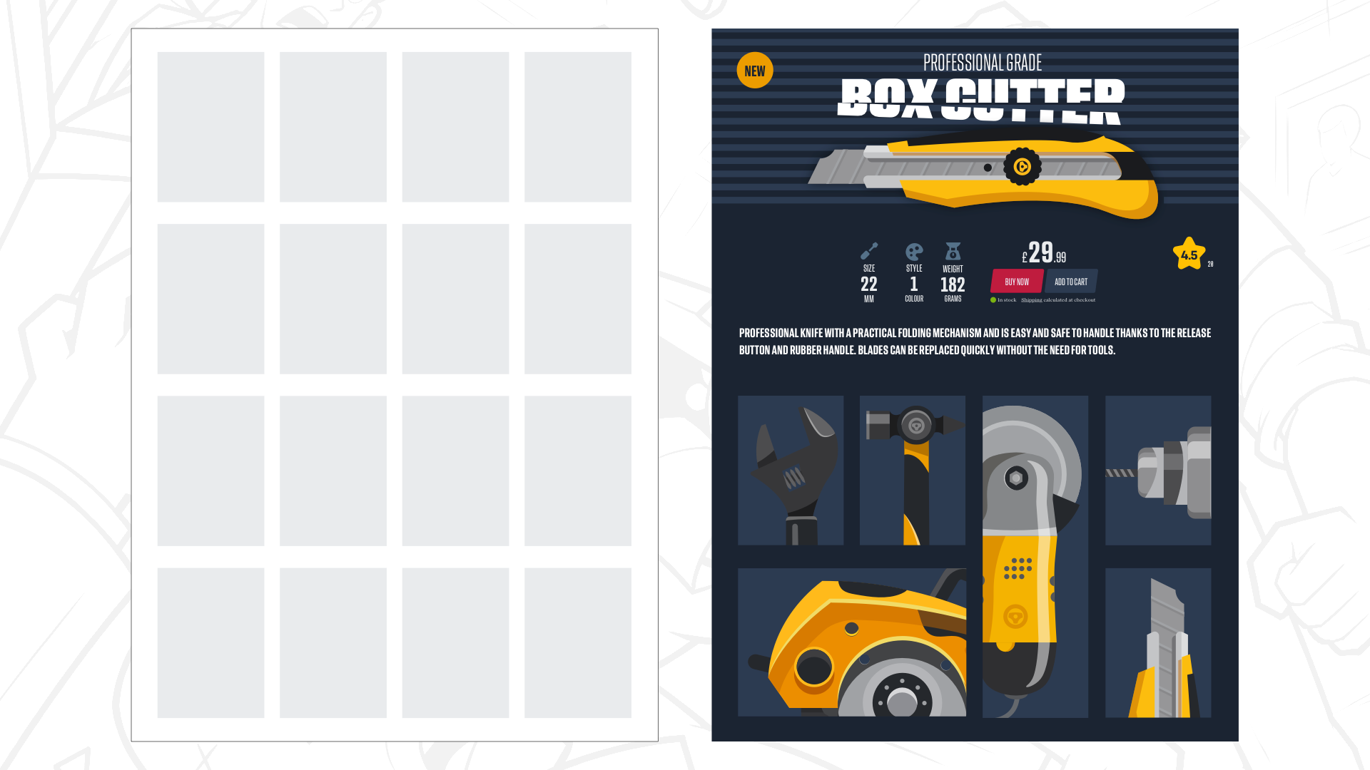
For example, a 4×4 modular grid yields 16 distinct functional units. A designer can command high drama by spanning a massive typographical headline and principal product photograph across four central modules, while secondary product specifications and interactive shopping tools occupy singular, deliberate modules nearby. Alternative products within a grid can be scaled dynamically—some occupying single modules, others stretching across two modules horizontally or vertically. This variability creates an organic layout that feels curated rather than algorithmically generated.
3. Mixing Grids: Compound Layouts
To prevent multi-page applications—such as a site housing a magazine, an e-commerce shop, and a legal services portal—from feeling repetitive, designers can utilize compound grids.
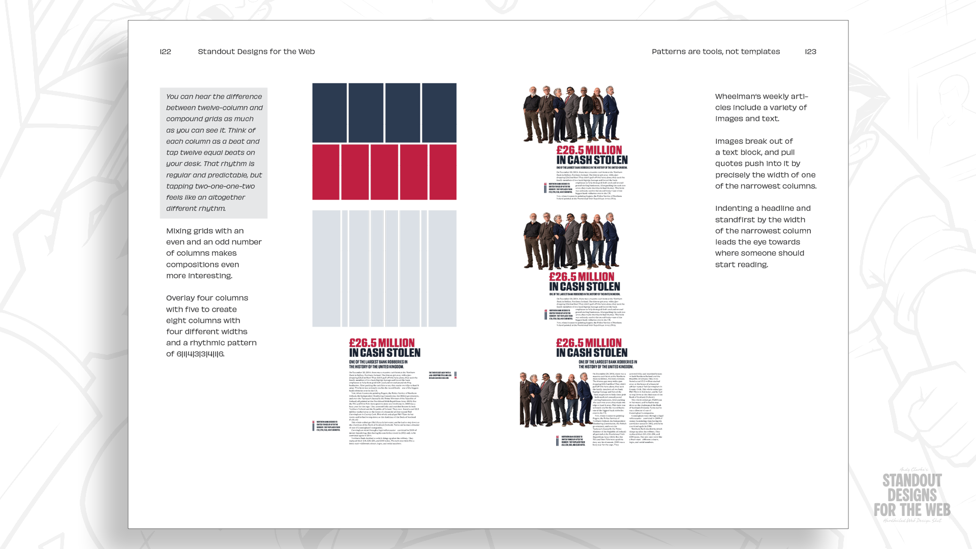
A compound grid integrates two or more distinct grid types (column, modular, or hierarchical) within a single page layout. These grids can overlap, sit adjacently, or stack vertically.
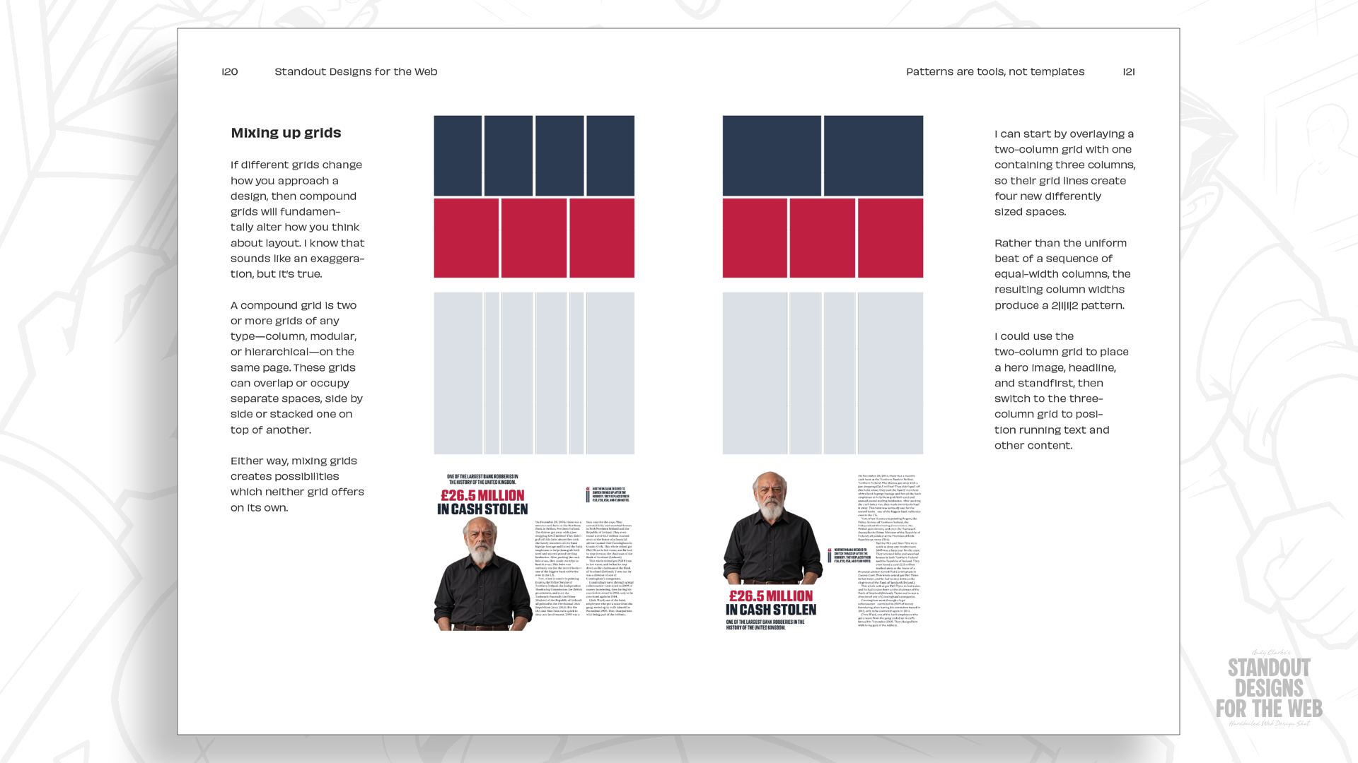
- Overlapping Systems: Overlaying a 2-column grid with a 3-column grid creates an intersecting matrix of 4 columns across two distinct structural widths.
- Creative Flexibility: This technique allows wide photographic assets or bold headlines to claim expansive structural zones, while pullquotes, metadata, and supplementary text find secure homes within narrower, harmonious interstitial spaces.
By mixing different column counts across distinct sections of a site—such as blending 4-column and 5-column underlying structures—brands maintain a unified visual language while giving individual pages their own distinct character.
Future Outlook: The Next Era of Web Composition
The web design industry stands at a critical crossroads. As tools like CSS Grid, Subgrid, and container queries mature, the technical barriers preventing sophisticated, editorial-grade page composition have completely evaporated. The limitations are no longer technological; they are purely habitual.
As articulated in professional design discourse, the overarching goal of moving beyond the twelve-column default is not to embrace chaos or "difference for difference’s sake." Rather, it is about reclaiming intentionality. When digital creators refuse to let template familiarity make aesthetic choices for them, websites transform from generic content silos into immersive brand extensions.
The forthcoming release of Standout Designs for the Web—scheduled for publication on November 20 at $14.99 for DRM-free EPUB and PDF editions, complete with pre-order bonuses like the Hardboiled Client Interview Guide—signals a growing industry appetite for deeper theoretical foundations.
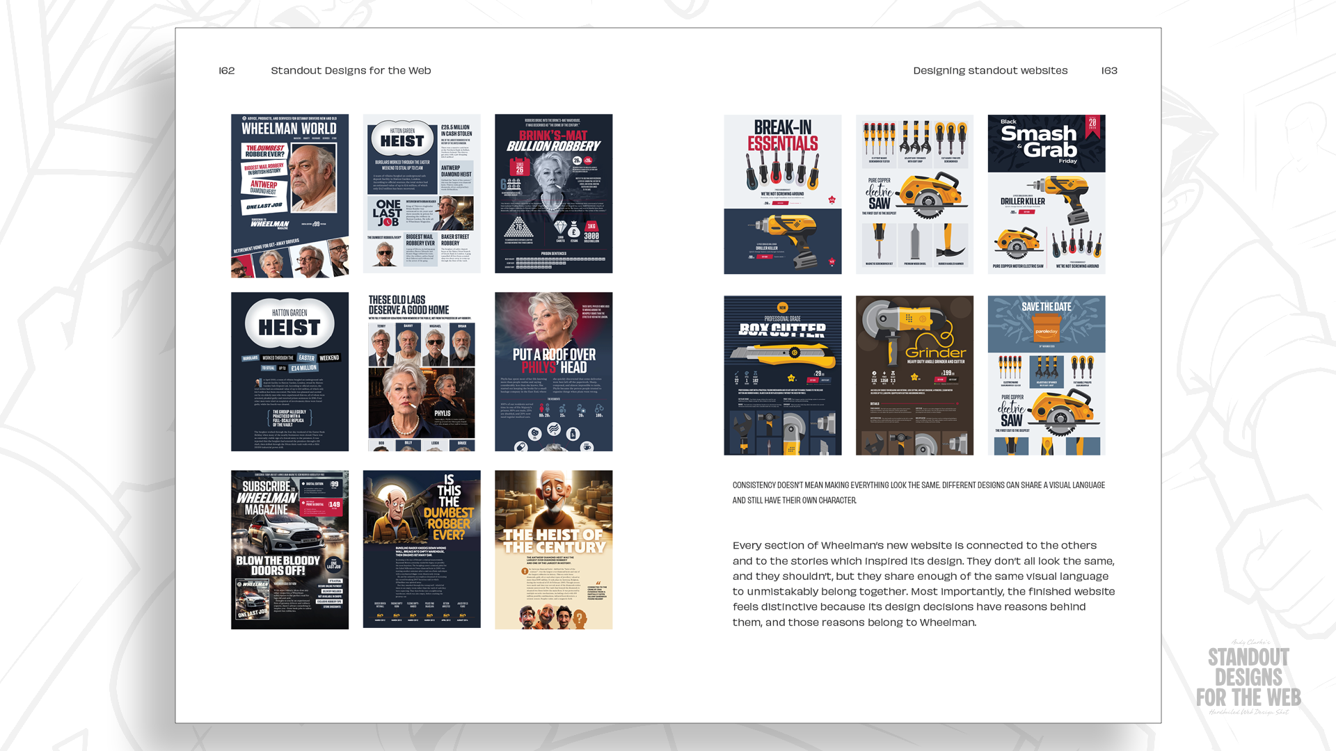
Ultimately, the future of web design belongs to practitioners who view grids not as rigid cages that dictate what a page must look like, but as flexible structural tools that empower unique stories to be told with precision, clarity, and uncompromising individuality.