
Executive Overview
Nearly a decade after its initial introduction to the web platform, the native HTML <dialog> element remains one of the most deceptively nuanced components in modern web architecture. While developers frequently rely on third-party JavaScript libraries, component frameworks, or custom-built UI primitives to handle overlays, modals, and tooltips, the browser engine now provides robust, highly optimized native primitives that far outperform legacy implementations in accessibility, performance, and security.
Despite its longevity, developers routinely consult documentation to remember the architectural differences between pop-ups and modals, the syntax for animating entry and exit states, or the mechanics of styling the elusive ::backdrop pseudo-element. As web standards evolve—introducing groundbreaking features like Invoker Commands, @starting-style rules, and advanced overscroll-behavior controls—revisiting the <dialog> element reveals a mature, powerful API capable of replacing heavy external dependencies.
This report provides a definitive, end-to-end technical guide to implementing, styling, animating, and optimizing native HTML dialogs. By examining the structural mechanics, accessibility requirements, and modern browser feature support, engineering teams can build resilient, accessible, and performant user interfaces that honor web standards.
Detailed Chronology & Architectural Evolution
Phase 1: Basic Markup and Invocation Mechanics
At its core, a native dialog requires minimal markup. However, understanding how the browser handles its state transition from closed to open is foundational to using the element correctly.
<button id="dialog-button">Open Dialog</button>
<dialog id="dialog">
  <p>This is a native dialog element.</p>
</dialog>
By default, a <dialog> element is not rendered; it remains closed and hidden from the viewport. While developers can manually apply the boolean open attribute (<dialog open>), this is rarely appropriate for production applications, where dialogs must be triggered by user interactions.
Instead, developers invoke the element via JavaScript. However, a critical architectural distinction exists between the show() and showModal() methods:

const dialogButton = document.querySelector('#dialog-button');
const dialog = document.querySelector('#dialog');

// WRONG for modals: Treats the dialog as a pop-up
dialogButton.addEventListener('click', () =>
  dialog.show();
);

// CORRECT for modals: Elevates the element to the top layer
dialogButton.addEventListener('click', () =>
  dialog.showModal();
);
Using show() renders the dialog more like a lightweight pop-up or tooltip: it lacks a backdrop, is not centered automatically by the user agent stylesheet, and does not listen for the Esc key. Conversely, showModal() promotes the element to the browser’s top layer, generates a protective backdrop, centers the element within the viewport, and automatically handles focus management and keyboard dismissal (Esc).
Phase 2: Dismissal and Declarative Closures
Closing a dialog can be accomplished programmatically via the close() method or declaratively via standard HTML form submission mechanics.
const formButton = document.querySelector('#dialog-button');
const formDialog = document.querySelector('#dialog');
const formClose = document.querySelector('#dialog-close');

formButton.addEventListener('click', () =>
  formDialog.showModal();
);

formClose.addEventListener('click', () =>
  formDialog.close();
);
For developers seeking a zero-JavaScript approach, HTML forms nested within a dialog provide a declarative alternative:
<dialog id="dialog">
  <form method="dialog">
    <button type="submit">Close dialog</button>
  </form>
</dialog>
When the submit button inside a method="dialog" form is activated, the browser automatically closes the dialog without requiring explicit event listeners.
Phase 3: The Frontier of Invoker Commands
As web standards progress, the ecosystem is moving toward increasingly declarative UI patterns. Invoker Commands represent an evolving, experimental proposal designed to connect triggers directly to dialogs entirely within markup, bypassing JavaScript boilerplate altogether.
<button command="show-modal" commandfor="my-dialog">Show Dialog</button>

<dialog id="my-dialog">
  <p>Controlled entirely via declarative HTML attributes.</p>
  <button command="close" commandfor="my-dialog">Close Dialog</button>
</dialog>
Through the command and commandfor attributes, developers can bind buttons directly to specific target elements. For engineering teams needing to track these interactions, JavaScript event listeners can capture command events seamlessly:

const dialogs = document.querySelectorAll("dialog");

dialogs.forEach(dialog =>
  dialog.addEventListener("close", () =>
    // Execution path when dialog closes
  );

  dialog.addEventListener("command", event =>
    if (event.command == "show-modal")
      // Execution path when modal command fires
     else if (event.command == "close")
      // Execution path when close command fires

  );
);
Supporting Context, Accessibility, & Metrics
Accessibility Considerations & Screen Reader Optimization
Accessibility is where native HTML elements dramatically outperform custom JavaScript implementations. When a modal dialog opens, the browser automatically triggers inertness on the rest of the document. Background content cannot be selected, focused, or interacted with, satisfying core Web Content Accessibility Guidelines (WCAG) requirements for focus trapping.
However, developers must remain vigilant regarding icon-only interface elements, such as "X" close buttons:
<!-- Suboptimal for Accessibility -->
<dialog id="dialog">
<button id="dialog-close">X</button>
</dialog>
<!-- Optimized for Accessibility -->
<dialog id="form-dialog">
<button id="form-close">
<span class="visually-hidden">Close modal</span>
<span aria-hidden="true">×</span>
</button>
</dialog>By hiding decorative iconography via aria-hidden="true" and providing an explicit, visually hidden text string (.visually-hidden), screen reader users receive precise contextual announcements without degrading visual presentation.
Furthermore, engineers must consider initial focus placement. By default, the browser often focuses the first focusable element inside the modal—frequently the close button. If users accidentally press the Space key, this can trigger an unintended closure. To optimize user experience, assign explicit focus to primary form fields or links using the tabindex attribute if the default focus target poses usability friction.
Managing Background Inertness and Layout Shifts
When a modal dialog opens, the background page becomes inert. Crucially, this behavior is exclusive to showModal(); standard show() calls do not enact inertness.
A common engineering hurdle involves layout shifts caused by disappearing scrollbars when a modal opens. To prevent unintended layout jitter across background elements, engineers should enforce stable scrollbar gutters:

dialog
  &[open]
    scrollbar-gutter: stable;
To prevent the underlying page from scrolling while a modal is active, modern CSS offers elegant declarative controls. Utilizing Chrome’s support for overscroll-behavior on non-scrollable containers, combined with overflow management, keeps background content locked in place:
dialog
  overflow: hidden;
  overscroll-behavior: contain;

  &::backdrop
    overscroll-behavior: contain;
Alternatively, broader cross-browser support can be achieved using the :has() relational pseudo-class:
body:has(dialog[open])
  overflow: hidden;
Styling the Native Dialog API
Customizing the Backdrop
By default, the user agent stylesheet applies a subtle, semi-transparent tint to the backdrop. To make modals visually distinct, developers can style the ::backdrop pseudo-element directly:
dialog::backdrop
  background-color: rgba(0, 0, 0, 0.6);
  backdrop-filter: blur(8px);
Styling Borders, Backgrounds, and Open States
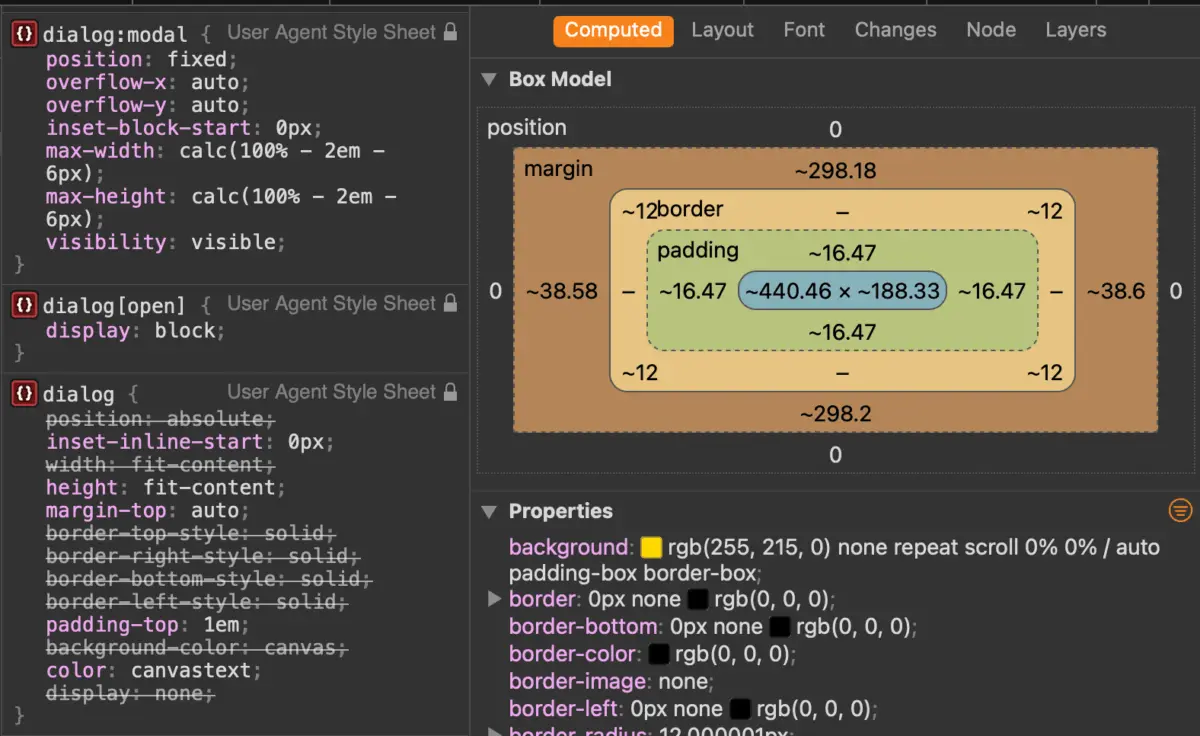
Default styling includes a stark white background and a heavy black border. Customizing these properties requires selecting the dialog in its open state or utilizing the :modal pseudo-class for maximum specificity:
dialog
  background-color: transparent;
  border: none;

  &[open]
    background-color: #ffffff;
    border-radius: 16px;
    box-shadow: 0 25px 50px -12px rgba(0, 0, 0, 0.25);
Advanced Animations with @starting-style
Historically, animating elements from display: none to display: block was impossible in pure CSS because browsers could not calculate an initial transition state. The introduction of the @starting-style at-rule solves this limitation, enabling smooth entry and exit transitions for native dialogs:
@starting-style
  dialog:open
    opacity: 0;
    transform: scale(0.95);


dialog
  opacity: 0;
  transform: scale(0.95);
  transition: opacity 0.3s cubic-bezier(0.16, 1, 0.3, 1),
              transform 0.3s cubic-bezier(0.16, 1, 0.3, 1);
  overflow: hidden;
  overscroll-behavior: contain;

  &[open]
    opacity: 1;
    transform: scale(1);
Official Guidelines: Dialog vs. Popover API
A frequent architectural question in modern frontend engineering is whether to implement the Dialog API or the Popover API. While syntactically similar, they serve fundamentally different use cases and possess stark accessibility divergences.

According to accessibility audits and web standards research compiled by industry experts like Zell Liew, developers should evaluate APIs based on user interaction models:
- Popovers lack built-in focus trapping, do not make background content
inert, and require manual assignment of explicit ARIA roles. They are ideal for non-modal elements such as tooltips, dropdown menus, and contextual card overlays where background interaction should remain fully active. - Dialogs (Modals) enforce top-layer rendering, automatically trap keyboard focus, establish background inertness, and listen for the
Esckey out of the box. They are strictly designed for attention-requiring workflows such as confirmation prompts, form submissions, and critical user alerts.
Engineering teams should avoid forcing popovers to act as modals via custom JavaScript; instead, selecting the native primitive tailored to the interaction model ensures long-term maintainability and compliance with accessibility standards.
Future Outlook
The native HTML <dialog> element represents a triumph of modern web standards, bridging the gap between heavy JavaScript component libraries and lightweight, performant browser primitives. As browser vendors continue rolling out support for features like the :open pseudo-class, Invoker Commands, and @starting-style, the developer experience around native overlays is more streamlined than ever.
By abandoning legacy plugin dependencies in favor of native architectures, engineering teams reduce bundle sizes, eliminate fragile event-listener bindings, and guarantee superior accessibility for all users. Future iterations of the web platform will undoubtedly expand upon these primitives, ensuring that native HTML remains the premier foundation for sophisticated user interface design.