

Executive Overview
For the past decade, as dark mode evolved from an experimental developer novelty into an absolute baseline requirement for modern digital interfaces, a standard design pattern quickly crystallized across the web. Almost reflexively, frontend developers and user experience (UX) architects introduced a persistent three-state toggle into website headers, navigation bars, and settings menus. Users were routinely presented with a tri-state control offering explicit choices: Light, Dark, and System (or Auto).
While this approach initially felt comprehensive—giving the user ultimate control over their viewing environment—a growing chorus of UI/UX experts is challenging its underlying philosophy. At the vanguard of this movement is prominent web standards advocate, developer, and designer Lea Verou. In a widely discussed analysis, Verou argues that the omnipresent three-state color scheme toggle is an anti-pattern. It introduces unnecessary visual clutter, cognitive friction, and UI bloat for a feature that is largely tangential to a user’s primary intent on a website.
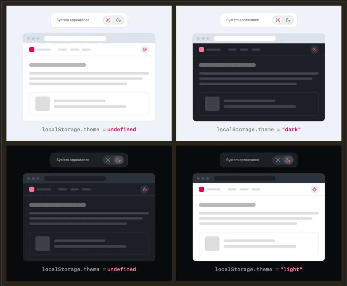
The core argument is deceptively simple: Why display a dedicated "System" option when a well-designed, two-state toggle can effortlessly express all three operational states? By leveraging native operating system preferences as the default baseline, websites can rely on user overrides only when a manual intervention is actively desired. This override can then be cleanly stored in browser memory (localStorage) for future sessions.
This deep dive explores the mechanics of this proposed UX shift, examining the cognitive load of persistent interface elements, the nuances of state management, edge cases involving user intent, and the specific scenarios where tri-state controls might still legitimately belong.
Detailed Chronology: The Evolution and Over-Engineering of Color Schemes
To understand why the web industry arrived at the current standard of tri-state dark mode toggles, it is necessary to retrace how color scheme preferences were handled historically.
Phase 1: The Monolithic Web and Manual Media Queries
In the early days of responsive design and media queries, color schemes were dictated entirely by the author. A website was either light by default, or developers relied on primitive JavaScript injections to swap out stylesheets. Users had zero agency over the rendering surface of a website unless they utilized aggressive browser extensions like Dark Reader.
Phase 2: The Rise of prefers-color-scheme
The introduction of the CSS media feature prefers-color-scheme marked a massive evolutionary leap forward. Browsers and operating systems began communicating the user’s system-level aesthetic preference directly to the web page. Suddenly, websites could natively adapt to a user’s operating system environment without requiring a single line of JavaScript or an explicit interface toggle. If your Mac or Windows machine was set to Dark Mode, compliant websites automatically rendered in dark tones.
Phase 3: The Tri-State Proliferation
However, developers quickly realized that operating system settings are blunt instruments. A user might prefer a dark operating system UI for late-night coding in a terminal, but prefer a bright, clean, high-contrast white background when reading an editorial article on a news site during daylight hours.
To bridge this gap, developers introduced site-specific toggles. To be "safe" and cover all conceivable edge cases, teams gravitated toward a rigid tri-state control pattern:
- Light Mode: Force the application into a light aesthetic regardless of the system setting.
- Dark Mode: Force the application into a dark aesthetic regardless of the system setting.
- System Mode: Defer entirely to the OS-level
prefers-color-schememedia query.
While functionally complete, this UI component quickly became ubiquitous, occupying prime real estate in navigation headers across millions of blogs, SaaS dashboards, and e-commerce platforms—often regardless of how frequently a visitor actually interacted with it.
Phase 4: The Pushback and the Two-State Renaissance
As UI minimalism and performance-driven design have taken center stage in the 2020s, designers have begun auditing persistent UI components. Verou’s recent critique marks a turning point in this evolution, encouraging the industry to strip away redundant controls in favor of fluid, implicit behaviors that respect user attention spans and reduce screen clutter.
Supporting Context & Metrics: Cognitive Dissonance and UI Minimization
The movement to eradicate the persistent three-state color toggle is rooted in established principles of human-computer interaction (HCI), particularly Hick’s Law and cognitive load theory.
The Cost of Visual Noise in Navigation Headers
Every interactive element placed inside a primary navigation header extracts a cognitive tax from the visitor. When a user arrives at a website, their immediate objective—their primary intent—is typically to read an article, purchase a product, evaluate a service, or locate specific information.
A permanent three-state control (often rendered as a segmented control with three icons representing the Sun, the Moon, and a Computer Monitor) introduces unnecessary visual noise. It forces the human brain to consciously or subconsciously process an architectural choice that has very little to do with the page’s actual content.
As Verou notes, a theme toggle is entirely tangential to the user’s primary goal. By reducing this control from three states down to a streamlined two-state mechanism—or even a single contextual toggle—designers minimize cognitive dissonance. Less UI that accomplishes the exact same functional outcome is universally recognized as a hallmark of mature product design.
Analyzing the Functional States
To understand how a two-state control can successfully express three distinct system realities, we must break down the interaction matrix:
- Scenario A: No User Preference (Default). The user visits the site for the first time. The website reads the system preference via CSS/JS (
prefers-color-scheme: darkorlight). The UI simply reflects the active state. No explicit override is stored inlocalStorage. - Scenario B: The Override. The system is in Light mode, but the user prefers a dark interface for this specific site. They click the toggle once. The site switches to Dark mode, and this preference is saved to
localStorage. - Scenario C: Returning to System Alignment. What happens if the user wants to revert to the system setting after applying an override? This introduces an interesting technical edge case concerning
localStoragestate management.
If a user starts with a Light system preference, manually toggles it to Dark, and later wants to revert, does the system clear the localStorage value to fall back to the dynamic OS preference, or does it simply toggle the override back to Light?
Verou argues that this edge case is largely inconsequential:
"Even if their intent were to pin light instead of reverting to System (light), this is something they would only notice once these diverge, i.e. the OS switches to dark. At that point, fixing it is a single click away. It’s such an easy fix, that there is no point in dwelling on it further."
In essence, because theme switching is a low-frequency, low-stakes action, absolute programmatic perfection in handling every fringe state reset is vastly outweighed by the massive usability benefit of a cleaner, less cluttered persistent interface.
Official Perspectives and Industry Debate
The discourse surrounding Lea Verou’s proposals has ignited spirited debates across web development communities, UI/UX forums, and design critique platforms like CSS-Tricks.
Proponents of the streamlined two-state approach emphasize that browsers are increasingly absorbing color scheme management natively. In a compelling contribution to the community discussion, one developer noted a brilliant long-term vision: Development for the preference, but no need to show an override when the setting is managed directly by the browser itself.
As browser vendors continue to refine built-in accessibility and presentation settings, the need for individual websites to host complex, multi-option color controls diminishes. When a browser provides a universal, native mechanism for overriding visual styling per site, the website’s own UI burden is lifted entirely.
However, the debate is nuanced. Verou herself does not completely outlaw tri-state controls; rather, she categorizes them strictly, identifying specific scenarios where a three-state control remains appropriate and justified:
- High-Stakes Environments with Complex Contexts: Applications where visual fidelity is mission-critical (such as professional design software, video editing suites in-browser, or data visualization platforms where color contrast drastically impacts data interpretation) may warrant explicit, granular control over color spaces.
- Accessibility-First Settings Panels: While a persistent header toggle should remain ruthlessly minimal, a dedicated, deeply buried "Accessibility and Preferences" settings modal or page can accommodate a tri-state control without polluting the primary user journey. In a dedicated settings menu, users expect granular options and have mentally shifted into a configuration mindset.
Future Outlook: The Minimalist Web Interface
As the web matures, the pendulum of design philosophy is swinging firmly back toward radical minimalism and user-intent prioritization. The era of cramming every possible edge-case configuration option into the global header of a webpage is drawing to a close.
The shift away from the traditional tri-state dark mode toggle signals a broader recognition of user psychology: software should be intelligent by default, unobtrusive in execution, and manual only when strictly necessary.
By trusting operating system defaults, leveraging robust modern CSS features, and storing minimal state overrides quietly in the background, developers can deliver cleaner, faster, and more cognitively ergonomic digital experiences. The humble two-state toggle—or the complete disappearance of persistent theme controls in favor of native browser capabilities—represents the next evolution of web craftsmanship.
Ultimately, the best user interface is often the one you don’t have to think about. By stripping away redundant UI clutter, designers can return the focus where it belongs: on the content, the product, and the human being on the other side of the screen.