Executive Overview
Nearly a decade after its introduction to the web platform, the native HTML <dialog> element remains one of the most powerful yet nuanced pieces of modern web architecture. While it promises to standardize modal windows, lightboxes, and pop-ups without relying on heavy external JavaScript libraries, developers routinely find themselves referencing documentation for its setup, behavioral quirks, and styling requirements.
From managing native focus and creating accessible backdrop states to navigating the intricacies of CSS animations, the <dialog> element demands a thorough understanding of its underlying browser mechanics. Furthermore, as new features like invoker commands emerge and browser support for properties like the :open pseudo-class and overscroll-behavior matures, the way we build user interfaces is undergoing a subtle yet profound evolution. This guide offers an authoritative deep-dive into marking up, styling, animating, and making accessible the native HTML <dialog> element, ensuring robust implementations for both current and future web projects.
Detailed Chronology & Core Mechanics
Marking Up and Initializing the Dialog
At its core, implementing a native dialog requires minimal markup. A foundational setup couples a trigger button with the <dialog> container itself:
<button id="dialog-button">Open Dialog</button>
<dialog id="dialog">...</dialog>
By default, the element is closed and hidden from view. While developers can technically force it open via the boolean open attribute (<dialog open>), this is rarely desirable for standard interactive workflows. Instead, invocation is typically handled programmatically via JavaScript.
const dialogButton = document.querySelector('#dialog-button');
const dialog = document.querySelector('#dialog');

dialogButton.addEventListener('click', () =>
  dialog.show();
);
However, calling show() treats the element more like a traditional pop-up than a true modal. For most UI patterns—such as critical alerts, user confirmation prompts, and complex forms—developers should utilize the showModal() method instead.
const dialogButton = document.querySelector('#dialog-button');
const formDialog = document.querySelector('#dialog');

dialogButton.addEventListener('click', () =>
  formDialog.showModal();
);
The differences between show() and showModal() are profound:

- The Backdrop:
showModal()automatically generates a clickable, styleable backdrop that sits behind the dialog. - Viewport Positioning: Modals are automatically centered within the viewport.
- Focus Management & Keyboard Access: Modals trap focus within their boundaries and inherently listen for the
Esckey to dismiss the window.
Dismissal Strategies: JavaScript vs. Declarative HTML
When a modal is open, pressing the Esc key automatically closes it because the element is focused by default. To provide explicit user interface controls for closing, developers must embed a button within the structure and programmatically bind a close() method:
<button id="dialog-button">Open Dialog</button>

<dialog id="dialog">
  <button id="dialog-close">Close</button>
  <!-- Content goes here -->
</dialog>
const formButton = document.querySelector('#dialog-button');
const formDialog = document.querySelector('#dialog');
const formClose = document.querySelector('#dialog-close');
formButton.addEventListener('click', () =>
formDialog.showModal();
);
formClose.addEventListener('click', () =>
formDialog.close();
);Interestingly, while the API provides show() and showModal(), it lacks a corresponding closeModal() method; the singular close() handles both states uniformly.
For developers pursuing a zero-JavaScript architecture, dismissal can also be handled declaratively directly inside an HTML form:
<dialog id="dialog">
  <form method="dialog">
    <button type="submit">Close dialog</button>
  </form>
</dialog>
The Horizon: Invoker Commands
As web standards evolve, the ecosystem is moving toward heavily declarative paradigms. Enter invoker commands, an emerging feature designed to handle dialog states natively in HTML without writing explicit event listeners.
Using the experimental command and commandfor attributes, developers can bind triggers directly to actions:
<button command="show-modal" commandfor="my-dialog">Show Dialog</button>

<dialog id="my-dialog">
  <button command="close" commandfor="my-dialog">Close Dialog</button>
</dialog>
When JavaScript integration is still required to listen to these commands, developers can hook into standard events:

const dialogs = document.querySelectorAll("dialog");

dialogs.forEach(dialog =>
  dialog.addEventListener("close", () =>
    // Dialog was closed
  );

  dialog.addEventListener("command", event =>
    if (event.command == "show-modal")
      // Dialog was shown modally
     else if (event.command == "close")
      // Dialog was closed

  );
);
Supporting Context, Metrics & Accessibility
Accessibility Best Practices
Accessibility must be a primary concern when designing modals. A common pitfall involves labeling close buttons with a generic "X" character or an unlabelled SVG icon:
<!-- Anti-pattern: Poor screen reader support -->
<dialog id="dialog">
  <button id="dialog-close">X</button>
</dialog>
Screen readers will often announce this ambiguously. To build an inclusively designed button, developers should combine visually hidden text with an aria-hidden icon:
<dialog id="form-dialog">
  <button id="form-close">
    <span class="visually-hidden">Close modal</span>
    <span aria-hidden="true"></span>
  </button>
</dialog>
Furthermore, developers must consider initial focus placement. Because the close button frequently receives focus by default upon opening, users hitting the Space key prematurely can accidentally trigger a dismissal. If the dialog contains more critical interactive elements—such as form inputs or primary links—consider assigning initial focus explicitly via the tabindex attribute.
Innate Inertness and DOM Layering
One of the most powerful features of a modal dialog is its native implementation of inertness. When a modal dialog opens, the rest of the page behind it automatically becomes inert. This means text selection, background button clicks, form inputs, and tab navigation are completely disabled on background elements without requiring manual JavaScript manipulation or aria-hidden attributes on parent wrappers.
It is critical to note that this inert behavior only applies to modals initialized via showModal(). Non-modal dialogs opened via show() behave more like lightweight popovers (similar to tooltips), leaving the background interactive and bypassing top-layer management.
Official Guidelines & Advanced Styling
Styling the Backdrop
By default, the user agent stylesheet applies a very subtle tint behind modal dialogs. Developers can override this using the ::backdrop pseudo-element to create custom lighting, heavy shadows, or blur effects:

dialog
  &::backdrop
    background-color: rgba(0, 0, 0, 0.6);
    backdrop-filter: blur(4px);
Customizing Borders, Backgrounds, and States
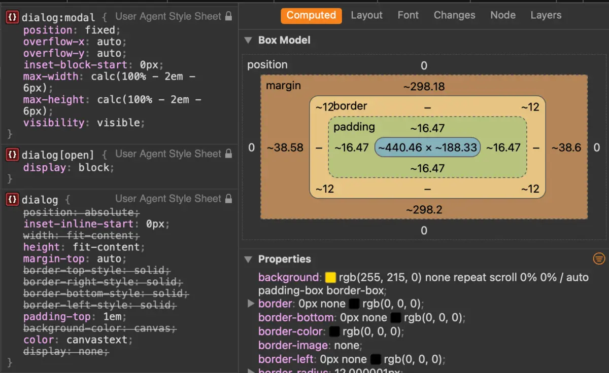
The default user agent stylesheet for a <dialog> applies a plain white background and a heavy black border. To apply custom styling, targeting the element in its open state via the :open pseudo-class (or the :modal pseudo-class for higher specificity) is required:
dialog
  background-color: transparent;
  border: 0;

  &[open]
    background-color: gold;
    border-radius: 12px;
Note on Browser Support: Modern browsers fully support the :open pseudo-class, but developers maintaining legacy codebases can also rely on the standard [open] attribute selector for safety.
To prevent layout shifts caused by disappearing scrollbars when a modal opens, use the scrollbar-gutter property:
dialog
  &[open]
    scrollbar-gutter: stable;
Preventing Background Scrolling
A frequent UI friction point occurs when background content behind a backdrop remains scrollable, disorienting users when the modal closes. Because a dialog is not inherently a scroll container, developers must carefully manage scroll behavior.
Modern implementations leverage overscroll-behavior paired with explicit overflow rules:
dialog
  overflow: hidden;
  overscroll-behavior: contain;

  &::backdrop
    overscroll-behavior: contain;
Alternatively, a concise and broadly supported approach involves checking if the document body :has() an open dialog and hiding body overflow accordingly:

body:has(dialog[open])
  overflow: hidden;
Animating Dialogs In and Out
Animating elements that transition from display: none to visible historically required complex JavaScript hacks. With native CSS, developers can use @starting-style to define initial entry states for entering animations:
@starting-style
  dialog:open
    opacity: 0;
    transform: scale(0.95);


dialog
  opacity: 0;
  transform: scale(0.95);
  transition: opacity 0.3s ease, transform 0.3s ease;

  &[open]
    opacity: 1;
    transform: scale(1);
Future Outlook: Dialog vs. Popover
As developers weigh whether to implement the Dialog API or the Popover API, understanding their architectural differences is vital. While their syntax can appear similar, their accessibility models diverge significantly.
- Popovers lack built-in focus trapping, do not automatically make background content inert, and require explicit accessible roles assigned by the developer. They are ideally suited for non-modal UI components like dropdown menus, tooltips, and floating menus.
- Dialogs provide robust focus management, native top-layer rendering, automatic backdrop generation, and implicit inertness of background elements. They are reserved exclusively for blocking, attention-demanding workflows.
Choosing the right API ensures that applications remain performant, accessible, and aligned with modern web standards. As the platform continues to mature, mastering the native <dialog> element remains an indispensable skill for every front-end engineer.