Executive Overview
Nearly a decade after its initial introduction to the web platform, the native HTML <dialog> element remains one of the most deceptively nuanced components in modern web architecture. While developers frequently rely on third-party JavaScript libraries or ad-hoc custom implementations for pop-ups, modals, and overlays, the browser’s native dialog subsystem offers robust performance, built-in accessibility semantics, and top-layer management that outclasses bespoke code.
Despite its longevity in specification roadmaps, developers regularly find themselves re-researching its API mechanics—distinguishing between simple pop-ups and full modals, managing asynchronous focus trapping, styling the elusive ::backdrop pseudo-element, handling viewport scroll behaviors, and implementing fluid entry and exit animations.
Recent advancements in CSS, including the :open pseudo-class, @starting-style at-rules, overscroll-behavior updates, and emerging declarative features like invoker commands, have fundamentally transformed how engineers interact with dialogs. This guide provides an exhaustive architectural breakdown of the native <dialog> element, exploring its semantic underpinnings, accessibility requirements, styling paradigms, and performance considerations for modern web applications.
Detailed Chronology & Evolution of the HTML Dialog
The Genesis of Native Modals
Before the standardization of the <dialog> element, web developers had to construct modals using arbitrary <div> containers combined with complex JavaScript event listeners. These implementations required manual management of aria-hidden attributes, custom focus traps to prevent keyboard users from tabbing outside the modal, and manual z-index management to ensure the overlay sat above all other page content. This fragmented landscape led to frequent accessibility failures and inconsistent user experiences across different sites and design systems.
The arrival of the HTML <dialog> element changed this paradigm by introducing browser-level primitives for modal mechanics. However, even with native support mature across all major evergreen browsers, the surface area of the API continues to expand. Understanding the chronological evolution of its supporting features—from basic DOM methods to modern declarative attributes—is essential for writing resilient, forward-compatible frontend code.
Core Markup and Basic Implementation
At its foundational level, marking up a dialog is remarkably straightforward:
<button id="dialog-button">Open Dialog</button>
<dialog id="dialog">...</dialog>
By default, a <dialog> element is hidden; it does not render on the page unless the open attribute is explicitly present in the HTML markup (<dialog open>). However, developers rarely want a dialog to be open upon initial page load. Instead, interaction is typically governed via JavaScript using either the .show() or .showModal() methods.

const dialogButton = document.querySelector('#dialog-button');
const dialog = document.querySelector('#dialog');

dialogButton.addEventListener('click', () =>
  // Opens the dialog as a non-modal pop-up
  dialog.show();
);
It is vital to recognize the architectural difference between .show() and .showModal(). Invoking .show() treats the dialog more like an unmanaged pop-up or tooltip. It does not generate a backdrop, does not center itself automatically in the viewport via user-agent styles, and does not trap keyboard focus or automatically close when the user presses the Esc key.
In contrast, invoking .showModal() elevates the element to the browser’s top layer, automatically positions it centrally, generates an interactive backdrop, makes the underlying document background completely inert, and binds the Esc key to close the interface. For the vast majority of application use cases, .showModal() is the correct architectural choice.
const formButton = document.querySelector('#dialog-button');
const formDialog = document.querySelector('#dialog');

formButton.addEventListener('click', () =>
  formDialog.showModal();
);
Closing Mechanisms: Imperative, Declarative, and Invoker Commands
Closing a dialog can be achieved through multiple patterns, depending on whether you prefer JavaScript control, declarative HTML forms, or emerging browser features.
1. Imperative JavaScript Control
Using a close button placed inside the dialog element, developers can listen for click events and invoke the .close() method:
<button id="dialog-button">Open Dialog</button>
<dialog id="dialog">
  <button id="dialog-close">Close</button>
</dialog>
const formButton = document.querySelector('#dialog-button');
const formDialog = document.querySelector('#dialog');
const formClose = document.querySelector('#dialog-close');
formButton.addEventListener('click', () =>
formDialog.showModal();
);
formClose.addEventListener('click', () =>
formDialog.close();
);(Note: While .showModal() initializes the modal state, the corresponding .close() method applies universally to both modal and non-modal dialog instances without requiring a specialized .closeModal() counterpart).
2. Declarative HTML Forms
For developers seeking a JavaScript-free approach, forms nested within a dialog can utilize the method="dialog" attribute. Submitting a form configured this way automatically closes the dialog and triggers native form submission handling without requiring a manual script:
<dialog id="dialog">
  <form method="dialog">
    <button type="submit">Close dialog</button>
  </form>
</dialog>
3. The Future: Invoker Commands
Expanding upon declarative patterns, the web platform is actively developing invoker commands (command and commandfor attributes). This experimental feature allows standard HTML buttons to directly open and close dialogs without writing custom event-listener boilerplate:

<!-- Opening via Invoker Command -->
<button command="show-modal" commandfor="my-dialog">Show Dialog</button>

<dialog id="my-dialog">
  <!-- Closing via Invoker Command -->
  <button command="close" commandfor="my-dialog">Close Dialog</button>
</dialog>
When integration with JavaScript is necessary to listen to these commands and execute side effects, developers can attach event listeners directly to the dialog instance:
const dialogs = document.querySelectorAll("dialog");

dialogs.forEach(dialog =>
  dialog.addEventListener("close", () =>
    // Logic executed upon dialog closure
  );

  dialog.addEventListener("command", event =>
    if (event.command == "show-modal")
      // Logic executed when opened modally via command
     else if (event.command == "close")
      // Logic executed when closed via command

  );
);
Supporting Context & Metrics: Accessibility and State Management
Accessibility Best Practices and Focus Management
Building accessible user interfaces requires meticulous attention to how screen readers interpret interactive controls. A common anti-pattern involves labeling a close button with a simple unicode "X" or an unlabelled SVG icon:
<!-- Accessibility Anti-Pattern -->
<dialog id="dialog">
  <button id="dialog-close">X</button>
</dialog>
Screen readers will often announce this ambiguously as "button" or misread the raw glyph. To maintain WCAG compliance while preserving visual design requirements, developers should utilize visually hidden text spans alongside aria-hidden presentation icons:
<dialog id="form-dialog">
<button id="form-close">
<span class="visually-hidden">Close modal</span>
<span aria-hidden="true">×</span>
</button>
</dialog>Additionally, developers must be mindful of default focus behavior. When a modal dialog opens, the browser automatically focuses the first focusable element inside the dialog—frequently the close button. While functional, this can occasionally lead to accidental closures if a user rapidly presses the Space bar immediately upon activation. If the dialog contains more complex primary content, such as a form input or text link, setting explicit initial focus via the tabindex attribute or programmatic focus management is often recommended.
Innate Inertness and the Top Layer
One of the most powerful underlying features of a modal dialog is its innate inertness. When .showModal() is executed, the entire DOM subtree outside the dialog becomes inert. This means that text selection, mouse clicks, keyboard focus, and pointer events are entirely disabled on background elements.
This behavior is exclusive to modal dialogs (show()) and does not apply to non-modal pop-ups or standard popovers. If multiple layered components are opened simultaneously, the modal dialog takes absolute precedence in the top layer, rendering any underlying non-modal elements completely inaccessible until the modal is dismissed.
Official Guidelines & Advanced CSS Styling
Styling the ::backdrop Pseudo-Element
By default, the user-agent stylesheet applies a very subtle, semi-transparent tint behind a modal dialog. This backdrop can be explicitly targeted and customized using the ::backdrop pseudo-element:

dialog
  &::backdrop
    background-color: rgba(0, 0, 0, 0.6);
    backdrop-filter: blur(4px);
    overscroll-behavior: contain;
By combining background opacity with modern CSS filters like backdrop-filter: blur(), developers can create rich, depth-focused overlays that clearly delineate the foreground modal from the background context.
Overriding User-Agent Styles and the :open Pseudo-Class
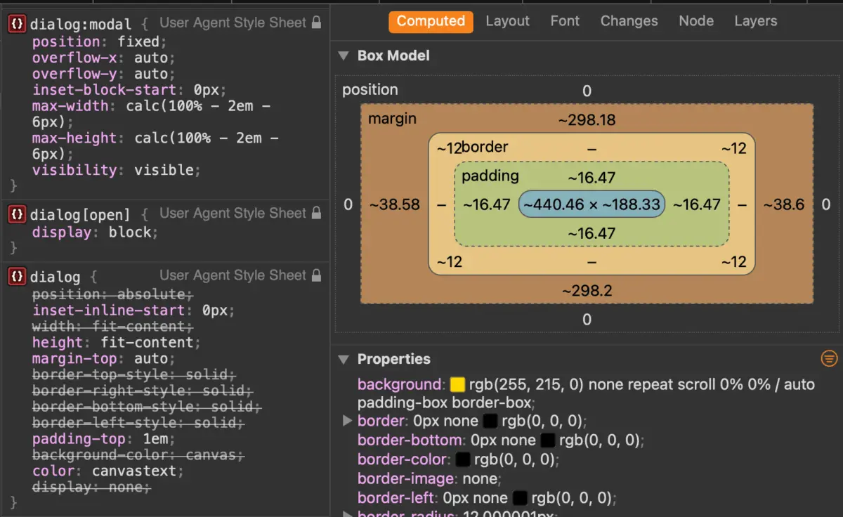
Native dialogs come equipped with a default white background, thick black borders, and center-viewport positioning derived from user-agent stylesheets. Customizing these styles requires targeting the element in its active state using the :open pseudo-class or the [open] attribute selector:
dialog
  /* Initial base state styles */
  border: 0;
  padding: 2rem;
  border-radius: 16px;
  background-color: #ffffff;
  box-shadow: 0 25px 50px -12px rgba(0, 0, 0, 0.25);

  &[open]
    /* Custom open-state configurations */
    display: flex;
    flex-direction: column;
Note on Browser Support: The :open pseudo-class enjoys broad, modern support across all major engines (including Safari), making it safe for production use. However, checking support or falling back to attribute selectors like dialog[open] ensures robust legacy compatibility.
Solving Viewport Scroll Leakage
A frequent frustration when building custom modals is background scroll leakage—where scrolling while a modal is open causes the underlying page content to scroll beneath the backdrop. Because a dialog is not inherently a scroll container by default, traditional CSS fixes like overflow: hidden on the dialog itself do not instantly solve the problem.
Modern CSS solutions leverage overscroll-behavior combined with viewport scroll container management:
dialog
  overflow: hidden;
  overscroll-behavior: contain;

  &::backdrop
    overscroll-behavior: contain;
Alternatively, a widely adopted, highly reliable pattern is to conditionally hide the body element’s overflow whenever an open dialog is present in the DOM using the :has() relational pseudo-class:
body:has(dialog[open])
  overflow: hidden;
Future Outlook & Animation Paradigms
Animating Dialog Entry and Exit
Historically, animating native dialogs was notoriously difficult because elements transitioning from display: none to display: block could not easily interpolate opacity or transform properties. Modern CSS solves this through the combination of transition properties and the @starting-style at-rule.

To create a smooth fade-in and scale-up effect when a dialog opens, developers define the starting styles explicitly:
@starting-style
  dialog:open
    opacity: 0;
    transform: scale(0.95);


dialog
  opacity: 0;
  transform: scale(0.95);
  transition: opacity 0.3s cubic-bezier(0.16, 1, 0.3, 1),
              transform 0.3s cubic-bezier(0.16, 1, 0.3, 1),
              overlay 0.3s cubic-bezier(0.16, 1, 0.3, 1) allow-discrete,
              display 0.3s cubic-bezier(0.16, 1, 0.3, 1) allow-discrete;

  &[open]
    opacity: 1;
    transform: scale(1);
The inclusion of allow-discrete alongside display and overlay transitions ensures that the browser correctly calculates the exit animation before removing the element from the top layer.
Dialog API vs. Popover API: Choosing the Right Tool
As web standards evolve, developers are frequently forced to choose between the Dialog API and the Popover API. While superficially similar, they serve fundamentally different architectural purposes:
- Use the Dialog API when: You are building blocking user experiences, confirmations, forms, or workflows that demand absolute user attention, keyboard focus trapping, and automatic background inertness (
showModal()). - Use the Popover API when: You are building non-modal, lightweight UI components such as tooltips, dropdown menus, floating cards, or contextual helpers that do not block interaction with the rest of the page and do not require focus trapping.
Misusing the Popover API for critical modal workflows introduces severe accessibility regression, forcing developers to manually write complex JavaScript to handle focus management, aria roles, and background muting.
Conclusion
The native HTML <dialog> element has matured into an indispensable cornerstone of modern web development. By moving modal logic out of heavy third-party JavaScript libraries and directly into the browser engine, developers gain unparalleled performance, bulletproof accessibility semantics, and elegant declarative control. As features like invoker commands, @starting-style, and advanced overscroll handling continue to standardize across all browser vendors, building robust, accessible, and stunningly animated dialogs has never been more achievable. Embracing these native primitives ensures faster load times, cleaner codebases, and superior user experiences for the web of tomorrow.