
Executive Overview
Nearly a decade after its initial introduction into the web platform, the native HTML <dialog> element remains one of the most deceptively nuanced components in modern web architecture. While developers frequently reach for it to build pop-ups, alerts, and complex multi-step wizards, the subtle differences between handling a standard pop-up versus a true modal continue to trip up even seasoned engineers.
The web community’s recurring reliance on reference materials for the <dialog> element underscores a broader reality: native HTML elements have evolved far beyond simple semantic wrappers. Today, they encapsulate complex state machines, accessibility trees, top-layer rendering contexts, and sophisticated browser-level APIs.
This comprehensive guide investigates the modern anatomy of the <dialog> element. We will examine core markup and JavaScript APIs, declarative controls via emerging invoker commands, accessibility best practices for screen readers and keyboard navigation, innate inertness, advanced backdrop styling, and performant CSS animations utilizing @starting-style. Finally, we will differentiate between the Dialog API and the Popover API to ensure architects select the correct primitive for their specific UI requirements.
Detailed Chronology: Evolution and Implementation Mechanics
Marking up and Invoking a <dialog>
At its foundational level, implementing a native dialog requires minimal boilerplate HTML:
<button id="dialog-button">Open Dialog</button>
<dialog id="dialog">...</dialog>
By default, the browser renders this element closed. While developers can force it open using the boolean open attribute (<dialog open>), this is rarely desirable outside of static documentation or specific server-side rendering edge cases. Instead, developers invoke the element dynamically via JavaScript using the .show() or .showModal() methods.
const dialogButton = document.querySelector('#dialog-button');
const dialog = document.querySelector('#dialog');

dialogButton.addEventListener('click', () =>
  dialog.show();
);
Crucially, utilizing .show() treats the dialog as a non-modal pop-up rather than a true modal. A non-modal implementation does not generate a backdrop, does not center itself automatically in the viewport, and lacks native keyboard dismissal via the Esc key.

For most interactive application workflows—such as confirmation prompts, authentication overlays, and data-entry forms—developers should invoke .showModal():
const dialogButton = document.querySelector('#dialog-button');
const formDialog = document.querySelector('#dialog');

dialogButton.addEventListener('click', () =>
  formDialog.showModal();
);
Closing Mechanisms: JavaScript and Declarative HTML
When a modal dialog is opened via .showModal(), focus shifts directly into the element by default, enabling the user to dismiss it immediately by pressing the Esc key. To provide an explicit user interface (UI) mechanism for closing the dialog, such as a close button, developers can programmatically bind the .close() method:
const formButton = document.querySelector('#dialog-button');
const formDialog = document.querySelector('#dialog');
const formClose = document.querySelector('#dialog-close');

formButton.addEventListener('click', () =>
  formDialog.showModal();
);

formClose.addEventListener('click', () =>
  formDialog.close();
);
Alternatively, developers can execute this behavior entirely without JavaScript using declarative HTML form submission methods:
<dialog id="dialog">
  <form method="dialog">
    <button type="submit">Close dialog</button>
  </form>
</dialog>
Emerging Horizons: Invoker Commands
As web standards progress, the ecosystem is moving toward increasingly declarative paradigms. The emerging invoker commands specification introduces native attributes designed specifically to control dialogs and popovers without writing imperative event listeners.
<button command="show-modal" commandfor="my-dialog">Show Dialog</button>

<dialog id="my-dialog">
  <button command="close" commandfor="my-dialog">Close Dialog</button>
</dialog>
By assigning the command and commandfor attributes, developers directly link button actions to target elements. For engineering teams requiring event tracking or telemetry, these commands can be intercepted cleanly via JavaScript:
const dialogs = document.querySelectorAll("dialog");

dialogs.forEach(dialog =>
  dialog.addEventListener("close", () =>
    // Analytics or cleanup on close
  );

  dialog.addEventListener("command", event =>
    if (event.command == "show-modal")
      // Logic executed when dialog opens modally
     else if (event.command == "close")
      // Logic executed when command closes dialog

  );
);
Supporting Context & Metrics: Accessibility and Innate Inertness
Accessible Button Labeling
A common anti-pattern in modern interface design is utilizing a minimalist "X" character—or an unlabelled SVG icon—for a modal’s close button:

<dialog id="dialog">
  <button id="dialog-close">X</button>
</dialog>
While visually compact, this practice degrades the experience for screen reader users, who may hear an unhelpful character announcement. Best practices require a visually hidden span containing descriptive text, coupled with an aria-hidden attribute applied directly to the decorative icon:
<dialog id="form-dialog">
<button id="form-close">
<span class="visually-hidden">Close modal</span>
<span aria-hidden="true">×</span>
</button>
</dialog>Additionally, developers must be mindful of initial focus states. Because the default behavior focuses the first focusable element inside the modal (frequently the close button), users tapping the Space key immediately upon opening might inadvertently close the dialog. If the dialog contains rich form fields or complex typography, explicitly assigning initial focus via the tabindex attribute to a primary input or heading wrapper provides a significantly more resilient user experience.
Innate Inertness and the Top Layer
One of the most powerful architectural advantages of the native <dialog> element when opened as a modal is its innate inertness. Behind an active modal dialog, the rest of the web document becomes entirely inert. Text selection, pointer events, background focus, and keyboard inputs are disabled automatically without requiring manual JavaScript wrappers or manual aria-hidden management on root application containers.
This occurs because modal dialogs are rendered directly inside the browser’s top layer—a rendering plane that exists completely outside the normal document flow, stacking context hierarchy, and overflow clipping paths of the DOM.
Official Statements & Styling Paradigms
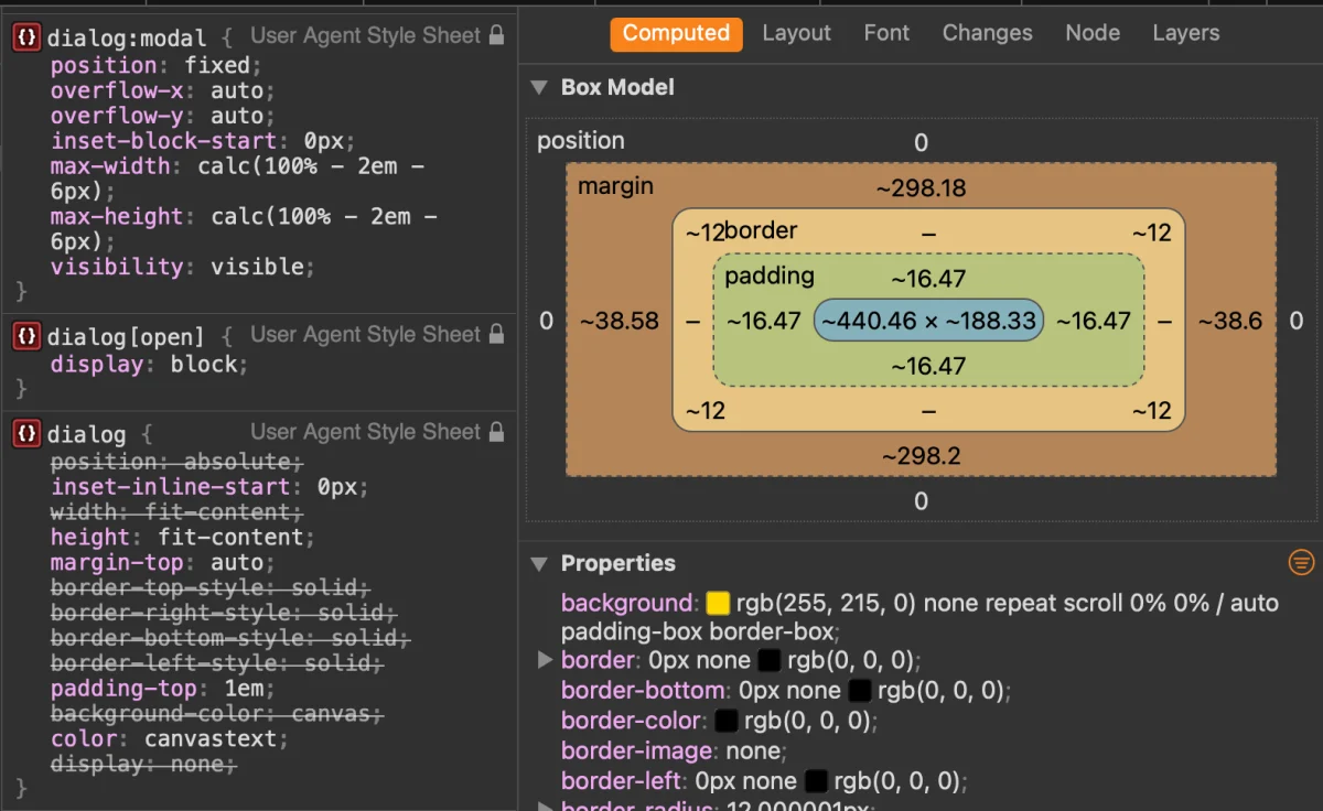
Styling a native dialog requires an understanding of user-agent (UA) stylesheets, pseudo-classes, and pseudo-elements.
Customizing the Backdrop
By default, the pseudo-element representing the shaded area behind a modal (::backdrop) features a remarkably subtle tint. Developers can enhance visual contrast or establish branding requirements by targeting the pseudo-element directly:

dialog::backdrop
  background-color: rgba(0, 0, 0, 0.6);
  backdrop-filter: blur(4px);
  overscroll-behavior: contain;
Selecting and Styling the Open State
Styling the dialog box itself should be handled via the :open pseudo-class (or attribute selector [open] for broader legacy support) rather than targeting the base element directly:
dialog
  border: 0;
  padding: 0;
  background: transparent;

  &[open]
    background-color: #ffffff;
    border-radius: 16px;
    box-shadow: 0 25px 50px -12px rgba(0, 0, 0, 0.25);
Furthermore, to combat layout shifts caused by disappearing scrollbars on the main document, developers should implement scrollbar-gutter:
dialog
  &[open]
    scrollbar-gutter: stable;
Preventing Background Scroll Leakage
A classic usability challenge with modals is "scroll chaining," where a user scrolling at the bottom boundary of a modal inadvertently scrolls the background document underneath. Because a dialog is not inherently classified as a strict scroll container by default, modern browsers (such as Chrome 144+) support addressing this natively:
dialog
  overflow: hidden;
  overscroll-behavior: contain;

  &::backdrop
    overscroll-behavior: contain;
Alternatively, a widely supported and highly reliable fallback involves utilizing the :has() relational pseudo-class on the document body:
body:has(dialog[open])
  overflow: hidden;
Performant Entry and Exit Animations
Historically, animating dialogs required complex JavaScript timelines because elements transitioning from display: none cannot natively interpolate CSS properties like opacity or transform. Today, the combination of CSS transitions and the @starting-style at-rule enables smooth, purely declarative open/close animations:
@starting-style
  dialog:open
    opacity: 0;
    transform: scale(0.95);


dialog
  opacity: 0;
  transform: scale(0.95);
  transition: opacity 0.3s ease-in-out, transform 0.3s ease-in-out, overlay 0.3s ease-in-out allow-discrete, display 0.3s ease-in-out allow-discrete;

  &[open]
    opacity: 1;
    transform: scale(1);
Future Outlook: Dialog vs. Popover API
As developers design complex web applications, a frequent architectural question arises: Should I implement a <dialog> or utilize the Popover API?

According to technical research by accessibility and frontend experts such as Zell Liew, the foundational distinction between these two APIs centers on accessibility semantics and focus management.
Core Differences at a Glance
| Feature / Behavior | HTML <dialog> (Modal) |
Popover API (popover) |
|---|---|---|
| Top Layer Rendering | Yes | Yes |
| Inert Background | Automatic (inert) |
Manual |
| Focus Trapping | Automatic | Manual |
Keyboard Dismissal (Esc) |
Built-in | Built-in |
| Primary Use Case | Critical user interruptions, forms, confirmations | Non-modal menus, tooltips, dropdowns, pickers |
Popovers lack innate accessibility affordances out of the box. They do not automatically trap keyboard focus, nor do they render the background document inert. Developers deploying popovers for interactive menus or complex widgets must manually manage focus trapping, assign appropriate ARIA roles, and handle screen-reader announcements.
Conversely, the <dialog> element provides robust, out-of-the-box semantics specifically calibrated for modal interactions that demand undivided user attention.
Architectural Conclusion
The evolution of the web platform demonstrates that native primitives continue to replace brittle custom JavaScript libraries. By mastering the native HTML <dialog> element, leveraging declarative invoker commands, respecting accessibility semantics, and utilizing modern CSS features like @starting-style, developers can build performant, accessible, and maintainable user interfaces that stand the test of time.