

Executive Overview
Nearly a decade after its initial introduction to the web platform, the native HTML <dialog> element remains one of the most powerful yet nuanced building blocks in modern web architecture. While developers frequently employ it to construct pop-ups, lightboxes, alerts, and complex multi-step application workflows, the underlying mechanics of styling, focus management, accessibility, and state transitions are frequently misunderstood.
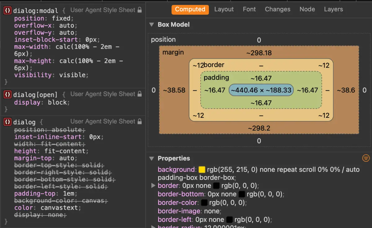
Far from being a simple styled <div>, the <dialog> element interacts intimately with the browser’s internal rendering tree, utilizing the top layer, native viewport centering, and built-in accessibility semantics. Navigating this architecture requires a firm grasp of how user-agent styles, pseudo-classes like :modal and :open, the ::backdrop pseudo-element, and recent developments like overscroll-behavior and @starting-style harmonize.
This comprehensive guide serves as an authoritative reference for engineers seeking to harness the full potential of native HTML dialogs. We will deconstruct markup strategies, examine declarative alternatives through emerging invoker commands, resolve tricky scrolling issues, implement robust accessibility (a11y) patterns, and execute fluid entry and exit animations. Finally, we will draw a definitive line between the Dialog API and the Popover API to ensure you choose the right tool for every architectural requirement.
Detailed Chronology & Evolution
The journey of native dialogs on the web spans decades of custom JavaScript polyfills, mismatched accessibility trees, and complex z-index wars. Before the <dialog> element was specified, developers relied on div-based overlays that required manual state management, custom keyboard listeners for the Escape key, and complex focus-trap loops to prevent screen reader users from navigating behind the modal.
When browsers finally implemented the <dialog> element, it brought native semantics and crucial layout primitives into the HTML specification. However, developers quickly realized that a specification standard is only as good as its interoperability. The evolution didn’t stop at basic opening and closing.
Over the years, the web platform has steadily patched the gaps in styling and layout control:
- The
:modaland:openPseudo-Classes: Providing precise control over styled states depending on how the dialog was invoked. - The
::backdropPseudo-Element: Elevating the background styling capabilities to obscure and blur underlying content natively. - The
@starting-styleAt-Rule: Unlocking the ability to transition properties likeopacityandtransformfrom a non-rendered state (display: none) into the DOM. - Modern Scroll Containment: Recent improvements in browser engines allowing properties like
overscroll-behavior: containto prevent background page scrolling without resorting to brittle JavaScript body-lock hacks.
Understanding this trajectory helps explain why certain CSS properties behave counterintuitively when applied to dialogs—and why modern CSS features are required to bend them to our design system requirements.

Core Implementation: Markup, Methods, and States
Implementing a native dialog begins with fundamental HTML markup. By default, a dialog is inert, hidden, and absent from the user’s active viewport.
<button id="dialog-button">Open Dialog</button>
<dialog id="dialog">
  <p>This is the core content of our native dialog.</p>
  <button id="dialog-close">Close</button>
</dialog>
Programmatic Control: show() vs. showModal()
To open a dialog via JavaScript, developers have two distinct methods at their disposal, each yielding fundamentally different behavioral archetypes:
dialog.show(): This method opens the dialog as a non-modal popup (resembling a tooltip or dropdown). It does not generate a backdrop, does not center the element automatically via viewport calculations, and does not render the background contentinert.dialog.showModal(): This is the method required for true modal dialogs. It instantly places the element in the browser’s top layer, generates a clickable::backdrop, centers the element within the viewport, fires up focus management, and marks all underlying DOM subtrees asinert.
const dialogButton = document.querySelector('#dialog-button');
const dialog = document.querySelector('#dialog');
const dialogClose = document.querySelector('#dialog-close');

// Open as an attention-grabbing modal
dialogButton.addEventListener('click', () =>
  dialog.showModal();
);

// Close programmatically
dialogClose.addEventListener('click', () =>
  dialog.close();
);
It is worth noting an ergonomic quirk in the API design: while we invoke showModal() to open a modal, the corresponding closing method is simply .close(), regardless of whether the dialog was opened modally or non-modally.
Declarative Closing and Invoker Commands
JavaScript is not strictly mandatory for closing a dialog. By wrapping a submit button inside a form with a method="dialog" attribute, browsers will automatically close the dialog and submit any associated form data without requiring a single line of scripting:
<dialog id="dialog">
  <form method="dialog">
    <p>Are you sure you want to proceed?</p>
    <button type="submit" value="confirm">Confirm</button>
    <button type="submit" value="cancel">Cancel</button>
  </form>
</dialog>
Looking forward, the web platform is actively standardizing invoker commands, an experimental feature designed to make both opening and closing dialogs entirely declarative directly inside HTML markup using the command and commandfor attributes:
<button command="show-modal" commandfor="my-dialog">Show Dialog</button>

<dialog id="my-dialog">
  <p>Controlled entirely via declarative invoker commands.</p>
  <button command="close" commandfor="my-dialog">Close Dialog</button>
</dialog>
Developers can also hook into these commands using JavaScript event listeners to execute side-effects whenever a dialog is triggered or dismissed:
document.querySelectorAll("dialog").forEach(dialog =>
  dialog.addEventListener("command", event =>
    if (event.command == "show-modal")
      console.log("Modal was successfully invoked.");
     else if (event.command == "close")
      console.log("Modal was dismissed.");

  );
);
Supporting Context, Metrics, and Accessibility (A11y)
Building a performant component means very little if it alienates users relying on assistive technologies. The native <dialog> element handles heavy lifting regarding accessibility, but subtle implementation choices can disrupt the experience.

Labeling Icon-Only Close Buttons
A common UI pattern is placing a minimalist "X" or an SVG cross in the top-right corner of a dialog. Screen readers require explicit textual cues to announce these actions meaningfully. Simply injecting an unlabelled symbol forces screen readers to read raw character codes or remain silent.
To build an inclusively hidden button, combine visually hidden text spans with aria-hidden attributes on decorative graphical elements:
<dialog id="form-dialog">
<button id="form-close">
<span class="visually-hidden">Close modal</span>
<span aria-hidden="true">×</span>
</button>
</dialog>Managing Initial Focus
When a modal dialog opens, the browser automatically shifts focus to the first focusable element inside the dialog. In many layouts, this happens to be the close button located at the top of the DOM structure. While functional, this can lead to accidental dismissals if a user hits the Space bar immediately upon opening.
If your modal contains rich interactive content—such as input fields, primary call-to-action buttons, or deep text blocks—consider explicitly directing initial focus to a preferred element using the tabindex attribute or programmatic JavaScript .focus() calls.
Innate Inertness and Stacking Contexts
When a modal is active, the rest of the page becomes inert. Text selection, mouse clicks, keyboard navigation, and focus rings are completely disabled for everything outside the modal. This behavior occurs automatically at the browser engine level, requiring zero custom event handling.
However, developers must remain cautious when mixing dialogs with fixed-position headers, sticky footers, or competing popover elements. Because modal dialogs reside in the browser’s top layer, they bypass standard CSS stacking contexts entirely, rendering behind-the-scene elements inaccessible by design.
Official Guidelines & Advanced Styling Techniques
User-agent stylesheets provide basic, highly functional default styling for dialogs—typically a white background, a stark black border, and a faint backdrop. Modern design systems demand complete creative freedom over these default parameters.

Targeting the Open State and Backdrops
When applying custom CSS rules to a dialog, styling the base dialog element directly can lead to specificity battles. Instead, target the element in its active state using the [open] attribute or the :modal pseudo-class:
dialog
  background: transparent;
  border: none;

  &[open]
    background-color: #ffffff;
    border-radius: 16px;
    box-shadow: 0 25px 50px -12px rgb(0 0 0 / 0.25);
    padding: 2rem;
    max-width: 600px;
    width: 90vw;
To style the background dimming effect, utilize the ::backdrop pseudo-element. You can introduce rich color tints, high-performance backdrop filters, or subtle blurs to emphasize the modal focus:
dialog::backdrop
  background-color: rgba(15, 23, 42, 0.6);
  backdrop-filter: blur(8px);
  transition: backdrop-filter 0.3s ease, background-color 0.3s ease;
Solving Background Scrolling
One historic pain point of modal implementation has been preventing the background document from scrolling while a modal is open. Because a dialog is not inherently a scroll container, developers traditionally had to toggle overflow: hidden on the <body> element via JavaScript:
body:has(dialog[open])
  overflow: hidden;
Alternatively, modern browser engines support overscroll-behavior on non-scrollable scroll containers, allowing for a strictly declarative CSS solution:
dialog
  overflow: hidden;
  overscroll-behavior: contain;

  &::backdrop
    overscroll-behavior: contain;
Fluid Entry and Exit Animations with @starting-style
Historically, animating a dialog entering and exiting the DOM was notoriously difficult because elements transitioning from display: none cannot naturally interpolate CSS properties. The introduction of the @starting-style rule completely revolutionizes this workflow.
By defining an initial render state, we can make dialogs smoothly fade and scale into view:
@starting-style
  dialog:open
    opacity: 0;
    transform: scale(0.95);


dialog
  opacity: 0;
  transform: scale(0.95);
  transition: opacity 0.3s cubic-bezier(0.16, 1, 0.3, 1),
              transform 0.3s cubic-bezier(0.16, 1, 0.3, 1);

  &[open]
    opacity: 1;
    transform: scale(1);
Future Outlook: Dialog vs. Popover API
As the web platform continues to mature, developers are often confronted with an architectural choice: Should I use the Dialog API or the Popover API?

While their syntax and declarative behaviors can appear remarkably similar, their intended use cases and accessibility guarantees are fundamentally divergent:
| Feature | Dialog API (<dialog>) |
Popover API (popover) |
|---|---|---|
| Primary Use Case | Modals, critical user prompts, forms requiring explicit completion. | Tooltips, menus, floating action dropdowns, non-blocking UI. |
| Backdrop Generation | Built-in via ::backdrop (in modal mode). |
Requires custom styling or manual overlay construction. |
| Focus Trapping | Automatic (keeps user focused inside the modal). | Light-dismiss behavior (clicks outside close it, no focus trap). |
| Inertness | Automatically makes background content inert. |
Does not alter background inertness. |
| Accessibility Tree | Native modal semantics out of the box. | Requires explicit ARIA roles depending on component type. |
As frontend architects, the guiding principle should never be "which API is newer or easier to style," but rather "what user experience am I trying to create?"
If your component demands immediate user attention, locks out background interactions, traps keyboard focus, and requires explicit user closure, the native HTML <dialog> element remains the undisputed gold standard of web engineering. If your component is a transient helper—such as a tooltip or contextual menu—the Popover API should be your mechanism of choice.
By mastering the nuanced interplay of modern CSS, native methods, and strict accessibility standards, developers can build interfaces that are not only visually stunning and buttery-smooth, but deeply resilient and accessible to every human being on the web.