

Executive Overview
The evolution of user interface (UI) and user experience (UX) design has long prioritized comprehensive control. For years, digital architects operated under the assumption that giving users every possible customization option directly in the viewport was the gold standard of accessible, user-centered design. Nowhere has this been more evident than in the ubiquitous implementation of dark mode and light mode theme toggles across modern websites and web applications.
For the better part of the last decade, developers have routinely deployed a three-state selection mechanism—Light, Dark, and System—directly within their primary site navigation or header layouts. However, a recent, fiercely debated critique spearheaded by prominent web standards advocate and developer Lea Verou is challenging this conventional wisdom. Verou’s thesis is simple yet radical: tri-state theme toggles are largely unnecessary, introducing avoidable cognitive overhead and visual clutter to interfaces where users arrive with entirely different primary objectives.
By streamlining theme preference controls into a more intuitive, elegant two-state system that defers seamlessly to operating system (OS) defaults unless actively overridden, web designers can reduce interface friction. This paradigm shift argues that software should intelligently adapt to the user rather than forcing them to navigate redundant menu options. This comprehensive investigative report examines the mechanics of this proposed UX shift, analyzes the cognitive dissonance inherent in persistent tri-state menus, explores edge cases involving local storage and state management, and outlines the rare scenarios where three-state controls genuinely remain appropriate.
Detailed Chronology: The Rise and Questioning of Theme Preferences
To understand the current debate surrounding theme toggles, one must examine how web development arrived at the modern tri-state paradigm.
Phase 1: The Binary Web (Early Era)
In the nascent days of widespread web styling, websites were overwhelmingly designed with a single, predetermined visual theme—typically dark text on a stark white background. Users possessed zero control over color schemes at the webpage level; any adjustments to contrast or brightness had to be handled locally via browser extensions, operating system high-contrast modes, or specialized reading view features.
Phase 2: The Emergence of Dark Mode and System Queries
As OLED displays proliferated on mobile devices and laptops, consumer demand for dark interfaces surged due to perceived battery savings and reduced eye strain in low-light environments. Operating systems rapidly introduced system-wide dark modes. Browser vendors followed suit by implementing the CSS Media Query prefers-color-scheme, allowing websites to natively detect whether a user’s operating system was configured for a light or dark aesthetic.
Phase 3: The Tri-State Proliferation
To give users granular control beyond what the operating system dictated, developers began embedding theme toggles directly into website headers. Because developers wanted to cover all bases, they naturally gravitated toward a three-option paradigm:
- Light Mode (Force light styling)
- Dark Mode (Force dark styling)
- System / Auto (Inherit OS settings)
While this approach offered maximum flexibility, it quickly created a visual tax. Placing three distinct icons, a segmented control, or a dropdown menu directly into a website’s primary navigation added unnecessary visual noise to spaces meant for core user navigation.
Phase 4: The Verou Critique (Present Day)
The pendulum is now swinging back. Led by critical UX breakdowns such as Verou’s analysis, the front-end engineering community is actively reconsidering whether displaying three discrete options for a secondary utility—like color schemes—is a net positive for user experience. Developers are asking a fundamental question: Why force users to manually declare what the browser can already deduce automatically?
Supporting Context & Metrics: The Cognitive Cost of UI Clutter
When evaluating website navigation bars, every visual element introduced competes directly for the visitor’s attention. In modern UX psychology, this competition is understood through the lens of cognitive load theory and Hick’s Law, which dictates that the time and effort required to make a decision increases with the number and complexity of choices available.
The Psychology of Secondary Controls
Theme switching is, by its very nature, a tangential user intent. When a visitor navigates to an informational blog, an e-commerce platform, or a software dashboard, their primary goal is consumption, evaluation, or task completion. They are there to read an article, purchase a product, or manage data.
The color scheme of the webpage is a supporting environmental factor. When developers place an always-visible, persistent tri-state toggle in the global navigation bar, they inadvertently elevate a peripheral utility to a primary structural element. This introduces cognitive dissonance:
- Visual Overhead: Three distinct buttons or icons take up precious horizontal or vertical screen real estate, crowding out critical navigation links like "Pricing," "Documentation," or "About."
- Decision Fatigue: Even if the decision is minor, forcing users to parse multiple theme icons introduces micro-friction upon every initial page load.
The Mathematics of State Reduction
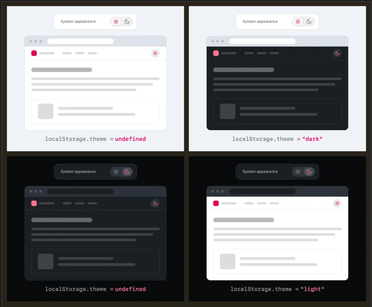
By transitioning from a tri-state visible control to a refined two-state system backed by intelligent fallbacks, interfaces shed unnecessary UI weight. Under the proposed model:
- Default State: The website respects the user’s OS preference (
prefers-color-scheme) with zero user interaction required. - Override State: If the user explicitly clicks the toggle to switch themes, that preference is captured, applied instantly, and stored persistently in the browser’s
localStorage.
As Verou notes, once an override is established, the user no longer needs a visible interface reminding them of three separate operational modes. They simply interact with a binary toggle that reflects their current override state or allows them to toggle back.
Technical Analysis: Managing State and Edge Cases
Moving away from the traditional tri-state toggle introduces fascinating technical and architectural challenges, particularly regarding state persistence, localStorage management, and handling divergences between user overrides and operating system shifts.
Handling localStorage and OS Divergence
One of the primary technical questions raised by developers adopting a simplified two-state toggle concerns state regression: What happens when a user starts with a Light system preference, manually overrides it to Dark, and later wants to revert to the system setting?
Consider the following behavioral scenarios:
- Initial Load: Operating system is set to Light. The website renders in Light mode automatically. No override exists in
localStorage. - User Action: The user clicks the toggle to switch to Dark mode. The system writes
theme: 'dark'tolocalStorage. - The Divergence Edge Case: Later, the user’s operating system automatically switches to Dark mode (e.g., evening arrives). Because an explicit override (
theme: 'dark') exists inlocalStorage, the website remains locked in Dark mode, matching both the user’s manual preference and the new system state.
Critics sometimes argue that this creates ambiguity: Does the user now think they are on "System" mode or "Dark" mode? Verou argues that this distinction is largely academic and irrelevant to the user’s actual journey:
"Remember, this control is entirely tangential to the actual user goal for visiting the website. Even if their intent were to pin light instead of reverting to System (light), this is something they would only notice once these diverge, i.e. the OS switches to dark. At that point, fixing it is a single click away. It’s such an easy fix, that there is no point in dwelling on it further."
The "Invisible" Control Paradigm
Advanced implementations of this philosophy go a step further: if the user’s active theme matches the current system preference, the toggle can remain visually minimal or even hidden from primary view until hovered or accessed via a settings sub-menu.
When developers remove persistent, always-visible tri-state dropdowns from headers, they eliminate clutter while preserving underlying functional depth. The browser handles the heavy lifting via native CSS media queries, and JavaScript only engages when an explicit user override is registered.
Official Perspectives and Community Discourse
The discussion sparked extensive dialogue across front-end engineering forums, CSS-Tricks retrospectives, and developer blogs. Industry professionals weighed in on the nuances of accessible design versus minimalist UI.
Proponents of the simplified two-state model emphasize that software should be opinionated in its reduction of friction. As one lead UI engineer noted in the community thread:
"Development for the preference is essential, but there is simply no need to show a clunky override widget when the base intelligence is already built directly into the browser and operating system."
Conversely, accessibility advocates raise valid points regarding user predictability. For users with cognitive disabilities or specific visual processing needs, explicit tri-state buttons can sometimes provide immediate, unambiguous feedback about what state the application is currently in, removing any guesswork about whether a theme is being inherited or forced.
When Is a Tri-State Control Actually Appropriate?
Even within the framework of minimizing unnecessary UI, Verou and UX researchers acknowledge that there are specific, distinct scenarios where a three-state control remains justified and necessary:
- Complex Enterprise Dashboards with High Customization: Applications where users spend hours managing multi-window interfaces, such as developer IDEs, design tools (like Figma or Adobe Creative Cloud), or data analytics suites, where theme inheritance might conflict with localized project settings.
- Accessibility-First Settings Panels: Dedicated accessibility or user preference modals (as opposed to primary global navigation headers), where users explicitly open a settings menu with the sole intent of configuring environmental parameters. In a dedicated settings panel, the presence of a tri-state radio group (Light | Dark | System) is expected and aligns directly with the user’s immediate task.
Future Outlook: The Next Wave of Adaptive Web Design
As web development matures into an era defined by micro-interactions, performance optimization, and minimalist aesthetics, the design patterns governing user navigation are undergoing rigorous pruning.
The movement away from bloated, always-visible tri-state theme toggles signals a broader philosophical shift in front-end engineering: trusting the platform. Modern browsers and operating systems are more capable than ever at communicating user intent through native APIs like prefers-color-scheme, prefers-reduced-motion, and forced-colors.
By leaning into these native capabilities rather than duplicating them with redundant UI controls in website headers, developers can create cleaner, faster, and more cognitively harmonious digital environments.
Summary Recommendations for Web Developers:
- Audit Your Navigation: Examine your site’s header or primary navigation. Ask whether a permanent theme toggle genuinely serves your visitors’ primary intent.
- Embrace Native Defaults: Allow
prefers-color-schemeto handle the heavy lifting for first-time visitors without requiring any manual interaction. - Implement Intelligent Overrides: If a user chooses to override the system default, store that preference cleanly in
localStorageand provide a seamless, low-friction toggle rather than a cumbersome tri-state dropdown. - Reserve Tri-State Menus for Settings Modals: Keep granular three-state controls tucked away inside dedicated user preferences or settings panels where users actively expect configuration choices.
Ultimately, the best interface is often the one that gets out of the user’s way entirely—allowing them to focus on content while quietly adapting to their needs in the background.