

Executive Overview
In the modern landscape of web design, few UI/UX patterns are as ubiquitous—and as frequently overengineered—as the dark mode toggle. For the better part of the last decade, developers have defaulted to a tripartite UI structure for color schemes: a control offering explicit options for "Light," "Dark," and "System." While this approach appears user-centric on the surface, it introduces unnecessary cognitive friction, clutters interface headers, and fundamentally misunderstands how users interact with aesthetic preferences on the web.
A compelling new critique by web standards expert and developer Lea Verou argues that this tripartite convention is deeply flawed. Verou posits that websites should abandon the cluttered three-state toggle in favor of a streamlined, intelligent two-state control—or eliminate visible toggles altogether when system integration handles the heavy lifting. By defaulting to the visitor’s system settings and allowing a simple manual override stored locally via localStorage, developers can achieve absolute functional parity while dramatically reducing interface noise.
This article explores the nuances of Verou’s argument, diving deep into the mechanics of UI/UX minimalism, the psychology of cognitive load in web navigation, and the rare scenarios where traditional tri-state controls still hold value. As web development matures into an era that prioritizes accessibility, performance, and clean design systems, rethinking how we handle color schemes is a vital step toward more intuitive digital experiences.
Detailed Chronology and the Evolution of Color Scheme Controls
The Dawn of Native Dark Mode
To understand the current debate surrounding dark mode toggles, we must examine how color scheme preferences evolved on the web. In the early days of custom web themes, dark mode was a novelty implemented via JavaScript cookies and custom CSS stylesheets. Users had to explicitly click a button to invert a site’s color palette, and their preference was tied strictly to that single domain.
The paradigm shifted dramatically with the introduction of the CSS Media Query prefers-color-scheme. Suddenly, operating systems and browsers could natively broadcast a user’s aesthetic preference—whether light or dark—directly to the web browser. Browsers quickly adopted this, allowing websites to automatically render in the user’s preferred mode without requiring a single line of custom JavaScript or a dedicated UI element.
The Rise of the Tri-State Control
Despite native OS integration, developers recognized that users often wanted site-specific overrides. A user might prefer a dark operating system environment, for instance, but prefer reading a text-heavy documentation site in a bright, high-contrast light mode.
To accommodate this, web developers introduced manual toggles. Seeking to be as accommodating as possible, the industry quickly standardized around a three-state UI pattern:
- Light Mode: Force the site to render with a light palette.
- Dark Mode: Force the site to render with a dark palette.
- System Mode: Defer to the operating system’s
prefers-color-schemequery.
While this seemed comprehensive, it created a bloated UI element—often occupying valuable real estate in site headers and navigation bars—for a feature that is fundamentally tangential to the user’s primary goal on the website.
The Verou Intervention
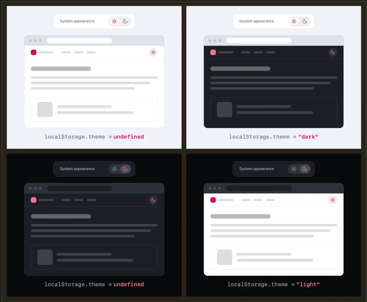
In early 2026, web standards advocate Lea Verou published a seminal critique of these implementations, challenging the industry-standard assumption that more options equate to better user experience. Verou argued that the "System" state is largely redundant in a persistent, visible toggle. Instead, a well-designed two-state control can effortlessly express all three necessary states: default to system settings, and apply an explicit user override the moment a toggle is engaged. This override is then safely cached in the browser’s localStorage for subsequent visits.
Supporting Context, Mechanics, and UI/UX Implications
Deconstructing the Two-State Paradigm
The core of Verou’s argument rests on a simple truth: theme switching is not the primary user intent when visiting a website. Whether a user is reading an article, purchasing a product, or searching for technical documentation, color customization is a secondary, supportive utility. When developers place a bulky, three-state dropdown or segmented control in the primary navigation, they introduce unnecessary cognitive dissonance.
To visualize how a two-state control manages three distinct scenarios, consider the following breakdown:
- Scenario A (No Override / Default): The user has no explicit preference saved on the site. The website intelligently reads the operating system’s setting via
prefers-color-schemeand renders accordingly. - Scenario B (Explicit Light Override): The user’s operating system is set to dark, but they prefer a light interface for this specific site. They click the toggle once. The site switches to light mode, and this preference is saved to
localStorage. - Scenario C (Explicit Dark Override): Conversely, if a user running a light OS environment activates the toggle, the site shifts to dark mode and caches that override.
As Verou notes, the edge cases involving synchronization—such as what happens when a user toggles back to a state that matches their system settings—are practically negligible. If a user starts with a light system preference, overrides it to dark, and later decides they want to revert, the underlying state logic handles the transition gracefully. Even if an override diverges from a newly changed system setting, fixing it requires a single, effortless click.
Cognitive Dissonance and Interface Clutter
In modern UI/UX design, every visual element demands a fraction of the user’s cognitive bandwidth. When persistent UI controls—those visible in headers across every page of a site—feature multiple complex states, they force the user’s brain to process unnecessary information.
By stripping the toggle down to its bare essentials, developers achieve several key benefits:
- Reduced Visual Noise: Navigation bars become cleaner, allowing users to focus on primary content (navigation links, search bars, brand logos).
- Lower Cognitive Load: Binary choices (on/off, light/dark) are processed significantly faster by the human brain than tripartite choices (light/dark/system).
- Enhanced Mobile Responsiveness: On mobile viewports where screen real estate is at an absolute premium, eliminating redundant UI states prevents header overcrowding.
Official Perspectives and Community Discourse
The response from the broader web development and design community to Verou’s proposal has been robust, sparking intense debates on platforms like CSS-Tricks, GitHub, and developer forums.
Industry veterans have pointed out that while tri-state controls feel thorough during the development phase, they often fail real-world usage metrics. One prominent developer noted in a community discussion thread: "Development for the preference is essential, but there is zero need to show a persistent override option when the foundational setting is already being managed seamlessly by the browser and operating system itself."
Another viewpoint highlighted in the discourse centers on browser-level controls. As modern browsers increasingly incorporate built-in developer tools and native UI extensions for forcing color schemes, web developers no longer carry the sole burden of managing complex environmental overrides. When the browser environment itself begins to shoulder the responsibility of color inversion and preference management, individual websites can afford to lean toward minimalist design patterns.
When Are Tri-State Controls Actually Appropriate?
Crucially, Verou does not argue that tri-state controls should be entirely eradicated from the web. Instead, she delineates specific contexts where three states are genuinely warranted:
- Dedicated Settings Panels: In user account settings, dashboard preferences pages, or software configuration menus—where users actively expect to manage granular application behaviors—a tri-state dropdown or radio group is entirely appropriate. In these dedicated spaces, efficiency of navigation header space is not a constraint, and the user’s explicit intent is configuration.
- Complex Multi-Theme Environments: Applications that support more than two distinct visual modes (e.g., Light, Dark, Sepia, High-Contrast, and System Default) inherently require multi-state controls. However, for standard consumer websites toggling purely between light and dark modes, this complexity remains unwarranted.
Future Outlook: The Next Generation of Web Aesthetics
As we look toward the future of web standards and design systems, the conversation initiated by Lea Verou points toward a broader industry recalibration. For too long, web development has suffered from "feature creep" in UI components—adding complexity under the guise of user choice.
The movement toward minimalist color scheme toggles signals a maturing design philosophy: one that respects user attention, values performance and clean architecture, and trusts intelligent default behaviors over heavy-handed interface design.
In the coming years, we can expect component libraries, design frameworks (such as Tailwind CSS and Bootstrap), and content management system themes to gradually adopt these streamlined patterns. Developers building next-generation web applications will increasingly rely on invisible system integrations paired with frictionless, lightweight overrides.
Ultimately, the best user interface is often the one you don’t have to think about. By removing the redundant "System" state from persistent navigation headers, web developers can deliver cleaner, faster, and more intuitive digital experiences that respect both the user’s aesthetic preferences and their cognitive space.