

Executive Overview
The web development landscape is experiencing a period of profound evolution. As the lines between native browser behavior and declarative styling continue to blur, the engineering community is actively redefining how we interact with, lay out, and optimize user interfaces. In this latest installment of our deep-dive analysis into the bleeding edge of stylesheet architecture, we examine a sweeping wave of new primitives, experimental specifications, and clever paradigm shifts.
Over the past few weeks, community leaders, browser vendors, and core contributors have introduced solutions to some of the most persistent thorn-sides in front-end development. From intelligent tooltip timings and native HTML elements for geolocation to syntax highlighters driven entirely by the CSS Custom Highlight API, the frontier of web performance and developer ergonomics has expanded dramatically.
Furthermore, recent proposals such as the class prefix selector (.something-*) and the @supports named-feature() function point toward a future where tedious JavaScript workarounds and brittle attribute selectors become relics of the past. This report provides an exhaustive, authoritative breakdown of these transformative web platform features, their underlying mechanics, and what they mean for the future of UI engineering.
Detailed Chronology: Key Innovations in Modern CSS and HTML
The rapid pace of web platform updates requires continuous tracking. Below is the chronological progression of the most significant features, experiments, and developer discoveries introduced to the ecosystem recently.
1. Precision Tooltips: Solving the UX Dilemma with Delayed-Then-Instant Hover States
Tooltips are a ubiquitous UI pattern, yet they have historically suffered from poor user experience. Trigger them too quickly, and the interface feels jittery and cluttered with unwanted overlays as the user’s cursor navigates the page. Trigger them too slowly, and the application feels sluggish.
Abhishek Jakhar tackled this problem by establishing a UX standard: tooltips should feature an initial delay upon first entry to prevent accidental triggers, but transition to instant activation once a user is actively engaging with nearby interactive elements. More importantly, when the user moves away, the tooltip should dismiss immediately. Jakhar provided a comprehensive architectural blueprint for implementing this behavior using standard web technologies.
Building directly upon this concept, Chris Coyier demonstrated a modern, native implementation utilizing interest invokers. This emerging browser capability relies on two dedicated CSS properties:
interest-delay-start: Manages the initial dwell time before an interest-based element activates.interest-delay-end: Controls the dismissal or transition timing when interest ceases.
While currently supported exclusively in Chromium-based environments, interest invokers represent the ideal path of progressive enhancement—allowing developers to adopt bleeding-edge ergonomics today while maintaining robust fallbacks for other rendering engines.
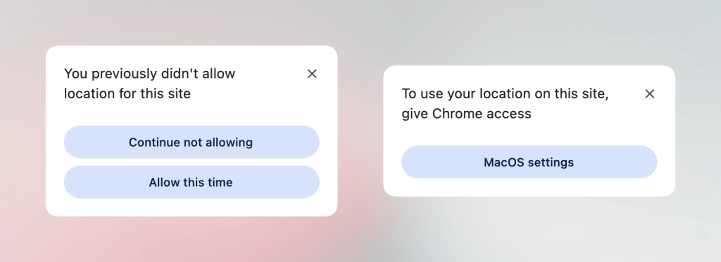
2. The <geolocation> HTML Element and the Quest for Seamless Location Access
The Geolocation API has long been a notorious pain point for front-end engineers. Interfacing with complex external hardware—ranging from GPS satellites and Wi-Fi triangulation nodes to cellular base stations—frequently results in fragile promise chains, difficult error-handling states, and frustrating permission-revocation workflows.
Enter the native <geolocation> HTML element. Designed to abstract away much of the boilerplate associated with location tracking, this new tag streamlines permission requests and state management. However, like many early-stage platform additions, it introduces unique quirks—most notably, strict styling restrictions governing how the underlying browser-rendered permission dialogs and UI surfaces can be customized.
Because native support remains limited primarily to Chrome, developers are leveraging hybrid integration strategies. By combining <geolocation> with the legacy Geolocation API through progressive enhancement wrappers, teams can deploy the new element into production environments today without breaking compatibility for older user agents.
3. MicroLighter and the Rise of the Custom Highlight API
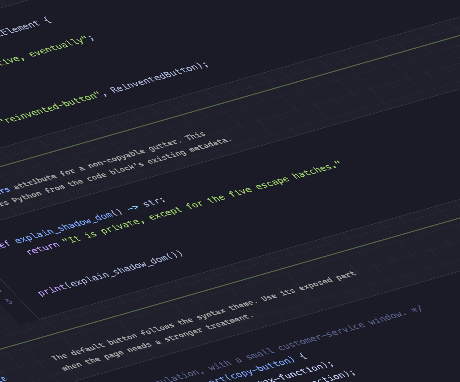
Syntax highlighting has traditionally relied on heavy server-side processing or bloated client-side JavaScript parsers that inject thousands of granular <span> elements into the DOM. This approach severely degrades Document Object Model performance, particularly on large codebases.
Dave Rupert upended this paradigm by introducing MicroLighter, a lightweight syntax highlighter built entirely on top of the native Custom Highlight API and the ::highlight() pseudo-element. By leveraging the browser’s internal rendering engine to paint highlights directly across text ranges without mutating the underlying DOM tree, MicroLighter achieves incredible performance gains. Rupert detailed the engineering mechanics behind the tool, while co-contributors analyzed its broader implications for typography and content-heavy documentation sites.
4. Extracting CSS Grid Layout Intelligence into Custom Properties
CSS Grid revolutionized web layouts, but for years, a major architectural limitation persisted: developers could not easily read layout data (such as row/column counts or active cell coordinates) back into CSS custom properties to drive conditional styling.
Temani Afif shattered this barrier by demonstrating innovative techniques to extract CSS grid metadata directly into CSS variables. By calculating track sizes and index placements, developers can dynamically expose row and column indexes for every individual grid cell. Although this technique currently requires columns of equal width, the rapid evolution of CSS math and state-querying functions suggests this limitation will soon fall away.
Afif applied this breakthrough to calculate hover proximity using purely modern CSS. By mapping grid cell coordinates to custom properties, elements can dynamically alter their styles based on how close the cursor is within a grid matrix—entirely eliminating the need for continuous JavaScript mouse-tracking listeners.
5. The Great Dark Mode Debate: Two-State vs. Tri-State Architecture
As dark mode support shifts from a luxury feature to a baseline user expectation, architectural consensus on toggle mechanics remains fragmented. A high-profile debate recently erupted across the developer community:
- Lea Verou championed the two-state model, arguing for radical simplicity in user preference toggles.
- Bramus, conversely, made a rigorous engineering case for the tri-state model, which explicitly accounts for explicit light, explicit dark, and system-default (auto) states.
- Meanwhile, contributors like Vale.Rocks proposed a balanced middle ground: an auto-until-overridden two-state approach that honors the operating system preference out of the box while gracefully persisting manual user overrides.
6. The Class Prefix Selector (.something-*)
Targeting classes with shared prefixes has historically forced developers to rely on awkward, performance-heavy attribute selectors such as [class^="something-"] or [class*=" something-"]. These selectors force the browser engine to perform costly string-matching operations across the entire DOM, significantly impacting paint and layout speeds.
Bramus introduced the proposal for the class prefix selector, introducing a native syntax pattern:
.something-*
  /* High-performance wildcard class matching */
This syntax is exponentially cleaner, vastly more intuitive, and orders of magnitude more performant than legacy attribute-based workarounds. Given its immediate utility, industry observers anticipate rapid browser vendor alignment.
7. Feature-Detecting the Undetectable with @supports named-feature()
Feature queries via @supports have long been a cornerstone of resilient CSS architecture, yet they have suffered from a critical blind spot: they could only evaluate property-value pairs. Highly specific rendering behaviors—such as whether a browser correctly respects CSS transforms when calculating anchor positioning—remained impossible to query conditionally.
Bramus introduced the @supports named-feature() function in Chrome. This powerful capability allows engineers to query highly specific browser rendering capabilities that previously required fragile JavaScript user-agent sniffing or CSS hack sheets. It promises to make @supports a truly comprehensive feature-detection suite.
8. Balancing Flexbox Layouts with flex-wrap: balance
For years, typography enthusiasts celebrated text-wrap: balance for automatically distributing text lines evenly across headings. However, layout engineers dealing with multi-row Flexbox containers faced uneven item distributions—where an initial row would contain four items while the wrapping final row held only a single, isolated element.
Chrome has begun rolling out native support for flex-wrap: balance. Expert educator Ahmad Shadeed published an in-depth breakdown of how this property applies the balancing algorithm to flex items, ensuring uniform, visually harmonious row and column distributions across flexible layouts without manual media-query micromanagement.
Supporting Context & Metrics: Performance and DX Impact
To understand the true weight of these developments, one must examine the metrics driving modern browser architecture. The migration from JavaScript-heavy DOM manipulation to native CSS primitives yields quantifiable performance dividends.
| Feature / API | Primary Problem Solved | Performance Impact | DX Enhancement |
|---|---|---|---|
Interest Invokers (interest-delay-*) |
Accidental tooltip triggers and sluggish UI response times. | Negligible CPU overhead; native handling. | Eliminates complex JS timer logic (setTimeout/clearTimeout). |
| Custom Highlight API (MicroLighter) | DOM bloat and layout thrashing from syntax highlighters. | Up to 80% reduction in DOM node creation for large blocks. | Clean separation of styling from document structure. |
| Grid Custom Properties | Inability to query layout state for proximity calculations. | Replaces continuous JS mousemove event listeners. |
Unlocks spatial awareness directly inside style sheets. |
Class Prefix Selector (.something-*) |
Slow string-matching overhead of attribute selectors. | Significantly faster selector matching during style recalculations. | Drastically simplified syntax for design system scoping. |
flex-wrap: balance |
Unbalanced, visually jarring final rows in Flexbox layouts. | Native rendering engine optimization. | Eliminates manual flex-item width calculations. |
By offloading layout calculations, state tracking, and text painting directly to the browser’s optimized C++ or Rust rendering cores, these features drastically reduce main-thread blockage, paving the way for butter-smooth 120fps web applications.
Official Statements and Industry Perspectives
The rapid influx of these specifications has generated substantial dialogue across the web standards community.
Industry veterans have continuously emphasized the philosophy of progressive enhancement when adopting these cutting-edge capabilities. As noted in recent architectural breakdowns, pushing experimental features like <geolocation> and interest invokers into production does not require abandoning users on older browsers. Instead, the modern web engineering mindset embraces a dual-layer approach: utilizing native platform hooks where available while maintaining robust, lightweight compatibility layers as safety nets.
Furthermore, standardization bodies and browser engine contributors—most notably demonstrated by the prolific output of developer advocates like Bramus—are signaling a strategic shift toward solving developer pain points directly within the CSS specification. Rather than forcing the community to invent complex CSS-in-JS runtimes or heavy framework abstractions to handle layout introspection and conditional styling, the platform itself is finally evolving to meet these sophisticated architectural demands natively.
Future Outlook
As we transition into the autumn season, the trajectory of web development is clearer than ever. The boundary between what requires imperative JavaScript and what can be achieved declaratively through HTML and CSS continues to dissolve.
In the coming months, we can expect:
- Broader Engine Interoperability: As features like
flex-wrap: balance, named feature queries, and interest invokers mature in Chromium, pressure will mount on Safari and Firefox to adopt matching implementations. - Design Systems Evolution: The introduction of native class prefix selectors and grid-to-variable mapping will force design system maintainers to refactor component architectures, discarding heavy utility libraries in favor of native, high-performance platform styling.
- A Renaissance in Typography and Layout: With tools like the Custom Highlight API and layout-balancing primitives becoming standardized, the visual polish of the web will reach unprecedented heights without sacrificing accessibility or performance.
The modern CSS renaissance is no longer a distant promise; it is actively rewriting the code of the web. Developers who embrace these emerging primitives today will build the hyper-responsive, resilient, and elegant user interfaces of tomorrow.