

Executive Overview
Cascading Style Sheets (CSS) have evolved from a rudimentary tool used merely to apply color and basic typography to web pages into a robust, Turing-complete visual styling engine capable of complex graphical transformations. Among the various properties that have matured over successive iterations of the CSS specification, the border-image property stands out as a deceptively powerful feature. While many web developers take it for granted—often relying on standard, predictable styles like solid, dashed, or double lines—advanced practitioners understand that border-image opens the door to deeply creative, dynamic user interfaces.
Historically, animating a border presented a significant technical hurdle. Because standard CSS properties do not naturally support the interpolation of complex gradients over time, developers often had to resort to heavy JavaScript wrappers, complex pseudo-element stacking, or performance-draining SVG manipulations. However, recent advancements in native CSS architecture—specifically the widespread implementation of the @property rule for registering custom CSS variables—have completely transformed this landscape.
By pairing border-image with registered custom properties and CSS gradients, front-end engineers can now construct fluid, high-performance border animations that mimic vector graphics without sacrificing DOM efficiency. This article provides an authoritative, deep-dive exploration into the mechanics of CSS border images, analyzes the inherent limitations of curved elements, details step-by-step code implementations for linear and conic gradient animations, and explores the broader future outlook for modern web interface design.
Detailed Chronology: The Evolution of CSS Borders and Gradients
To fully appreciate the breakthrough of animating border images, it is vital to examine how web styling evolved from rigid, boxed layouts to fluid, gradient-driven visual frameworks.
Phase 1: The Era of Static Box Models
In the early days of the web, borders were strictly bound by the border-style, border-width, and border-color properties. Developers were limited to mathematical shapes—lines, dots, dashes, and grooved insets—rendered entirely by the browser’s native painting engine. Any attempt to introduce complex textures or multi-colored framing required slicing raster images into small chunks and applying them via cumbersome HTML table structures or repetitive background image hacks.
Phase 2: The Introduction of Border Images
The CSS3 specification introduced the border-image shorthand property, allowing developers to slice an external image file (such as a PNG or SVG) and stretch, repeat, or round those slices across an element’s bounding box. While this solved the static design problem, it introduced a rigid workflow dependency: assets had to be created outside the stylesheet, leading to heavier payload sizes and disconnected design pipelines.
Subsequent updates allowed developers to pass CSS gradients (linear-gradient, radial-gradient, and later conic-gradient) directly into the border-image-source property. This eliminated the need for external raster files, enabling pure-code aesthetic styling. Yet, a major limitation remained: CSS gradients could not be easily animated because browsers lacked the mathematical logic to interpolate between complex gradient color stops and directional percentages smoothly.
Phase 3: The Custom Property Revolution (@property)
The modern era of CSS animation arrived with the standardization of the CSS Houdini APIs, most notably the @property rule. By allowing developers to explicitly define custom CSS variables with specific data types (such as <percentage>, <angle>, or <number>), the browser could finally understand how to interpolate values that were previously locked as static strings.
When applied to border-image, this meant that variables embedded within gradients could now be targeted by CSS transitions and keyframe animations. The result is a seamless, hardware-accelerated method for drawing, expanding, and transforming borders dynamically in real time.
Supporting Context & Metrics: Why Use border-image over Alternatives?
When evaluating modern UI animation strategies, performance and maintenance overhead are critical metrics. While alternative approaches exist—such as Temani Afif’s popular technique utilizing CSS masks—border-image offers distinct architectural advantages for specific use cases.
The Curvature Caveat
The most prominent technical limitation of the border-image property is its interaction with rounded corners. By default, border-image does not curve to match the path of a border-radius. When an element has rounded corners and a border image applied simultaneously, the underlying image remains strictly bound to the rectangular box model, often resulting in visual clipping at the corners.
For developers building components with pill shapes or heavily rounded cards, this can be a dealbreaker, prompting the use of CSS mask techniques that conform natively to border radii. However, for sharp-edged cards, dashboards, data tables, and futuristic HUD (Heads-Up Display) interfaces, border-image bypasses the rendering overhead of complex masking layers.
Efficiency and Automatic Replication
border-image excels in efficiency due to its native handling of repetition and slicing:
- Automatic Scaling: Unlike multi-layered pseudo-element approaches that require manual positioning of absolute divs on the top, right, bottom, and left of a container,
border-imageautomatically distributes and scales across all four borders simultaneously. - Granular Control via Slicing: Through the
border-image-sliceproperty, developers can dictate precisely which portions of the source image or gradient are rendered, mimicking the flexibility ofbackground-sizeandbackground-position. - Reduced DOM Weight: Implementing animated borders via
border-imagerequires zero auxiliary HTML markup. A single structural element (such as adiv) is all that is necessary to render and animate the border.
Technical Implementation Guide
To demonstrate the practical application of these concepts, let us construct a card component featuring an animated border that reacts dynamically to user hover events.
1. The HTML Structure
Keeping the markup strictly semantic and minimalist ensures optimal accessibility and performance:
<div class="card">
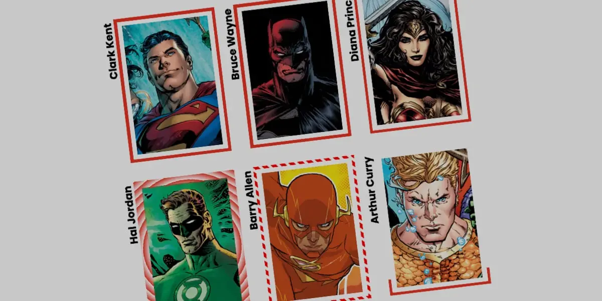
  <strong>Bruce Wayne</strong>
</div>
2. Base Styles and Layout
Next, we define the physical dimensions of the .card element, establish a relative positioning context, and apply a background image:
.card
  width: 180px;
  aspect-ratio: 0.69;
  position: relative;
  background: center/90% no-repeat;
  background-image: url("batman.jpg");
  padding: 1rem;
  box-sizing: border-box;
  display: flex;
  align-items: flex-end;
  color: #ffffff;
  font-family: system-ui, sans-serif;
3. Integrating the Linear Gradient Border
We introduce a linear gradient as the border-image-source. By setting both the active color and the transparent color to start at 0%, we create an immediate hard stop, which acts as our baseline for the animation:
.card
  /* ... previous styles ... */

  /* Creates a linear color definition */
  border-image-source: linear-gradient(-45deg, #e50914 var(--p, 0%), transparent 0%);

  /* Controls how the gradient is sliced */
  border-image-slice: 1;

  /* Sets the physical thickness of the border */
  border-image-width: 4px;

  /* Pushes the border outward from the card edge */
  border-image-outset: 6px;
4. Registering the Custom Property for Animation
Because standard CSS cannot interpolate percentage shifts inside gradients directly, we register a custom property (--p) using the @property rule:
@property --p
  syntax: "<percentage>";
  initial-value: 0%;
  inherits: false;
Now, we wire this custom property into our hover state to trigger the animation:
.card
  /* ... base styles ... */
  border-image-source: linear-gradient(-45deg, #e50914 var(--p), transparent 0%);
  transition: --p 0.5s ease-in-out;

  &:hover
    --p: 100%;
When a user hovers over the card, the custom variable --p shifts from 0% to 100%. This commands the browser to expand the red color stop across the entire length of the gradient, giving the convincing optical illusion that the border is actively "drawing" itself around the perimeter of the element.
5. Advanced Variations: Conic Gradients and Tiling
We can take this concept further by swapping out the linear gradient for a conic-gradient and leveraging the border-image-repeat property with the round keyword. The round value instructs the browser to fit a whole number of slices along the border, slightly stretching or squeezing them to achieve a mathematically perfect fit without awkward clipping.
First, we register two custom properties to control both the slicing depth and the rotational angle:
@property --n
  syntax: "<number>";
  initial-value: 1;
  inherits: false;


@property --a
  syntax: "<angle>";
  initial-value: 0deg;
  inherits: false;
Next, we apply these registered properties to our advanced card class:
.advanced-card
  width: 200px;
  aspect-ratio: 1;
  position: relative;

  border-image-source: conic-gradient(from var(--a), #00f2fe var(--a), transparent 0%);
  border-image-width: 6px;
  border-image-slice: var(--n);
  border-image-repeat: round;

  transition-property: --n, --a;
  transition-duration: 0.8s;
  transition-timing-function: cubic-bezier(0.4, 0, 0.2, 1);

  &:hover
    --n: 15;
    --a: 360deg;
In this configuration, hovering over the element triggers a dual-property transition: the rotation angle (--a) spins the conic gradient through a complete 360-degree rotation, while the slice value (--n) expands from 1 to 15, creating a complex, pulsating geometric tiling effect along the outer edges of the box.
Official Statements and Industry Perspective
Leading web standards advocates and CSS engineers have continually championed the expansion of Houdini properties as a turning point for web design. Industry experts note that prior to the @property specification, developers were forced to rely on heavy JavaScript requestAnimationFrame loops to achieve smooth color-stop and angle interpolations.
According to browser engine contributors, native property registration shifts computational workloads directly to the GPU (Graphics Processing Unit). Because the browser’s rendering engine understands the explicit data type (<angle>, <percentage>, or <number>), it can optimize the frame-by-frame interpolation of CSS variables during layout painting. This ensures that even complex animated border effects maintain a consistent 60 frames per second (FPS), avoiding the stuttering and layout thrashing commonly associated with script-driven DOM manipulations.
Future Outlook
As CSS continues to evolve through the inclusion of advanced Houdini specifications, container queries, and parent selectors, the boundary between static markup and interactive motion design becomes increasingly blurred.
We can anticipate several key developments in the near future regarding border styling:
- Native Border Radius Interpolation for Images: Ongoing discussions within the CSS Working Group suggest future specifications may introduce better alignment between
border-imagepainting boxes and complexborder-radiuscurves, potentially eliminating the current geometry restrictions. - Expanded Houdini Support: As browser adoption for registered custom properties reaches ubiquitous status across all evergreen desktop and mobile engines, complex mathematical styling will become standard practice rather than an advanced technique.
- Design System Integration: Frameworks and component libraries are beginning to ingest these animated border primitives, moving away from heavy SVG icon packs and canvas wrappers in favor of lightweight, token-driven CSS variables.
By mastering properties like border-image, border-image-slice, and the @property rule, front-end developers are no longer passive consumers of rigid browser styles. Instead, they wield direct programmatic control over the digital canvas, crafting interfaces that are performant, accessible, and visually captivating.