Executive Overview
The native HTML <dialog> element stands as a testament to the evolution of web architecture, bridging a long-standing gap in developer tooling by eliminating the need for brittle JavaScript-heavy libraries to handle modal windows, popups, and dialog boxes. Nearly a decade after its initial introduction into web standards, developers continue to explore its nuanced behaviors, rich styling APIs, and intricate accessibility requirements.
While the element appears deceptively simple on the surface, deploying it effectively demands an understanding of its underlying user-agent styles, state management via JavaScript and emerging HTML specifications, and robust accessibility patterns. This comprehensive analysis explores the architectural mechanics of the <dialog> element, covering everything from fundamental markup to advanced backdrop styling, spatial positioning, scrolling behavior, hardware-accelerated animations, and its critical architectural separation from the Popover API.
Detailed Chronology: From Basic Markup to Modern Interactivity
Marking Up and Initializing the Dialog
At its core, implementing a native dialog requires minimal HTML. A standard setup pairs an interactive trigger button with the <dialog> element itself:
<button id="dialog-button">Open Dialog</button>
<dialog id="dialog">...content goes here...</dialog>
By default, this element remains closed upon page load. While developers can technically force the dialog open by applying the boolean open attribute directly within the markup (<dialog open>...</dialog>), this pattern is rarely desired in production environments. Instead, standard initialization relies on the DOM API.
The show() vs. showModal() Dilemma
JavaScript provides two distinct methods to open a dialog: .show() and .showModal().

- The
.show()Method: Invokingdialog.show()treats the element similarly to a lightweight pop-up. It lacks an automatic backdrop, does not center itself by default on the viewport, and does not automatically trap user focus or respond to theEsckey. - The
.showModal()Method: In most application architectures, developers require a true modal experience. The.showModal()method automatically generates a shaded backdrop, centers the element within the viewport, traps keyboard focus inside the container, and listens for theEsckey to dismiss the dialog.
const dialogButton = document.querySelector('#dialog-button');
const formDialog = document.querySelector('#dialog');

dialogButton.addEventListener('click', () =>
  formDialog.showModal();
);
Closing Mechanisms and Declarative Control
When a modal is active, pressing the Esc key closes it by default, leveraging the browser’s built-in accessibility affordances. However, providing a dedicated UI close button inside the dialog requires explicit JavaScript binding via the .close() method:
const formButton = document.querySelector('#dialog-button');
const formDialog = document.querySelector('#dialog');
const formClose = document.querySelector('#dialog-close');

formButton.addEventListener('click', () =>
  formDialog.showModal();
);

formClose.addEventListener('click', () =>
  formDialog.close();
);
Interestingly, the specification does not provide a reciprocal closeModal() method; .close() handles both modal and non-modal states seamlessly. Furthermore, developers seeking a zero-JavaScript approach can achieve declarative closing natively within HTML by embedding a form with method="dialog":
<dialog id="dialog">
  <form method="dialog">
    <button type="submit">Close dialog</button>
  </form>
</dialog>
The Evolution of Invoker Commands
As web standards continue to mature, the introduction of Invoker Commands promises to streamline declarative dialog management entirely within HTML, reducing reliance on custom event listeners. Though experimental, this specification introduces the command and commandfor attributes:
<button command="show-modal" commandfor="my-dialog">Show Dialog</button>

<dialog id="my-dialog">
  <p>This dialog is controlled entirely via declarative attributes.</p>
  <button command="close" commandfor="my-dialog">Close Dialog</button>
</dialog>
For applications requiring programmatic oversight of these interactions, developers can listen to unified command events via JavaScript:
const dialogs = document.querySelectorAll("dialog");

dialogs.forEach(dialog =>
  dialog.addEventListener("close", () =>
    // Handle dialog closure event
  );

  dialog.addEventListener("command", event =>
    if (event.command == "show-modal")
      // Handle modal open command
     else if (event.command == "close")
      // Handle close command

  );
);
Supporting Context & Metrics: Accessibility and State Management
Inclusive Design and Button Labeling
A common anti-pattern in UI engineering involves labeling close buttons with a minimalist "X" or an unlabelled SVG icon. While visually concise, screen readers fail to interpret these characters meaningfully unless supplemented with accessible text.

To maintain compliance with modern accessibility standards (WCAG), developers should pair icons with visually hidden utility classes while hiding the decorative asset from assistive technologies via aria-hidden:
<button id="form-button">Open Dialog</button>
<dialog id="form-dialog">
<button id="form-close">
<span class="visually-hidden">Close modal</span>
<span aria-hidden="true">×</span>
</button>
</dialog>Care must also be taken regarding initial focus states. When a modal opens, focus automatically defaults to the first focusable element inside the container—frequently the close button. If users inadvertently strike the Space bar immediately upon opening, the dialog may close unexpectedly. For complex forms, assigning initial focus to a specific form field or primary link using the tabindex attribute provides a more reliable user experience.
Innate Inertness and the Top Layer
One of the most powerful architectural features of a modal dialog is its innate inertness. When a modal opens via .showModal(), the background document automatically becomes inert. This structural state disables all user interactions across the rest of the page, including text selection, mouse clicks, focus traversal, and input entry, without requiring manual CSS or JavaScript orchestration.
Crucially, this inert behavior is exclusive to true modals (.showModal()), distinguishing them from simple pop-ups or tooltips initialized via .show(). If multiple overlapping layers are rendered, modal dialogs reside exclusively on the browser’s top layer, guaranteeing visual and interactive dominance over standard document flows.
Official Guidelines: Styling and Layout Engineering
Customizing the Backdrop
The default UA stylesheet for the ::backdrop pseudo-element provides a subtle, semi-transparent tint. However, this default is often too faint for high-contrast enterprise interfaces. Developers can fully customize the backdrop using the ::backdrop pseudo-element:

dialog
  &::backdrop
    background-color: rgba(0, 0, 0, 0.6);
    backdrop-filter: blur(4px);
Overriding User-Agent Styles and Positioning
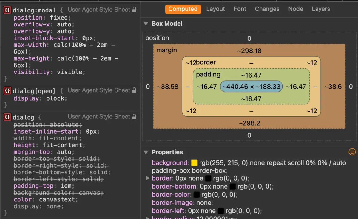
By default, user-agent stylesheets apply a stark white background and a heavy black border to <dialog> elements, alongside automatic viewport centering. Customizing these properties requires targeting the element within its active state, utilizing either the :open pseudo-class or the higher-specificity :modal pseudo-class:
dialog
  border: none;
  background: transparent;

  &[open]
    background-color: var(--dialog-bg, #ffffff);
    border-radius: 12px;
    box-shadow: 0 20px 25px -5px rgb(0 0 0 / 0.1);
Managing Scrollbars and Viewport Overflow
Opening a modal frequently removes background scrollbars, which can cause layout shifts across the underlying document. Utilizing scrollbar-gutter: stable; helps mitigate this jitter:
dialog
  &[open]
    scrollbar-gutter: stable;
Furthermore, preventing background scrolling while a modal is active has historically required complex JavaScript scroll locks. Modern CSS offers cleaner, declarative solutions. In modern browser environments supporting enhanced overscroll-behavior, scroll chaining can be prevented directly:
dialog
  overflow: hidden;
  overscroll-behavior: contain;

  &::backdrop
    overscroll-behavior: contain;
Alternatively, checking for open dialog states at the document body level provides broad, reliable browser support:
body:has(dialog[open])
  overflow: hidden;
Hardware-Accelerated Animations
Animating dialog entry and exit states requires careful management of the DOM rendering lifecycle. Because a closed dialog possesses a computed style of display: none, standard CSS transitions will fail unless paired with the @starting-style at-rule:

@starting-style
  dialog:open
    opacity: 0;
    transform: scale(0.95);


dialog
  opacity: 0;
  transform: scale(0.95);
  transition: opacity 0.3s ease-out, transform 0.3s ease-out, display 0.3s ease-out allow-discrete;

  &[open]
    opacity: 1;
    transform: scale(1);
Future Outlook: Dialog vs. Popover API
As the web platform expands its native component capabilities, developers frequently face an architectural choice between the Dialog API and the Popover API. While superficially similar, these specifications serve fundamentally divergent use cases governed by strict accessibility requirements.
Key Architectural Differences
| Feature | HTML <dialog> (Modal) |
HTML Popover API |
|---|---|---|
| Top Layer Rendering | Yes | Yes |
| Automatic Focus Trap | Yes | No |
| Background Inertness | Yes (Blocks background interaction) | No (Background remains active) |
| Dismissal Mechanism | Esc key, explicit close triggers |
Esc key, light-dismiss (clicking outside) |
| Primary Use Case | Critical user flows, forms, confirmations | Tooltips, menus, contextual overlays |
Attempting to repurpose a lightweight popover for mission-critical modal workflows introduces severe accessibility vulnerabilities, requiring developers to manually script focus traps, manage ARIA roles, and toggle inert subtrees. Conversely, employing heavy modal dialogs for transient tooltips degrades user experience by interrupting page interactivity unnecessarily.
Conclusion
The native HTML <dialog> element has matured from an experimental web component into an indispensable pillar of modern frontend engineering. By leveraging its robust declarative syntax, built-in accessibility primitives, and powerful styling hooks, developers can build faster, more resilient, and deeply inclusive web applications without relying on third-party JavaScript frameworks.