Executive Overview
For decades, the web design community has treated CSS borders as static, utilitarian boundaries. The standard toolkit—consisting of straightforward solid lines, subtle dashed styling, or classic double borders—has served its purpose well in separating content blocks and defining interface containers. Yet, as digital design systems mature, the demand for fluid, immersive, and dynamic user interfaces (UIs) has outpaced these primitive styling techniques.
Enter the CSS border-image property. Long considered a niche feature relegated to complex decorative paneling or retro web graphics, border-image is currently undergoing a renaissance among front-end architects. By leveraging modern CSS Houdini APIs, registered custom properties, and advanced gradient mathematics, developers can transform rigid rectangular boundaries into living, breathing elements.
This article explores a sophisticated technique for animating CSS border images. Moving beyond basic static implementations, we will examine how to bridge the gap between static CSS properties and smooth transitions, utilizing linear and conic gradients paired with CSS custom properties (@property). By the conclusion of this guide, front-end engineers will possess the advanced technical insights necessary to implement performant, eye-catching border animations that elevate modern web applications from functional to exceptional.
Detailed Chronology: The Evolution of CSS Borders and the Border-Image Renaissance
To fully appreciate the breakthrough of animating border images, it is helpful to trace the chronological progression of CSS boundary styling and the technical hurdles developers have historically faced.
Era 1: The Static Foundations (CSS1 to CSS2)
In the early days of cascading style sheets, borders were bound strictly to the box model. Developers could manipulate thickness (border-width), style (border-style such as solid, dashed, or dotted), and color (border-color). While reliable and computationally inexpensive, this model offered zero room for custom geometry or dynamic color transitions. Creating complex or rounded gradient boundaries required nested HTML elements and heavy background image sprites.
Era 2: The Introduction of Border-Image (CSS Backgrounds and Borders Module Level 3)
The introduction of the border-image property promised a revolution. Instead of relying on solid color values, developers could theoretically slice and apply external raster images—or eventually, gradients—directly to an element’s border box.
However, early adoption hit a massive structural wall: border images do not intrinsically curve to match border-radius properties. Because border-image cuts and maps rectangular regions onto a box’s bounding edges, applying a border-radius typically resulted in visual clipping or awkward rendering artifacts. Consequently, many developers abandoned border-image in favor of intricate wrapper divs, pseudo-elements (::before and ::after), or complex SVG masking strategies.
Era 3: The Houdini Breakthrough and Animating Gradients (Modern CSS)
The modern web platform has changed the equation. With the widespread adoption of the CSS Properties and Values API (part of CSS Houdini), developers are no longer forced to accept the static nature of gradients and border-image parameters.
By utilizing the @property rule to explicitly register custom properties with specific data types (such as <percentage>, <angle>, or <number>), the browser’s rendering engine can finally interpolate—or animate—values that were previously considered untransitionable. This technical breakthrough allows front-end engineers to animate border-image-source, border-image-slice, and rotation angles in real time, unlocking fluid, performant UI interactions previously restricted to JavaScript or heavy Canvas implementations.
Supporting Context & Metrics: Why border-image Outperforms Masking Approaches
When engineering animated gradient borders, developers generally fall into one of two ideological camps: those who champion CSS masks (such as the popular techniques popularized by UI experts like Temani Afif) and those who champion direct border-image manipulation.
Performance and Efficiency Metrics
From a performance perspective, border-image offers distinct advantages in layout calculation and rendering overhead:
- DOM Tree Cleanliness: Mask-based border animations often require multiple pseudo-elements, nested wrapper elements, or complex
clip-pathcalculations that bloat the Document Object Model (DOM). In contrast, a pureborder-imageimplementation can be applied directly to a single, semantic element (e.g., a.carddiv), preserving a lean DOM tree. - Automatic Repetition and Slicing: The
border-image-sliceandborder-image-repeatproperties allow the browser to automatically distribute graphical assets or gradient patterns uniformly across all four sides of a box without requiring manual coordinate mapping for top, right, bottom, and left boundaries. - GPU Acceleration Potential: When paired with registered custom properties (
@property), animations targeting border-image parameters can be heavily optimized by the browser, maintaining smooth 60 FPS transitions even on lower-powered mobile devices.
The Structural Limitation Trade-Off
It is vital to acknowledge the primary trade-off of this approach: border-image does not natively respect border-radius. If your design system calls for heavy, smooth, pill-shaped rounded corners combined with an animated border, pure border-image will clip at sharp 90-degree angles. However, for rectangular cards, dashboard widgets, and sharp-cornered UI components, the efficiency and elegance of border-image animations remain unmatched.
Technical Implementation Guide
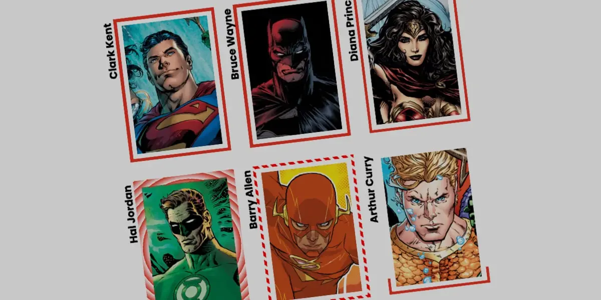
Let us dive into the code required to build and animate advanced CSS border images. We will construct a card component featuring a custom background image and a dynamic, hover-activated gradient border.
1. The Markup Foundation
We begin with a clean, semantic HTML structure. Nothing overly complex is required—just a container element holding our content:
<div class="card">
  <strong>Bruce Wayne</strong>
</div>
2. Base Component Styles
Next, we establish our base CSS architecture, defining explicit dimensions, positioning, and a background image for our .card component:
.card
  width: 250px;
  aspect-ratio: 0.69;
  position: relative;
  background: center / 90% no-repeat;
  background-image: url("batman.jpg");
  padding: 1.5rem;
  box-sizing: border-box;
  display: flex;
  flex-direction: column;
  justify-content: flex-end;
  color: #ffffff;
  font-family: system-ui, sans-serif;
3. Integrating the Linear Gradient Border
To introduce our dynamic border, we utilize longhand properties for border-image. This ensures maximum clarity regarding how individual attributes affect the rendering pipeline:
.card
  /* ... previous styles ... */

  /* Creates a linear color gradient source */
  border-image-source: linear-gradient(-45deg, #ff3366 var(--p), transparent 0%);

  /* Controls how the gradient is carved across the border */
  border-image-slice: 1;

  /* Sets the physical thickness of the rendered border */
  border-image-width: 4px;

  /* Pushes the border outward, creating breathing room from the content */
  border-image-outset: 6px;
Understanding the Gradient Logic:
In this configuration, the linear gradient initiates with a vibrant crimson (#ff3366) tied to our custom variable var(--p), immediately followed by transparent 0%. Because both color stops share the 0% threshold, the browser creates an immediate color transition point. As the variable value shifts, the gradient dynamically expands or contracts.
4. Registering Custom Properties with CSS Houdini
By default, browsers cannot interpolate between arbitrary percentages within a gradient unless they understand the underlying data type. We use the @property at-rule to register our animation variable:
@property --p
  syntax: "<percentage>";
  initial-value: 0%;
  inherits: false;
5. Animating on Hover
With our custom property registered, we can define the interactive state. When a user hovers over the card, the --p variable transitions from 0% to 100%, giving the visual impression that the border is drawing itself around the container:
.card
  /* ... base styles ... */
  border-image-source: linear-gradient(-45deg, #ff3366 var(--p), transparent 0%);
  transition: --p 0.4s ease-in-out;

  &:hover
    --p: 100%;
Advanced Variations: Conic Gradients and Tiling
Linear gradients represent only the surface of what is achievable. By shifting our strategy to conic gradients and utilizing the border-image-repeat property, we can generate mesmerizing rotational effects.
Implementing Conic Gradients with Repeating Slices
Consider the following advanced implementation, which incorporates rotational angles and automatic tile repetition:
/* Register custom properties for slicing depth and rotational angle */
@property --n
  syntax: "<number>";
  initial-value: 1;
  inherits: false;


@property --a
  syntax: "<angle>";
  initial-value: 0deg;
  inherits: false;


.card-advanced
  width: 250px;
  aspect-ratio: 0.69;
  position: relative;

  /* Conic gradient bound to dynamic angle variables */
  border-image-source: conic-gradient(from var(--a), #3b82f6 var(--a), transparent 0deg);

  border-image-width: 6px;
  border-image-slice: var(--n);

  /* Tile and repeat the sliced regions smoothly without clipping */
  border-image-repeat: round;

  transition-property: --n, --a;
  transition-duration: 0.7s;
  transition-timing-function: cubic-bezier(0.4, 0, 0.2, 1);

  &:hover
    --n: 15;
    --a: 360deg;
Analyzing the Visual Output
In this advanced setup:
border-image-repeat: roundinstructs the rendering engine to scale and tile our sliced border pattern so that a whole number of segments fits perfectly along each edge, eliminating awkward half-pixel gaps.--n: 15dynamically expands the slicing depth upon hover, fracturing the border into an intricate, repeating geometric pattern.--a: 360degexecutes a full rotational sweep of the conic gradient, making the border appear to spin dynamically around the card perimeter in real time.
Future Outlook
As web design systems evolve toward greater interactivity and micro-interactions, the boundary between static styling and JavaScript-driven animation continues to blur. The techniques outlined in this article demonstrate the immense power currently available natively within the CSS specification.
Looking ahead, we can anticipate several exciting developments in the realm of CSS borders and layout painting:
- Native Border-Radius Support for Border Images: Working groups within the W3C are continuously evaluating proposals to reconcile
border-imagerendering with curved clipping paths. Once standardized, this will eliminate the primary technical hurdle facing modern layout engineers. - Expanded Houdini Paint APIs: Developers will increasingly author custom Houdini Paint Worklets that generate complex, procedural SVG-like border behaviors directly on the GPU without requiring heavy external asset requests.
- Mainstream Design System Adoption: As browser support for
@propertyand advanced paint functions reaches 100% ubiquity across evergreen browsers, animated border images will transition from experimental code pens to standard components within enterprise design systems like Material-UI, Tailwind variants, and custom corporate UI libraries.
Conclusion: Your Next Steps
Static borders are officially a relic of the past. By combining the layout efficiency of border-image, the mathematical flexibility of CSS gradients, and the computational power of registered custom properties (@property), front-end developers have an unprecedented opportunity to craft delightful, responsive, and performant user interfaces.
Your assignment: Take the code snippets provided in this masterclass, break them apart, experiment with multi-color stops, and integrate them into your next dashboard or card component. The modern web canvas is yours to animate.