For decades, the craft of front-end web development has relied on a patchwork of clever workarounds, structural hacks, and pseudoelements to solve a fundamental layout challenge: styling the gutters, alleys, and negative spaces between items in CSS Grid and Flexbox containers. While layout engines evolved from floats and inline blocks to sophisticated systems like Flexbox and Grid, the styling of the gaps between layout tracks remained largely antiquated. Developers were forced to inject extraneous markup or apply complex border combinations to achieve simple visual dividers, introducing maintenance overhead and layout fragility.
Today, that era of workarounds is officially drawing to a close. With the stable release of Chrome and Edge (version 149 and later), native CSS gap decorations have graduated to full production readiness in Chromium-based browsers. Spearheaded by Microsoft’s Edge web platform team—in close collaboration with the broader Chromium community and the W3C CSS Working Group—this feature extends the familiar column-rule property from multi-column layouts into the universal realms of Grid and Flexbox.
Accompanied by robust new longhand properties, refined syntax, and precise control over line intersections, caps, and overlaps, gap decorations represent one of the most powerful visual enhancements to modern CSS in recent years. This article explores the architectural journey of gap decorations, examines the critical feedback-driven updates implemented since their initial preview, and walks through a practical, step-by-step masterclass demonstrating how to transform a standard personal website using these cutting-edge capabilities.
Detailed Chronology: From Border Hacks to Native Specifications
To understand the magnitude of the CSS gap decorations release, it is essential to trace the historical progression of layout styling and the collaborative effort required to standardize this feature across the web ecosystem.
The Era of Hacks and Pseudoelements
Before the advent of native gap styling, web developers attempting to place separator lines between grid or flex items had to choose between two imperfect paths:
Border Hacks: Applying borders directly to grid or flex items, which often required complex nth-child logic to suppress outer borders on container edges, or adding structural padding that complicated responsive design calculations.
Pseudoelement and Empty DOM Injection: Inserting extra structural <div> elements or leveraging ::before and ::after pseudoelements positioned absolutely within the grid container. This approach heavily bloated the DOM, degraded accessibility metrics, and broke down completely when layouts wrapped dynamically or handled spanning items.
Standardization and Early Previews
Recognizing these pain points, Microsoft’s Edge web platform team took the helm in designing and standardizing native gap decorations. The core objective was simple: build upon the existing mental model of column-rule (which developers already used in multi-column layouts) and scale it to handle the complex intersection dynamics of two-dimensional CSS Grid and wrapping Flexbox layouts.
Early previews introduced by engineers such as Patrick Brosset provided the community with its first glimpse of stylable gaps. These initial explorations demonstrated how a single line of CSS could replace dozens of lines of layout hacks. Following the initial developer preview, the feature underwent rigorous testing. Feedback poured in from front-end engineers worldwide, prompting the W3C CSS Working Group and browser vendors to refine property names, introduce granular longhand controls, and optimize paint behavior for empty containers.
The Chromium Rollout (Version 149)
With the launch of Chrome and Edge version 149, gap decorations achieved stable, robust support across the Chromium ecosystem. Other browser engine vendors have actively participated in standards venues throughout the process, laying the technical groundwork for eventual cross-browser interoperability. Developers building modern web experiences can now leverage these capabilities in production, backed by an evolving ecosystem of playgrounds, documentation resources, and live demos.
Supporting Context & Metrics: Refining the Gap Decoration Syntax
Early testing exposed several friction points in the initial API design, leading to crucial nomenclature and functional updates. Understanding these changes ensures developers adopt the most up-to-date, standards-compliant syntax.
Key Syntax and Property Revisions
Old Property / Syntax
New Property / Syntax
Description of Change
row-rule-outset column-rule-outset
row-rule-inset column-rule-inset
Renamed for conceptual clarity. Setting these properties now insets the rules inward from the decoration edges rather than expanding them outward.
Introduces fine-grained control, allowing developers to independently inset outer ends (caps), intersections (junctions), and start/end coordinates.
gap-rule-paint-order
rule-overlap
Renamed for clarity. Dictates the visual layering hierarchy where row rules and column rules intersect.
Not available
rule-visibility-items
A newly introduced property that governs whether rules are rendered adjacent to empty areas or unpopulated cells within a container.
The Power of Granular Control
The transition from "outset" to "inset" terminology fundamentally shifted how layout boundaries are calculated. Furthermore, the introduction of specialized longhand properties—such as column-rule-inset-cap and row-rule-inset-junction—grants designers surgical precision over complex grids. Instead of treating gap lines as monolithic strokes, developers can shorten caps to create floating aesthetic dividers, seamlessly join intersecting grid alleys, and suppress dangling lines in unpopulated layout cells.
Official Statements & Architectural Insights
The development of gap decorations required close cooperation between browser engine implementers, specification writers, and web developers. The feature stands as a testament to Microsoft and Google’s shared commitment to modernizing CSS layout capabilities.
"CSS gap decorations extend a mental model developers already know and love from multi-column layouts, scaling it effortlessly to Grid and Flexbox. By leading the standardization and implementation of this feature across Chromium, our goal was to eliminate years of painful layout hacks and empower creators with unprecedented visual control."
— Microsoft Edge Web Platform Team
Engineering leads involved in the project emphasize that gap decorations are not merely a cosmetic addition; they represent a fundamental optimization in how browser rendering engines handle space allocation. By calculating rules directly within the layout gap architecture, browsers avoid the layout thrashing and computational overhead previously associated with complex pseudoelement positioning schemes.
Practical Masterclass: Building and Upgrading a Modern Site
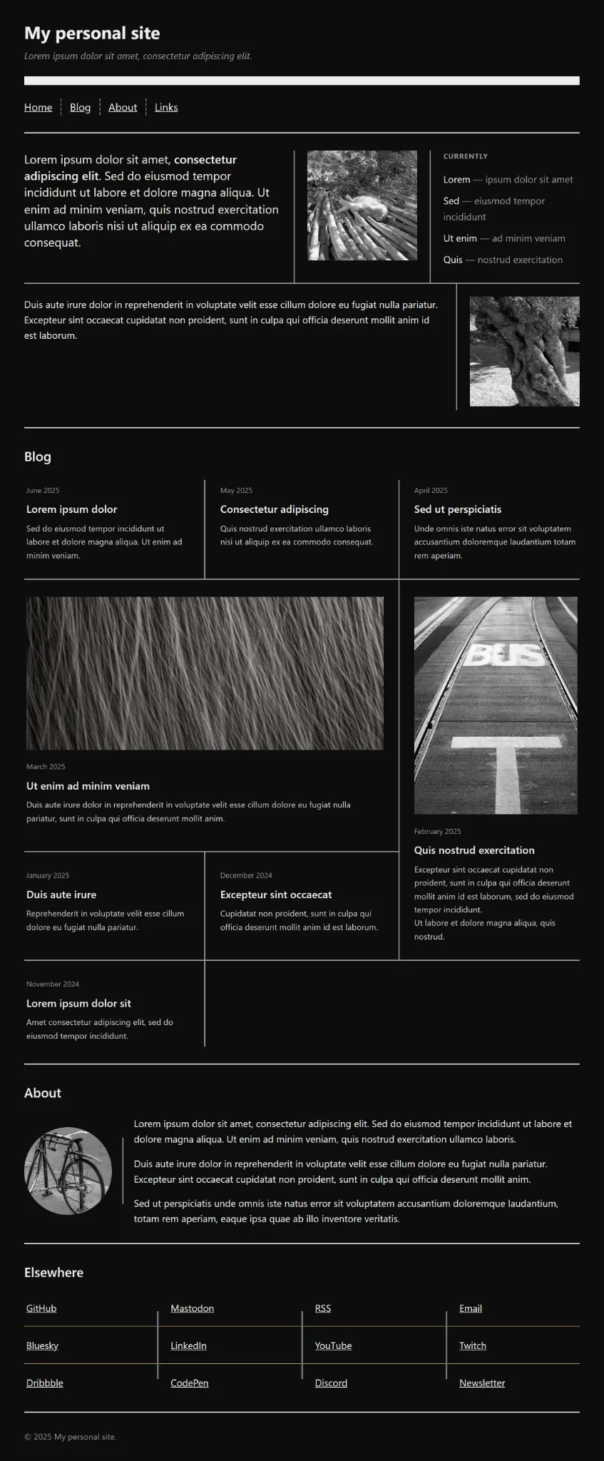
To witness the true power of native gap decorations, let us walk through the process of upgrading a personal website layout. We will build across multiple sections—ranging from auto-repeating section dividers to complex flexbox wrappers and multi-span grid blog layouts.
Initial Markup Foundation
We begin with a clean, semantic HTML structure containing a header, navigation, home section, blog section, about section, links section, and footer:
Step 1: Dynamic Section Dividers with repeat(auto)
In our base layout, the <body> acts as a macro-grid separating major page sections. Previously, developers hard-coded repetition counts (e.g., repeat(2, 2px solid #efefef)). By leveraging the new auto repeater keyword, our section dividers automatically scale as new sections are added to the page:
body
  display: grid;
  gap: 4rem;
  margin: 2rem;
  row-rule:
    1rem solid #efefef,
    repeat(auto, 2px solid #efefef);


nav ul
  display: flex;
  flex-wrap: wrap;
  gap: 2rem;
  column-rule: 2px dashed #666;
Step 2: Decorating Flexbox Gaps in the Home Section
The home section utilizes a wrapping flexbox container with varying flex-basis values for greetings, photos, and notes:
To decorate this flex container, we apply the unified rule shorthand property. Because flex lines are separated by our 3rem gap, we utilize column-rule-inset: overlap-join to ensure adjacent rules merge cleanly at junctions while maintaining flush outer caps:
Unmanaged grid rules can sometimes project unsightly dangling lines into empty cells in trailing rows. We resolve this elegantly using rule-visibility-items: around, which ensures gap decorations only render when at least one bordering side contains active content. Combined with rule-inset: overlap-join, we achieve a polished, professional architectural grid:
Step 4: Insetting Decorations in the About Section
For the "About" biography card, we want a clean side-by-side layout featuring a circular avatar paired with descriptive text. To give the separator line breathing room and prevent it from spanning the full container height, we apply column-rule-inset:
By default, browser painting orders might place thicker column rules behind thinner row rules. We take explicit control of this layering hierarchy using the rule-overlap property, and refine our vertical line lengths using column-rule-inset-cap:
The introduction of native CSS gap decorations marks a profound maturation of the web platform. By migrating layout decoration logic out of the DOM and into the layout engine itself, developers gain unprecedented performance, cleaner markup, and expressive styling power that was previously impossible without heavy scripting or fragile CSS hacks.
As Chromium-based browser adoption widens and other engine vendors continue their engagement in standards forums, gap decorations are poised to become a universal cornerstone of modern front-end development. Developers are encouraged to explore interactive browser playgrounds, experiment with the newly standardized properties, and contribute to documentation efforts on platforms like MDN.
The era of border hacks is officially over. Welcome to the clean, native, and infinitely controllable world of CSS gap decorations.