
Executive Overview
In the modern digital landscape, dark mode has graduated from a niche developer preference to a near-ubiquitous standard of web design. From high-traffic media publications to minimalist developer blogs, nearly every modern website features a mechanism allowing users to toggle between light and dark themes. Yet, as front-end architecture and user experience (UX) design mature, a quiet debate has emerged regarding the mechanics of these interfaces.
At the center of this discourse is web standards expert and developer Lea Verou, whose recent critique of traditional light/dark mode implementations has sparked a broader industry conversation. Verou challenges the standard practice of deploying persistent, tri-state UI controls—options typically labeled "Light," "Dark," and "System"—in website navigation bars and headers. She argues that these bloated three-state controls introduce unnecessary cognitive friction, distract from primary user intent, and clutter clean web architecture.
Verou’s alternative proposal is deceptively simple: harness a streamlined two-state control that defaults to the user’s operating system preference, applying an explicit override only when a user actively chooses to deviate from it. This preference is then safely stored within the browser’s localStorage for future sessions.
This article explores the architectural, psychological, and practical implications of Verou’s UX philosophy. By examining the mechanics of browser-level inheritance, the psychology of cognitive dissonance in navigation design, and the rare exceptions where tri-state controls remain necessary, we analyze why the future of web theming may rely on doing significantly less with our user interfaces.
Detailed Chronology: The Evolution and Critique of Theme Toggles
To understand the weight of Verou’s critique, one must first examine how the web arrived at the modern tri-state toggle.
The Rise of Native Theming
For decades, web developers relied on cookies or basic JavaScript injections to remember whether a visitor preferred a light or dark page. These early implementations were largely manual and siloed to individual domains. However, the introduction of the CSS Media Query prefers-color-scheme changed the paradigm entirely. Browsers and operating systems began communicating user-level aesthetic preferences directly to the web page, allowing sites to adapt automatically upon the first load.
To accommodate users who wished to defy their operating system’s global settings, developers introduced on-page toggles. Naturally, many designers defaulted to mimicking operating system settings panels, offering a segmented control or dropdown featuring three distinct choices:
- Light Mode
- Dark Mode
- System Default
Verou’s Intervention
In mid-2026, Lea Verou published a comprehensive technical analysis challenging this convention. Her central thesis posited that a well-designed two-state control could effortlessly express all three operational states without demanding dedicated interface real estate for the "System" option.
According to Verou, a user’s initial interaction with a page should automatically respect the system preference. If the user desires a change, a single interaction (such as clicking a sun or moon icon) applies an explicit override. That override is captured, stored, and respected moving forward.
Following the initial publication of her critique, the web development community engaged in rigorous debate across platforms like Bluesky and developer forums. This discourse eventually prompted Verou to publish a follow-up summary, clarifying distinctions between persistent global navigation toggles and localized settings menus, and refining the parameters for when a tri-state model is actually justifiable.
Supporting Context & Metrics: The Cost of Cognitive Clutter
The debate over light and dark mode UI is not merely aesthetic; it is deeply rooted in cognitive psychology and interaction design.
The Problem of Persistent UI Clutter
When a persistent light/dark toggle is placed in a website’s primary header or navigation bar, it occupies valuable visual and functional real estate. Every element added to a main navigation bar introduces a fraction of cognitive load—a phenomenon known in UX design as Hick’s Law, which states that the time it takes to make a decision increases with the number and complexity of choices.
While a theme toggle is rarely the primary reason a user visits a website, a tri-state control forces the human eye and brain to process three distinct options every time the navigation is scanned. Furthermore, it introduces abstract concepts like "System" settings into spaces where users are attempting to consume content, read articles, or purchase products.
The Mechanics of the Two-State Alternative
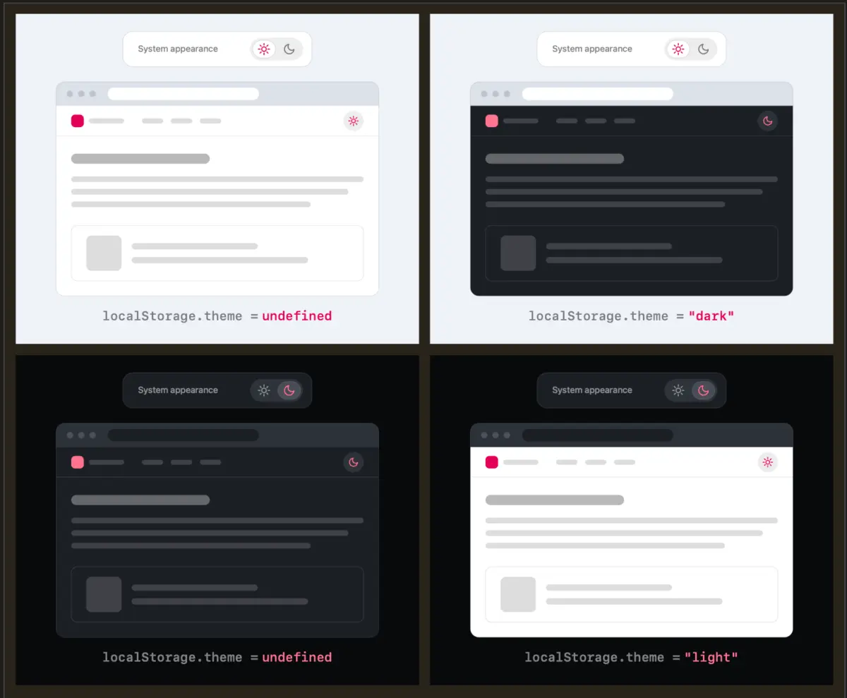
Verou’s proposed two-state approach strips the interface down to its bare essentials. When a user lands on a page:
- Unconfigured State: The website reads the
prefers-color-schememedia query and renders accordingly. No override exists inlocalStorage. - First Override: The user clicks the toggle to switch themes. The site registers this action, applies the alternative theme, and writes the preference to
localStorage. - Subsequent Visits: The site checks
localStoragefirst. If a preference is found, it overrides the system setting. If no preference is found, it defaults back to the dynamic system preference.
[User Arrives]
      │
      ▼
Check localStorage ──(Found)──► Apply Stored Preference (Light/Dark)
      │
   (Not Found)
      ▼
Read prefers-color-scheme (System Default)
      │
      ▼
User Clicks Toggle ──► Save Override to localStorage
The Edge Cases: What Happens When States Diverge?
A common counter-argument raised by developers involves state divergence. For instance:
- A user visits a site with their OS set to Light.
- The user manually toggles the site to Dark.
- Later, the user changes their operating system-wide preference to Dark.
In a traditional tri-state system, the user would explicitly see that they are locked into a manual override unless they explicitly select "System." In a streamlined two-state system, the site continues to serve the manually overridden "Dark" mode because the override value exists in localStorage.
Critics might ask: How does the user return to following the system preference?
Verou dismisses this concern as a marginal edge case. Theme preference switching is inherently tangential to the primary user intent of visiting a website. If the user eventually notices that their manual override and their system settings have diverged and they wish to re-sync them, resolving the discrepancy requires a single click. Because the fix is instantaneous and effortless, dedicating permanent UI space to prevent this rare occurrence is an inefficient use of design real estate.
Official Perspectives and Community Discourse
The broader web development community has weighed in heavily on Verou’s proposals, highlighting a complex tension between browser-level architecture and web-level implementation.
The Browser vs. Website Responsibility Debate
One of the most compelling insights generated during the community discussion—highlighted by developer Chris Coleman—focuses on where the responsibility of theme management truly lies:
"All I ever wanted was for my OS to be dark, not every website I look at. It was a huge leap by the browser vendors to tie all web content to that system preference. Anyway, I think the light/dark preference should be in the browser, and what you propose seems perfectly in line with that."
This perspective exposes a fundamental architectural flaw in how the modern web handles themes. Operating systems introduced dark modes as a system-wide utility, and browser vendors rapidly bound web rendering engines to that same switch. Consequently, users who enjoy a dark desktop environment are frequently subjected to aggressive dark-mode websites, even when a clean, high-contrast light mode might be superior for reading long-form text.
If browsers eventually adopted granular, per-site or global theme configurations directly within their native settings menus, the need for individual websites to host complex theme toggles would evaporate entirely. Until that browser-level evolution occurs, developers must manage user preferences via on-page UI—making Verou’s streamlined two-state model the most pragmatic interim solution.
When Is a Tri-State Control Actually Appropriate?
While Verou advocates eliminating the tri-state control from standard global headers, she acknowledges that three-state mechanics are not entirely obsolete. Her research outlines specific application scenarios where a tri-state control remains justified:
- Dedicated Settings and Preferences Panels: Inside a user account dashboard, application settings page, or configuration modal, space is not at a premium. In these dedicated environments, explicitly displaying "Light," "Dark," and "System" options provides absolute clarity and control without cluttering the primary reading experience.
- Complex Multi-Tiered Application Environments: In software-as-a-service (SaaS) platforms, creative tools, or code editors where users manage extensive environmental preferences, explicit tri-state selections prevent ambiguity and support deep customization.
Future Outlook: The Trend Toward Minimalist UI Architecture
As web design continues to iterate toward maximal efficiency and minimal cognitive load, the philosophies championed by Lea Verou point toward a broader industry shift.
1. The Death of the Unnecessary Toggle
We are likely entering an era where many websites will abandon persistent UI theme toggles altogether. By relying entirely on robust CSS media queries (prefers-color-scheme) and building inherently adaptable, highly accessible color tokens using modern CSS features (such as relative color syntax and CSS variables), sites can render perfectly in any environment without requiring user intervention.
2. Smarter Browser Integration
Looking further ahead, browser vendors may heed the growing chorus of developer and user feedback. By moving color scheme preferences out of raw operating system inheritance and into browser-level settings—allowing users to set global rules like "Run all blogs in light mode, but development tools in dark mode"—the web ecosystem will decouple content consumption from raw system theming.
3. Design System Maturity
For organizations that choose to retain manual toggles, Verou’s work serves as a masterclass in design system pruning. Stripping navigation bars of redundant UI components aligns directly with broader trends in digital minimalism: reducing visual noise, accelerating user workflows, and respecting the user’s cognitive bandwidth.
Conclusion
Lea Verou’s critique of light/dark mode UI serves as a timely reminder that good design is as much about what is omitted as what is included. By recognizing that a two-state override model can fully satisfy user intent without the bloat of a persistent tri-state control, designers can craft cleaner, faster, and more intuitive digital experiences. Whether through refined two-state headers, hidden overrides, or the eventual evolution of native browser controls, the future of web theming looks remarkably streamlined.