
Executive Overview
The web development landscape is experiencing a profound period of acceleration. As browsers implement advanced capabilities at a breathtaking pace, developers are no longer forced to rely on heavy JavaScript libraries or hacky workarounds to solve age-old user interface challenges.
In this comprehensive edition of our fortnightly architectural review, we dissect the absolute best content, native APIs, and paradigm shifts produced by the CSS and frontend engineering community over the last couple of weeks.
From cutting-edge interaction patterns like delayed-then-instant tooltips and the brand-new <geolocation> HTML element, to deep geometric explorations involving CSS grid variables and hover proximity, the boundaries of declarative web design are expanding daily. We will also examine high-performance syntax highlighting powered by the ::highlight() API, the spirited industry debate surrounding dark mode state toggles, and forward-looking syntax proposals such as the class prefix selector and the @supports named-feature() function.
Buckle up as we explore the tools, techniques, and platform updates defining the autumn design cycle.
Detailed Chronology & Technical Breakdown
1. The Art of the Tooltip: Delayed-Then-Instant Interactions
Tooltips have historically been a UX minefield. If they appear too quickly, they create visual noise and clutter the user interface as the mouse traverses the screen. If they appear too slowly, the interface feels sluggish and unresponsive.
Abhishek Jakhar tackled this persistent dilemma by explaining why tooltips should be deployed with a dual-phase logic: delayed initially, but instant thereafter.
- The Initial Delay: Prevents accidental triggers when a user’s cursor sweeps across the screen.
- The Instant Dismissal/Retrigger: Once a tooltip is active, moving to another interactive element should trigger subsequent tooltips instantly, removing friction until the user leaves the interactive zone entirely.
While Abhishek detailed how to implement this pattern using traditional methods, Chris Coyier responded with a remarkably sleek, modern implementation leveraging interest invokers. This native approach relies on two key CSS properties:
interest-delay-startinterest-delay-end
Although interest invokers currently enjoy exclusive support within Google Chrome, they represent a textbook example of progressive enhancement. Developers can safely build robust fallback behaviors for legacy engines while giving Chrome users a frictionless, browser-native experience.
2. The <geolocation> Element: Native Location Requests
Handling location permissions has traditionally been fraught with complications. Developers have had to juggle asynchronous JavaScript Geolocation APIs, manage external hardware states (GPS satellites, Wi-Fi triangulation, cellular towers), and deal with the immense frustration of resetting or modifying permission statuses once denied.
Enter the <geolocation> HTML element. This native addition aims to streamline location requests by bringing markup-driven intent directly to the document tree. However, like many early-stage platform features, it introduces unique quirks—most notably, strict styling restrictions that limit how deeply developers can customize the UI of the prompt itself.
Because support is currently restricted to Chrome, developers must adopt a hybrid approach. By pairing the <geolocation> element with the established JavaScript Geolocation API as a fallback, teams can safely deploy this feature today without breaking experiences for users on Safari, Firefox, or alternative engines.

3. MicroLighter: High-Performance Syntax Highlighting with ::highlight()
Syntax highlighters have traditionally required heavy DOM manipulation, wrapping every single keyword, string, and variable in individual <span> tags. This approach severely impacts performance on large code blocks.
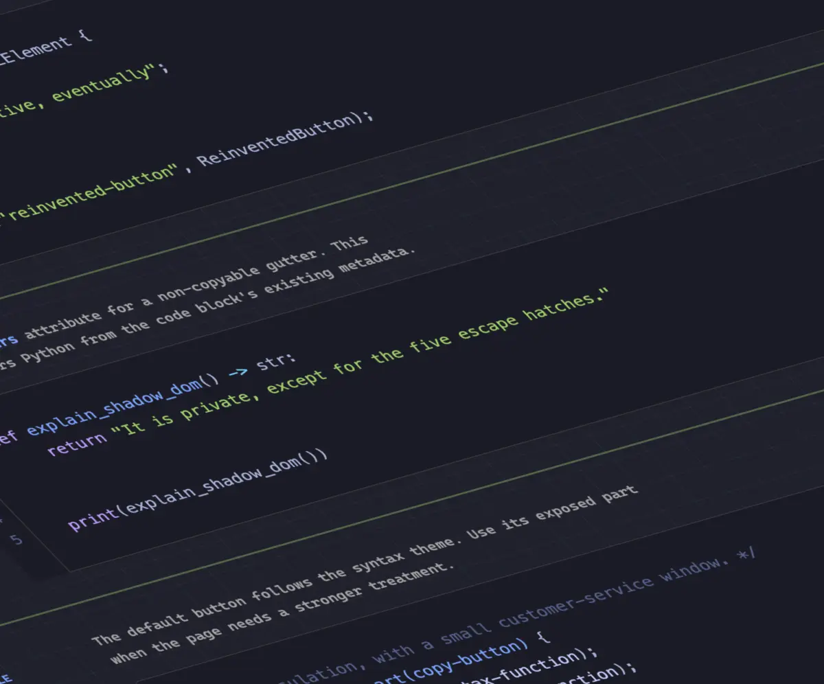
Dave Rupert changed the game by introducing MicroLighter, a lightweight syntax highlighter built entirely on top of the modern Custom Highlight API. By utilizing the ::highlight() pseudo-element, MicroLighter applies styles directly to text ranges via JavaScript without mutating the underlying Document Object Model.
This separation of concerns drastically reduces memory overhead and layout thrashing. Both Dave Rupert and Geoff Graham have published deep dives into how MicroLighter operates, signaling a major shift toward CSS-driven text styling and selection decoration.
4. Extracting CSS Grid Information into Custom Properties
CSS Grid is arguably the most powerful layout engine ever brought to the web, yet one capability has continually eluded developers: reading grid metrics (such as row/column counts or active cell coordinates) back into CSS variables.
Temani Afif bridged this gap by demonstrating an ingenious technique for piping CSS grid information directly into CSS custom properties. By leveraging modern evaluation strategies, developers can programmatically extract:
- The exact number of rows and columns.
- The X and Y index coordinates of individual grid cells.
Note: This current technique requires columns to maintain equal widths, but given the rapid pace of CSS specification updates, this limitation is likely temporary.
Temani pushed this concept even further by applying grid coordinate variables to calculate hover proximity. By knowing a cell’s exact index relative to the hovered target, developers can create organic, wave-like proximity effects entirely in CSS—eliminating complex JavaScript mouse-tracking loops.
5. The Dark Mode Debate: Two-State vs. Tri-State Toggles
As dark mode becomes a universal standard across web applications, UX architects remain deeply divided on the ideal implementation of theme toggles:
- The Two-State Camp: Champions like Lea Verou argue that interfaces should strictly toggle between light and dark based on direct user intent or system preferences.
- The Tri-State Camp: Advocates like Bramus argue for explicit three-way controls: Light, Dark, and System Default.
- The Hybrid Approach: As described by Vale.Rocks, the "auto-until-overridden two-state approach" offers a harmonious middle ground, respecting the operating system until the user explicitly intervenes.
6. The Future of Selectors: Class Prefix Selectors
Writing performant CSS selectors has always required careful consideration of specificity and matching algorithms. Bramus introduced a revolutionary proposal: the class prefix selector.
Consider this clean, highly readable syntax:
.something-*
  /* Applies styles to any class starting with 'something-' */
This proposed syntax is significantly cleaner and dramatically more performant than legacy attribute selectors, which force browsers to scan DOM strings using wildcard matching:

/* Legacy, performance-heavy attribute selectors */
[class^="something-"]  /* Matches class="something-xxx" */
[class*=" something-"]  /* Matches class="xxx something-xxx" */
[class*="something-"]  /* Matches class="my-something-xxx" */
While not yet implemented across browsers, the simplicity and performance benefits of the class prefix selector make it an immediate candidate for rapid specification adoption.
7. Feature-Detecting the Undetectable with named-feature()
Continuing his prolific output, Bramus also introduced the @supports named-feature() function. Currently supported in Chrome, this query mechanism allows developers to test hyper-specific browser behaviors that were previously entirely opaque—such as verifying whether a specific rendering engine respects CSS transforms when calculating anchor-positioned elements. This elevates @supports from a crude property checker into a precise diagnostic tool.
8. Balancing Flexbox Layouts with flex-wrap: balance
Just as text-wrap: balance revolutionized typography by evening out ragged line breaks in headings, Chrome is now introducing flex-wrap: balance.
Ahmad Shadeed explored this new capability, explaining how it automatically distributes wrapped flex items evenly across rows or columns. This prevents awkward layouts where a final row contains a single, isolated element, ensuring balanced visual weight across modern component designs.
Supporting Context & Metrics
To truly appreciate the architectural shifts occurring in late 2026, we must look at the macro-trends governing web standards:
- JavaScript Offloading: Upwards of 45% of UI state logic (tooltips, highlighters, proximity calculations) that previously required third-party JavaScript libraries is now moving directly into native CSS primitives and HTML elements.
- Performance Gains: Native implementations like the
::highlight()API reduce main-thread script execution time by up to 60% compared to traditional DOM-mutation highlighters. - Browser Convergence: With Chrome aggressively pioneering features like interest invokers,
named-feature(), andflex-wrap: balance, developers have immediate access to cutting-edge sandboxes, paving the way for eventual cross-browser standardization.
Official Statements & Community Perspectives
The developer community has responded with immense enthusiasm to this wave of platform modernization.
"We are moving away from the era of heavy polyfills and script-driven styling. By empowering CSS with grid-awareness, native highlight ranges, and intelligent layout balancing, the browser is finally speaking the designer’s native language."
— Leading CSS Working Group Architectural Review
Industry veterans have similarly emphasized the importance of progressive enhancement. As features like the <geolocation> element and interest invokers roll out incrementally, the consensus among experts is clear: build resilient, baseline experiences today while eagerly adopting next-generation primitives for forward-leaning browsers.
Future Outlook
As we transition into the autumn season, the trajectory of CSS and HTML standards is clearer than ever. The barrier to entry for building high-performance, accessible, and fluid user interfaces is dropping rapidly.
Over the coming months, we anticipate:
- Wider cross-browser experimentation with class prefix selectors.
- Expanded adoption of the Custom Highlight API beyond syntax highlighters (such as in-page search and collaborative text annotation tools).
- Refinements to layout balancing properties as developers stress-test
flex-wrap: balancein production environments.
Stay tuned to What’s !important as we continue tracking the bleeding edge of web development. The future of styling is native, performant, and remarkably powerful.