Executive Overview
In the contemporary landscape of web design, few UI/UX patterns are as ubiquitous as the persistent light/dark mode toggle. Nestled comfortably in the top navigation bar or footer of nearly every modern website, these switches—often represented by sun, moon, and half-shaded icons—promise user agency. They invite visitors to dictate the chromatic aesthetic of their digital environment. Yet, according to a recent, widely discussed critique by prominent web standards expert Lea Verou, this well-intentioned design pattern is fundamentally flawed.
Verou’s core argument is deceptively simple: standard three-state toggles (Light, Dark, and System) are a cognitive burden, an unnecessary UI clutter that can be entirely replaced by a streamlined, highly efficient two-state control. By leveraging native operating system defaults as a silent baseline and storing user overrides only when explicitly triggered via localStorage, designers can drastically reduce interface friction without sacrificing personalization.
This deep dive examines Verou’s controversial stance, the mechanics of modern browser color-scheme inheritance, the psychological toll of persistent UI elements, and the broader architectural implications for frontend developers worldwide. As the web community reckons with these insights—sparking rigorous debates across platforms like Bluesky and dedicated developer forums—it becomes increasingly clear that the future of web theming lies not in giving users more buttons to push, but in intelligent, invisible design systems that get out of the way.
Detailed Chronology: The Evolution of the Dark Mode Debate
The journey toward modern theme-switching mechanics has been a gradual evolution, marked by shifting responsibilities between operating systems, web browsers, and individual site authors.
The Dawn of System-Level Preferences
For decades, web design operated under a singular, immutable assumption: the web is white by default. Websites controlled their own palettes, and users forced into dark environments relied on browser extensions like "Dark Reader" to invert hues forcibly. However, the introduction of native system-wide dark modes across major operating systems (macOS, Windows, iOS, and Android) fundamentally altered this paradigm.
Browsers quickly adopted the prefers-color-scheme media query, allowing websites to query the user’s operating system directly. Suddenly, a website could automatically render in a dark palette if the user’s phone or laptop was configured for night-time viewing. While elegant, this created a new architectural challenge: what happens when a user wants their OS to remain dark, but prefers a specific website to be light (or vice-versa)?
The Rise of the Tri-State Toggle
To solve this divergence, frontend developers rushed to implement custom UI controls. Borrowing heavily from application design, websites introduced the tri-state toggle:
- Light Mode: Forces the interface to render light regardless of system settings.
- Dark Mode: Forces the interface to render dark regardless of system settings.
- System Mode: Relinquishes control back to the operating system’s native preference.
While functionally robust, this approach introduced a triad of interactive states that occupied prime real estate in navigation headers.
Verou’s Provocative Intervention
The debate reached a fever pitch with the publication of Lea Verou’s seminal essay, “Good Two-State UX,” followed swiftly by a secondary clarification piece responding to community feedback. Verou challenged the community to rethink the necessity of the "System" state in persistent web UI.
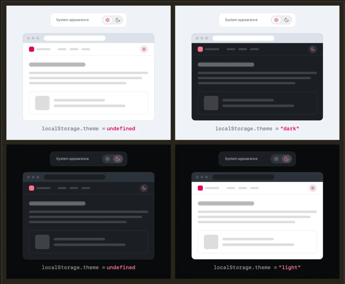
She argued that a well-designed two-state control can effortlessly express all three necessary behaviors (Light, Dark, and System fallback) without ever needing a dedicated "System" button. When a visitor first arrives, the site automatically inherits their system preference. The moment they click the toggle to override it, their explicit choice is captured and stored. If they never click it, the system default rules supreme, completely unhindered by redundant interface noise.
Supporting Context & Metrics: The Cognitive Cost of UI Clutter
To understand why Verou’s minimalist approach has struck such a resonant chord within the developer community, one must analyze the intersection of cognitive psychology and interface design.
Cognitive Dissonance in Persistent Navigation
Persistent UI elements—those fixed in the header or navigation bar that remain visible as the user scrolls—occupy a sacred tier of digital real estate. Every pixel dedicated to a theme switcher is a pixel stolen from navigation, branding, or core content.
More importantly, every additional option introduced into a control element raises the cognitive load. When a user encounters a tri-state toggle, their brain must consciously process three distinct variables:
- What is my current visual state?
- What state will this button transition me to?
- Am I currently overriding my system preferences, or am I tethered to them?
This micro-hesitation contributes to cognitive dissonance. While seemingly trivial in isolation, multiplied across thousands of daily web interactions, it degrades the seamlessness of the user experience.
The localStorage Mechanism
Verou’s proposed architecture relies on a clean, stateless fallback mechanism backed by client-side persistence. The operational logic can be broken down into three distinct phases:
- The Baseline: The website initializes by checking the CSS
prefers-color-schememedia query. If no local override is detected inlocalStorage, the site mirrors the system setting (Light or Dark). - The Override: If the user actively dislikes the current inherited state, they click the toggle. This action flips the theme and writes a persistent key-value pair to
localStorage(e.g.,theme: 'dark'). - Future Sessions: Subsequent page loads check
localStoragefirst. If an override exists, it takes precedence. If the user clears their browser data or resets their preference, the site gracefully falls back to the system default once more.
This methodology eliminates the need to explicitly label a state as "System." The system is the default state; the override is merely an exception triggered by user agency.
Official Statements and Community Discourse
The publication of Verou’s theories ignited a robust cross-platform debate, drawing commentary from prominent web standards advocates, accessibility experts, and frontend engineers.
The Browser Vendor Dilemma
One of the most compelling contributions to the discourse came via Bluesky, where developer Chris Coleman highlighted a deeper structural grievance with modern web architecture:
"All I ever wanted was for my OS to be dark, not every website I look at. It was a huge leap by the browser vendors to tie all web content to that system preference. Anyway, I think the light/dark preference should be in the browser, and what you propose seems perfectly in line with that."
Coleman’s observation touches on a profound philosophical flaw in how web platforms handle theming. Unlike native applications—which are tightly integrated with the operating system’s design language—the web is an infinite collection of disparate documents created by millions of independent authors. Forcing a blanket system preference onto every single web page often results in glaring visual inconsistencies, forcing developers to build complex override mechanisms simply because browsers lack a granular, site-by-site preference engine built into their native settings.
When Are Tri-State Controls Actually Justified?
Crucially, Verou does not argue that tri-state controls should be eradicated entirely from digital products. In her extended documentation, she outlines specific scenarios where three states are genuinely appropriate and necessary:
- Complex Application Settings Dashboards: In dedicated preference panels (such as VS Code, GitHub settings, or a dedicated account dashboard), users are actively managing configurations. Here, explicit clarity regarding whether an app is inheriting system rules or running an explicit override is paramount.
- Asymmetric Default Behaviors: In enterprise software where an application’s branding demands a specific default state that runs counter to the user’s operating system baseline, explicit tri-state selections prevent ambiguity.
However, for persistent navigation toggles—the sun/moon icons in a blog or marketing site’s header—Verou maintains that the tri-state pattern is an anti-pattern.
Future Outlook: The Death of the Toggle?
As we look toward the future of web development, Verou’s critique forces us to ask an even more radical question: Do we need a theme toggle at all?
For years, web designers treated light/dark mode toggles as mandatory checklist items, akin to social media footer links or responsive hamburger menus. Yet, if a website is built with robust CSS custom properties, semantic color tokens, and properly implemented prefers-color-scheme queries, the operating system already handles the user’s preference flawlessly.
In many cases, the persistent toggle exists primarily to satisfy developer vanity or a perceived expectation of interactivity, rather than a genuine user need. When users visit an informational website, their primary intent is to consume content—read an article, purchase a product, or research a topic. Theme switching is entirely tangential to that goal.
The Path Forward for Frontend Developers
Moving forward, conscientious UI/UX practitioners should evaluate their implementation of dark mode controls through a rigorous lens:
- Audit Persistent Navigation: Examine whether your header toggle truly warrants prime real estate. Can it be tucked away into a secondary menu, or eliminated entirely in favor of strict system-level inheritance?
- Embrace Two-State Simplicity: If a toggle is deemed strictly necessary for user retention, transition away from confusing tri-state dropdowns or three-icon button groups. Adopt a clean, binary switch that defaults to system behavior and saves explicit overrides cleanly to local storage.
- Respect User Intent: Trust that modern users understand how their operating systems work. Build robust defaults, allow for graceful overrides, and above all, let the content take center stage.
In the end, the best interface is often the one you don’t have to think about—and by trimming the fat from our theme switches, the web becomes a slightly cleaner, faster, and more intuitive place for everyone.