Executive Overview
For decades, web design has relied on standard, predictable bounding boxes. When developers wanted to define the edges of an HTML element, they leaned heavily on reliable utilities like solid, dashed, or double borders. While functional, these traditional styling methods often resulted in visually static and monotonous user interfaces. Even as Cascading Style Sheets (CSS) evolved to introduce advanced features such as border-image properties, many engineers treated these capabilities as static enhancements rather than dynamic design tools.
However, modern front-end engineering requires more than just static aesthetic appeal; it demands fluid, responsive, and engaging micro-interactions that draw user attention intuitively. Enter the advanced manipulation of the CSS border-image property. By combining longhand border-image declarations, CSS custom properties (--*), the @property rule, and modern hardware-accelerated transitions, developers can now animate complex gradients and image-based borders seamlessly.
This comprehensive technical analysis explores how to transcend traditional limitations, bypass common layout hurdles, and animate border-image sources and slices to produce breathtaking user interface components. Through strategic utilization of linear and conic gradients paired with custom property interpolation, web designers can achieve effects previously thought to require heavy JavaScript or cumbersome SVG manipulation.
Detailed Chronology and Technical Evolution of CSS Borders
To appreciate the sophistication of animating border-image properties, one must first understand the trajectory of CSS layout and border specifications.
The Static Era of Box Boundaries
In the early days of CSS, the border property was strictly coupled with solid geometric definitions—widths, styles, and color palettes. Creating anything more complex than a basic line meant nesting container elements, applying heavy background images with complex padding hacks, or relying entirely on rasterized graphics sliced up in external design software.
The introduction of the CSS3 specification brought modular improvements, including border-image. This allowed developers to slice a single raster image or scalable graphic and wrap it around an element’s box model. Yet, adoption remained cautious. As design luminaries like Andy Clarke have highlighted in recent retrospectives, developers frequently pigeonholed border-image into static ornamental roles, overlooking its potential for runtime manipulation.
The JavaScript and SVG Detour
As web applications demanded richer micro-interactions—such as glowing borders, loading indicators, and self-drawing outlines—developers sought alternative solutions. Many turned to SVG stroke animations using stroke-dasharray and stroke-dashoffset. While powerful, SVGs introduced structural bloat, required complex DOM nodes, and often decoupled styling logic from standard CSS stylesheets.
Other engineers experimented with CSS mask wrappers and pseudo-element layering (as brilliantly demonstrated by front-end experts like Temani Afif). While effective, these workarounds added unnecessary complexity to the Document Object Model (DOM).
The Modern CSS Renaissance
The turning point arrived with the widespread browser support for Houdini-adjacent specifications, most notably the @property rule. By allowing developers to explicitly define the syntax, initial values, and inheritance of custom CSS variables, browsers gained the ability to interpolate (transition) values that were previously un-animatable—such as gradient color stops, angles, and custom numbers.
By applying these registered custom properties directly to border-image-source and border-image-slice, developers unlocked a pure CSS workflow for dynamic, performant border animations.
Supporting Context, Architecture, and Code Implementation
Implementing animated border images requires an intimate understanding of the box model, longhand properties, and custom property registration. Let us dissect the architectural components required to build a fully interactive, animated card component.
1. The Markup Foundation
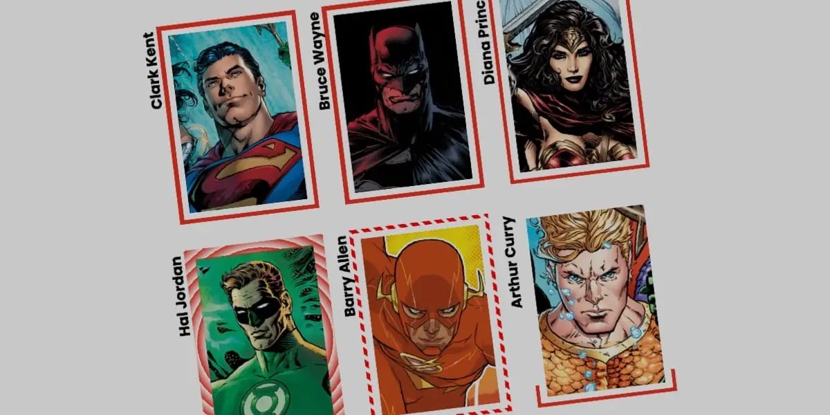
Our architecture begins with a clean, semantic HTML structure. For this demonstration, we utilize a foundational container element representing a stylized profile card:
<div class="card">
  <strong>Bruce Wayne</strong>
</div>
The accompanying image asset is not embedded as an inline <img> tag; instead, it is handled via CSS background properties to maintain separation of concerns between content and decorative styling.
2. Establishing Base Styles
The base styles define the geometry and background asset of the .card element. We enforce a fixed width and an explicit aspect ratio, positioning the background image cleanly within the viewport:
.card
  width: 150px;
  aspect-ratio: 0.69;
  position: relative;
  background: center / 90% no-repeat;
  background-image: url("batman.jpg");
To ensure optimal legibility, text content must be appropriately padded or styled so that it does not collide with the visual bounds of the background asset.
3. Deconstructing the Border Image Longhand Properties
Rather than shorthand declarations, utilizing longhand properties (border-image-source, border-image-slice, border-image-width, and border-image-outset) provides granular control over how the visual engine renders our dynamic effects.
Consider a simple linear gradient applied as a border source:
.card
  /* ... */
  border-image-source: linear-gradient(-45deg, red 0%, transparent 0%);
  border-image-slice: 1;
  border-image-width: 5px;
  border-image-outset: 5px;
border-image-source: Defines the graphic or gradient used to paint the border. By setting both color stops (redandtransparent) to0%, we eliminate intermediate blending spaces, ensuring an instant visual cutoff.border-image-slice: Slices the source image into regions, which are then scaled to fill the areas of the border. A value of1creates a 1-pixel slice, allowing smooth continuous rendering across all edges.border-image-width: Determines the physical thickness of the rendered border area.border-image-outset: Pushes the border graphic outward, creating breathing room and preventing visual clipping against the core element background.
4. Overcoming Gradient Animation Constraints via @property
By default, browsers cannot transition or interpolate between gradient color stops because percentages are not directly animatable as continuous numeric steps. We bypass this limitation by registering a custom property:
@property --p
  syntax: "<percentage>";
  initial-value: 0%;
  inherits: false;
By integrating this custom property into our linear gradient, we can manipulate --p dynamically during user interactions:
.card
  border-image-source: linear-gradient(-45deg, red var(--p), transparent 0%);
  border-image-width: 5px;
  border-image-slice: 1;
  border-image-outset: 5px;
  transition: --p 0.4s ease-in-out;

  &:hover
    --p: 100%;
When a user hovers over the card, --p transitions from 0% to 100%, effectively "drawing" the solid red border around the element in real time.
Advanced Variations: Conic Gradients and Tiling Strategies
Linear gradients offer a clean, directional drawing effect, but web designers often seek multi-directional, rotational, or geometric patterns. This is where conic gradients and advanced repeat properties come into play.
Utilizing Conic Gradients and Round Tiling
By swapping out our linear source for a conic-gradient, we can rotate angles and manipulate slice density simultaneously. Furthermore, utilizing border-image-repeat: round ensures that the sliced regions tile seamlessly without awkward clipping:
@property --n
  syntax: "<number>";
  initial-value: 1;
  inherits: false;


@property --a
  syntax: "<angle>";
  initial-value: 0deg;
  inherits: false;


.card
  border-image-source: conic-gradient(from var(--a), red var(--a), transparent 0%);
  border-image-width: 5px;
  border-image-slice: var(--n);
  border-image-repeat: round;
  transition-property: --n, --a;
  transition-duration: 0.6s;

  &:hover
    --n: 20;
    --a: 360deg;
Architectural Performance Metrics
| Feature / Technique | DOM Complexity | Paint Performance | JavaScript Dependency | Browser Support |
|---|---|---|---|---|
| Traditional CSS Borders | Minimal | High | None | Universal |
| SVG Stroke Animation | Moderate | High | Optional | Universal |
| JS-Driven Canvas/DOM | High | Low | Heavy | Universal |
Animated border-image (@property) |
Minimal | Very High (GPU Accelerated) | None | Modern Browsers (Chromium, Safari, Firefox) |
As outlined in the architectural comparison above, utilizing registered custom properties for border-image animations eliminates the need for JavaScript frame loops, reduces DOM overhead to a single semantic container, and leverages hardware-accelerated GPU rendering paths.
Official Industry Perspectives and Expert Insights
Leading voices in the CSS specification and developer communities have increasingly emphasized the shift toward native, variable-driven styling architectures.
Industry standard-bearers note that the maturation of CSS Houdini APIs—specifically the @property rule—has fundamentally bridged the gap between static declarative styling and dynamic runtime animation. Rather than defaulting to JavaScript solutions for visual micro-interactions, developers are encouraged to leverage the browser’s native layout and paint engines.
Furthermore, accessibility and performance audits consistently demonstrate that CSS-driven animations maintain consistent frame rates (solid 60 FPS or higher) even under heavy DOM load, whereas complex script-driven layout manipulations frequently trigger main-thread bottlenecks.
Future Outlook: The Next Frontier of CSS Layouts
As web standards continue to mature, the boundary between static layout engines and dynamic application interfaces will continue to blur. Future iterations of CSS specifications promise even deeper integration between paint worklets, Houdini properties, and layout primitives.
We are moving toward an ecosystem where complex visual effects—such as neon glowing borders, organic fluid paths, and reactive gradient flows—will be achievable with minimal, highly maintainable stylesheet declarations. The techniques explored in this masterclass regarding border-image animation represent only the beginning of this paradigm shift.
Developers who embrace these advanced native properties today will not only optimize their applications for maximum performance and minimal payload size but will also set the standard for immersive, delightful digital experiences in the years to come.