Executive Overview
Nearly a decade after its initial introduction to the web platform, the native HTML <dialog> element remains one of the most powerful yet nuanced building blocks in modern web architecture. While developers frequently implement simple pop-ups or alerts, harnessing the full potential of <dialog>—ranging from native modality and accessibility constraints to advanced CSS backdrop styling, the @starting-style rule, and scroll management—requires a deep dive into browser user agent (UA) styles and progressive enhancement patterns.
As modern browsers continue to roll out updates—such as Safari’s support for the :open pseudo-class and Chrome’s implementation of overscroll-behavior—front-end engineers have unprecedented declarative control over user interactions. This article provides an exhaustive, production-ready reference for working with native dialogs, comparing them directly with the Popover API, exploring accessibility traps, and detailing advanced layout and transition techniques.
Detailed Chronology & Evolution of the Web Dialog
1. Marking Up and Opening the Dialog
The foundational markup for a native dialog is deceivingly simple:
<button id="dialog-button">Open Dialog</button>
<dialog id="dialog">...</dialog>
By default, the element is closed and hidden from the DOM rendering tree via user agent styles (display: none). While developers can manually toggle the open attribute (<dialog open>), this is rarely desirable for dynamic application logic. Instead, JavaScript provides two distinct methods to open a dialog: show() and showModal().
- The
show()Method: Invokingdialog.show()treats the element more like a lightweight pop-up or tooltip. It does not generate a backdrop, does not center itself automatically in the viewport, and does not restrict user interaction with the rest of the page. - The
showModal()Method: This is the preferred method for the vast majority of use cases. It promotes the dialog to the browser’s top layer, generates a clickable or styleable backdrop, centers the element within the viewport, and automatically traps keyboard focus while listening for theEsckey.
const dialogButton = document.querySelector('#dialog-button');
const formDialog = document.querySelector('#dialog');

dialogButton.addEventListener('click', () =>
  formDialog.showModal();
);
2. Mechanisms for Closing
To dismiss a modal via user interface controls, developers must hook up a closing mechanism. While the Esc key works out of the box due to native browser behavior, a dedicated close button requires explicit handling via the close() method:

const formButton = document.querySelector('#dialog-button');
const formDialog = document.querySelector('#dialog');
const formClose = document.querySelector('#dialog-close');

formButton.addEventListener('click', () =>
  formDialog.showModal();
);

formClose.addEventListener('click', () =>
  formDialog.close();
);
Interestingly, while the API offers showModal(), it does not feature a corresponding closeModal() method; the singular close() method handles all instances seamlessly. Alternatively, developers can bypass JavaScript entirely by using a declarative form submission method directly inside the markup:
<dialog id="dialog">
  <form method="dialog">
    <button type="submit">Close dialog</button>
  </form>
</dialog>
3. The Advent of Invoker Commands
Looking toward the bleeding edge of web standards, the evolving specification for invoker commands promises entirely declarative communication between triggering elements and dialogs. Using the command and commandfor attributes, developers can eliminate boilerplate event listeners entirely:
<button command="show-modal" commandfor="my-dialog">Show Dialog</button>

<dialog id="my-dialog">
  <button command="close" commandfor="my-dialog">Close Dialog</button>
</dialog>
For applications requiring state observation, developers can still listen to these commands via JavaScript event handlers:
const dialogs = document.querySelectorAll("dialog");

dialogs.forEach(dialog =>
  dialog.addEventListener("command", event =>
    if (event.command == "show-modal")
      // Dialog was shown modally
     else if (event.command == "close")
      // Dialog was closed

  );
);
Supporting Context, Metrics & Accessibility Considerations
Button Labeling and Screen Readers
A common pitfall when designing close buttons is relying strictly on a visual cue, such as an "X" or an SVG icon:
<!-- Anti-pattern for accessibility -->
<button id="dialog-close">X</button>
Screen readers will struggle to interpret this contextually. Best practices dictate pairing a visually hidden text span with an aria-hidden icon:

<button id="form-close">
<span class="visually-hidden">Close modal</span>
<span aria-hidden="true">×</span>
</button>Furthermore, engineers must consider initial focus management. When a dialog opens, focus automatically shifts to the first focusable element inside it—which is often the close button. If the user accidentally hits the Space bar, the dialog might close unexpectedly. If the dialog contains more complex interactive elements, such as form inputs or primary CTAs, developers should assign initial focus using the tabindex attribute.
Innate Inertness and the Top Layer
One of the most profound architectural benefits of showModal() is innate inertness. When a modal opens, the underlying document is rendered inert. Text selection, mouse clicks, keyboard focus, and background inputs are entirely locked down without requiring manual attribute toggling.
However, this distinction does not apply to non-modal dialogs opened via show(). If developers attempt to open competing overlays (such as a popover and a modal simultaneously), the modal takes precedence in the top layer, rendering any background popover inaccessible.
Official Guidelines: Advanced Styling & Layout
Styling the Backdrop
By default, the native <dialog> backdrop features a subtle, semi-transparent tint that can be exceptionally difficult to perceive. Developers can target and customize this overlay using the ::backdrop pseudo-element:
dialog
  &::backdrop
    background-color: rgba(0, 0, 0, 0.6);
    backdrop-filter: blur(4px);
Overriding User Agent Defaults and State Selectors
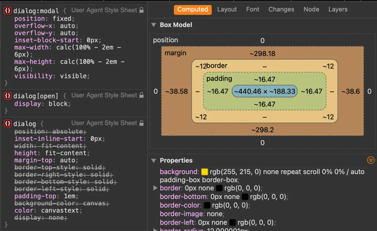
The native <dialog> element comes pre-configured with a stark white background and a heavy black border. To apply custom themes safely, target the element in its :open state or utilize the :modal pseudo-class, which boasts even higher specificity:

dialog
  border: none;
  background: transparent;

  &[open]
    background-color: #ffffff;
    border-radius: 16px;
    box-shadow: 0 20px 25px -5px rgb(0 0 0 / 0.1);
Note on Browser Support: Safari recently added native support for the :open pseudo-class. For legacy system fallbacks, pairing attribute selectors ([open]) with :modal ensures robust cross-browser rendering.
Managing Background Scroll and Overscroll Behavior
When a modal is active, background content scrolling can disorient the user. While a traditional approach involves applying overflow: hidden to the body via a :has() selector:
body:has(dialog[open])
  overflow: hidden;
Modern CSS offers a more declarative approach using overscroll-behavior. By combining overflow: hidden on the dialog with overscroll-behavior: contain on both the dialog and its backdrop, scroll chaining can be completely prevented:
dialog
  overflow: hidden;
  overscroll-behavior: contain;

  &::backdrop
    overscroll-behavior: contain;
Implementing Smooth Entry and Exit Animations
Historically, animating dialogs in and out of the DOM was notoriously difficult because elements with display: none cannot transition states smoothly. By combining CSS transitions with the @starting-style at-rule, developers can orchestrate elegant fade-ins and scale effects:
@starting-style
  dialog:open
    opacity: 0;
    transform: scale(0.95);


dialog
  opacity: 0;
  transform: scale(0.95);
  transition: opacity 0.3s ease, transform 0.3s ease, overlay 0.3s ease allow-discrete, display 0.3s ease allow-discrete;

  &[open]
    opacity: 1;
    transform: scale(1);
Future Outlook: Dialog vs. Popover API
As developers design complex user interfaces, a recurring architectural question arises: Should I use the Dialog API or the Popover API?

While both leverage the browser’s top layer, their fundamental accessibility semantics differ wildly:
- Dialog API: Built explicitly for modal interactions. It automatically traps focus, renders background content inert, listens for the
Esckey, and establishes rigid semantic boundaries required for critical user interruptions. - Popover API: Designed for non-modal floating content (such as tooltips, dropdown menus, or contextual panels). Popovers do not trap focus natively, do not make background content inert, and require developers to manually assign proper ARIA roles and accessibility affordances.
Summary Checklist for Selection
- Choose
<dialog>when: You need to command user attention, block background interactions, gather form input, or present critical alerts requiring direct user acknowledgement. - Choose
[popover]when: You are building non-blocking UI components that supplement the existing page flow without interrupting the user’s primary task path.
By choosing the correct underlying primitive and leveraging modern CSS capabilities like ::backdrop, @starting-style, and native inertness, front-end engineers can deliver accessible, high-performance interfaces that stand the test of time. Future iterations of the web platform will only expand these native capabilities, reducing the need for heavy JavaScript-based UI libraries.