
Executive Overview
For the better part of the past decade, web developers and UI/UX designers have defaulted to a standardized pattern for handling website appearance: the tri-state light/dark mode toggle. Perched neatly in navigation bars, headers, and footer menus across millions of websites, these controls typically offer three distinct options: Light, Dark, and System.
While this approach has long been praised for giving users granular control over their browsing environments, a growing faction of interface design experts argues that it represents a triumph of clutter over clarity. Leading this charge is prominent web standards expert and developer Lea Verou, whose recent critique of persistent color scheme controls has ignited a vigorous industry debate. Verou contends that the standard tri-state toggle is largely redundant, introducing unnecessary cognitive friction and visual noise into primary navigation paths.
According to Verou and supporting UX analysts, a streamlined, two-state mechanism can effectively manage all three behavioral scenarios without bloating the user interface. By defaulting to the operating system’s native preference and relying on user overrides only when those preferences diverge, websites can reduce cognitive load, clean up headers, and respect user intent. This article explores the mechanics of this proposed paradigm shift, examining the psychological impact of persistent UI elements, the nuance of browser-level versus site-level preferences, and the rare exceptions where tri-state controls still hold value.
Detailed Chronology: How the Debate Unfolded
The modern conversation surrounding dark mode implementation did not happen in a vacuum. It is the culmination of years of evolution in how operating systems, browsers, and websites handle color themes.
Phase 1: The Emergence of System Preferences
When operating systems like macOS, Windows, iOS, and Android introduced native dark modes, web browsers quickly followed suit by exposing these preferences to the Document Object Model (DOM) via media queries such as prefers-color-scheme. Suddenly, websites could automatically adapt to a user’s environmental lighting preference without requiring manual intervention. This was widely celebrated as a massive leap forward in accessibility and ergonomic design.
Phase 2: The Proliferation of the Tri-State Toggle
Recognizing that not every user wants their web browsing to match their operating system settings—perhaps preferring a dark OS for battery saving or late-night coding, but a light browser background for reading text-heavy articles—developers scrambled to build custom toggles.
To ensure maximum flexibility, developers universally adopted the tri-state model:
- Light Mode: Force the website into a light aesthetic regardless of the OS.
- Dark Mode: Force the website into a dark aesthetic regardless of the OS.
- System Mode: Respect the underlying operating system’s current theme.
While functional, this approach meant that millions of websites added permanent, clickable UI elements dedicated entirely to a secondary preference, occupying valuable real estate in primary navigation menus.
Phase 3: Lea Verou’s Critique and Industry Response
In August 2026, Lea Verou published a foundational essay challenging the necessity of the tri-state toggle for persistent site navigation. Verou argued that a well-designed two-state control could effortlessly express all three operational states.
The core of her argument rested on user behavior patterns: visitors do not visit websites primarily to switch themes; they visit to consume content, shop, or utilize a service. Theme toggling is a tangential action. Therefore, forcing users to parse a three-option menu introduces unnecessary cognitive friction.
Following her initial post, Verou published a comprehensive follow-up addressing the wave of industry feedback, clarifying boundaries between persistent navigation toggles, settings pages, and contextual tools. The debate resonated deeply across developer communities on platforms like Bluesky and CSS-Tricks, forcing a broader re-evaluation of modern web design minimalism.
Supporting Context & Metrics: The Psychology of UI Clutter
To understand why a two-state control is superior to a tri-state dropdown or segmented button, one must look at fundamental principles of human-computer interaction (HCI), specifically Hick’s Law and the concept of cognitive dissonance.
Hick’s Law and Decision Time
Hick’s Law states that the time it takes for a person to make a decision is a logarithmic function of the choices available to them. When users land on a website, their brains must rapidly parse the visual hierarchy to identify primary actions (navigating to articles, searching for products, logging in) versus secondary chrome (theme toggling, language selection).
[Traditional Tri-State Toggle]
┌─────────┬─────────┬─────────┐
│  Light  │  Dark   │ System  │  <-- Higher Cognitive Load
└─────────┴─────────┴─────────┘

[Proposed Two-State Control / Automatic Fallback]
┌─────────┬─────────┐
│  Light  │  Dark   │          <-- Lower Cognitive Load (Override Only)
└─────────┴─────────┘
When a persistent header displays a three-way toggle, it forces the user’s brain to process three distinct mental states every time their eye scans the navigation bar, even if they never intend to change the theme. By reducing the toggle down to a simple binary state—or eliminating the persistent UI element entirely in favor of an automatic system fallback—designers minimize extraneous cognitive load.
The Mechanics of the Two-State Override
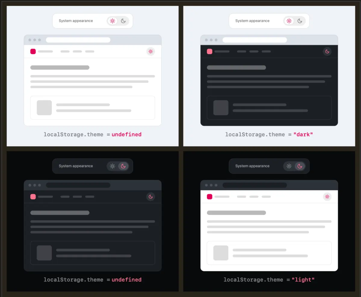
Verou’s proposed model operates on a elegantly simple logic loop:
- Default State: The website has no local preference stored. It reads the operating system via
prefers-color-schemeand displays accordingly. - The Override: If the user dislikes the current automatic match, they click the toggle to switch to their preferred state (e.g., forcing Dark mode).
- Persistence: That choice is saved locally (typically via
localStorage). Future sessions respect this explicit override.
What happens if the user wants to revert to the system setting after applying an override? Critics often worry about an undefined localStorage value or complex state machines. However, Verou points out a crucial reality: theme switching is entirely tangential to user intent. If a user pins Light mode, and their OS later switches to dark, the divergence becomes immediately obvious to them. At that exact moment, fixing it is a single, intuitive click away. There is no need to engineer complex, multi-option menus to preempt a scenario that is easily rectified on the rare occasions it actually matters.
Official Perspectives and Industry Commentary
The discourse surrounding Verou’s proposals has highlighted a deep-seated frustration among users regarding how aggressive modern web applications are with forced styling.
A prominent voice in the community, web developer Chris Coleman, captured this sentiment effectively in a widely shared discussion thread:
"All I ever wanted was for my OS to be dark, not every website I look at. It was a huge leap by the browser vendors to tie all web content to that system preference. Anyway, I think the light/dark preference should be in the browser, and what you propose seems perfectly in line with that."
Coleman’s observation touches on a deeper architectural flaw in how the web handles styling. Operating system dark modes were originally designed for native applications—interfaces built with native controls and consistent design systems. When browser vendors automatically forced web content to mirror these OS settings, they inadvertently assumed that users wanted a pitch-black background on every text-heavy documentation site or blog they visited.
While browser-level controls could theoretically solve this by letting users set global rules for how websites interpret system preferences, developers must currently manage this at the site level. In this context, Verou’s guidance provides a pragmatic framework: respect the system by default, allow a quick override, and keep the persistent UI as invisible and frictionless as possible.
When Are Tri-State Controls Actually Appropriate?
To be thoroughly objective, Verou does not argue that tri-state controls should be banned entirely from the internet. In her follow-up documentation, she outlines specific scenarios where a three-state option remains completely justified:
- Dedicated Settings Panels: On a user account dashboard or a comprehensive preferences page where users explicitly configure their application environment, clarity and exhaustiveness take precedence over minimal inline design. A three-way radio group or dropdown is entirely appropriate here because the user’s primary intent at that moment is configuration.
- Complex Multi-Theme Environments: Applications that support more than two themes (e.g., Light, Dark, High Contrast, Sepia, and System) inherently require multi-state controls.
However, for a persistent, omnipresent toggle sitting in a global website header, the tri-state approach fails the test of minimalist, user-focused design.
Future Outlook: The Minimalist Web Interface
As the web design industry matures, the pendulum is swinging away from maximalist UI ornamentation and toward intentional minimalism. Every pixel in a primary navigation bar competes for the user’s attention. As web performance and accessibility standards tighten, developers are re-evaluating whether persistent theme toggles belong in the header at all.
Several future trends are likely to emerge from this philosophical shift:
- The Vanishing Toggle: Many content-focused websites may abandon visible toggles entirely, trusting that modern operating system media queries and browser-level controls are robust enough to handle the heavy lifting. If a user’s system is set to dark, the site renders dark; if they want an override, they can rely on browser extensions or native user-agent style sheets.
- Contextual and Adaptive UI: Instead of persistent headers taking up permanent space, future interfaces may feature adaptive controls that only appear when a user demonstrates intent to customize their viewing experience, or tuck them neatly inside an expandable user menu.
- Standardized Browser Preferences: As browser vendors continue to iterate on developer and user tools, we may see more robust browser-level overrides that remove the burden from individual content publishers entirely, realizing Chris Coleman’s vision of separating OS-level aesthetics from web-level consumption.
Conclusion
Lea Verou’s analysis of light and dark mode toggles is much more than a nitpicky UI/UX debate—it is a masterclass in reducing friction and respecting user psychology. By recognizing that theme switching is a secondary, tangential action, designers can strip away redundant UI clutter, streamline their navigation bars, and deliver a cleaner, more focused browsing experience. Whether through a streamlined two-state override or the total elimination of persistent toggles in favor of intelligent system defaults, the future of web design points toward a quieter, less intrusive digital landscape.