
Executive Overview
In the fast-paced, hyper-trend-driven ecosystem of contemporary British fashion, few names command the quiet, fervent respect afforded to East London’s Aaron Esh. Known universally for his moody, nocturnal palette—a steady diet of midnight blacks, slate greys, and rain-slicker blues that mirrored the asphalt of the capital’s industrial underbelly—Esh carved out a distinct niche as a purveyor of brooding urban sophistication. His garments were tailored for the melancholic romantic, the denizen of dimly lit clubs, and the nocturnal wanderer.
Yet, fashion thrives on metamorphosis. For his Spring/Summer 27 collection, staged within the storied, sweat-soaked walls of Camden’s iconic Electric Ballroom, Esh orchestrated what can only be described as a stylistic paradigm shift. He found religion in color.
Entitled simply "Electric," the SS27 presentation shattered the designer’s signature monochromes in favor of a chromatic explosion that was, in his own words, "almost aggressively so." This was not a tentative dip into the pastel shallows or a muted compromise with earthy tones; it was a headlong dive into violent pinks, electric purples, searing crimsons, and hyper-saturated teals. By crashing these aggressive pigments against one another in calculated defiance of traditional styling rules, Esh achieved a rare feat: he made the uncomfortable look undeniably alluring.
This comprehensive report examines the anatomy of Aaron Esh’s SS27 breakthrough. Through an investigative look at the chronology of the show, contextual analysis of his design ethos, breakdown of the materials, official commentary, and a projection of what this seismic shift means for the future of the brand, we decode the dawn of Esh’s technicolor era.
Detailed Chronology: Inside the Electric Ballroom
The Atmosphere and Build-Up
The air inside the Electric Ballroom was thick with anticipation long before the first beat dropped. For decades, Camden’s legendary venue has served as a crucible for counterculture, playing host to punk icons, grunge pioneers, and indie legends. It was an intentional backdrop. Esh did not want a sterile, white-box European runway; he wanted the grime, the history, and the visceral energy of a London gig venue.
As the invited press, buyers, and industry heavyweights squeezed onto the worn floorboards, the auditory assault began. The PA system roared to life, pumping out ear-splitting electro tracks that vibrated through the chests of the front row. This was not the polite, ambient hum of a luxury fashion house; it was the deafening pulse of a Saturday night out, setting a frenetic tempo for the garments about to pass by.
The Opening Look: Shocking Pink as a Manifesto
If an established designer is going to break their own golden rule and embrace color, subtlety is rarely the most effective vehicle. True to form, Esh announced his chromatic renaissance with maximum volume.
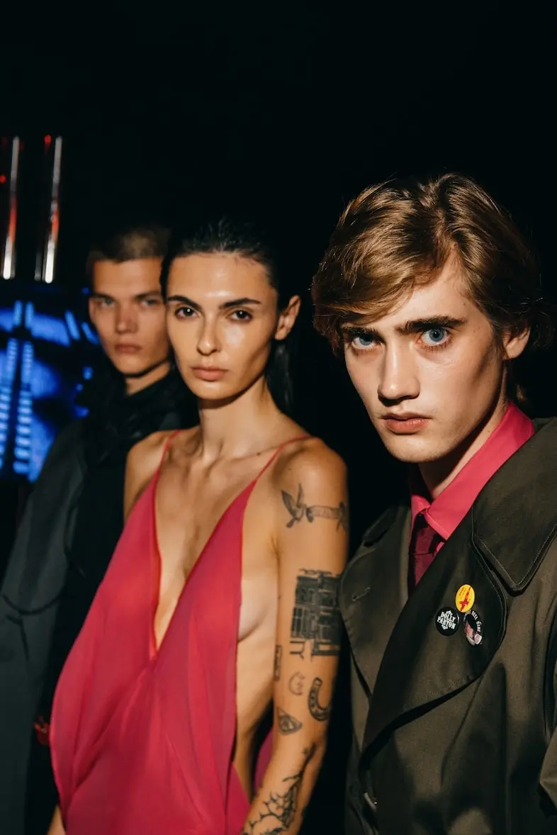
The first model to stride down the runway emerged wrapped in a shade of shocking pink so intense it seemed to hum under the venue’s harsh lights. The hue instantly summoned historical ghosts: the fierce, unapologetic femininity of Elsa Schiaparelli’s legendary "Shocking Pink," and the silver-screen magnetism of Marilyn Monroe in Gentlemen Prefer Blondes.
Yet, this was no retro pastiche. Filtered through Esh’s distinctly gritty, East London lens, the dress was a study in contrasts. It was a delicate, bias-cut gown that shimmied and swished with every aggressive stomp of the model’s boots against the concrete floor. The vulnerability of the bias-cut silk was instantly hardened by the industrial brutality of the venue and the blaring electro soundtrack. It established the central tension of the entire collection: grace meeting grit.
The Mid-Show Escalation: A Riot of Unruly Hues
While the foundational blues, blacks, and deep charcoals that built the Aaron Esh brand were still present—serving as vital anchor points—they were continually ambushed by the new regime of color. Crimsons bled into view; electric purples demanded spatial dominance; teals sliced through the darkness.
What made the chronology of the runway compelling was not merely the introduction of these bright shades, but how they interacted. Esh avoided monochromatic safety nets or tonal gradients. Instead, he forced disparate colors to share space. A rich burgundy coat might be contrasted with a flash of acidic lime or electric blue lining; a violent purple top clashed purposefully with deep navy trousers. The runway felt less like a curated display of garments and more like a living, breathing snapshot of London street life at 3:00 AM—unpredictable, chaotic, and utterly alive.
The Finale and Climax
As the final models marched in formation under the pulsating lights, the collection’s narrative crystallized. The transition from the moody, introverted collections of Esh’s past to this extroverted, high-voltage display felt earned. It was a calculated risk that paid off in real-time, leaving the audience electrified not just by the clothes, but by the sheer audacity of a designer willing to tear up his own rulebook in front of the entire industry.
Supporting Context & Metrics: The Anatomy of "Wrongness"
The Philosophy of "Tasteful Incorrectness"
To truly understand the brilliance of Aaron Esh’s SS27 collection, one must examine his evolving philosophy on taste and styling. In contemporary fashion, much of the market is driven by algorithmic safety—safe color-blocking, trend-forecasting adherence, and predictable commercial formulas. Esh actively revolts against this corporate homogenisation.
"I have always been interested in the point where taste becomes personal," Esh noted in his show-notes manifesto. "When something is technically wrong but instinctively right. When you see someone wearing a combination you would never have imagined and immediately want to wear it."
This pursuit of "technical wrongness" manifested in several key stylistic experiments throughout the SS27 collection:
- The Party-Girl Paradox: One of the standout silhouettes featured a fluffy, feathered skirt rendered in that signature shocking pink. Traditionally, such a garment screams high-octane glamour and predictable eveningwear styling. Esh dismantled this potential cliché by anchoring the piece with a utilitarian grey zip-up blazer and an industrial leather hood. The juxtaposition instantly neutralized the frivolousness of the feathers, grounding them in urban realism.
- Textural Friction: Craquelé leather effect black tights—possessing a distinct, cracked-paint finish—were paired with delicate heels, only to be thrown off balance by the inclusion of an oversized, casual hoodie. This high-low, day-meets-night, formal-meets-slacker layering became a masterclass in modern dressing.
- The Ghost of the Late 2000s: Throughout the collection, striped skirts and aggressive color-blocking nodded subtly to the indie-sleaze and blog-house eras of the late 2000s, modernized through sophisticated tailoring and luxury fabrications.
Material Innovation and Fabrication Metrics
While the color story dominated conversation, the structural integrity of the garments relied on Esh’s trademark technical precision. Working with a rigorous framework, the brand utilized a carefully curated selection of fabrics to balance the visual chaos of the color palette:
- Bias-Cut Silks: Providing fluidity and movement, contrasting against rigid outerwear.
- Technical Leathers: Treated with craquelé and matte finishes to add depth and tactile resistance.
- Heavyweight Cotton Fleeces: Elevated via architectural cuts in hoodies and zip-ups, proving that streetwear silhouettes can exist comfortably within a luxury paradigm.
- Feather Embellishments: Lightweight, dynamic additions that introduced organic movement to structured looks.
| Collection Element | Traditional Approach | Aaron Esh SS27 Approach |
|---|---|---|
| Color Palette | Monochromatic, moody, dark neutrals | Aggressive brights (shocking pink, crimson, teal) |
| Styling | Harmonious color-coordination | Intentional clashing and "wrongness" |
| Silhouette | Streamlined nocturnal tailoring | High-low hybrids (hoodies with feathered skirts) |
| Venue Aesthetic | Sterile, white-cube runway | Gritty, high-energy gig venue (Electric Ballroom) |
Official Statements & Industry Reception
The industry’s reaction to Esh’s chromatic awakening was swift, overwhelmingly positive, and laced with a sense of relief that a young designer was willing to evolve rather than rest on his laurels.
In his official show notes, distributed to critics upon entry, Aaron Esh articulated the core thesis of the collection with poetic precision:
"Spring Summer 27 feels electric. The colours are bright, almost aggressively so. They collide rather than coordinate: unexpected shades sitting beside one another, things that shouldn’t belong together somehow making perfect sense… It is no longer about following the rules. It is about instinct."
Fashion critics were quick to praise the collection’s psychological depth. For years, Esh had been boxed into the "dark London designer" category—a badge of honor, but potentially a creative dead-end if left unchallenged. By introducing color without sacrificing the brooding DNA that made him famous, Esh proved his versatility.
Prominent buyers noted that the addition of commercial yet daring brights—particularly the shocking pink tailoring and teal outerwear—significantly broadens the brand’s retail appeal while maintaining its avant-garde credibility. The collection successfully bridges the gap between editorial-driven shock value and wearable, highly desirable wardrobe pieces.
Future Outlook: What the Technicolor Era Means for Aaron Esh
As the dust settles on the sticky floors of the Electric Ballroom and the fashion pack migrates to the next capital on the circuit, the long-term implications of Aaron Esh’s SS27 collection come into focus.
1. Commercial Expansion and Global Reach
While Esh’s previous monochromatic offerings cultivated a fiercely loyal, niche following among avant-garde connoisseurs, the injection of high-impact color opens doors to broader international markets. Retailers in regions with sunnier climates or more vibrant street-style cultures—who previously found the moody London palette a hard sell—now have accessible entry points into the brand through hot pink statement pieces, vivid crimsons, and dynamic layering separates.
2. Design Evolution: The Nuance of Control
The primary challenge for any designer who breaks out of a signature aesthetic is avoiding whiplash. Esh has deftly avoided this trap. By maintaining his foundational base of blacks, greys, and navy blues, he created a visual tether to his past work. Future collections will likely explore the nuanced middle ground between this newly discovered chromatic freedom and his foundational darkness, establishing a richer, more complex signature style.
3. Redefining Modern British Luxury
At a time when British fashion often struggles between commercial pragmatism and radical creativity, Aaron Esh continues to occupy a vital middle space. He proves that youthful instinct, when paired with technical mastery, can outshine heritage conformity. The "Electric" collection signals that Esh is not merely a seasonal flash in the pan, but a defining voice of his generation—one that now possesses both shadow and light.
Conclusion
Aaron Esh did not just put on a fashion show for Spring/Summer 27; he executed a stylistic exorcism. By banishing the safety of monochrome and leaning into the "aggressive" beauty of color collision, he redefined his parameters as a designer. From the shock-pink opening look to the defiant, rule-breaking styling of hoodies with feathered skirts, the presentation at the Electric Ballroom will be remembered as the moment Aaron Esh stepped out of the shadows and into the blinding, beautiful light of his own evolution.