
Executive Overview
As Apple prepares for the official rollout of watchOS 27 later this month, millions of Apple Watch users around the globe are bracing for a wave of sweeping interface adjustments, feature sunsets, and workflow redesigns. While major software updates historically bring an influx of highly anticipated capabilities—ranging from advanced health sensors to deeper AI integration via Siri—watchOS 27 introduces a different kind of paradigm shift: subtraction.
The upcoming firmware marks the permanent removal or profound alteration of several core features that have defined the Apple Watch user experience for years. Most notably, Apple is retiring the dedicated Walkie-Talkie application, deprecating the familiar Digital Crown double-click multitasking gesture, and fundamentally overhauling how the Digital Crown single-click behaves via a brand-new dynamic app grid.
For power users, developers, and everyday wearers alike, these changes signal a distinct pivot in Apple’s design philosophy for wrist-worn computing. By streamlining interfaces, prioritizing predictive AI-driven layouts, and reducing reliance on traditional multitasking shortcuts, Apple is attempting to solve the eternal challenge of the smartwatch: keeping interactions glanceable, fast, and frictionless on an inherently constrained screen. However, this minimalist crusade inevitably leaves behind workflows that loyalists have spent the better part of a decade mastering.
This deep-dive investigative report examines the exact nature of these changes, analyzes how they impact daily usability, explores the broader strategic context behind Apple’s design choices, and evaluates what the future holds for the world’s most popular wearable ecosystem.
Detailed Chronology of the watchOS 27 Overhaul
The transformation seen in watchOS 27 did not happen overnight; rather, it is the culmination of months of iterative testing, developer feedback, and aggressive interface pruning. Understanding the timeline of these changes sheds light on how Apple prepares its user base for major functional disruptions.
June: The Beta 1 Shockwave
The first sign of significant interface restructuring arrived in early June during Apple’s Worldwide Developers Conference (WWDC) ecosystem rollouts, coinciding with the launch of the watchOS 27 developer beta. Testers immediately noticed that pressing the Digital Crown no longer hurled them directly into the traditional, full-screen app launcher (whether arranged in the classic honeycomb grid or the list view).
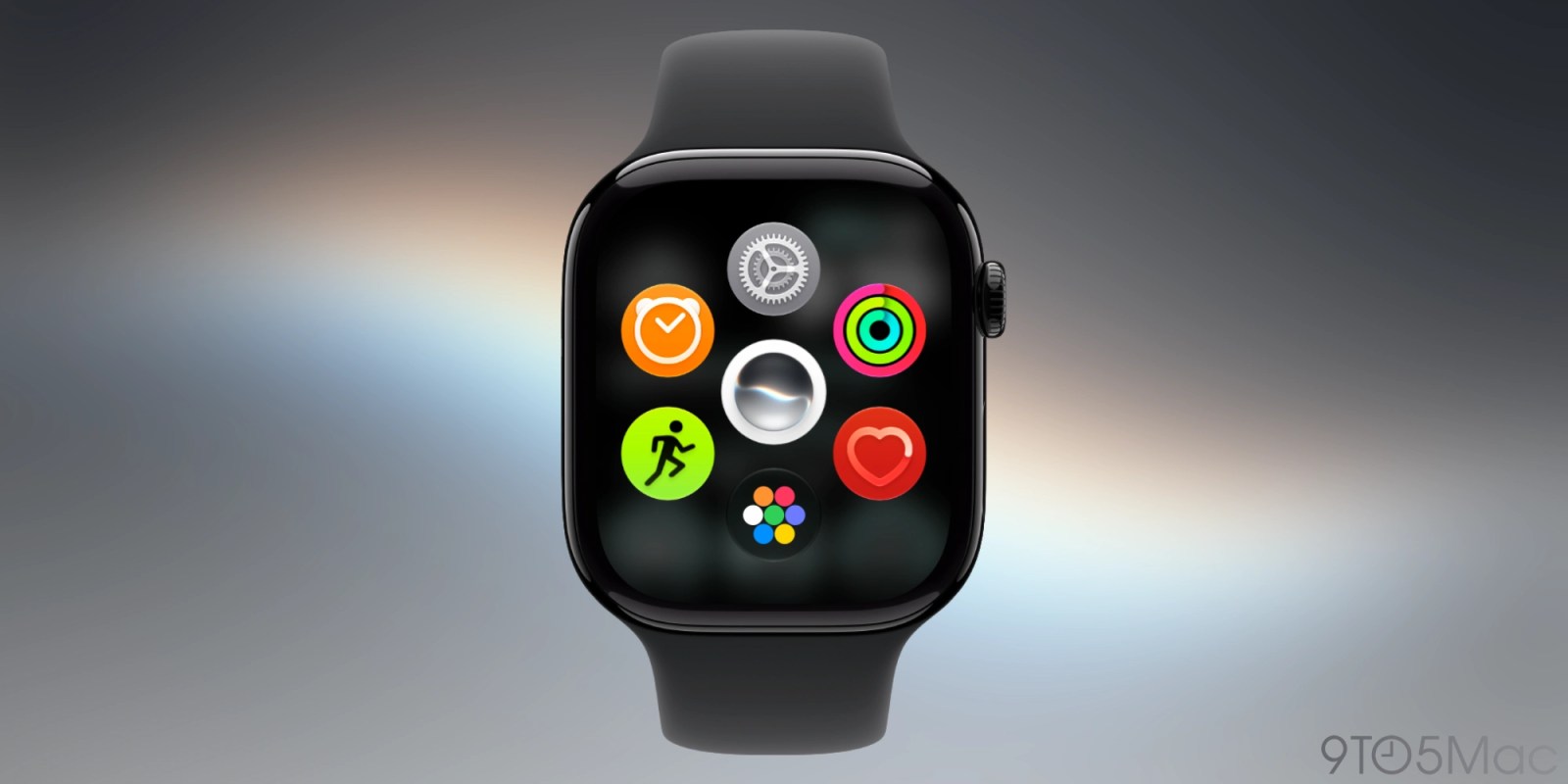
Instead, a single press invoked a new "dynamic app grid" layout. At the same time, power users navigating the beta quickly realized that double-clicking the Digital Crown—a gesture long relied upon for rapid multitasking between two recent applications—yielded identical results to a single click. The shortcut was effectively gone.
July: Public Beta Realities and User Pushback
As the public beta program opened up to a wider audience in July, discussions across developer forums, Reddit, and tech publications reached a fever pitch. Users who had relied on the Walkie-Talkie app for quick, spontaneous conversations with family members began to notice subtle deprecation warnings and removal markers within the software ecosystem. Articles began circulating questioning whether the cultural cachet of the Walkie-Talkie app had ever truly matched its engineering footprint.
September: Finalizing the Cuts and Looking Ahead
By early September, as Apple locked down the final release candidates (RC) ahead of this month’s public deployment, it became clear that Apple had no intention of rolling back these interface alterations. The death of the double-click multitasking gesture was confirmed as an intentional architectural decision rather than an unaddressed bug. Concurrently, the permanent omission of the Walkie-Talkie app was cemented, leaving users with a smaller native app footprint on their wrists.
Deconstructing the Changes: What’s Leaving and What’s Changing
To fully grasp the magnitude of the watchOS 27 update, we must break down the three most prominent adjustments hitting devices this month.
1. The Quiet Retirement of Walkie-Talkie
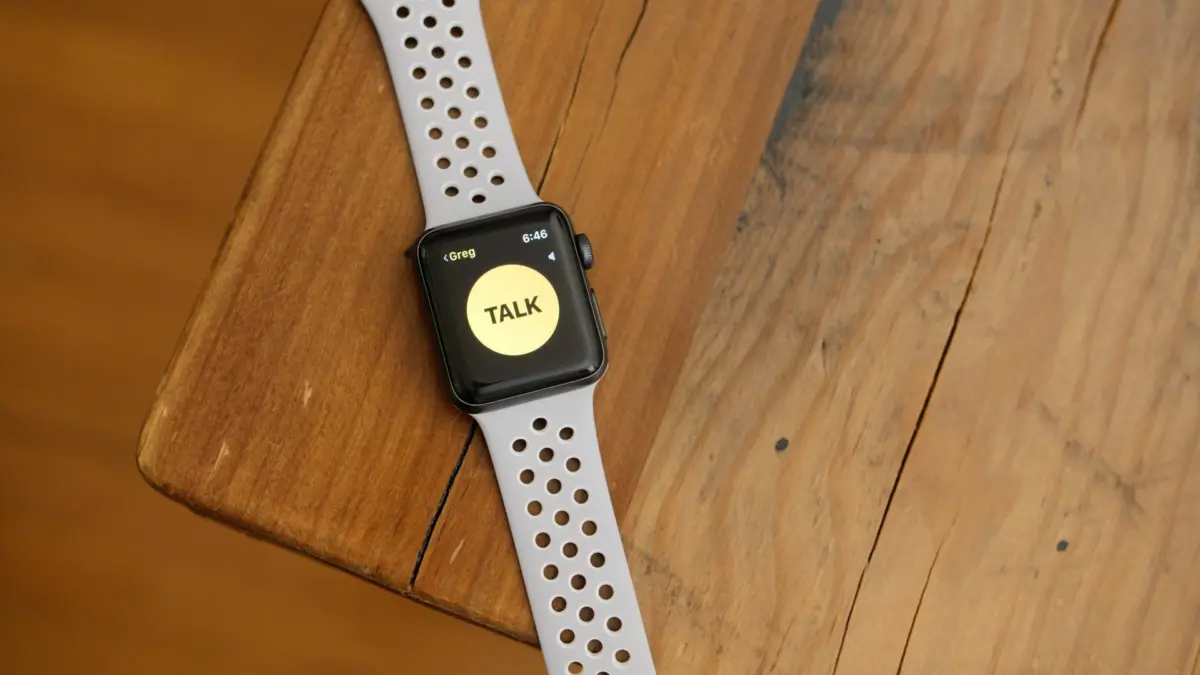
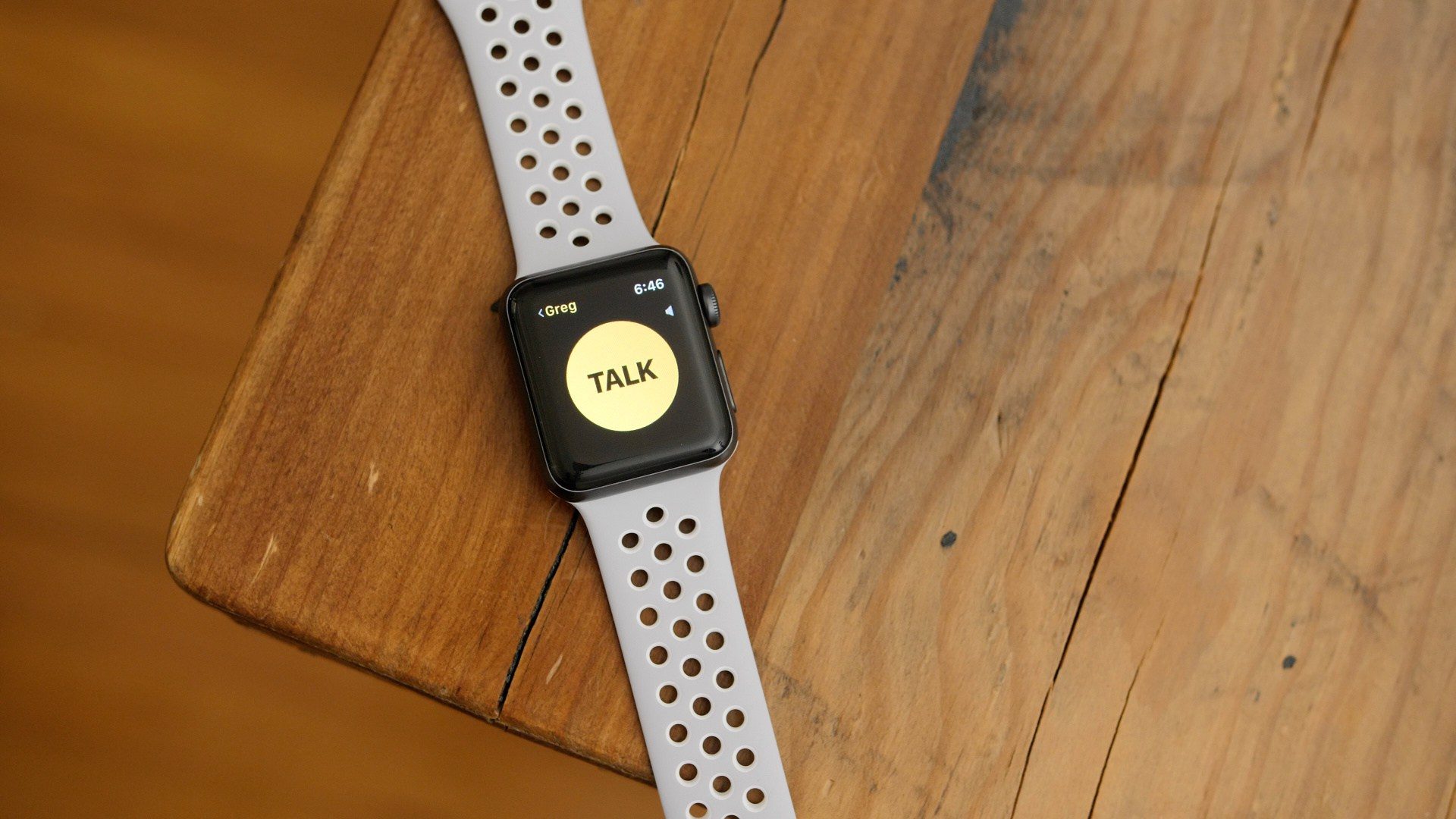
Introduced back in watchOS 5 as a fun, skeuomorphic nod to physical two-way radios, the Walkie-Talkie app allowed Apple Watch users to engage in real-time, push-to-talk audio conversations exclusively with other Apple Watch wearers. While it generated initial enthusiasm as a novelty, the feature suffered from a polarizing reception over its multi-year lifespan.
For many, leaving the service enabled meant perpetually seeing a persistent yellow status dot or app icon on their watch faces, creating a sense of digital clutter. Connection drops, handshake failures between disparate cellular networks, and the requirement of mutual opt-ins also hindered its mass adoption.
Despite its niche appeal, the removal of Walkie-Talkie leaves a distinct void. There is currently no true third-party equivalent that replicates the low-latency, watch-to-watch, push-to-talk simplicity that Apple’s native integration provided. While voice messaging via apps like Messages or WhatsApp remains functional, they lack the immediate, synchronous nature of a dedicated walkie-talkie channel. Industry analysts note that its removal suggests low engagement metrics globally, prompting Apple to trim dead weight from its native binary code.
2. The Loss of the Multitasking Shortcut
Perhaps the most jarring adjustment for power users is the vaporization of the Digital Crown double-click shortcut. Since the early days of watchOS, rapidly pressing the Digital Crown twice allowed users to bounce seamlessly between their current app and the previously used application, or jump back to the watch face.
In watchOS 27, that double-click gesture has been rendered functionally redundant, performing the exact same action as a single click. Apple has yet to introduce an alternative shortcut to replace it, leaving the watch’s physical hardware underutilized.
Given that the Apple Watch possesses a remarkably limited number of physical controls—typically just the Digital Crown and the Side Button—losing a hardware shortcut places an even heavier burden on touchscreen navigation or gestures like AssistiveTouch. Users who routinely multitowed between a fitness tracking app and a podcast controller, or an authenticator app and a transit pass, now find themselves forced to traverse menus manually.
3. The Dynamic App Grid Takes Center Stage
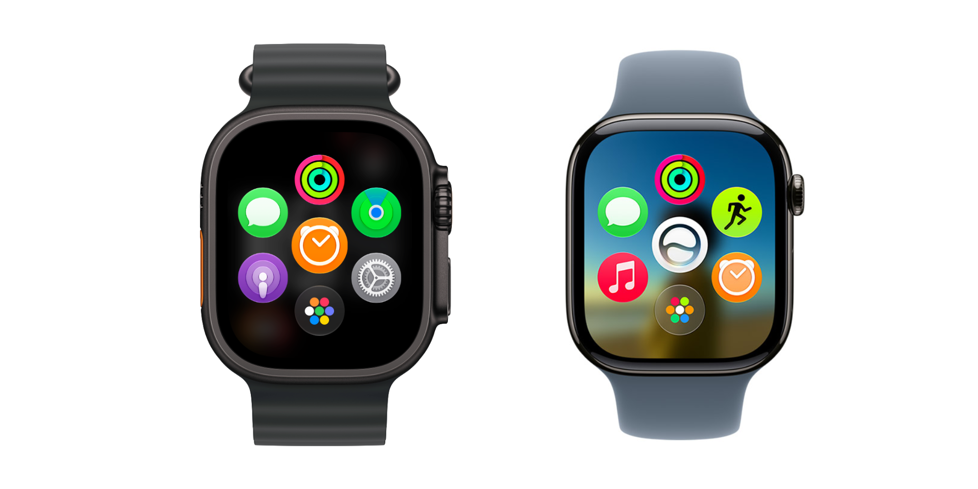
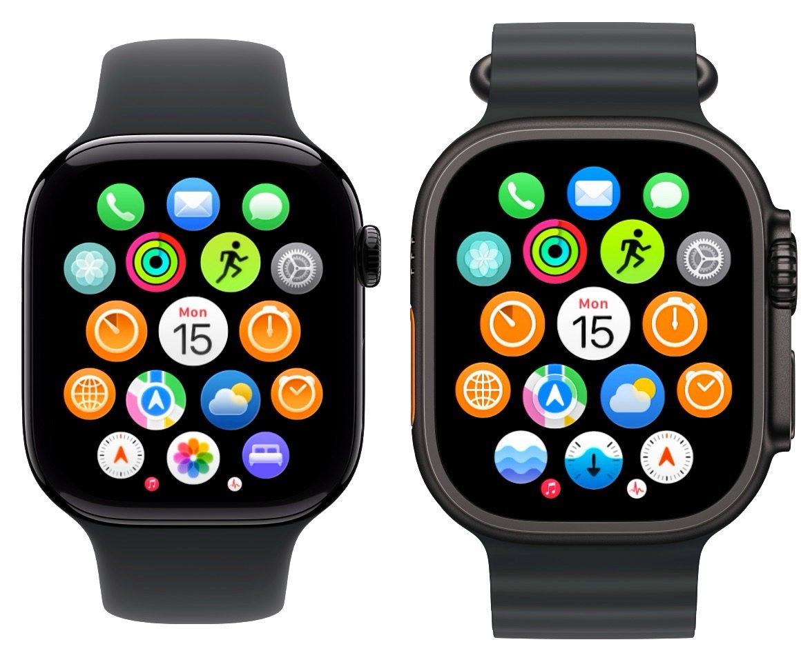
For nearly ten years, clicking the Digital Crown from the watch face or an active application opened the comprehensive app launcher. watchOS 27 completely redefines this core navigation pillar by replacing the traditional grid-first approach with a "dynamic app grid."
When pressing the Digital Crown now, users are greeted by:
- A curated selection of five intelligently suggested apps (leveraging on-device machine learning based on time, location, and user habits).
- A prominent shortcut icon for the native Siri application.
- A dedicated icon to expand into the full, traditional app grid or list view.
While the logic behind this change is sound—studies have consistently shown that the vast majority of Apple Watch owners only use a tiny fraction of their installed apps regularly—the implementation takes some getting used to. Larger tap targets make selecting apps easier on smaller displays, but seasoned users who prefer absolute control and predictability over their app launcher may find the dynamic rearrangement slightly disorienting. Furthermore, the aggressive front-and-center placement of the Siri app underscores Apple’s broader corporate push to infuse generative and contextual AI into every single corner of its operating system ecosystem this year.
Supporting Context & Metrics: The Evolution of Watch Navigation
To understand why Apple is making these sweeping changes in watchOS 27, one must examine the macro-level evolution of wearable computing design.
| watchOS Era | Primary App Launcher Paradigm | Multitasking Method | Key Philosophy |
|---|---|---|---|
| watchOS 1 – 3 | Honeycomb App Grid (Static) | App Switcher via Side Button / Crown Gestures | Showcasing capability, high density of options on a small screen. |
| watchOS 4 – 9 | Honeycomb / List View with Dock | Digital Crown Double-Click & Side Button Dock | Balancing speed with quick-access app management. |
| watchOS 10 – 26 | Smart Stack Widgets & Unified Grid | Digital Crown Double-Click Shortcut | Glanceability first, reducing deep app engagement in favor of widgets. |
| watchOS 27 (Current) | Dynamic App Grid (AI-Assisted) | Unified Single/Double Click (Deprecation) | Predictive computing, machine learning curation, minimal clutter. |
Market research indicates that the average Apple Watch user interacts with their device fewer than 80 times per day, with the vast majority of sessions lasting under five seconds. In this environment, deep app organization schemes become secondary to rapid information delivery. Apple’s internal telemetry clearly pointed toward low overall usage for the Walkie-Talkie app and heavy reliance on Siri or Smart Stack widgets rather than manual app grid hunting. By automating the app launcher to display predictive options, Apple is attempting to eliminate the friction of scrolling through dozens of tiny circular app icons.
Official Statements and Industry Reception
While Apple has not published a dedicated standalone press release detailing every minor feature deprecated in watchOS 27—opting instead to focus its marketing messaging on major health, fitness, and AI capabilities—company representatives and developer session notes provide insight into the rationale behind the update.
In developer documentation accompanying the release candidates, Apple emphasizes its commitment to "streamlining navigational hierarchies" and "reducing cognitive load during micro-interactions." The underlying message is clear: the Apple Watch is designed to be glanced at, interacted with briefly, and put away. Features that require sustained attention or complex multi-step gestures are increasingly being evaluated through the lens of whether they truly serve the core wearable value proposition.
Independent developers and tech journalists have expressed mixed reactions. Some applaud Apple for being willing to ruthlessly prune legacy features that clutter the interface, arguing that software bloat is a silent killer of user experience. Others, however, lament the ongoing erosion of customizable control, pointing out that removing hardware shortcuts alienates long-time enthusiasts who have optimized their daily workflows around muscle memory.

Future Outlook: Where Goes watchOS From Here?
As watchOS 27 lands on supported devices this month, the tech community will be watching closely to see how users adapt to the missing features and altered navigation paradigms.
History suggests that user outrage over removed features—such as the controversial removal of legacy watch faces in previous updates—gradually gives way to acceptance as the new normal sets in. However, the outcry over the missing multitasking shortcut may prompt Apple to reconsider how physical buttons are mapped in future point releases. Rumors continue to circulate regarding potential future hardware iterations featuring customizable action buttons or expanded gesture controls across the entire Apple Watch lineup, which could ultimately reintroduce efficient multitasking in a more refined form.
For now, users preparing to update should back up their devices, anticipate a brief adjustment period when pressing the Digital Crown, and bid a final farewell to the yellow Walkie-Talkie icon. Change on the wrist is never entirely painless, but in the relentless pursuit of seamless, AI-driven wearable computing, Apple has made it clear that legacy features must occasionally be left behind in the digital dust.