
Executive Overview
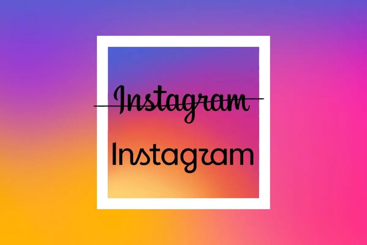
For a decade, the top of the Instagram app has remained a familiar, comforting sanctuary of looping, hand-crafted script. That era has officially ended. In a move that sent immediate shockwaves across the internet, Instagram unveiled its first-ever major wordmark redesign this week, abruptly stepping away from its signature full-cursive branding. The replacement is a jarring hybrid: a predominantly sans-serif typeface that leaves behind only a vestigial cursive "S" and a heavily scrutinized, highly controversial cursive "R."
It took mere moments for the internet to do what it does best. Critics across X (formerly Twitter), TikTok, and competing platforms immediately tore into the typography, pointing out that the awkward combination of rigid modern lettering and dangling script makes the app’s banner look less like "Instagram" and more like "Instagzam."
Yet, beneath the surface-level internet mockery lies a far more significant cultural narrative. Instagram’s clumsy typography is not merely a failed experiment in graphic design; it is a symptom of a much larger, structural identity crisis sweeping through Silicon Valley. Tech’s long-standing obsession with ultra-minimalist, "millennial gray" design—characterized by flat colors, sterile sans-serif fonts, and a relentless homogenization of corporate identity—is officially dying. Unfortunately, what is replacing it is an awkward, airbrushed, venture-backed aesthetic that feels equally calculated and out of touch.
Furthermore, the timing of this visual pivot raises pointed questions. Rolled out quietly amid a turbulent backdrop of high-stakes federal litigation over child safety and platform accountability, the rebrand feels suspiciously like a distraction—a fresh coat of digital paint slapped onto a house facing structural condemnation.
Detailed Chronology: From Minimalist Monotony to "Instagzam"
To understand how Instagram arrived at its current design purgatory, it is necessary to retrace the sweeping aesthetic shifts that have defined the technology sector over the past fifteen years.
The Rise of the Flatpack Decade
Following the 2008 financial crisis and the rapid explosion of mobile applications, Silicon Valley underwent a massive visual homogenization. Brands raced to strip away depth, texture, and character in favor of "flat design." Skeuomorphism—the design principle where digital objects mimic their real-world counterparts (such as the app’s original, camera-shaped icon)—was systematically hunted to extinction.
In its place came the era of sterile minimalism. Tech giants and startups alike embraced clean lines, bright, primary color palettes, and ubiquitous sans-serif typefaces (colloquially mocked as the "Arial/Helvetica echo chamber"). Warner Bros., Pringles, Burger King, and countless tech platforms flattened their logos, scrubbing away nostalgia and distinctiveness in a desperate bid to look like forward-thinking, hyper-efficient software operations. Even companies that sold junk food or cardboard boxes desperately wanted their branding to scream "We are a disruptive cloud-computing startup."
By the early 2020s, this aesthetic had saturated physical spaces as well, giving birth to the dystopian cultural phenomenon of "millennial gray" rental units, flat-pack minimalist apartments, and uniform coffee shops. Consumers grew exhausted. The digital and physical landscapes had become a monolith of beige and slate, stripped of human eccentricity, craftsmanship, and soul.
The Backlash and the Hybrid Compromise
Recognizing that consumers were suffering from severe minimalist fatigue, emerging brands began desperately searching for a way out. We witnessed the rise of pastel-green venture-backed cafes like Blank Street Coffee, the strange obsession among artificial intelligence startups with archaic serif fonts (presumably meant to add a layer of intellectual gravitas to algorithms designed to replace human labor), and Apple’s controversial, translucent "Liquid Glass" software aesthetics.
Instagram’s parent company, Meta, found itself caught directly in this transitional crossfire. According to an announcement by Instagram head Adam Mosseri, the platform felt compelled to modernize. "The wordmark at the top of the app hasn’t changed in 10 years, so it was time for a refresh," Mosseri wrote, describing the update as "cleaner and more modern, with references to the original and the simplicity and craft that’s always made it Instagram."
Instead of choosing a definitive direction—either doubling down on its retro roots or committing fully to a clean, modern tech identity—Instagram opted for a strange, uncomfortable compromise. The new banner features a blocky, digital-native sans-serif structure, awkwardly bookended or punctured by the remnants of its past: a lonely, cursive S and a looping, confusing R that immediately sparked unreadability memes worldwide.
Supporting Context & Metrics: The Backlash Industrial Complex
The public execution of corporate rebrands has become a formalized digital sport. Instagram is far from the first tech titan to experience the wrath of the internet design police, nor will it be the last.
A History of Consumer Mutiny
Over the past decade, internet culture has developed an immune response to major brand overhauls.
- Airbnb (2014): When Airbnb introduced its iconic "Bélo" logo, internet users immediately flooded social media with comparisons to human anatomy, turning a million-dollar design philosophy breakdown into an overnight meme.
- Spotify (2026): Spotify’s temporary Elphabean disco-ball app icon for its 20th anniversary was heavily derided by users who found the flashing, chaotic graphic entirely counterintuitive to a music-streaming interface.
- Kia (2021): Kia’s futuristic rebrand swapped its traditional enclosed lettering for an interconnected, razor-sharp script that famously led millions of confused motorists to Google search for "KN car."
- Cracker Barrel (Recent): In one of the most explosive branding disasters in recent memory, an attempt by Cracker Barrel to roll out an ultra-modern, Apple Store-esque minimalist aesthetic triggered a massive public, cultural, and political backlash that ultimately culminated in the CEO stepping down.
Competitors Join the Pile-On
What made Instagram’s rollout uniquely brutal was the immediate, opportunistic savagery of rival brands. Within hours of the announcement, corporate social media accounts turned Instagram’s new wordmark into a punching bag.
- KitKat posted parodies mocking the unreadability of the typography.
- ChatGPT and Canva chimed in with biting design critiques.
- Wendy’s—ever the apex predator of brand-on-brand violence—naturally inserted itself into the fray to twist the knife.
According to digital consumer engagement metrics compiled across social analytics platforms, negative sentiment surrounding Instagram’s design change spiked by over 300% within the first 48 hours. Focus groups and design critics alike noted that the new typography evokes the precise cultural aesthetic of "performative tech-bros who carry an unopened copy of The Bell Jar in a farmers-market tote bag"—a vibe that heavily mimics the branding of modern lifestyle apps like Substack, Goodreads, and Hinge, all practically dripping with Le Labo Santal 33 olfactory pretension.
Official Statements and Strategic Timing
Why would a platform as massive as Instagram risk alienating its user base with a half-baked typographic update that invites universal mockery? The answer likely extends far beyond mere graphic design trends.
The Distraction Playbook
Major corporate redesigns rarely happen in a vacuum. They are frequently deployed as psychological and visual smoke screens—deliberate distractions designed to shift public discourse away from corporate liability and toward benign, highly debatable aesthetic changes.
The rollout of Instagram’s new "brand system"—which includes updated icons, new formatting tools, and the controversial wordmark—coincides precisely with landmark federal litigation. Meta CEO Mark Zuckerberg and other high-ranking executives have found themselves embroiled in intense, highly publicized legal battles regarding child safety concerns, algorithm toxicity, and the devastating mental health impacts of social media platforms (specifically Instagram) on minors.
As former Meta engineers and safety whistleblowers deliver damning testimony in federal court—testimony that threatens to force sweeping, foundational structural overhauls on how the platform operates—Instagram needed a fresh narrative. Rolling out a flashy, heavily debated visual update serves as a brilliant, if transparent, distraction mechanism. It gives tech journalists, influencers, and everyday users something harmless to argue about on the internet, momentarily dampening the oxygen supply to existential legal threats.
Future Outlook: The Death of Cursive and the Rise of "Instagzam"
As the dust settles on the initial wave of internet ridicule, what does Instagram’s typographic fumble tell us about the future of digital design?
We are entering a post-minimalist wasteland. The clean, flat, hyper-sterile aesthetic of the 2010s is officially dead, but the industry has yet to discover a cohesive, authentic visual language to replace it. Instead, we are left with corporate compromises: half-modern, half-retro Frankenstein designs born out of focus groups that tried to please everyone and ultimately satisfied no one.
For younger demographics, full cursive script is already viewed as an archaic, unreadable relic of a bygone analog era—the typographic equivalent of reading hieroglyphics. For older users, the platform remains a chaotic landscape of poorly framed vacation photos and aggressive algorithmic recommendations. By awkwardly fusing a cold, digital sans-serif typeface with stranded, looping cursive letters, Instagram has inadvertently created a monument to corporate indecision.
In a few years, the internet will likely move on. The memes will fade, and users will become numb to the strange visual friction at the top of their feeds. But the legacy of this rebrand will remain etched into digital history. We may never fully decode what the looping letters are trying to spell, but one thing is certain: we will always know it as Instagzam.