

Executive Overview
For decades, web developers have navigated a labyrinth of creative workarounds, SVG injections, and heavy computational hacks just to break free from the unyielding tyranny of the rectangular box. While CSS has evolved dramatically—introducing powerful layout paradigms like Flexbox and Grid—shaping the web has historically remained a fragmented, frustrating endeavor.
That paradigm is shifting fundamentally. Following the recent arrival of the shape() function and the corner-shape property, a new powerhouse is entering the specification stage: the border-shape property.

Where traditional properties like clip-path and mask forced an impossible compromise—forcing developers to choose between a clean vector silhouette and structural decorations like borders or box shadows—border-shape bridges the gap. It introduces an era where geometric styling, native borders, and fluid animations coexist seamlessly. Though currently experimental and exclusive to Chromium-based browsers, this breakthrough promises to redefine modern web design systems, rendering legacy hacks obsolete and opening unprecedented creative avenues for frontend developers.
Detailed Chronology: The Journey to Native CSS Geometry
To understand the weight of the border-shape proposal, we must trace the deliberate, step-by-step evolution of CSS geometry handling over recent years.

Phase 1: The Era of Hacks and clip-path
In the early days, creating non-rectangular elements required nesting hidden elements, manipulating transparent border tricks (such as the classic CSS triangle hack), or relying heavily on inline SVGs. The introduction of clip-path and CSS masks changed the landscape by allowing developers to carve shapes out of rectangular elements.
However, clip-path came with a fatal flaw for designers: it acted like a literal cookie cutter. It sliced through the entire element—including its borders, outlines, and box shadows. If a developer wanted a bordered star or a polygon with a glowing outline, clip-path could not accommodate it directly, forcing complex multi-layered element wrappers to fake the illusion of a border.

Phase 2: The Arrival of shape() and corner-shape
The CSS Working Group began addressing these limitations by introducing specialized tools.
- The
shape()Function: This modern value forclip-pathandoffset-pathstreamlined vector creation by adopting simplified SVG-like syntax directly inside stylesheets, bypassing the verbose constraints of older functions likepath(). - The
corner-shapeProperty: Operating in tandem withborder-radius, this property introduced predefined keywords—such asround,scoop,bevel,notch, andsquircle—to transform element corners. Whilecorner-shapeallowed basic decorative framing that previous clip properties struggled with, its structural utility was still bound strictly to the element’s corners.
Phase 3: The border-shape Breakthrough
Recognizing that developers needed complete control over an element’s structural perimeter rather than just its corners, the specification introduced border-shape. By moving past the restrictive "cutting" mechanism of clip-path, border-shape treats the border as an organic stroke or fill mapped directly to a mathematical path. This evolution brings web development closer to native vector editing software, empowering developers to style, stroke, and animate complex geometries without touching a single graphic design program.

Supporting Context & Metrics: Why border-shape Changes Everything
The technical implications of border-shape solve some of the most persistent bottlenecks in frontend engineering.
Stroke Mode vs. Fill Mode
According to the current working drafts of the CSS Borders module, border-shape accepts either a single <basic-shape> or a dual-shape syntax, defining two distinct rendering modes:

- Stroke Mode (Single Shape): The browser renders the border as a literal stroke along the specified path. The width of the stroke is determined by the element’s computed border width. This mode makes generating outlined, border-only shapes—such as a hollow star, an intricate heart, or a jagged frame—as simple as writing a single line of CSS.
- Fill Mode (Dual Shape): By passing two shapes (for example, combining
inset(0)with a nestedcircle()), the border renders as the solid area residing between the two paths. The first shape dictates the outer boundary, while the second defines the inner cutout.
Quantitative Advantages Over Legacy Methods
- DOM Reduction: Eliminates the need for 3-to-4 nested HTML divs previously required to simulate bordered vector shapes.
- Stylesheet Conciseness: Replaces verbose SVG data URIs with native, readable CSS functions.
- Performance Gains: Hardware-accelerated path rendering minimizes layout reflow costs compared to DOM-heavy vector approximations.
Official Statements and Technical Specifications
The design philosophy behind border-shape centers on developer ergonomics and expressive freedom. The CSS Working Group structured the property to feel instantly familiar to anyone who has utilized clip-path, lowering the cognitive barrier to entry.
.shape
  /* Legacy approach (clips decorations entirely) */
  clip-path: shape(M 0 0, L 100 100, L 0 100 Z);

  /* Modern approach (retains borders, shadows, and outlines) */
  border-shape: shape(M 0 0, L 100 100, L 0 100 Z);
Industry experts note that the synergy between border-shape and the shape() function represents the true tipping point. Because shape() natively converts complex vector mathematics into digestible CSS values, web designers can seamlessly migrate vector assets from tools like Figma directly into production style sheets.

Furthermore, standard interactive decoration properties—including box-shadow, outline, and border-color—no longer look at the element as a rigid bounding box. Instead, they wrap fluidly around the geometry defined by border-shape.
.advanced-box
  border: 8px solid crimson;
  box-shadow: 0 10px 20px rgba(0,0,0,0.2);
  border-shape: inset(0) circle(50px);
In this configuration, the box-shadow and border respect the complex geometry generated by the dual-shape syntax, completely bypassing the frustrating clipping artifacts of the past.

Future Outlook: Creative Horizons and Adoption Timeline
While border-shape is currently restricted to Chromium-based environments (with Baseline status pending broader multi-engine implementation), early adopters are already pushing the boundaries of what is possible.
Dynamic Breakout Backgrounds and Text Decorations
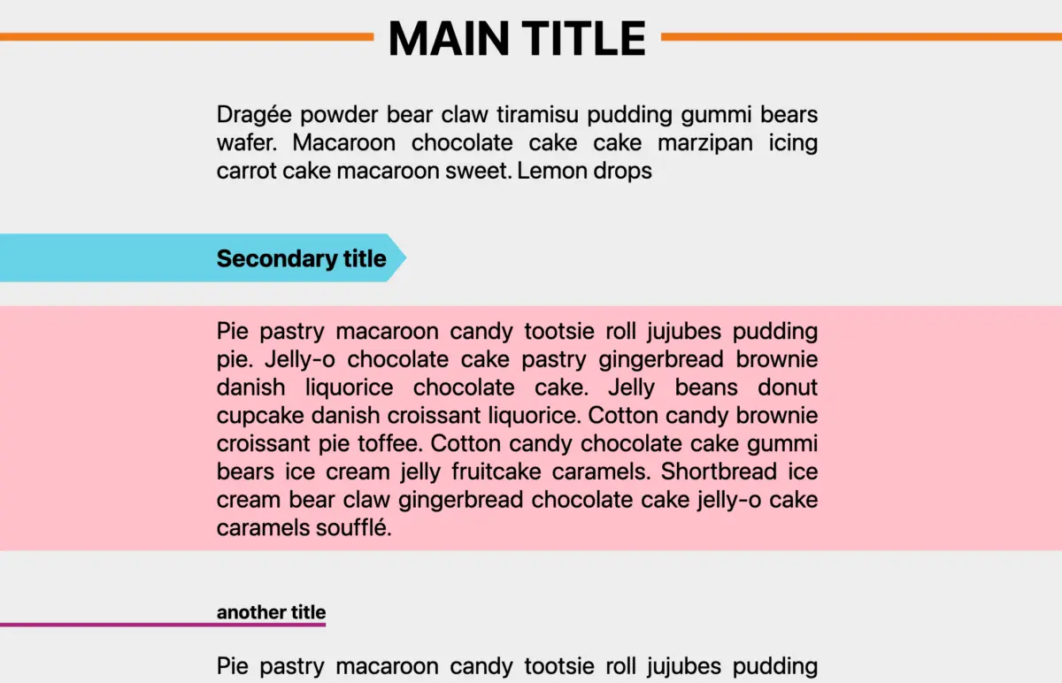
One of the most exciting implications of border-shape is the ability to orchestrate breakout design patterns effortlessly. By manipulating dual-shape values—such as expanding an outer rectangular inset while shrinking an inner shape to zero—developers can craft full-bleed background highlights and asymmetric header underlines that break out of standard container constraints without triggering horizontal scrollbars or relying on brittle negative margins.

Fluid Animations and Interactive States
Because border-shape interfaces directly with the browser’s geometric rendering engine, it opens up advanced animation workflows:
- Hover-State Morphs: Animating between different polygon coordinates or shape functions on user interaction.
- Reveal Effects: Transitioning
border-widthproperties over dual-shape layouts to create smooth drawing and wiping effects. - Organic Loaders: Building complex, squishy, and fluid loading spinners natively using pure CSS code rather than resource-heavy GIFs or multi-frame SVG animations.
The Road Ahead
As browser vendors continue to collaborate on cross-engine standardization, border-shape stands poised to transition from an experimental playground into a cornerstone of modern web design systems. Developers are encouraged to experiment with the feature in Chromium browsers, audit existing UI component libraries for potential vector optimizations, and prepare for a future where geometric freedom on the web is no longer an uphill battle, but a native standard.