

Executive Overview
The landscape of web design is undergoing a monumental architectural shift. For decades, shaping elements on the web has been an exercise in creative workarounds, reliance on external raster or vector assets, and fragile layout hacks. While the introduction of clip-path, mask, and border-radius brought us closer to true native styling freedom, they all suffered from a critical limitation: decorations like borders, outlines, and box-shadows were inextricably bound to the rectangular bounding box of the element. Clipping an element meant clipping its decorations away entirely, robbing developers of the ability to create organic, styled, and outlined geometric shapes natively.
Enter the next evolution of CSS layout engines: the newly standardized shape() function, the versatile corner-shape property, and the ultimate game-changer, the border-shape property.

Together, these features represent a paradigm shift in how browsers calculate and render layout geometries. The border-shape property allows developers to define complex structural shapes that directly govern an element’s borders and shadows without resorting to destructive clipping. Whether building fluid breakout backgrounds, intricate hand-drawn UI components, interactive loaders, or reactive animated blobs, border-shape eliminates decades of CSS friction. Although browser support currently sits primarily within the Chromium ecosystem, this trio of CSS features is rapidly establishing a new baseline for modern frontend engineering.
Detailed Chronology: The Journey to Native CSS Shapes
To fully appreciate the breakthrough represented by border-shape, it is vital to trace the historical progression of shape manipulation within the Cascading Style Sheets specification.

Phase I: The Box Model Era and Early Hacks
In the early days of CSS, every element was strictly confined to a rectangular box model. Creating anything other than a rectangle required extraordinary ingenuity. The classic "CSS Triangle" hack, discovered by the web development community in the late 2000s, exploited the way adjacent CSS borders met at diagonal angles. By setting zero-width content boxes and manipulating transparent border widths, developers could conjure triangles, trapezoids, and arrows. While effective, these hacks were non-semantic, fragile, and impossible to scale cleanly without altering the underlying document flow.
Phase II: The Rounded Revolution (border-radius)
The introduction of border-radius in CSS3 felt revolutionary. For the first time, developers could soften harsh corners natively. However, border-radius was strictly limited to circular or elliptical arcs. Attempts to create alternative corner aesthetics—such as concave scoops, sharp bevels, or smooth squircles—still required complex SVG masks or raster image sprites.

Phase III: Clipping and Masking (clip-path and mask)
The arrival of clip-path and mask properties opened the door to arbitrary vector geometries. Using polygons, circles, and inline SVG paths (path()), developers could slice elements into virtually any shape imaginable.
- The Fatal Flaw: Because
clip-pathoperates as a post-layout rendering filter, it lops off everything outside the designated vector boundary. If an element had a 10px solid border, that border was clipped in half or removed entirely along the angled edges. Adding a border that accurately followed a clipped shape required doubling up elements, absolute positioning, or complex SVG overlays.
Phase IV: The Modern Era (shape(), corner-shape, and border-shape)
Recognizing these enduring developer pain points, the CSS Working Group initiated specifications for advanced geometric styling.

shape()function: A streamlined, SVG-compatible syntax introduced forclip-pathandoffset-paththat makes drawing complex lines, arcs, and curves directly in CSS vastly simpler than legacypath()strings.corner-shapeproperty: A companion toborder-radiusthat introduces structural keywords (round,scoop,bevel,notch,squircle) to redefine element corners.border-shapeproperty: The capstone feature that unlinks shape definitions from destructive clipping, allowing borders, outlines, and box shadows to dynamically follow custom geometries.
Supporting Context & Metrics: Why border-shape Matters
The introduction of native geometric properties is not merely an aesthetic enhancement; it addresses significant performance and developer experience bottlenecks in modern web applications.
- Asset Weight Reduction: Historically, complex UI frames, blob cards, and organic divider shapes required inline SVGs, background data-URIs, or external image requests. By moving these shapes into native CSS via
border-shapeandshape(), teams can eliminate hundreds of kilobytes of redundant vector assets, reducing DOM complexity and accelerating Time-to-Interactive (TTI). - Maintenance and Scalability: SVG backgrounds struggle to respond dynamically to variable text lengths and responsive typography container queries. Native CSS shapes scale fluidly with text content, padding, and layout changes, ensuring layouts never break under dynamic localization or responsive reflows.
- Animation Performance: Animating SVGs via DOM manipulation or SMIL is notoriously taxing on the browser’s main thread. In contrast, native CSS properties like
border-shapeare optimized for hardware acceleration, enabling butter-smooth, 60fps transitions on hover, focus, and state changes.
Official Specifications & Technical Breakdown
According to the official W3C CSS Borders Module Level 4 draft, the border-shape property fundamentally alters how strokes and fills are calculated around an element’s geometry. The property accepts either a single <basic-shape> or two <basic-shape> values, unlocking two distinct rendering modes:

1. Stroke Mode (Single <basic-shape>)
.shape
  border: 8px solid var(--accent-color);
  border-shape: shape(M 0 0 L 100 0 L 50 100 Z);
In Stroke Mode, the border is rendered as an organic stroke tracing the exact trajectory of the specified shape path. The thickness of the stroke is dictated by the element’s computed border widths. This completely replaces fragile CSS clipping workarounds, allowing developers to render clean, outlined vector shapes with a single declaration.
2. Fill Mode (Two <basic-shape>s)
.shape
  border: 16px solid var(--primary-color);
  border-shape: inset(0) circle(40px);
In Fill Mode, the border occupies the geometric region between two distinct paths. The first shape defines the outer boundary, while the second shape defines the inner boundary. This provides unmatched precision for creating cutout shapes, specialized picture frames, and dynamic background containers without nesting structural HTML elements.

Practical Implementation and Advanced Patterns
The true power of border-shape shines when combined with the new shape() function and modern layout paradigms. Here is how developers are leveraging these properties in production environments today.
Border-Only Shapes and Cutouts
Creating a standalone outlined heart, starburst, or custom polygon no longer requires SVG markup. By pairing a transparent content box with a defined border and border-shape, complex shapes snap into place:

.badge-outline
  border: 4px solid #ff3366;
  border-shape: shape(M 50 15 C 30 -5 0 20 20 50 L 50 85 L 80 50 C 100 20 70 -5 50 15 Z);
By switching to the two-value syntax (inset(0) combined with a vector shape), developers can instantly carve complex voids out of solid background fills, creating sophisticated visual hierarchy with minimal code.
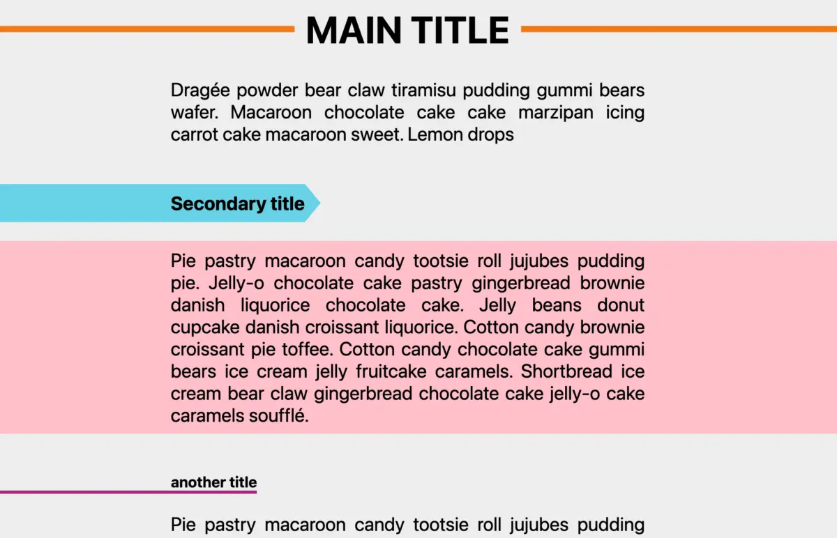
Breakout and Partial Decorations
One of the most historically frustrating tasks in responsive web design is the "breakout background"—forcing a container’s background color or border decoration to extend past its parent grid container to the edge of the viewport.

With border-shape, developers can orchestrate breakout backgrounds cleanly:
.hero-banner
  border-shape: inset(0 -100vw) circle(0);
  border-color: rgba(255, 105, 180, 0.15);
This technique allows content to remain centered within standard reading boundaries while optical background decorations safely stretch edge-to-edge. Furthermore, partial decorations—such as localized corner borders, hand-drawn underlines, and asymmetrical accent flags—can be crafted by keeping paths restricted within standard element bounds.

High-Performance Shape Animations
Because border-shape values are fully animatable via CSS transitions and keyframes, interactive states become exceptionally fluid. By animating stroke widths, inset boundaries, or path coordinates, developers can build reactive UI components:
.interactive-card
  border: 2px solid transparent;
  border-shape: inset(0);
  transition: border-shape 0.4s cubic-bezier(0.4, 0, 0.2, 1), border-color 0.4s ease;


.interactive-card:hover
  border-color: #00f2fe;
  border-shape: shape(M 0 0 L 100 0 L 100 100 L 0 100 Z); /* Morphing path */
Future Outlook
As the web platform marches forward, the standardization of geometry-driven CSS properties signals the twilight of archaic layout hacks. The integration of shape(), corner-shape, and border-shape bridges the historical gap between vector graphics and cascading style sheets.

While current support remains largely restricted to Chromium-based environments, browser vendors are actively working toward interoperability. As Baseline status is achieved across all major rendering engines, border-shape is poised to become an indispensable pillar of modern design systems, component libraries, and creative web development.
Developers are encouraged to experiment with these properties today using progressive enhancement techniques, ensuring that cutting-edge geometric flourishes enhance modern browsers while graceful fallbacks protect legacy clients. The canvas of the web has never been more flexible—and the era of pure CSS geometry has officially begun.