Executive Overview
The web development ecosystem is undergoing a profound structural evolution, propelled by a rapid influx of low-level capabilities, native HTML enhancements, and deeply requested styling primitives. As browsers continue to bridge the gap between traditional JavaScript-driven solutions and pure declarative markup, front-end developers are finding themselves equipped with a vastly more powerful toolkit.
This edition of What’s !important captures a defining period in CSS and web platform engineering. Over the past few weeks, community leaders, browser engineers, and specification authors have introduced innovations that fundamentally rethink how we handle user interactions, spatial geometry, layout distributions, and feature detection. From native HTML geolocation controls and high-performance syntax highlighting powered by the Custom Highlight API, to revolutionary layout introspection and forward-looking selectors like the class prefix selector, the boundaries of what can be achieved with vanilla web technologies are expanding daily.
This report provides an exhaustive, authoritative breakdown of these developments. We examine the technical mechanics, architectural benefits, progressive enhancement strategies, and industry debates surrounding the latest wave of web platform updates.
Detailed Chronology: Key Breakthroughs in CSS and HTML
1. Mastering User Intent: Delayed-then-Instant Tooltips
The user experience of tooltips has long been plagued by two opposing problems: accidental triggers caused by fleeting mouse movements over interactive areas, and sluggish dismissal speeds when users move away from content they no longer wish to inspect.
Abhishek Jakhar tackled this persistent UX friction by outlining a robust method for creating "delayed-then-instant" tooltips. Under this paradigm, tooltips require a deliberate dwell-time before appearing (preventing visual noise during cursor transit), but vanish immediately upon exit. While Jakhar detailed a programmatic implementation to achieve this fluid state management, edge cases remain—such as overly compact hoverable regions causing accidental de-triggering—reinforcing the ongoing necessity of carefully tuned hover delays.
Expanding on this concept, Chris Coyier introduced a modern, specification-driven implementation leveraging interest invokers. This emerging browser capability introduces two critical CSS properties:
interest-delay-start: Controls the dwell duration required before an element’s associated interest content is invoked.interest-delay-end: Manages the swiftness with which the interest state is torn down.
Although interest invokers currently enjoy exclusive support within Chromium-based environments, they represent a watershed moment for declarative UI states, offering a clear path for progressive enhancement across diverse browser engines.
2. The <geolocation> HTML Element: Bridging Hardware and Markup
The Geolocation API has historically presented significant implementation hurdles. Developers have had to navigate complex external hardware dependencies (including GPS satellites, Wi-Fi triangulation, and cellular tower telemetry) alongside brittle permission-state management interfaces.
To alleviate this friction, the web platform has introduced the experimental <geolocation> HTML element. By encapsulating location-request mechanics directly within a native markup node, the element streamlines acquisition flows. However, this convenience introduces distinct platform quirks—most notably, rigid styling restrictions imposed on the native permission dialogs and UI surfaces.
Because browser support is currently restricted to Chrome, developers are turning to hybrid integration strategies. By utilizing the <geolocation> element alongside the established JavaScript Geolocation API through progressive enhancement patterns, teams can deploy modern markup today without breaking compatibility for legacy or non-Chromium user bases.

3. MicroLighter: Revolutionizing Syntax Highlighting via the Custom Highlight API
Traditional syntax highlighters often rely on heavy DOM manipulation, wrapping individual tokens in numerous <span> elements that bloat the document tree and degrade rendering performance on large code blocks.
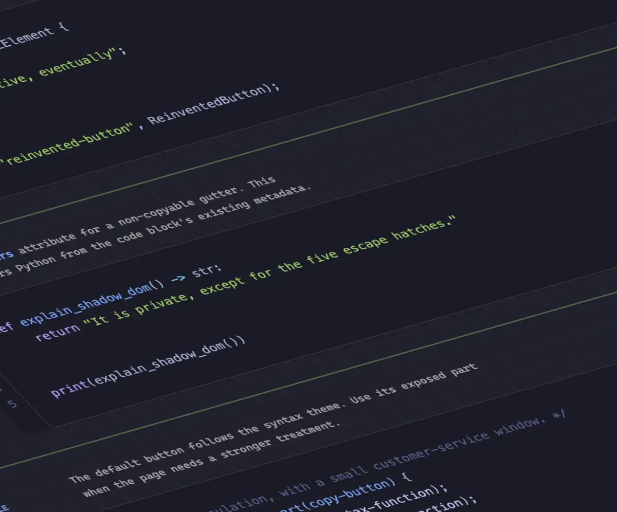
Dave Rupert disrupted this pattern by releasing MicroLighter, a lightweight syntax highlighter built directly on top of the native Custom Highlight API. By bypassing structural DOM modifications and instead applying styles via range-based CSS highlights, MicroLighter achieves exceptional performance and pristine semantic markup.
Technical deep dives by both Rupert and Geoff explore the inner workings of the Custom Highlight API, demonstrating how progressive enhancement allows modern browsers to render rich syntax maps while gracefully degrading to plain text in environments lacking support.
4. Extracting CSS Grid Layout Coordinates into Custom Properties
For years, CSS Grid has excelled at macro-layout arrangement, yet developers have continually faced a frustrating architectural wall: the inability to feed layout metrics—such as explicit row/column counts or dynamic cell coordinates—back into CSS custom properties for stylistic computations.
Temani Afif dismantled this limitation by demonstrating a technique to expose CSS grid metrics directly to custom properties. By mapping column and row configurations, developers can capture exact $X$ and $Y$ indexes for individual grid cells. Although this technique currently relies on equal-width column constraints, it unlocks powerful styling capabilities.
Most notably, Afif applied this architectural bridge to calculate hover proximity, allowing elements within a grid to dynamically react based on their spatial distance from the user’s cursor—a feat previously requiring heavy JavaScript geometry calculations.
5. The Dark Mode Debate: Two-State vs. Tri-State Toggles
As dark mode support matures across the web, UI/UX architecture standards are diverging over user preference controls. The community is currently engaged in a spirited debate between two distinct interface paradigms:
- The Two-State Model: Championed by Lea Verou, this approach toggles strictly between light and dark modes, prioritizing simplicity and minimalism.
- The Tri-State Model: Advocated by Bramus, this model introduces explicit states for Light, Dark, and System Auto, giving users granular control over preference inheritance.
Bridging these perspectives, developer Vale.Rocks introduced an "auto-until-overridden" two-state approach. This hybrid philosophy respects the operating system’s default preference while seamlessly switching to a persistent manual override upon user interaction, balancing automated convenience with explicit choice.
6. The Class Prefix Selector: Performance and Clarity
Bramus proposed a major quality-of-life syntax enhancement for CSS selectors: the class prefix selector. Designed to match classes sharing a specific naming convention without relying on inefficient attribute selectors, the proposed syntax looks remarkably clean:
.something-*
  /* Targeted styles */
This notation offers a massive performance and readability advantage over legacy attribute matching workarounds, which suffer from heavy evaluation overhead:

[class^="something-"]
  /* Matches class="something-xxx" */


[class*=" something-"]
  /* Matches class="xxx something-xxx" */


[class*="something-"]
  /* Matches class="my-something-xxx" */
Given its intuitive syntax and drastic reduction in selector complexity, industry adoption and specification movement are expected to progress rapidly.
7. Feature Detecting the Undetectable with @supports named-feature()
Expanding the horizons of conditional styling, Bramus introduced the named-feature() function within @supports queries. Currently landing in Chrome, this feature enables developers to query hyper-specific rendering behaviors that were previously impossible to detect via standard CSS feature queries—such as verifying whether a browser correctly honors transforms on anchor-positioned elements. This addition promises to make progressive enhancement strategies far more reliable and granular.
8. Balancing Flexbox Layouts with flex-wrap: balance
Following the immense popularity of text-wrap: balance for typography, the Chromium engine has introduced flex-wrap: balance. Ahmad Shadeed explored the mechanics of this new layout property, which automatically distributes flex items evenly across wrapped rows or columns. This eliminates awkward, orphan-heavy wrapping patterns and ensures visually harmonious multi-line flex components without requiring manual sizing hacks.
Supporting Context & Metrics
To contextualize the scale of these updates, we can analyze the performance and architectural shifts across modern rendering engines:
| Feature / API | Primary Engine Support | Performance Impact | Architectural Paradigm |
|---|---|---|---|
| *Interest Invokers (`interest-delay-`)** | Chromium (Experimental) | Neutral to Positive | Declarative UI States |
<geolocation> Element |
Chromium (Experimental) | Positive (Reduced JS overhead) | Native Markup Encapsulation |
| Custom Highlight API (MicroLighter) | Broad Modern Support | High (Eliminates DOM bloat) | Non-destructive Text Styling |
| Grid Custom Properties Bridge | Universal (Modern CSS) | Moderate | Layout-to-Variable Data Flow |
| *Class Prefix Selector (`.something-`)** | Proposed / In-Review | High (Optimized selector matching) | Syntax Optimization |
@supports named-feature() |
Chromium | Neutral | Advanced Feature Detection |
flex-wrap: balance |
Chromium | Positive (Automated balance) | Responsive Layout Formatting |
The architectural trajectory is clear: the web platform is aggressively shifting away from heavy JavaScript polyfills and DOM manipulation libraries, replacing them with high-performance, native primitives executed directly by browser layout and paint engines.
Official Statements & Community Discourse
The rapid deployment of these features has sparked vibrant discussions across standards bodies, engineering blogs, and independent developer forums.
- On Native Capabilities vs. JavaScript Abstractions: Independent tooling maintainers have emphasized that APIs like the Custom Highlight API do not merely offer syntactic sugar; they represent a fundamental paradigm shift. By moving heavy text processing out of the JavaScript execution thread and into native highlight rendering pipelines, web applications can maintain high frames-per-second metrics even under heavy computational loads.
- On Layout Introspection: CSS working group discussions surrounding grid metric extraction highlight a growing demand for bidirectional data flow within CSS. Allowing layout engines to communicate structural data back into custom properties blurs the traditional line between structural layout and computed styling, enabling reactive design patterns that previously required constant JavaScript
ResizeObserverpolling. - On Progressive Enhancement: Leading educators within the CSS community continue to champion robust fallback strategies. Because innovations like interest invokers,
<geolocation>elements, andnamed-feature()queries debut in Chromium-first release cycles, the engineering community stresses the importance of defensive coding patterns to ensure uncompromised utility for users on alternative browser engines.
Future Outlook
As we transition into the cooler months and look toward the future of web standards, the roadmap for CSS and HTML engineering has never looked more vibrant.
The convergence of native UI primitives, granular layout introspection, and performance-first APIs signals an era where developers spend less time engineering workarounds for basic interactions (such as tooltips, geolocation wrappers, and syntax highlighters) and more time focusing on unique product experiences.
We anticipate the following developments over the next development cycle:
- Standardization and Interoperability: Watch for Firefox and WebKit implementation signals regarding interest invokers and class prefix selectors as developers build real-world production test cases.
- Ecosystem Tooling Maturation: Post-processor and bundler ecosystems will likely begin introducing early transformation pipelines for proposed syntaxes like
.something-*, allowing teams to write future-proof CSS today. - Design System Evolution: Component libraries will increasingly adopt layout-balancing properties (
flex-wrap: balance) and grid-variable bridges to create truly fluid, self-adjusting UI components that adapt dynamically to arbitrary content constraints.
The web platform continues to mature into a remarkably expressive application runtime. By embracing these modern primitives, front-end engineers are well-positioned to build faster, more resilient, and more maintainable user interfaces than ever before.