
Executive Overview
In an era where digital brand identities must constantly negotiate the line between historical equity and contemporary aesthetic standards, Meta-owned Instagram has introduced a subtle yet highly calculated evolution of its visual signature. On Thursday, the social media giant officially rolled out a redesigned wordmark—the stylized, text-only logo that spells out the company’s name. The decision to retire the previous iteration, which had served as the platform’s textual anchor for a decade, stems from a corporate consensus that the older typeface had begun to feel dated in a rapidly shifting digital landscape.
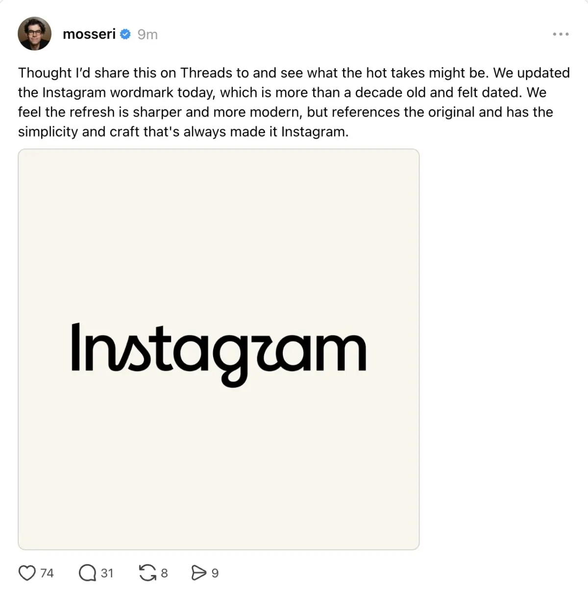
The announcement, delivered by Instagram Head Adam Mosseri across both Instagram and Threads, positioned the redesign as a "sharper and more modern" interpretation of the classic script. While the update preserves the fundamental DNA of the brand’s cursive roots, it introduces refined geometric alterations to specific glyphs.
As with any high-profile corporate rebrand, the public reaction has been highly polarized. While design purists and brand strategists have praised the typeface’s cleaner lines and sophisticated curves, a vocal segment of the user base has met the change with skepticism, giving rise to viral memes and debates regarding legibility.
This visual update raises broader questions about typographic literacy among younger demographics, the strategic imperatives behind tech-industry rebrands, and whether this typographic shift signals an impending, comprehensive overhaul of Instagram’s iconic, gradient-infused mobile application icon.
Detailed Chronology of Instagram’s Visual Evolution
To understand the strategic significance of the new wordmark, one must examine Instagram’s broader visual history, which has evolved in tandem with its transition from a niche photo-sharing utility to a global cultural and economic powerhouse.
[2010: Skeuomorphic Era] ──> [2016: Flat Design Revolution] ──> [2026: Modernized Cursive Refinement]
(Brown Polaroid Camera)      (Pink/Purple Gradient Icon)        (Sharper, Sophisticated Wordmark)
The Era of Skeuomorphism (2010–2016)
In its infancy, Instagram’s visual identity was defined by skeuomorphism—a design trend that mimics real-world textures and objects. The original application icon, featuring a detailed, retro-style brown Polaroid camera complete with a rainbow stripe, captured the nostalgic, analogue spirit of early mobile photography. The accompanying wordmark, heavily inspired by the retro script typeface Billabong, featured soft, fluid, and highly legible cursive lettering that evoked the feeling of a handwritten signature on the back of a physical photograph.
The 2016 Flat Design Revolution
In May 2016, Instagram executed one of the most controversial rebrands in tech history. Under the leadership of then-head of design Ian Spalter, the platform discarded its skeuomorphic assets in favor of a hyper-minimalist aesthetic. The brown camera was replaced with a simplified glyph set against a vibrant, multi-colored gradient of pink, purple, and orange.
Simultaneously, the inner interface of the application was stripped of color, transitioning to a stark black-and-white canvas designed to make user content the focal point. While the 2016 redesign initially triggered widespread user backlash, it ultimately set a new industry standard for flat, gradient-driven mobile UI design.
The Thursday Announcement
The latest chapter in Instagram’s design chronology unfolded on Thursday, when Adam Mosseri posted a brief video and text update on Threads and Instagram. Mosseri revealed that after ten years of service, the existing wordmark was being retired.
According to Mosseri, the objective was to deliver a visual signature that feels contemporary and clean without sacrificing the brand recognition built over the last decade and a half. The rollout was pushed quietly to the live application interfaces, appearing on the login screens, navigation headers, and corporate landing pages worldwide.
Design Deep Dive: Typography, Cursive, and the "Instagzam" Phenomenon
The new wordmark represents a highly stylized departure from standard corporate sans-serif typography, leaning heavily into bespoke, humanist calligraphy. However, the artistic flourishes introduced by the design team have sparked intense debate regarding legibility and cultural relevance.
Old Wordmark (Fluid, Traditional Cursive)
   │
   ├──> "s" -> Soft, standard loop
   ├──> "r" -> Classic cursive shoulder
   └──> "g" -> Rounded, traditional loop

New Wordmark (Sharper, Geometric Cursive)
   │
   ├──> "s" -> Sharp, sail-like angular loop
   ├──> "r" -> Angular, stylized peak (resembling a "z")
   └──> "g" -> Elliptical, modern descender loop
Typographic Anatomy of the New Wordmark
The updated typeface introduces sharper angles, more pronounced terminals, and a distinct geometric rhythm. Several key letterforms have undergone significant modifications:
- The "s": The letter "s" has been reshaped with a tighter, more angular loop, resulting in a silhouette that some design critics have compared to a small, stylized sail on a sailboat.
- The "g": The lower loop (descender) of the "g" features a more elliptical, structured curve, abandoning the looser, hand-drawn look of the previous iteration.
- The "r": Perhaps the most controversial modification is the letter "r." The peak of the letter has been designed with a sharp, angular transition that mimics the pen-lift of traditional calligraphy.
The "Instagzam" Meme and Brand Automaticity
Within hours of the rollout, social media platforms—ironically, including Instagram and Threads—were flooded with commentary pointing out that the stylized "r" causes the wordmark to read as "Instagzam."
Despite the humor surrounding the "Instagzam" phenomenon, brand experts argue that the legibility of individual letters is largely irrelevant for a company of Instagram’s scale. This is a concept known in cognitive psychology as brand automaticity. Because "Instagram" is one of the most universally recognized brand names on Earth, the human brain does not decode the wordmark letter-by-letter. Instead, it processes the wordmark as a singular, holistic graphic symbol. Consequently, artistic flourishes can be introduced without risking actual brand confusion.
The Generational Cursive Divide
From an anthropological perspective, Instagram’s decision to double down on an old-fashioned cursive aesthetic is highly intriguing. Over the past two decades, educational systems globally have systematically phased out cursive writing from primary school curricula. As a result, a substantial portion of Gen Z and Generation Alpha—demographics that represent Instagram’s primary engine for user growth and engagement—cannot read or write fluent cursive.
[Generational Shift in Typography]
Traditionalists/Millennials: Cursive = Nostalgic, Human, Hand-crafted
Gen Z/Gen Alpha:             Cursive = Abstract, Geometric Iconography
By utilizing a wordmark that features complex, connected script elements, Instagram is presenting its youngest users with a form of abstract iconography rather than readable text. What a Millennial or Gen X user views as an elegant cursive "s," a younger user may perceive simply as a custom geometric shape. This contrast adds a layer of depth to the redesign, positioning the wordmark as a bridge between historical analog calligraphy and futuristic digital geometry.
Supporting Context & Metrics: The Business of Brand Refreshes
Corporate identity updates are rarely driven by purely aesthetic motivations; they are deeply calculated business maneuvers designed to achieve specific strategic outcomes.

The "Blandification" Counter-Trend
For the past decade, the tech industry has been dominated by a phenomenon known as "blandification" or "debranding." Major tech companies—ranging from Google and Spotify to Pinterest and Airbnb—abandoned their unique, quirky serif and script logos in favor of highly uniform, sterile geometric sans-serif typefaces (often closely resembling Helvetica or Futura).
[The Trend of Tech Logo "Blandification"]
Google (Playful Serif)      ──> GOOGLE (Flat Sans-Serif)
Spotify (Wavy, Green Icon)  ──> SPOTIFY (Flat Sans-Serif)
Airbnb (Cursive Script)     ──> AIRBNB (Flat Sans-Serif)

[Instagram's Counter-Trend]
Instagram (Maintains and Refines Custom Cursive Script)
While this shift optimized logos for readability on low-resolution mobile screens, it resulted in a homogenized corporate landscape where every tech brand looked virtually identical. By choosing to refine and retain its cursive script rather than transitioning to a flat sans-serif, Instagram has consciously rejected "blandification." This decision preserves its distinct visual identity, ensuring the brand remains instantly recognizable in a crowded marketplace.
Scale of Influence
To comprehend the operational scale of this design change, one must look at the platform’s reach metrics:
| Metric | Estimated Volume |
|---|---|
| Monthly Active Users (MAU) | Over 2 billion globally |
| Daily Active Users (DAU) | Over 1.4 billion globally |
| Average Daily App Opens per User | 6 to 10 times |
| Estimated Daily Wordmark Impressions | 10 to 15 billion impressions |
Given these metrics, a change to the wordmark is not a minor cosmetic update; it is a massive-scale visual deployment that impacts billions of consumer touchpoints daily. For advertisers, a refreshed, modern aesthetic signals a healthy, evolving platform that remains highly relevant to contemporary consumers, thereby protecting Meta’s primary source of revenue.
Official Statements and Industry Reactions
In public communications, Meta has framed the redesign as a natural, evolutionary step.
Executive Commentary
In his announcement on Threads, Adam Mosseri emphasized the balance between preservation and modernization:
"We’ve updated our wordmark to be sharper and more modern, while still keeping the simplicity and heritage of the original design we all know. It’s a subtle change, but one that we think brings a fresh energy to the app."
This statement reflects a classic rebranding strategy: reassuring long-time users that the core identity remains intact while subtly signaling progress to shareholders and design critics.
The Silent Corporate Front
When contacted for further clarification regarding the scope of the design changes, Meta’s corporate communications team declined to provide additional commentary. Specifically, the company has remained tight-lipped on whether this wordmark update is a standalone project or the opening salvo of a broader, platform-wide visual transformation.
Design Community Critique
Within professional graphic design circles, the reception has been largely constructive. Many typographers have praised the structural integrity of the new letterforms, noting that the previous wordmark suffered from slightly unbalanced weight distribution and inconsistent slant angles.
"The new wordmark exhibits superior typographic tension," noted one prominent brand consultant. "The curves are tighter, the transitions are cleaner, and it feels much more cohesive when rendered at smaller resolutions on OLED displays."
Future Outlook: Is a New App Icon Next?
The introduction of the new wordmark inevitably fuels speculation regarding the future of Instagram’s broader visual ecosystem. The most pressing question among industry observers is whether Meta plans to update the iconic gradient app icon.
[Potential Visual Convergence Pipeline]
New Cursive Wordmark (Released)
   │
   └───> UI Typography Harmonization (In Progress)
            │
            └───> Redesigned App Icon / Gradient Shift (Speculative)
The current pink-to-yellow gradient icon, introduced during the 2016 rebrand, is now a decade old. In the fast-moving tech sector, a ten-year-old visual asset is an anomaly. Over the past several years, Meta has subtly tweaked the saturation and color balance of the gradient, making it slightly more vibrant, but the fundamental composition has remained unchanged.
If the new, sharper wordmark is any indication, Instagram may be moving toward a design language that favors higher contrast, sharper geometry, and a more sophisticated interplay of light and shadow. A corresponding app icon update could abandon the soft, circular lens of the current icon in favor of a sharper, more defined camera glyph that aligns with the angular aesthetic of the new "s" and "r" in the wordmark.
Furthermore, this update must be viewed in the context of Meta’s family of apps, which includes Facebook, WhatsApp, Threads, and Messenger. As Meta continues to integrate these platforms—particularly through unified messaging systems and cross-platform sharing—maintaining a harmonious yet distinct visual language for each app is critical.
Instagram’s refined wordmark asserts its unique identity as the creative, expressive heart of the Meta ecosystem. While Facebook remains the utilitarian social directory and WhatsApp serves as the secure communication utility, Instagram continues to position itself as the premier canvas for visual culture—a position that its newly sharpened, cursive signature is designed to protect and project for the next decade.