
Executive Overview
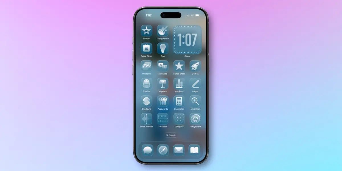
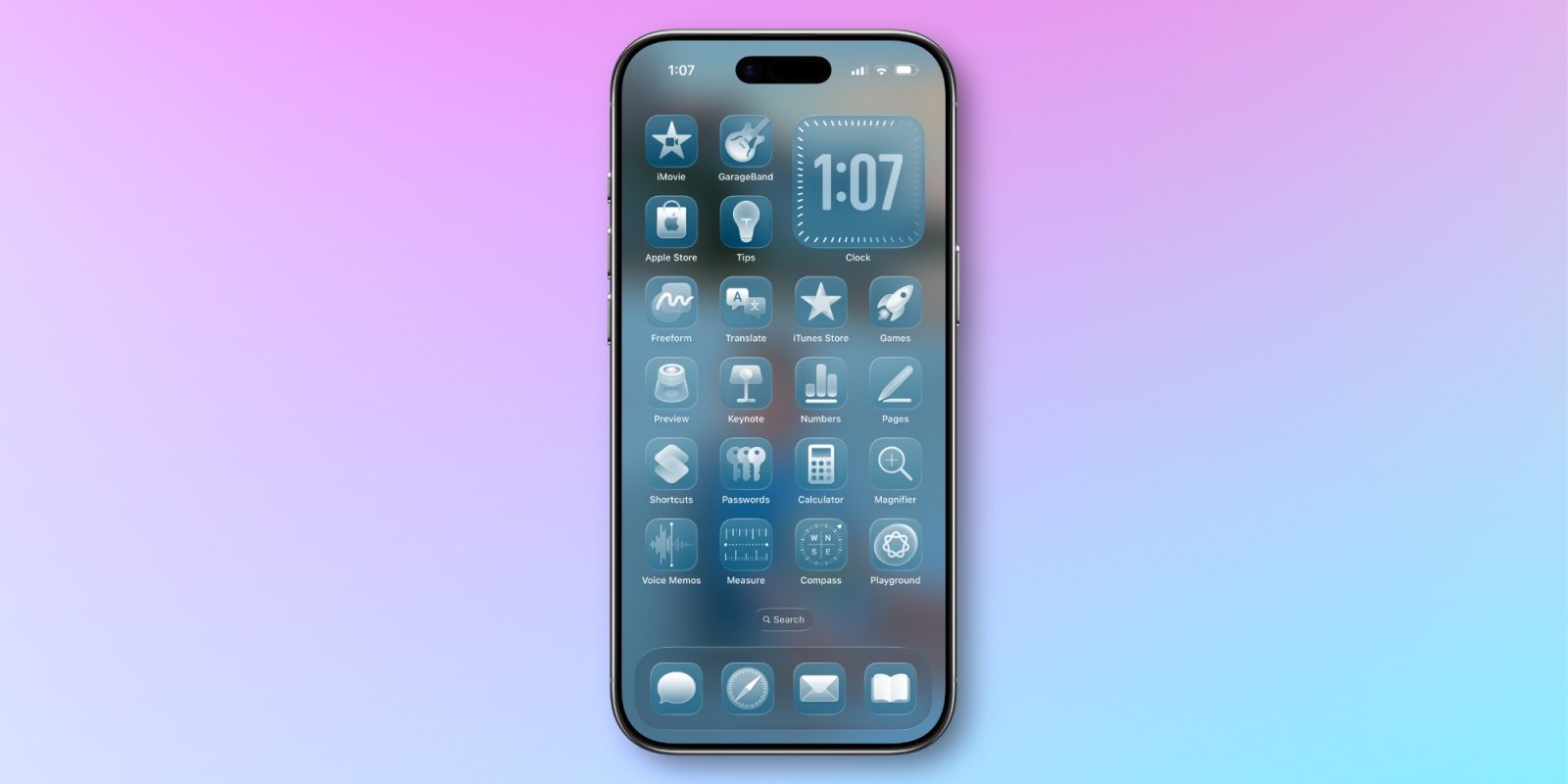
Over the past decade, Apple has fundamentally shifted its philosophy regarding the user interface of the iPhone. Once celebrated—and occasionally critiqued—for its tightly controlled, uniform aesthetic, iOS has steadily transformed into a deeply personalizable operating system. This evolution has not happened overnight. It represents a deliberate, multi-year progression that began with granular Lock Screen personalizations introduced in iOS 16, expanded into home screen icon color tinting with iOS 18, introduced clear and transparent icon options in iOS 26, and most recently integrated the dynamic "Liquid Glass" slider in iOS 27.
Yet, despite these monumental strides in visual individualization, a noticeable boundary remains. While users can alter the hues of their home screen applications, the deeper systemic UI elements—such as menu backgrounds, native toggles, system prompts, and application accents—frequently remain bound to traditional light and dark modes. As the mobile ecosystem matures, tech enthusiasts and design analysts alike are beginning to look past the imminent public release of iOS 27 and ask a logical, forward-thinking question: Should Apple introduce a system-wide color-theming engine akin to Google’s Material You, adapted for the Apple ecosystem?
This article explores the trajectory of iOS customization, examines existing system cues pointing toward a unified aesthetic framework, evaluates cross-platform precedents like macOS and Xcode, and projects what a holistic color-theming paradigm could mean for the future of Apple’s hardware and software integration.
Detailed Chronology: The Journey to Modern iOS Personalization
To understand where iOS is heading, it is necessary to examine how far the platform has traveled from its rigid, skuomorphic origins and the subsequent flat design era. For years, Apple maintained that a standardized visual identity was essential for user experience, accessibility, and brand cohesion. However, consumer demand for self-expression eventually prompted a strategic pivot within Cupertino’s software engineering division.
1. The Lock Screen Revolution (iOS 16)
The turning point for modern iOS customization arrived with iOS 16. For the first time, users were given the tools to fundamentally reshape the entry point of their iPhones. Apple introduced multi-layered wallpapers with depth effects, customizable clock fonts, color filters, and interactive widgets directly on the Lock Screen. This update broke the psychological barrier that had long kept the iPhone interface uniform across millions of devices worldwide.
2. Home Screen App Color Tinting (iOS 18)
Building upon the momentum of Lock Screen personalization, iOS 18 tackled the home screen grid. Apple introduced native app icon color tinting, allowing users to apply a uniform color filter across all application icons. While third-party workarounds using the Shortcuts app had existed for years, native integration meant that system-wide tinting could finally be applied cleanly, automatically respecting dark mode variants and contrast ratios without performance stutter.
3. Transparent Icons and Structural Transparency (iOS 26)
Continuing the quest for minimalist and dynamic home screens, iOS 26 pushed boundaries further by introducing "clear" and transparent app icons. This allowed users to showcase complex, detailed wallpapers without the visual obstruction of heavy icon backgrounds. Coupled with architectural UI shifts, the operating system began leaning heavily into layered transparencies, setting the technical groundwork for more advanced visual rendering engines.

4. The Liquid Glass Slider (iOS 27)
As developers prepare for the widespread adoption of iOS 27, the introduction of the new "Liquid Glass" slider has once again redefined how light and texture interact on mobile displays. This feature allows users to dynamically control the refraction, blur intensity, and specular highlights of UI cards and widgets. It demonstrates that Apple’s graphics and rendering pipelines are fully capable of real-time, resource-efficient visual transformations based on user preference.
Supporting Context & Metrics: The Case for System-Wide Theming
Despite these successive layers of personalization, a structural disconnect persists within iOS. Users can meticulously tint their home screen icons to a pastel pink, a deep navy, or an aggressive neon green, but the moment they open the Settings app, launch Safari, or receive a notification banner, they are thrust back into Apple’s default system styling—typically stark white, neutral gray, or pure black.
Bridging the Gap: The Material You Precedent
In the broader mobile landscape, Google’s Material You (introduced with Android 12) established a new benchmark for interface personalization. Material You dynamically extracts color palettes from the user’s active wallpaper and cascades those exact hexadecimal values across the entire operating system, influencing notification shades, Quick Settings toggles, third-party app headers, and system menus.
An iOS equivalent would not necessarily need to rely solely on wallpaper extraction. Given Apple’s ecosystem habits, a hybrid approach—combining icon color tinting, hardware-aware accessories, and manual color sets—would fit the brand ethos much more cleanly.
Hardware-Software Synergy: MagSafe and Beyond
Apple already possesses the foundational hardware telemetry to bridge physical accessories with digital themes. Last year, iOS 26 introduced a home screen setting designed to automatically match app icon color profiles with the specific colorway of an official MagSafe silicone or clear case attached to the iPhone.
If an iPhone can recognize that it is encased in a "Plum" or "Ultramarine" MagSafe silicone case and adjust the home screen iconography accordingly, extending that color profile system-wide is not a massive technical leap—it is the logical culmination of Apple’s ecosystem design strategy.
Desktop Parallels: macOS and Xcode
Critics of deep customization on iOS often point to uniformity as a pillar of mobile usability. However, Apple’s desktop operating system, macOS, has long offered system-wide accent color customization. Mac users can choose from a robust palette of accent colors (ranging from purple and pink to graphite) that dynamically tint buttons, radio controls, selection highlights, and scroll bars across both native and participating third-party applications.
Furthermore, during recent developer conferences, Apple introduced advanced color-theming controls within Xcode, the primary Integrated Development Environment (IDE) used by software engineers to build Apple ecosystem applications. Xcode’s modern workspace allows developers and designers to experiment with sophisticated, cohesive color schemes and semantic styling tokens. Bringing a fraction of that design flexibility and visual whimsy directly to the end-user on iOS and iPadOS would empower consumers without compromising software stability.
Official Perspectives and Industry Reception
While Apple’s Human Interface Guidelines (HIG) have historically guarded against excessive fragmentation, the company’s recent software iterations signal a softening stance. Executives and design leads have increasingly recognized that modern consumers view their smartphones not merely as utility devices, but as extensions of personal identity.
The Balance Between Cohesion and Customization
In past engineering sessions, Apple representatives have emphasized that personalization must never come at the expense of readability, accessibility, or core performance. Dynamic system-wide theming poses distinct challenges:
- Contrast Ratios: Automatically generated color themes must adhere to Web Content Accessibility Guidelines (WCAG) to ensure text remains legible against dynamically tinted backgrounds.
- Third-Party App Adaptation: While native apps would readily adopt system tint flags, developers of third-party applications would need simple, robust APIs to ensure their internal UI elements do not clash with a user’s chosen system theme.
Despite these hurdles, the industry reception toward incremental iOS personalization has been overwhelmingly positive. Tech analysts note that as hardware innovation plateaus—with annual smartphone upgrades focusing more on incremental internal improvements than radical physical redesigns—software personalization has become a primary battleground for consumer satisfaction.
Future Outlook: What Next for iOS and iPadOS?
As we look past the horizon of iOS 27 and toward future software milestones (such as early conceptual frameworks for iOS 28 and beyond), the integration of a holistic color-theming engine appears increasingly plausible.
1. Unified Design Tokens
To achieve true system-wide color harmony, Apple would likely implement a universal set of design tokens within UIKit and SwiftUI. These tokens would allow system elements and app views to reference abstract color roles (e.g., PrimaryContainer, AccentSurface, InteractiveHighlight) rather than rigid hex codes. When a user selects a custom system theme—whether derived from their wallpaper, their MagSafe case, or a custom palette—every participating interface element would instantly re-render to match.
2. iPadOS Consistency
The demand for deep customization is equally, if not more, pronounced on iPadOS. As iPads continue to blur the line between mobile computing and traditional desktop workstations (particularly with accessories like the Magic Keyboard), users expect desktop-class flexibility. System-wide color themes would help unify the iPad experience, making the tablet feel less like an oversized iPhone and more like a tailored computing canvas.

3. Developer Adoption and Ecosystem Buy-in
For a system-wide theming feature to truly succeed, Apple would need to provide developers with seamless tools—much like the asset catalogs in Xcode—to ensure their apps respect user-selected themes automatically. By leveraging automated SwiftUI modifiers, Apple could minimize the engineering burden on third-party developers while maximizing visual consistency across the entire App Store ecosystem.
Conclusion
Apple has proven over the past several operating system cycles that it is willing to rethink long-held dogmas regarding interface uniformity. From the Lock Screen overhauls of iOS 16 to the advanced glass rendering of iOS 27, the trajectory is clear: the iPhone is becoming a more personal, highly adaptable device.
Introducing a cohesive, system-wide color-theming engine—bridging the gap between home screen icon tints, MagSafe hardware accessories, and native application UI—represents the natural next step in this evolution. By borrowing design cues from macOS, Xcode, and even cross-platform industry standards, Apple has the opportunity to deliver a powerful, accessible, and deeply delightful personalization framework.
How would you feel about comprehensive color themes spanning the entirety of iOS and iPadOS? Would you embrace a fully harmonized color palette, or do you prefer the classic, neutral default aesthetic? The conversation is ongoing, and the future of Apple design remains yours to shape.