Executive Overview
For decades, the architectural evolution of web design has been bound by the constraints of layout tooling. When developers first abandoned the rigid limitations of table-based structures, they turned to floats, absolute positioning, and a patchwork of clever pseudo-element hacks to craft visual separation between layout items. The subsequent introduction of CSS Grid and Flexbox revolutionized layout design, offering robust distribution models for modern applications. Yet, a persistent friction point remained: styling the empty spaces—the gaps—between those layout items required cumbersome workarounds. Developers routinely injected extra markup, abused border properties, or relied on complex pseudo-element architectures simply to draw a line between elements.
That era is coming to a definitive close. With the official rollout of CSS gap decorations in Google Chrome and Microsoft Edge (starting with version 149), web developers are equipped with a native, highly controllable specification to style grid and flexbox gutters directly. Spearheaded by Microsoft’s Edge web platform team—in close collaboration with Chromium engineers and the broader CSS Working Group—this feature bridges a historical gap in the CSS specification. By extending the familiar multi-column column-rule property to apply seamlessly across both Grid and Flexbox, and by introducing entirely new longhand controls, the web platform has taken a massive leap forward in design expressiveness, code maintainability, and layout clarity.

This comprehensive technical report examines the historical context of gap styling, the recent standards refinement process driven by developer feedback, a granular walkthrough of upgrading a real-world personal site using the latest syntax, and an assessment of the future outlook for cross-browser interoperability.
Detailed Chronology: From Hacks to Native Standardization
The journey toward native gap decorations was neither short nor simple. To appreciate the magnitude of version 149, one must trace the progression of how developers historically handled layout borders.

The Era of Hacks and Workarounds
Before CSS Grid and Flexbox natively supported gutters, developers used margins to space elements out. However, if a design required a subtle dividing line between grid cells or flex items, standard borders could not be applied to the gaps because gaps, by definition, were non-paintable, empty spaces managed entirely by the layout engine.
To overcome this, developers invented several clever, albeit fragile, workarounds:

- The Border-on-Container Hack: Giving the parent container a background color and setting its grid/flex gaps to a specific width with a contrasting background color. While effective for simple checkerboard patterns, this approach failed entirely when layouts required complex overlapping items, responsive reflows, or multi-colored rules.
- Pseudo-Element Injection: Using
::beforeand::afterpseudo-elements to manually position absolute lines across container tracks. This approach bloated the DOM, introduced fragile coordinate calculations, and broke accessibility trees or responsive breakpoints. - Border-Right/Border-Bottom Overrides: Applying borders to individual items and meticulously removing them for the last item in a row or column using structural pseudo-classes like
:nth-child(). This method shattered under the weight of dynamic content, wrapping flex items, and irregular grid spans.
The Spark of Standardization
Recognizing these recurring developer pain points, the Microsoft Edge web platform team—alongside contributors from Google Chrome and the CSS Working Group—began designing a native solution. The core objective was simple: build upon established paradigms, specifically the column-rule property long used in multi-column layouts, and generalize it to modern grid and flexbox containers.
Early previews of the feature sparked intense community engagement. As developers began testing the initial implementations, their feedback loop proved invaluable. Early naming conventions and syntax structures underwent crucial refinements to maximize clarity, predictability, and developer ergonomics.

Key Syntax Refinements and Property Evolutions
Feedback from early testing cycles led to several breaking yet vital adjustments before the stable release in version 149:
| Old Terminology / Syntax | New Terminology / Syntax | Architectural Significance |
|---|---|---|
row-rule-outsetcolumn-rule-outset |
row-rule-insetcolumn-rule-inset |
The conceptual model was inverted. "Outset" was renamed to "inset" to better communicate that setting these properties now insets the rules inward from the outer edges of the decoration box. |
| No fine-grain control | New Longhand Properties:row-rule-inset-caprow-rule-inset-junctionrow-rule-inset-startrow-rule-inset-end(and corresponding column properties) |
Provides granular, independent control over outer ends (caps), intersections (junctions), and the starting/ending points of individual rules. |
gap-rule-paint-order |
rule-overlap |
Renamed for linguistic clarity. This property dictates the rendering layer hierarchy where horizontal row rules and vertical column rules cross each other. |
| N/A (New Addition) | rule-visibility-items |
A newly introduced control governing whether rules are painted next to entirely empty layout areas or grid tracks, keeping negative spaces clean. |
Supporting Context & Metrics: Code in Action
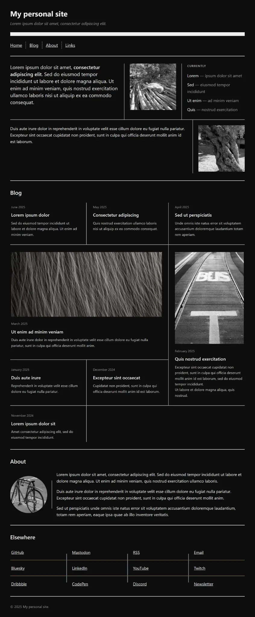
To fully understand how these modernized properties transform day-to-day front-end engineering, we can observe the evolution of a standard multi-section personal website layout. By migrating from legacy techniques to native gap decorations, the codebase shrinks dramatically while gaining advanced visual styling capabilities.

Baseline HTML Structure
Consider a modern semantic layout comprising a header, navigation bar, distinct content sections (home, blog, about, links), and a footer:
<body>
<header>
<h1>My personal site</h1>
<p class="tagline">Digital artisan and front-end architect.</p>
</header>
<nav>
<ul>
<li><a href="#home">Home</a></li>
<li><a href="#blog">Blog</a></li>
<li><a href="#about">About</a></li>
<li><a href="#links">Elsewhere</a></li>
</ul>
</nav>
<section id="home" class="home">
<div class="greeting">
<p class="lead">Building resilient systems for the modern web.</p>
</div>
<div class="photo">
<img src="cat.jpg" alt="A sleeping cat curled up on a desk." class="responsive-img">
</div>
<aside class="now">
<h3>Currently</h3>
<ul>
<li>Exploring <span>— Advanced CSS layout primitives</span></li>
</ul>
</aside>
<div class="note">
<p>Performance and accessibility remain core engineering metrics.</p>
</div>
</section>
<section id="blog" class="blog">
<h2>Blog</h2>
<div class="posts">
<article class="post feature">
<span class="date">June 2025</span>
<h3>The Anatomy of Next-Gen Layout Engines</h3>
<p>An exhaustive look into browser rendering pipelines and layout specifications.</p>
</article>
</div>
</section>
<footer>
<p>© 2025 My personal site. All rights reserved.</p>
</footer>
</body>Step 1: Fluid Layouts with Dynamic Repeaters
In initial implementations, layout dividers required hardcoded values matching static section counts (e.g., repeat(2, 2px solid #efefef)). By leveraging the new auto repeater keyword within row-rule, the page dynamically scales as content sections are added or removed:

body
  display: grid;
  gap: 4rem;
  margin: 2rem;
  row-rule:
    1rem solid #efefef,
    repeat(auto, 2px solid #efefef);


nav ul
  display: flex;
  flex-wrap: wrap;
  gap: 2rem;
  column-rule: 2px dashed #666;
Step 2: Flexbox Gap Decoration & Overlap Joins
When styling wrapping flex containers—such as the .home component—rules naturally span the full height of each flex line. To create a cohesive design where vertical column rules seamlessly meet horizontal row rules without clipping errors, developers apply the overlap-join value to the inset property:
.home
  display: flex;
  flex-wrap: wrap;
  gap: 3rem;
  rule: 2px solid #999; /* Shorthand for row-rule and column-rule */
  column-rule-inset: overlap-join;


.home > *
  flex: 1 1 12.5rem;


.home .greeting
  flex-basis: 26.25rem;


.home .note
  flex-basis: 22.5rem;
Step 3: Managing Empty Cells via rule-visibility-items
In complex grid architectures—such as a blog layout featuring posts that span multiple columns and rows—empty grid cells can cause awkward, dangling divider lines to bleed into whitespace. The newly introduced rule-visibility-items property resolves this elegantly:

.posts
  display: grid;
  grid-template-columns: repeat(3, 1fr);
  gap: 3rem;
  rule: 2px solid #999;
  rule-visibility-items: around;
  rule-inset: overlap-join;


.post.feature
  grid-column: span 2;


.post.tall
  grid-row: span 2;
By specifying rule-visibility-items: around;, gap decorations are only painted when at least one immediate side of the gap contains valid content. The gutter between two empty cells in trailing rows remains pristine, preventing accidental lines from extending into empty space.
Step 4 & 5: Precision Insets and Layer Overlaps
For components requiring visual breathing room, such as an author bio card with a circular avatar and descriptive text, rule insets can be measured explicitly:

.bio
  display: flex;
  align-items: center;
  gap: 2.5rem;
  column-rule: 2px solid #999;
  column-rule-inset: 2.5rem;
Furthermore, when mixing different rule widths and colors—such as in a multi-column link directory—developers can control the stacking context of crossing rules using rule-overlap:
.links ul
  display: grid;
  grid-template-columns: repeat(4, 1fr);
  gap: 1.5rem 2.5rem;
  row-rule: 1px solid #c9a96a;
  column-rule: 3px solid #6a707a;
  rule-overlap: column-over-row;
  column-rule-inset-cap: 1.75rem;
This ensures that the thicker column rules cleanly render over the thinner row rules, while column-rule-inset-cap neatly truncates the vertical rule extremities away from the outer container bounds.

Official Statements and Architectural Insights
The development and rollout of CSS gap decorations represent a collaborative milestone across browser vendor ecosystems. Key engineers from the Microsoft Edge team, Google Chrome, and the CSS Working Group shared critical insights regarding the architectural philosophy behind the feature.
Patrick Brosset, Senior Program Manager on the Microsoft Edge web platform team and pioneer of early gap decoration explorations, emphasized the shift in developer ergonomics:

"For years, developers have bent over backward with border tricks and structural pseudo-elements just to draw a simple line between grid items. Gap decorations elevate gutters from passive empty space into first-class design elements. What excites us most is the deep level of control—being able to manage intersections, outer caps, and visibility rules natively opens up typographic and architectural layouts that were previously painful to maintain."
Javier Contreras Tenorio, Software Engineer on the Chromium team who spearheaded the stable release deep dive, highlighted the rendering performance benefits:

"Moving gap rendering directly into the layout engine changes everything. Instead of forcing the Document Object Model to bear the weight of layout hacks, the browser calculates rules concurrently with grid and flex tracks. This guarantees pixel-perfect alignment, smooth responsive reflows, and zero layout thrashing."
Engineers from the CSS Working Group also noted that the introduction of properties like rule-overlap and rule-visibility-items establishes a scalable foundation for future layout decorations, ensuring the specification can accommodate increasingly sophisticated graphic design trends on the web.

Future Outlook and Ecosystem Adoption
As of version 149, CSS gap decorations are fully supported in Google Chrome, Microsoft Edge, and other Chromium-based browsers. This milestone represents a monumental victory for web standardization, immediately granting billions of end-users access to faster, cleaner, and more resilient web layouts.
Cross-Browser Interoperability
While Chromium-based browsers have taken the lead in stable implementation, other browser engine teams have actively participated in standards discussions within the W3C CSS Working Group. Historically, once a layout primitive proves its stability and developer utility in one major engine, competing engines accelerate their implementation timelines to maintain competitive parity. Front-end developers can safely begin utilizing gap decorations today via progressive enhancement, ensuring that older browser versions gracefully fall back to standard gap spacing without visual breakage.

Documentation and Developer Tooling
To support ecosystem-wide adoption, comprehensive documentation is actively rolling out across platforms like MDN Web Docs. Furthermore, interactive web playgrounds and open-source demonstration repositories hosted by Microsoft Edge provide developers with real-time testing environments. These tools allow engineers to experiment with rule-inset, rule-overlap, and rule-visibility-items parameters instantly, observing how layout gutters react to dynamic content changes.
Conclusion
The arrival of native CSS gap decorations marks the end of an era defined by layout workarounds and the beginning of a streamlined future for web architecture. By transforming gutters into fully stylable, highly controllable visual elements, the CSS specification continues to mature, empowering developers to build sophisticated, maintainable, and visually stunning digital experiences with unprecedented ease.