Executive Overview
For the better part of the last decade, dark mode has evolved from an aesthetic novelty into an expected standard of digital hygiene. Platforms, operating systems, and countless web applications now ship with sophisticated theme-switching capabilities designed to reduce eye strain, conserve OLED battery life, and cater to user comfort. Yet, as developers and designers rush to implement these features, a silent, persistent design anti-pattern has taken root across the web: the cluttered, tri-state persistent navigation toggle.
In a recent, widely discussed discourse sparked by web standards expert and developer Lea Verou, the UI/UX community has begun reckoning with a fundamental question: Why do websites insist on offering explicit "Light," "Dark," and "System" options in their primary navigation bars?
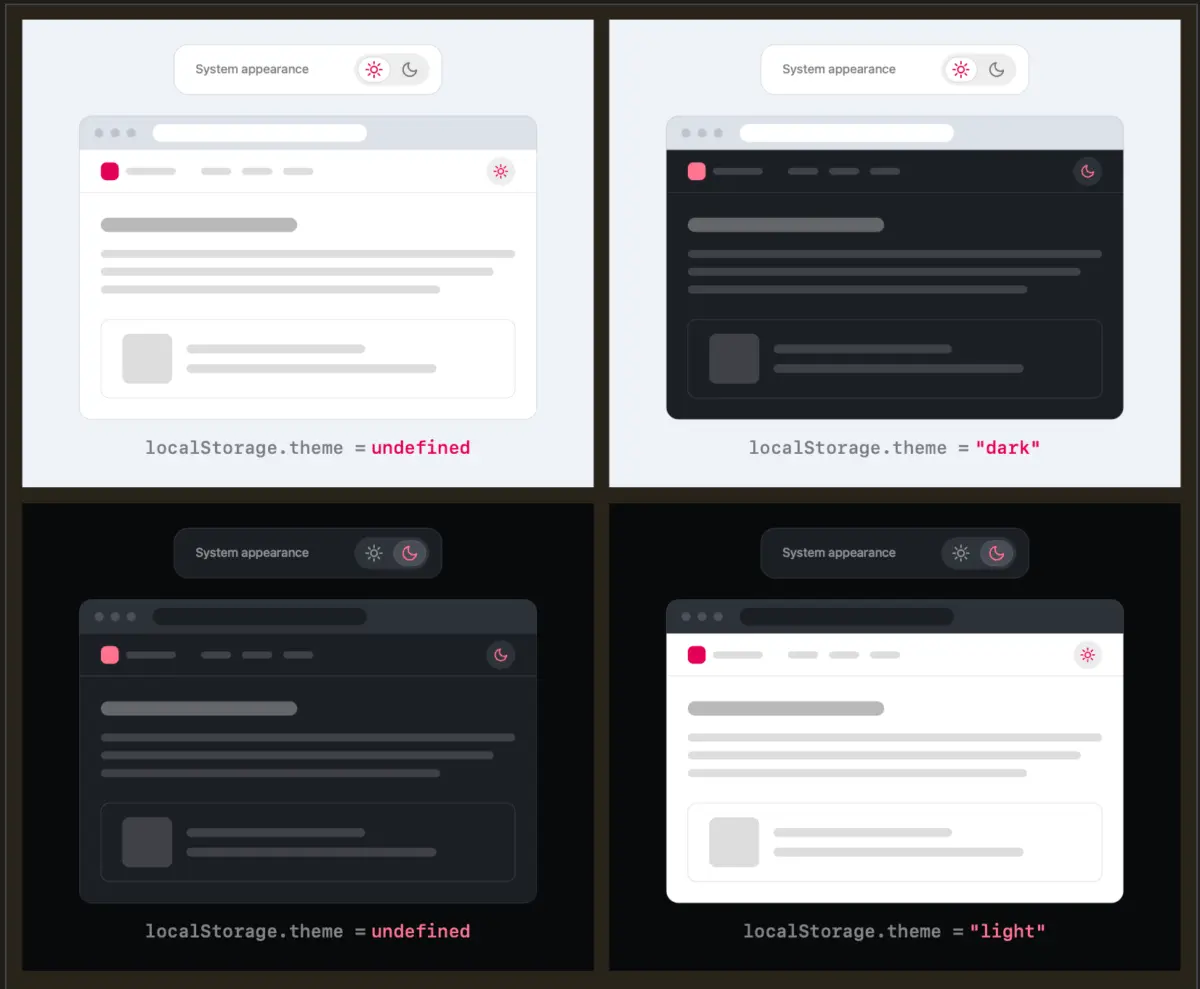
Verou’s core thesis is deceptively simple: a well-crafted, intuitive two-state control is entirely sufficient to express all three underlying states. Rather than wasting precious digital real estate and introducing cognitive friction into a user’s primary journey, websites should gracefully inherit the user’s operating system preferences by default, saving manual overrides to localStorage only when a user actively chooses to break away from that default.
This deep dive examines the anatomy of the dark mode debate, exploring the cognitive psychology of interface design, the technical nuances of persistent UI elements, and the evolving philosophy of how humans interact with digital color schemes.
Detailed Chronology: The Evolution of the Dark Mode Debate
The Rise of System-Level Inheritance
When browser vendors and operating system architects first introduced native dark mode toggles at the system level, it was heralded as a massive leap forward for user personalization. Suddenly, a user’s entire digital environment—from native file explorers to web browsers—could pivot from searing white to deep charcoal with a single master switch.
To bridge the gap between operating systems and the decentralized web, the prefers-color-scheme media query was introduced. This allowed web developers to query the user’s system preferences automatically. Suddenly, websites could natively respect whether a user preferred a light or dark interface without requiring any manual interaction on the page itself.
The Proliferation of the Tri-State Widget
As websites rushed to provide custom user controls—frequently housed in site headers or footers—designers fell back on a literal interpretation of user choices. If a website honors the system, but allows light and dark overrides, the logical UI component seemed to be a three-way toggle:
- Light Mode
- Dark Mode
- System / Auto
While functional, this approach introduced visual overhead. Dropdown menus, segmented control buttons, or cycling icons began cluttering headers that were already burdened with search bars, user profiles, authentication buttons, and core navigation links.
Verou’s Intervention and Community Pushback
In her seminal blog post on modern dark mode toggles, Lea Verou challenged the status quo. She argued that the "System" option in a persistent, on-page navigation bar is largely redundant.
According to Verou, a two-state control can seamlessly handle all scenarios. If a user visits a site with no prior preference, the site falls back to the system settings. The moment a user interacts with the toggle to force a change (e.g., switching from a light system default to a preferred dark reading experience), that override is locked in and saved to localStorage.
The community reaction was immediate and polarized. While many front-end engineers and UI/UX purists praised the minimalism, others raised edge-case concerns regarding state persistence: What happens when a user toggles back and forth? Does the application return to an undefined localStorage state (effectively re-engaging the system default), or does it stubbornly hold onto an explicit override?
Following the initial wave of debate, Verou published a comprehensive follow-up addressing these critiques. She doubled down on her original premise, emphasizing that theme switching is rarely, if ever, a user’s primary intent when arriving at a website. Therefore, making users parse a complex tri-state selector creates unnecessary cognitive load for an entirely secondary feature.
Supporting Context & Metrics: The Psychology of Interface Clutter
To understand why Verou’s arguments resonate so deeply with UX professionals, we must examine the cognitive load theory governing modern web design. Every visual element introduced into a persistent navigation bar demands a fraction of the user’s cognitive processing power.
Cognitive Dissonance and Persistent UI
In UI design, persistent elements are those that remain static across every page view—most notably the header and navigation bar. When a user lands on a content-driven website, their primary intent is consumption (reading an article, purchasing a product, finding documentation).
If a header features a complex tri-state theme switcher, the user’s brain must process three distinct pieces of information:
- What is the current visual state of the site?
- What does this icon/text label currently represent?
- What will happen if I click it, and how does it relate to my operating system settings?
This micro-hesitation contributes to cognitive friction. By reducing the control down to a minimalist two-state toggle—or eliminating it entirely in favor of strict system-level inheritance—designers remove points of friction, allowing the user’s primary intent to take center stage.
The Browser-Level Solution
The debate has also reignited broader conversations about where color scheme preferences actually belong. As highlighted in community discussions surrounding the debate (such as contributions from developer Chris Coleman on decentralized platforms like Bluesky), many users harbor a fundamental frustration: “All I ever wanted was for my OS to be dark, not every website I look at.”
The forced coupling of system-wide dark modes with web content has long been a point of contention. Coleman and other industry voices argue that granular light/dark preferences are fundamentally a browser-level concern, not something every individual web publisher should feel obligated to solve via custom UI components. If browsers eventually standardize native, per-site or global browser-level preference controls, the need for bespoke, on-page theme switchers will vanish almost entirely.
Official Perspectives & Expert Insights
While the debate remains centered within the developer and UX communities, the consensus among design thought leaders points toward a paradigm shift in how we handle secondary preferences.
When Are Three States Actually Justified?
Even as she champions the two-state model, Verou concedes that there are rare, highly specific edge cases where a tri-state control is genuinely appropriate. These typically manifest in complex applications—such as enterprise software dashboards, integrated development environments (IDEs) running in the browser, or design systems—where users spend hours in deep work sessions and require explicit, granular control over environment variables.
However, for standard content sites, blogs, marketing pages, and general web applications, the tri-state switcher is categorized as over-engineering.
The Philosophy of "Get Out of the Way"
The underlying philosophy driving this movement is best summarized by Verou’s perspective on user intent:
"Remember, this control is entirely tangential to the actual user goal for visiting the website. Even if their intent were to pin light instead of reverting to System (light), this is something they would only notice once these diverge, i.e. the OS switches to dark. At that point, fixing it is a single click away. It’s such an easy fix, that there is no point in dwelling on it further."
This quote encapsulates a vital truth of software and web design: designers frequently overestimate how much users care about managing minor preferences. If a site respects the user’s system 99% of the time, and requires a single, frictionless click to override it the 1% of the time it matters, the system has succeeded brilliantly.
Future Outlook: Where Web Design Goes From Here
As the digital landscape matures, the pendulum of design philosophy is swinging back toward radical simplicity. The era of maximalist UI—where every conceivable setting, toggle, and customization option was crammed into the user’s face—is giving way to intelligent defaults and contextual adaptation.
What Developers and Designers Should Do Now
For teams currently building or auditing web interfaces, the insights from the Verou debate offer clear, actionable takeaways:
- Audit Persistent Navigation: Examine your site’s header. Is a dark mode toggle truly necessary, or can the site rely entirely on
prefers-color-schemewithout user intervention? - Embrace the Two-State Paradigm: If a persistent toggle is required due to user demand or brand guidelines, strip it down from three states to two. Let the system handle the initial baseline, and let the toggle act purely as an override switch stored safely in
localStorage. - Minimize Cognitive Noise: Remember that secondary controls should never shout louder than primary content. Keep interactions subtle, fast, and completely transparent.
The Ultimate Destination: No Toggle At All
Perhaps the most profound takeaway from the ongoing dark mode discourse is that the ultimate UI/UX triumph may not be a better toggle—it might be the complete absence of one. As browser intelligence improves, operating systems become more context-aware, and AI-driven adaptive interfaces evolve, the need for manual theme-switching controls may fade into digital history. Until then, stripping away unnecessary states and embracing minimalist design remains our best path forward.