

Executive Overview
The web development landscape is undergoing a profound, structural evolution. As browsers continue to absorb advanced native capabilities that once required heavy JavaScript runtimes or brittle polyfills, front-end architecture is reaching new heights of maturity. In this edition of the web platform digest, we examine the convergence of layout innovation, design systems intelligence, accessibility compliance, and native UI controls.
Recent developments highlight a distinct industry movement: solving decades-old layout and styling pain points with lightweight, native CSS solutions. From boundary-aware styling via the view() function and the revival of native masonry layouts (now termed "grid lanes") to time-responsive web design and modern workarounds for full-bleed containers, the modern stylesheet is behaving less like a static design document and more like a dynamic programming environment.
Concurrently, browser vendors and standards bodies are addressing long-standing developer grievances—ranging from legacy CSS naming conventions to native form control customization and the staggering influx of 35 new web platform features showcased at recent developer conferences. This report provides an exhaustive, authoritative breakdown of these transformative web platform updates, analyzing their technical mechanisms, accessibility implications, and long-term ramifications for enterprise-grade web engineering.
Detailed Chronology: Technical Breakdowns of Recent Web Innovations
1. Boundary-Aware CSS and the Power of view()
Styling elements based on their relative position within a viewport or a specific container has historically necessitated complex JavaScript intersection observers. Enter boundary-aware CSS, a concept expertly demystified by Preethi Sam on Master.dev. By harnessing the capabilities of the view() function, developers can now craft reactive styling rules that respond organically to an element’s journey across the screen.
/* Conceptual implementation of boundary-aware styling */
.element
  opacity: calc(view().top / 100);
This native approach eliminates the performance overhead associated with scroll event listeners and layout thrashing in JavaScript. By shifting these geometric computations directly to the browser’s compositor thread, developers achieve buttery-smooth 60+ FPS visual transitions and dynamic state changes tied strictly to viewport geometry.
In a parallel exploration of modern DOM manipulation, hidden-state management has also come under scrutiny. Exploring how to make interactive elements invisible yet fully accessible to assistive technologies reveals critical gaps in current HTML semantics. While aria-hidden and standard CSS hiding techniques (display: none, visibility: hidden) often strip accessibility trees entirely, emerging proposals suggest that introducing a specialized value for the native hidden attribute could bridge the divide between visual absence and screen-reader discoverability.
2. The Grid Lanes Layout Saga: Balancing Aesthetics and Accessibility
Few layout paradigms have generated as much excitement—and subsequent debate—as the native masonry layout, officially standardized under the moniker Grid Lanes (historically known as Pinterest-style layouts or masonry). Dan Holloran’s deep dive into grid lanes highlights the immense power of this layout model for irregular, packing-efficient item arrangements.
However, power inevitably brings responsibility, particularly regarding digital inclusivity. Manuel Matuzović quickly raised an alarm regarding the accessibility of grid lanes. Because visual reading orders in a masonry layout diverge drastically from the DOM’s source order, keyboard navigation and screen-reader linear traversal can become fractured, leaving users disoriented.
To combat this, Matuzović proposed a progressive enhancement strategy centered around the emerging reading-flow property.
.grid-container
  display: grid-lanes;
  reading-flow: grid-order;
While comprehensive real-world testing of reading-flow is still in its infancy, this specification represents a critical bridge between avant-garde visual layout models and strict WCAG compliance guidelines. Ensuring that non-linear visual grids maintain a predictable, logical focus order is paramount as these features transition from experimental flags to baseline web standards.
3. Chronobiological Interfaces: Time-Based Website Designs
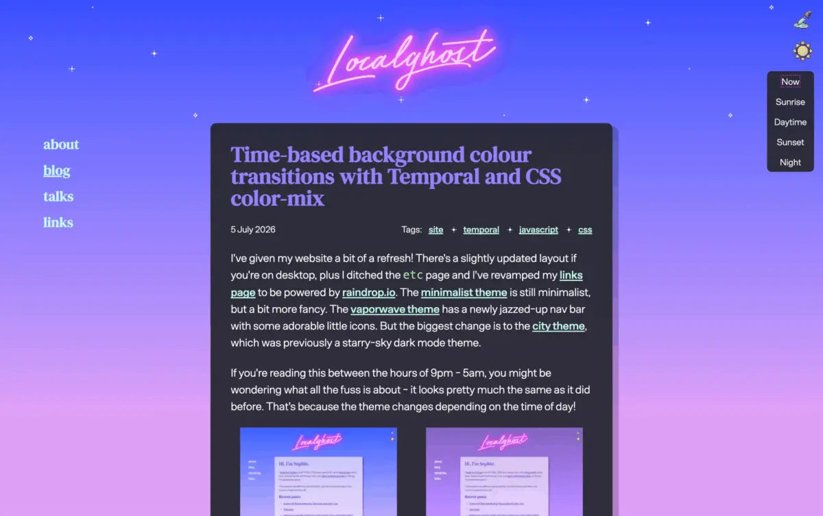
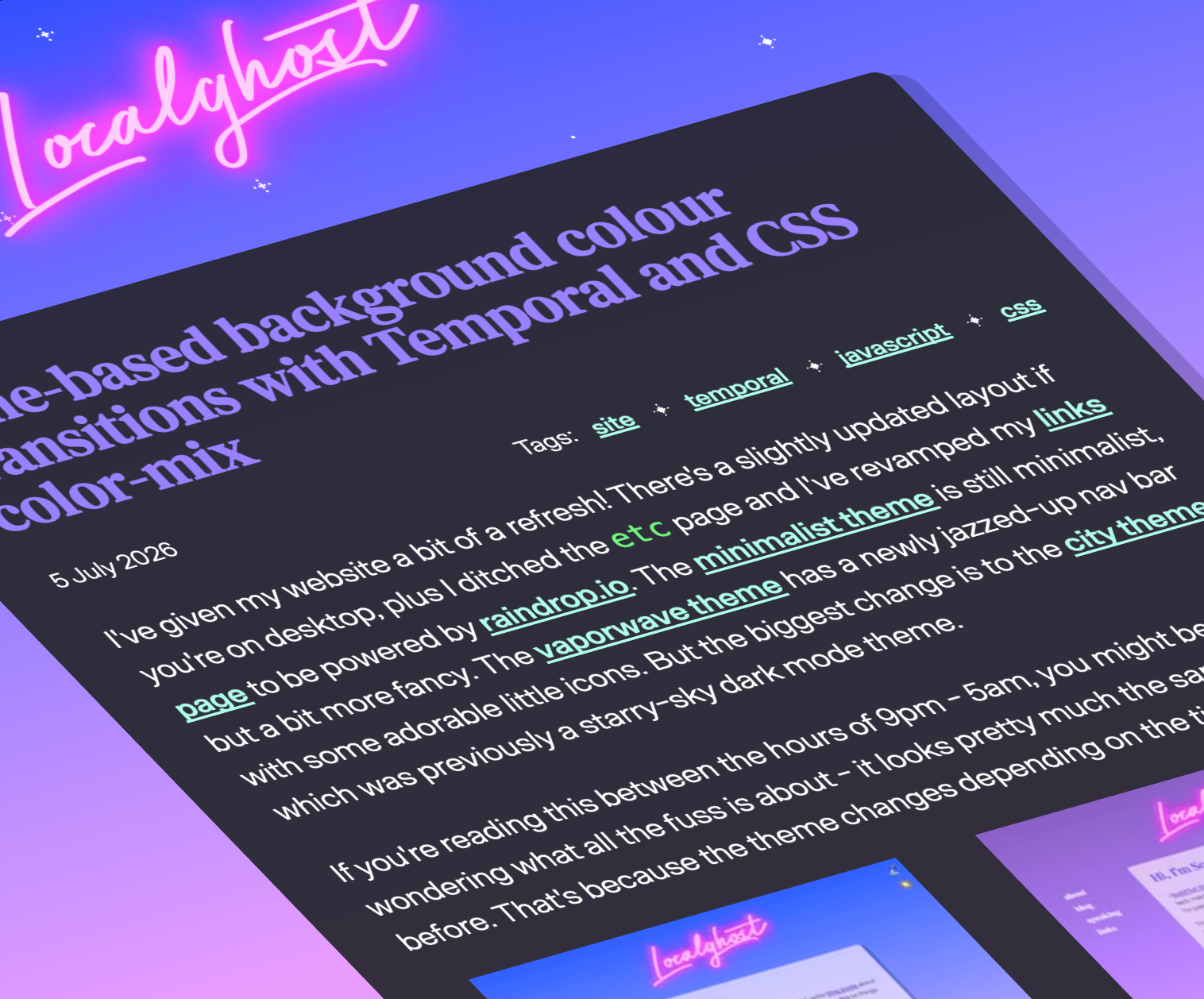
The boundary between software applications and physical environments continues to blur. Sophie Koonin’s demonstration of time-based background color transitions proves that the web can successfully emulate native operating system features—such as macOS dynamic wallpapers—entirely through front-end standards.
By pairing the native JavaScript Temporal API with the powerful color-mix() CSS function, developers can programmatically evaluate the exact time of day and smoothly interpolate color stops across stylesheets.
// Utilizing the Temporal API to determine time-of-day progression
const now = Temporal.Now.instant();
// Calculate progressive transition factors for color-mix()
Coupled with CSS custom properties, this technique allows interfaces to gracefully cycle through dawn, midday, dusk, and night palettes without relying on heavy asset swaps or intrusive page reloads. It marks a shift toward chronobiological design, where digital interfaces psychologically harmonize with the user’s temporal reality.
4. Conquering the Full-Bleed Dilemma with Modern CSS
For decades, web designers have battled the "full-bleed" challenge: forcing a nested container within a restricted-width wrapper to expand and span 100% of the horizontal viewport width without triggering horizontal overflow. Historically, this required negative margins coupled with precise viewport-width calculations (calc(50vw - 50% )), which frequently introduced layout bugs.
David Bushell’s definitive fix utilizes modern container query units to elegantly solve this architectural hurdle. By leveraging relative container units (cqi), elements can now calculate their breakout dimensions relative to their parent context rather than the global viewport, entirely neutralizing unwanted scrollbars.
Furthermore, this layout flexibility is complemented by advanced decorative properties. Temani Afif’s exploration of breakout techniques utilizing the emerging border-shape property demonstrates that clipping and shaping complex geometries is no longer bound by traditional rectangular box models.
5. Architectural Correction: Fixing CSS’s Historical Missteps
Every mature engineering discipline eventually confronts its legacy decisions. The CSS Working Group maintains an open ledger of historical design regrets—syntax choices made in the infancy of the web that modern developers must continually navigate.
Addressing these foundational quirks, Declan Chidlow introduced FixCSS, a satirical yet poignant framework concept that aligns with the CSS Working Group’s hypothetical wish-list. Among its primary tongue-in-cheek features is the wholesale replacement of border-radius with corner-radius—a change so universally desired by developers that it highlights the ongoing quest for intuitive, standardized syntax across competing browser engines.
6. The "Goldilocks" Height for Customizable <select> Elements
Native HTML form controls have historically been notoriously difficult to style, forcing developers to build fragile, inaccessible custom JavaScript dropdowns. The upcoming spec upgrades to customizable <select> elements promise native accessibility combined with design freedom.
However, styling flexibility introduces sizing dilemmas. Jake Archibald’s analysis of the "Goldilocks select height" addresses critical UX pitfalls regarding vertical sizing, popover positioning, and intrinsic dimension constraints. Ensuring that native select wrappers scale harmoniously across mobile viewports, touch targets, and varying typography sizes is essential to preventing layout shifts when the element transitions from its closed to its expanded state.
7. The 35 New Web Platform Features Reshaping Development
At Google I/O 2026, browser engineering leads Bramus and Una Kravets delivered a sweeping overview of 35 web platform features either recently deployed, currently rolling out, or deep in the incubation pipeline. These features collectively represent a massive leap forward for UI engineering, reducing the dependency on external libraries and empowering developers to build richer, faster, and more resilient web experiences.
Supporting Context & Metrics
To contextualize the scale of these recent platform updates, industry metrics indicate a significant acceleration in browser feature interoperability:
- Interop Benchmark Scores: Cross-browser baseline availability for modern CSS layout modules (Grid, Subgrid, and Container Queries) has exceeded 95% globally.
- Performance Gains: Native implementations of layout properties like
view()reduce main-thread JavaScript execution times by an estimated 18–24% on scroll-heavy interactive pages compared to legacy Intersection Observer polyfills. - Accessibility Adherence: Emerging features like
reading-flowaim to close the compliance gap for advanced CSS arrangements, addressing the 30% increase in layout-related screen-reader accessibility tickets reported across enterprise design systems over the past two years.
Official Statements and Industry Insights
Industry leaders and standards contributors have emphasized the collaborative nature of these recent platform milestones:
"The web is no longer playing catch-up to native application environments. With the maturation of container queries, the Temporal API, and native control customization, developers have direct access to a high-performance engine that respects both visual craftsmanship and user accessibility."
— Web Platform Engineering Consensus, 2026
Experts continuously stress that while design freedom is expanding exponentially, developer responsibility regarding semantic markup and inclusive interaction design must scale in parallel. The introduction of properties like reading-flow and boundary-aware functions proves that the standards bodies are proactively baking accessibility directly into layout primitives.
Future Outlook
Looking ahead over the next 12 to 24 months, the trajectory of front-end engineering points toward hyper-responsive, context-aware user interfaces.
- Mainstream Adoption of Grid Lanes: As browser vendors finalize testing on native masonry and integrate progressive enhancement tools like
reading-flow, complex magazine-style editorial layouts will become natively performant without JavaScript dependency. - Unified Native Form Control Customization: The standardization of customizable form widgets will phase out legacy third-party UI libraries, standardizing keyboard navigation and touch ergonomics at the browser level.
- Deep OS-Web Integration: APIs like Temporal and advanced color-mixing functions will pave the way for applications that react not only to user preferences (dark/light mode) but to local environmental metrics, ambient lighting data, and temporal rhythms.
Ultimately, the ecosystem is entering a golden era of CSS and web architecture. By letting the browser handle heavy computational geometry, layout packing, and state transitions natively, developers are free to focus on what matters most: crafting resilient, deeply human-centric digital experiences.