
Executive Overview
For the past decade, the visual landscape of the internet has been governed by an unyielding dictator: ultra-minimalism. From high-fashion houses to Silicon Valley tech behemoths, companies stripped away shading, ornamentation, gradients, and distinctive typography in favor of flat, sterile sans-serif fonts and muted color palettes. It was an era defined by clean lines, corporate neutrality, and a desperate bid to appear forward-thinking, accessible, and algorithmic-friendly.
Now, that era is coming to a messy, fragmented end.
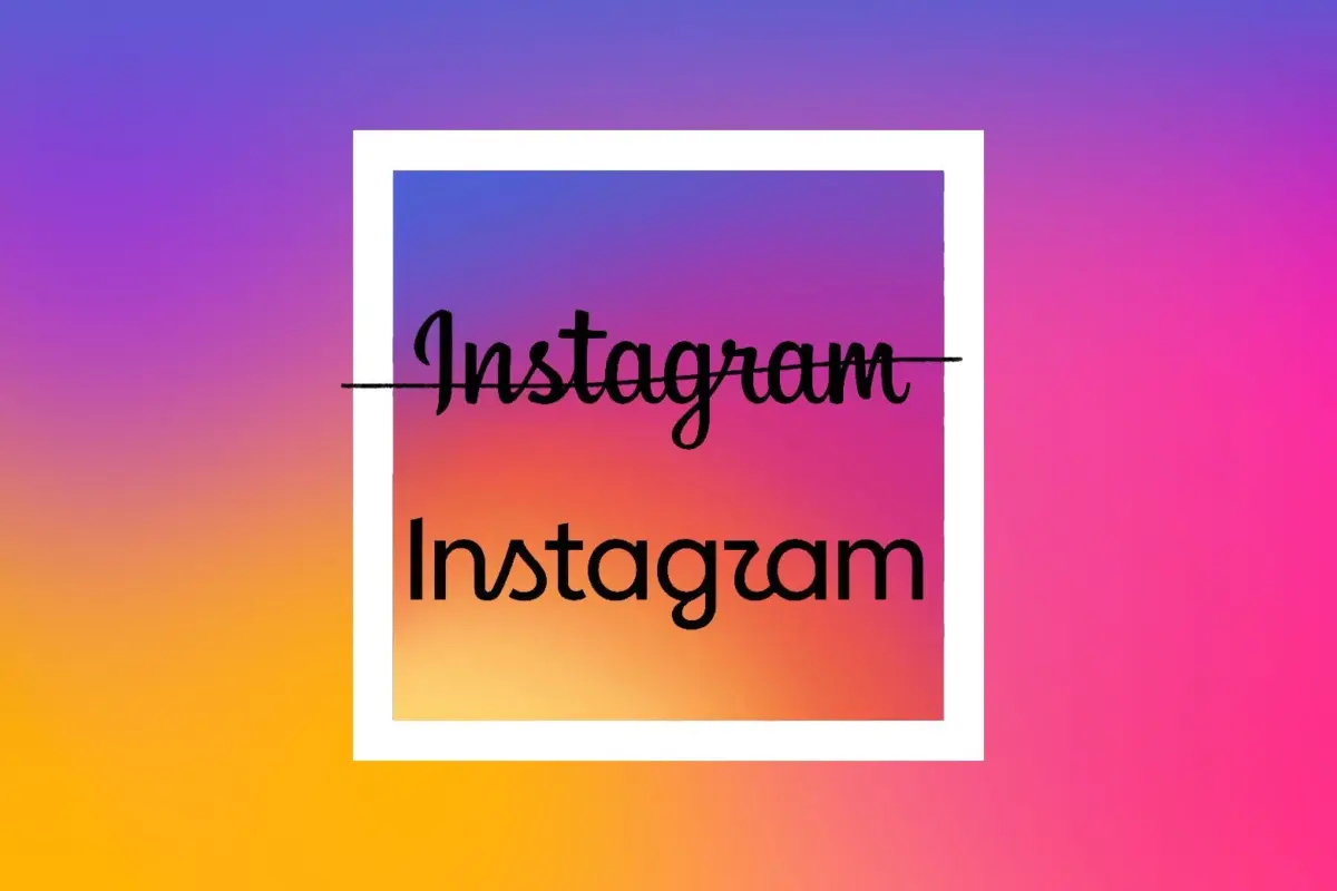
Instagram’s recent, highly publicized decision to unveil its first-ever new wordmark—stepping away from its signature 14-year-old cursive script in favor of a hybrid design—has ignited a firestorm across the design community and social media at large. The new logo, featuring a predominantly sans-serif structure punctuated by awkward, remaining cursive letters (“S” and “R”), was instantly pilloried by users. Within hours, internet sleuths and critics dubbed the unreadable new banner Instagzam.
Beyond the immediate internet mockery, however, Instagram’s pivot represents a critical turning point. It highlights a broader identity crisis sweeping through the tech industry. As millennial-gray minimalism falls out of favor, brands are scrambling to forge a new aesthetic identity. Yet, as Instagram’s clumsy hybrid wordmark proves, the transition away from minimalism is proving awkward, uninspired, and—above all—unwanted.
Compounding the timing of this visual overhaul are heavy background pressures: Meta is currently navigating high-stakes legal battles regarding child safety on its platforms. As the company faces potential foundational restructuring due to upcoming regulatory mandates, the new visual identity feels less like a organic creative evolution and more like a calculated distraction—a fresh coat of digital paint on a house undergoing structural inspection.
Detailed Chronology: From Cursive Roots to the "Instagzam" Era
To understand why Instagram’s new wordmark feels so jarring, one must look back at the platform’s visual history. Launched in 2010, Instagram was born during the golden age of skeuomorphism—an era where digital buttons looked like physical objects, and apps embraced rich textures, shadows, and handcrafted details. The original Instagram logo featured a retro Polaroid camera, complemented by a whimsical, hand-drawn cursive wordmark that screamed analog nostalgia.
As the platform evolved under Meta’s (then Facebook’s) ownership, the aesthetic shifted. In 2016, Instagram dropped its iconic skeuomorphic camera for the now-ubiquitous vibrant gradient app icon and a cleaner, though still stylized, script wordmark. For ten years, that cursive banner remained the unchanging anchor of the user experience, resting quietly at the top of millions of feeds daily.
The October 2026 Reveal
The silence was broken in October 2026, when Instagram head Adam Mosseri officially announced the rollout of the platform’s new brand system. In a post detailing the refresh, Mosseri stated:
“The wordmark at the top of the app hasn’t changed in 10 years, so it was time for a refresh. Cleaner and more modern, with references to the original and the simplicity and craft that’s always made it Instagram.”
Despite the executive framing, the public reaction was instantaneous and brutal. The new design merges a stark, modern sans-serif typeface with the remnants of the old script font—specifically retaining a looping cursive S and an awkwardly trailing R.
The resulting optical illusion rendered the name nearly unreadable to casual scrollers, sparking immediate viral critique across competing platforms like TikTok, X (formerly Twitter), and threads. Brands including KitKat, ChatGPT, Canva, and Wendy’s swiftly joined in on the dogpiling, mocking the uninspired typography.
The Cultural Resonance of "Tech-Bro Core"
Critics were quick to point out the specific cultural aesthetic the new logo evokes. It matches the visual language of modern, venture-backed digital products like Substack, Goodreads, Hinge, and various direct-to-consumer lifestyle brands. It is an aesthetic that sits uncomfortably at the intersection of aggressive corporate tech-bro ambition and performative intellectualism—reminiscent of farmers market canvas totes, unread copies of classic literature, and the ubiquitous scent of Le Labo’s Santal 33.
Rather than signaling authentic innovation, Instagram’s hybrid typeface read to many consumers as an uninspired compromise: a hesitant step away from the past that lacked the courage of a true, forward-looking redesign.
Supporting Context & Metrics: The Death of Flat Design
Instagram’s typographical stumble does not happen in a vacuum. It is part of a massive, industry-wide reckoning with visual identity. For over a decade, consumer tech and retail companies chased the "Apple-ification" of design.
The Rise and Fall of Corporate Minimalism
In the 2010s, iconic legacy brands stripped their identities of character. Warner Bros., Pringles, Burger King, and countless tech startups flattened their logos into uniform, unpretentious sans-serif wordmarks. Design analysts termed this the era of "brand homogenization," where every company began to look indistinguishable from the next.
However, consumer sentiment metrics over recent years have signaled a sharp fatigue with this minimalist homogeneity. Studies by consumer research firms, including Business Insider, indicate that modern audiences increasingly view ultra-minimalist logos as sterile, corporate, and lacking in authenticity.
The Counter-Revolutions: Gradients, Serifs, and "Liquid Glass"
As a result, companies have spent the past several years attempting to claw their way out of the flatpack design trap:
- The AI Serif Obsession: Emerging artificial intelligence firms have overwhelmingly embraced classic serif fonts, attempting to lend a veneer of humanistic, scholarly prestige to software designed to automate human labor out of the equation.
- Google and Apple Redesigns: Google injected rich gradients back into its Workspace app icons (Gmail, Docs, Sheets), while Apple introduced controversial interface updates like "Liquid Glass," moving away from absolute flatness toward dimensional, light-reflecting textures.
- DTC Pastels: Venture-backed consumer spaces—from trendy coffee chains like Blank Street Coffee to modern dental clinics like Tend—swapped aggressive neons for soft pastel greens and tactile branding elements.
Yet, as brands attempt to inject personality back into their digital real estate, they frequently overshoot the mark. The result is a cycle of consumer backlash where every new design choice is met with fierce public resistance.
A History of Public Backlash
Consumer aversion to corporate redesigns is practically a tradition at this point. Consider the public vitriol directed at:
- Spotify: The temporary "Elphabean" disco-ball icon rolled out for the app’s 20th anniversary, which baffled users.
- Kia: Its futuristic, hard-to-read font change that initially left motorists squinting at steering wheels wondering what brand of car they were driving.
- Airbnb: The 2014 introduction of its "Bélo" logo, which drew widespread internet mockery for its biological resemblance to human anatomy.
- Cracker Barrel: A recent, disastrous attempt to modernize its historic branding with an Apple Store-esque aesthetic, resulting in public outrage so severe it culminated in the CEO stepping down.
Against this backdrop, Instagram’s botched wordmark launch fits comfortably into a long lineage of corporate miscalculations where design teams mistake confusion for innovation.
Official Statements and Corporate Timing
The rollout of Instagram’s new brand system—which encompasses not just the controversial wordmark, but an entire suite of new typefaces, icons, and post-formatting tools—raises significant questions regarding corporate strategy and timing.
The Shadow of Regulatory Trials
While Adam Mosseri and Meta’s design teams have framed the update purely through the lens of aesthetic evolution and the passage of time, industry analysts note the striking coincidence of its release. The rebranding coincides directly with high-stakes federal scrutiny, including landmark trials involving Meta CEO Mark Zuckerberg and former engineers testifying over the documented mental health harms and child safety failures associated with Instagram and Facebook.
Legal and tech analysts suggest that major platform redesigns are frequently deployed during periods of corporate crisis. Introducing a fresh visual interface serves multiple strategic purposes:
- Shifting the Narrative: It draws media attention away from courtroom battles and regulatory hearings toward consumer-facing design debates.
- Preparing for Structural Change: If upcoming federal mandates force fundamental operational changes to Instagram’s algorithm, feed structures, or youth safety protections, a visual refresh softens the ground, making the app feel "new" and masking deeper architectural modifications.
Despite these underlying pressures, Meta’s official design blog maintains that the new brand system was crafted to honor the platform’s community while modernizing its toolkit for the next decade of digital media consumption.
Future Outlook: Where Tech Design Goes From Here
As the minimalist era officially gasps its last breath, the tech industry stands at a crossroads. The pendulum has swung away from the flat, sterile, millennial-gray aesthetics of the 2010s, but the destination remains deeply uncertain.
Instagram’s Instagzam fiasco serves as a cautionary tale for product designers and brand strategists alike. It demonstrates that simply grafting old elements (like a stray cursive S) onto a modern sans-serif frame does not create a bridge between past and future; rather, it creates an unreadable hybrid that satisfies no one.
What Lies Ahead for Digital Branding?
- The Death of Universal Readability: As brands desperately try to stand out in a saturated market, expect more experimental, idiosyncratic, and potentially polarizing typography. Legibility may increasingly take a backseat to brand differentiation.
- Nostalgia-Driven Hybridization: Companies will continue trying to mine their heritage for authenticity, leading to more awkward pairings of retro aesthetics with hyper-modern software architecture.
- The AI Aesthetic Backlash: As consumers grow increasingly weary of the calculated, seriffed branding utilized by generative AI startups, a counter-movement celebrating raw, unpolished, or intentionally anti-corporate design may emerge.
Ultimately, Instagram’s new wordmark is a fitting monument to the current cultural moment: awkward, transitional, and slightly confusing for everyone involved. In a few years, younger users won’t even remember what the original cursive script looked like, older users will continue adapting to the shifting digital landscape, and everyone will have made peace with the new normal. But the internet will never forget the brief, chaotic moment when Instagram tried to be bold, brave, and modern—and delivered Instagzam instead.