Executive Overview
Nearly a decade after its initial introduction to the web platform, the native HTML <dialog> element remains one of the most powerful, yet subtly nuanced, components in modern web architecture. While developers frequently implement custom JavaScript-heavy overlay systems, the W3C and WHATWG native <dialog> provides robust, highly optimized, and accessible functionality out of the box—handling top-layer rendering, focus management, and inert state management natively.
However, beneath its simple markup lies a sophisticated set of cascading rules, state behaviors, and styling constraints. From differentiating between a non-modal popup and an attention-grabbing modal, to managing smooth CSS transitions using @starting-style, overriding default user-agent (UA) styles, and coordinating with emerging specifications like invoker commands, mastering the <dialog> element requires a firm grasp of modern CSS and accessibility paradigms. This article provides an authoritative, exhaustive guide for engineers seeking to leverage the full depth of the HTML <dialog> specification in production environments.
Detailed Chronology & Evolution of Native Dialogs
The journey toward a native web dialog began as an effort to eliminate the brittle, insecure, and frequently inaccessible custom modal implementations prevalent across enterprise and consumer web applications. Historically, developers relied on div-based overlays, manually managing z-index wars, writing complex focus-trapping scripts, and manually toggling aria-hidden states on background content.
- The Inception Phase: The
<dialog>element was introduced into the HTML living standard to provide browser vendors a unified way to render dialog boxes, alert dialogs, and sub-windows. Early implementations, however, suffered from fragmented browser support and poorly defined specifications regarding the "top layer" and background inertness. - Standardization of the Top Layer: A critical milestone in the element’s lifecycle was its integration into the browser’s top layer architecture. This ensured that modal dialogs would cleanly break out of nested stacking contexts (
z-index,overflow: hidden, etc.) and render unfailingly above all other document content. - The CSS
:openand@starting-styleIntegration: For years, styling entry and exit transitions for native dialogs was notoriously difficult because elements transitioning fromdisplay: noneto visible could not be smoothly interpolated. The introduction of the:openpseudo-class (recently reaching broad cross-browser baseline status, including Safari 26.5) paired with the revolutionary@starting-stylerule finally granted developers clean, declarative control over entrance and exit animations. - Modern Enhancements (Invoker Commands & Overscroll Behavior): Today, the ecosystem is expanding further with the advent of declarative invoker commands (
commandandcommandforattributes) and refined overscroll-behavior rules in modern rendering engines (such as Chrome 144+), making JavaScript optional for basic dialog operations.
Technical Mechanics: Markup, Methods, and Modality
Basic Markup and Invocation
At its most fundamental level, a dialog requires minimal HTML:
<button id="dialog-button">Open Dialog</button>
<dialog id="dialog">
  <p>This is a native dialog box.</p>
  <button id="dialog-close">Close</button>
</dialog>
By default, the <dialog> element is closed and invisible. While developers can technically force it open via the boolean open attribute (<dialog open>), this is rarely appropriate for dynamic interfaces. Instead, interaction is handled via JavaScript using two distinct methods: .show() and .showModal().
const dialogButton = document.querySelector('#dialog-button');
const dialog = document.querySelector('#dialog');

dialogButton.addEventListener('click', () =>
  // Opens the dialog as a non-modal popup
  dialog.show();
);
Modality vs. Non-Modality
Understanding the distinction between .show() and .showModal() is critical:

.show()(Popup/Popover Behavior): Treats the dialog similarly to a lightweight popup or tooltip. It does not generate a backdrop, does not automatically center the element in the viewport, and crucially, does not render the underlying documentinert. Users can continue interacting with, selecting text within, and focusing elements outside the dialog..showModal()(True Modal Behavior): Renders the dialog in the browser’s top layer, generates a customizable::backdroppseudo-element, automatically centers the element on the screen, listens for theEsckey to handle closing automatically, and transforms the entire background DOM tree into aninertstate.
Supporting Context, Metrics, and Accessibility
The Inert State and Document Backgrounds
When .show() is called, the underlying document remains fully active. When .showModal() is invoked, the browser implicitly applies an inert state to the rest of the document subtree. This means text selection, pointer events, focus traversal, and form interactions outside the modal are entirely disabled without requiring manual JavaScript intervention.
However, a known UX hurdle arises with document scrolling. By default, a native dialog is not a scroll container; when a modal opens, the background content can still be scrolled by the user, potentially disorienting them when the modal closes.
To resolve this while maintaining optimal performance, modern CSS provides two primary approaches:
Approach A: The Viewport Overflow Lock (Legacy & Robust)
body:has(dialog[open])
  overflow: hidden;
Approach B: Overscroll Containment (Modern CSS)
Leveraging updates in modern rendering engines (Chrome 144+), developers can declare overscroll behavior directly on the dialog and its backdrop, paired with a hidden overflow:
dialog
  overflow: hidden;
  overscroll-behavior: contain;

  &::backdrop
    overscroll-behavior: contain;
Accessibility & Screen Reader Considerations
Accessibility must be a primary concern when designing custom close buttons inside a dialog. Using a simple "X" or an unlabelled SVG icon forces screen readers to announce unhelpful characters.

To maintain strict compliance with WCAG guidelines while utilizing icon-based close buttons, engineers should employ a visually hidden text pattern alongside an aria-hidden icon:
<dialog id="form-dialog">
<button id="form-close">
<span class="visually-hidden">Close modal</span>
<span aria-hidden="true">×</span>
</button>
</dialog>Additionally, developers should audit initial focus states. By default, the browser shifts focus directly to the first focusable element inside the dialog (often the close button). If hitting the Space key accidentally triggers an immediate close, developers should consider explicitly assigning initial focus to a primary form field or link using the tabindex attribute.
Official Guidelines & Specifications
According to the HTML Standard and W3C specifications, native dialog elements eliminate the need for heavy custom accessibility wrappers (aria-modal="true", focus-trap libraries, etc.).
Declarative Closing & Invoker Commands
Beyond JavaScript-driven .close() methods, developers can close dialogs declaratively straight from HTML by nesting a form with method="dialog":
<dialog id="dialog">
  <form method="dialog">
    <button type="submit">Close dialog</button>
  </form>
</dialog>
Looking forward, the emerging Invoker Commands specification aims to eliminate boilerplate JavaScript entirely for controlling dialog states. By utilizing the experimental command and commandfor attributes, buttons can control dialogs natively in markup:
<button command="show-modal" commandfor="my-dialog">Show Dialog</button>

<dialog id="my-dialog">
  <p>Controlled entirely via declarative HTML attributes.</p>
  <button command="close" commandfor="my-dialog">Close Dialog</button>
</dialog>
Engineers can still listen to these command events programmatically via JavaScript when necessary:

const dialogs = document.querySelectorAll("dialog");

dialogs.forEach(dialog =>
  dialog.addEventListener("command", event =>
    if (event.command == "show-modal")
      // Custom tracking or execution when modally opened
     else if (event.command == "close")
      // Custom tracking or execution when closed

  );
);
Advanced Styling: Backdrops, Open States, and Animations
Styling the ::backdrop
The default user-agent backdrop is often an extremely subtle semi-transparent tint. Developers can completely redefine this layer using the ::backdrop pseudo-element:
dialog::backdrop
  background-color: rgba(15, 23, 42, 0.75);
  backdrop-filter: blur(8px);
Targeting the Open State vs. Base Element
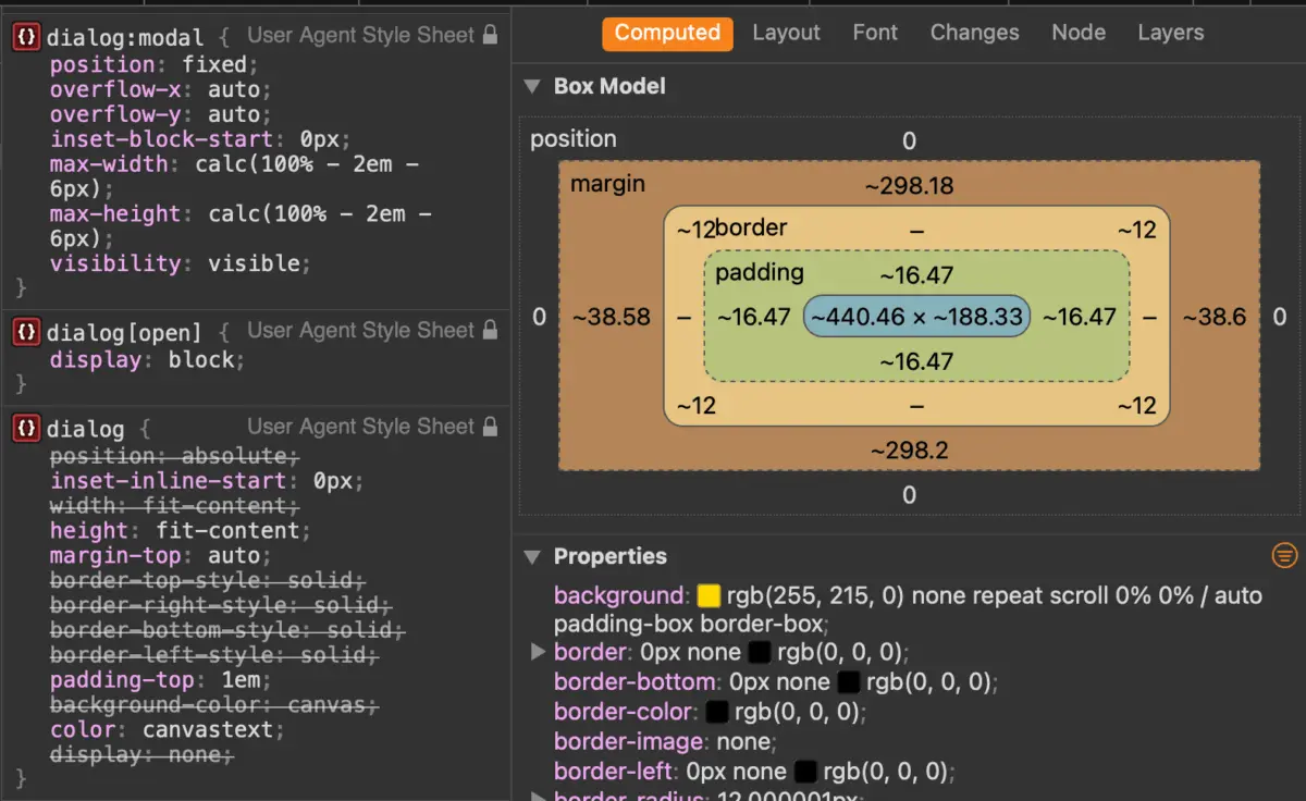
A common pitfall when styling native dialogs is applying layout and background styles directly to the dialog selector rather than its active state. Because user-agent styles apply specific rules when closed, custom properties should be scoped to the [open] attribute or the :open pseudo-class:
dialog
  border: 0;
  padding: 0;
  background: transparent;

  &[open]
    background-color: #ffffff;
    border-radius: 1rem;
    box-shadow: 0 25px 50px -12px rgb(0 0 0 / 0.25);
(Note: While :open enjoys robust modern support—including Safari 26.5+—targeting the [open] attribute remains a safe fallback for legacy environments.)
Crafting Smooth Entry and Exit Animations with @starting-style
Animating elements that toggle between display: none and visible states historically required convoluted JavaScript timeouts. Today, the @starting-style rule allows seamless entry transitions:
@starting-style
  dialog:open
    opacity: 0;
    transform: scale(0.95);


dialog
  opacity: 0;
  transform: scale(0.95);
  transition: opacity 0.3s ease-in-out, transform 0.3s ease-in-out, overlay 0.3s ease-in-out allow-discrete, display 0.3s ease-in-out allow-discrete;

  &[open]
    opacity: 1;
    transform: scale(1);
Dialog vs. Popover: Choosing the Right API
A frequent architectural dilemma for modern web developers is determining whether to use the Dialog API or the Popover API. While they appear superficially similar, their underlying use cases and accessibility implications diverge sharply:
- Use the Dialog API when: You are building a modal or non-modal dialog that demands user attention, requires focus trapping, needs to render content in the top layer with an automatic inert background, or collects critical user input (e.g., confirmation prompts, forms, error dialogs).
- Use the Popover API when: You are building lightweight, non-modal UI components that do not trap focus or block background interaction—such as dropdown menus, tooltips, floating action panels, or contextual help cards. Popovers dismiss easily on "light dismiss" events (clicking outside the boundary) and do not force the background into an inert state.
Attempting to force a popover to act as a secure modal requires manually re-implementing focus traps, aria attributes, and inert management—functionality that the native <dialog> element provides out of the box.

Future Outlook
As the web platform continues to mature, native HTML primitives like the <dialog> element represent the gold standard for performance, accessibility, and maintainability. By offloading complex state management, top-layer rendering, and accessibility affordances to the browser engine, engineering teams can ship cleaner codebases with significantly smaller JavaScript bundles.
As features like invoker commands and advanced transition properties transition from experimental status to widespread baseline availability, the native <dialog> will only become more essential to modern frontend engineering. Developers are encouraged to audit their existing third-party modal libraries and migrate toward this native powerhouse for future-proof, highly accessible web applications.