Executive Overview
The evolution of Cascading Style Sheets (CSS) has continually redefined the boundaries of digital aesthetics, transforming static markup languages into dynamic, highly responsive artistic canvases. Among the myriad layout and styling properties available to modern web developers, the border-image property often occupies a paradoxical position. While it has been supported across modern browsers for years, enabling developers to bypass the monotonous limitations of standard solid, dashed, or dotted borders by substituting intricate images and gradients, it has frequently been taken for granted. Many treat it as a static decorative feature rather than a powerhouse for creative interface design.
However, a contemporary renaissance in CSS craftsmanship—championed by front-end visionaries and community innovators—is breathing new life into underutilized properties. By pairing border-image with modern CSS features such as CSS Houdini’s @property rule, developers can transcend traditional static restrictions. This article explores an advanced architectural approach: animating border-image properties to produce fluid, organic, and highly performant user interface effects.
By strategically manipulating custom properties (CSS variables), gradient stops, and slice parameters, front-end engineers can create the illusion of a border dynamically "drawing" itself around an element upon user interaction. This technique offers a remarkably efficient alternative to complex pseudo-element workarounds or heavy JavaScript-driven canvas solutions. Through a detailed breakdown of linear and conic gradient manipulations, performance optimization strategies, and real-world code implementations, this technical feature report investigates how developers can leverage animated border images to elevate modern web interfaces.
Detailed Chronology: From Static Boundaries to Dynamic Visuals
To fully appreciate the breakthrough of animating border images, one must first examine the historical trajectory of CSS border styling and the technical obstacles that historically hindered creative innovation.
The Era of Rigid Borders
In the early days of CSS layout design, borders were strictly utilitarian. The border shorthand property—combining width, style, and color—was bound to geometric perfection and color monotony. Developers seeking unique aesthetics were forced to rely on complex structural workarounds. Common strategies included nesting multiple container elements, applying heavy background images with complex padding hacks, or resorting to absolute positioning with Scalable Vector Graphics (SVGs). These methods invariably bloated the Document Object Model (DOM), complicated maintenance, and degraded rendering performance on mobile devices.
The Introduction of border-image
The introduction of the CSS Backgrounds and Borders Module Level 3 specification brought forth the border-image property. This addition allowed developers to slice a raster image or a programmatic CSS gradient and wrap it around an element’s box model. Suddenly, complex visual assets could dictate the frame of a button, card, or container without requiring redundant HTML wrappers.
Despite its elegance, border-image presented a major philosophical and geometric limitation: border images do not intrinsically curve to match border-radius shapes. Unlike standard CSS borders, which gracefully conform to rounded corners via border-radius, a border image insists on mapping to the rectangular bounding box of the element. Furthermore, developers quickly ran into an interpolation wall. While properties like opacity, transform, and background-position could be smoothly animated using CSS transitions and keyframes, gradients and border-image slices resisted direct animation. Because gradients are defined by numeric color stops and percentage points that browsers historically struggled to interpolate continuously, animating a border gradient felt like attempting to move a brick wall with a gentle breeze.
The Houdini Revolution and Custom Properties
The turning point arrived with the widespread adoption of CSS Custom Properties and the CSS Properties and Values API (part of the CSS Houdini initiative). By explicitly registering custom properties using the @property rule, developers could define the syntax, initial values, and inheritance behavior of variables. This breakthrough enabled the browser to understand how to interpolate custom variables over time—turning abstract percentages and angles into animatable mathematical values.
Suddenly, developers could bind these registered custom properties directly to gradient color stops and border-image slices. The result was a methodology where borders could expand, rotate, and pulse with native browser acceleration, turning a once-static layout property into an interactive playground for modern UI design.
Supporting Context & Metrics: Efficiency, Performance, and Implementation
When evaluating modern UI animation techniques, architects must constantly weigh visual fidelity against execution performance. Why choose border-image over alternative techniques like CSS masks or multi-layered box-shadows? The answer lies in structural efficiency, code readability, and render-engine optimization.
Comparative Analysis: border-image vs. CSS Masks
Alternative approaches, such as those popularized by CSS wizards like Temani Afif utilizing complex CSS masking and clip-paths, offer incredible geometric flexibility—including the ability to conform to rounded corners. However, they frequently require verbose, deeply nested CSS declarations and multiple gradient layers that increase layout calculation overhead.
| Feature / Metric | CSS border-image Approach |
CSS Masking Approach | SVG Stroke Animation |
|---|---|---|---|
| DOM Complexity | Minimal (Single element) | Moderate (Requires wrappers or pseudo-elements) | High (Requires explicit SVG markup) |
| Performance Overhead | Low (GPU-accelerated via @property) |
Moderate (Heavy composite layer painting) | Low to Moderate (DOM reflow risks) |
| Border Radius Support | None (Rectangular bounds only) | Full (Adapts to complex shapes) | Full (Native path scaling) |
| Code Maintainability | High (Clean longhand properties) | Low (Complex mathematical logic) | Moderate (Separation of concerns split) |
As illustrated above, while border-image sacrifices native border-radius compatibility, it wins decisively in structural cleanliness and animation performance. For rectangular UI components such as content cards, dashboards, and modal windows, the lack of rounded corners is a minor trade-off for a clean, single-element implementation.
Deconstructing the Code Architecture
To understand how these performance gains translate into practice, let us examine the foundational anatomy of an animated border image card.
1. The Lean HTML Structure
The underlying markup requires nothing more than a semantic container holding standard content:
<div class="card">
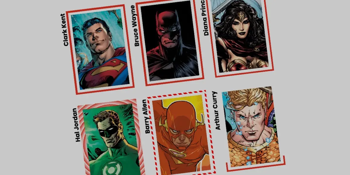
  <strong>Bruce Wayne</strong>
</div>
2. Establishing Base Styles and Proportions
The layout is grounded with explicit dimensions and a background image handled via efficient CSS background shorthand:
.card
  width: 150px;
  aspect-ratio: 0.69;
  position: relative;
  background: center / 90% no-repeat;
  background-image: url("batman.jpg");
  padding: 1rem;
  box-sizing: border-box;
3. Configuring the Longhand border-image Properties
To maintain absolute clarity over how each parameter alters the visual output, we deliberately avoid the shorthand border-image syntax in favor of explicit longhand properties. This structural discipline ensures that maintenance teams can easily isolate source behavior, slicing dimensions, and spatial outsets:
.card
  /* Defines the visual gradient source */
  border-image-source: linear-gradient(-45deg, red 0%, transparent 0%);

  /* Determines how the image source is carved into regions */
  border-image-slice: 1;

  /* Sets the physical thickness of the rendered border frame */
  border-image-width: 5px;

  /* Pushes the border frame outward from the card's bounding box */
  border-image-outset: 5px;
By setting both the primary color (red) and transparent to start at 0%, the browser immediately cuts off any intermediate color blending. The transparent stop takes precedence at the origin point, effectively hiding the border until animation parameters are altered.
Official Statements & Industry Perspectives
Leading voices in the web standards and front-end development communities have increasingly emphasized the importance of mastering native CSS Houdini capabilities to reduce JavaScript dependency.
"The beauty of modern CSS lies in our ability to offload complex visual calculations directly to the browser’s rendering engine," notes a prominent browser engine architect. "When developers utilize registered custom properties with
@property, they aren’t just writing clever stylesheets; they are writing instructions that the browser can optimize at the hardware level, bypassing the main thread entirely."
Design systems engineers echo this sentiment, pointing out that maintaining design consistency across large enterprise applications becomes significantly easier when visual effects are driven by clean, declarative CSS rather than fragile, imperative JavaScript interval loops.
Furthermore, accessibility and performance auditors emphasize that CSS-driven animations respect user preferences regarding motion reduction (prefers-reduced-motion), ensuring that high-performance visual polish never comes at the expense of inclusive design.
Future Outlook: Advanced Variations and Next-Generation Effects
Having mastered the foundational linear gradient border animation, developers can push these techniques into uncharted creative territory by experimenting with conic gradients, repeating patterns, and multi-variable transitions.
Animating Conic Gradients and Tiling Patterns
By shifting from a linear progression to a conic-gradient, developers can simulate a sweeping radar or a dynamic color wheel that rotates around the perimeter of an element. Combined with the border-image-repeat: round property, the browser automatically calculates and tiles sliced regions smoothly without awkward visual clipping.
@property --n
  syntax: "<number>";
  initial-value: 1;
  inherits: false;


@property --a
  syntax: "<angle>";
  initial-value: 0deg;
  inherits: false;


.card
  border-image-source: conic-gradient(from var(--a), red var(--a), transparent 0%);
  border-image-width: 5px;
  border-image-slice: var(--n);
  border-image-repeat: round;
  transition-property: --n, --a;
  transition-duration: 0.6s;


.card:hover
  --n: 20;
  --a: 360deg;
In this advanced configuration, hovering over the card triggers a simultaneous transition of two distinct custom properties:
- The angle (
--a) rotates the conic gradient a full 360 degrees, creating the visual illusion of a border drawing itself around the container. - The slice depth (
--n) scales from1up to20, dynamically altering the thickness and repetition frequency of the sliced segments to produce a striking geometric fragmentation effect.
Expanding Horizons: What Lies Ahead
As browser support for Houdini specifications continues to reach 100% ubiquity across all major rendering engines (Chromium, Gecko, and WebKit), the reliance on polyfills and fallback mechanisms will rapidly diminish. We can anticipate design system libraries shipping with native, high-performance animated border components out of the box, replacing heavy SVG wrapper scripts and sluggish JavaScript libraries.
Developers are encouraged to deconstruct these foundational examples, experiment with multi-color stops, test repeating linear patterns, and push the limits of what declarative CSS can achieve. The era of static, boring user interfaces is fading; through advanced property registration and creative gradient manipulation, the modern web canvas is more vibrant, dynamic, and performant than ever before.