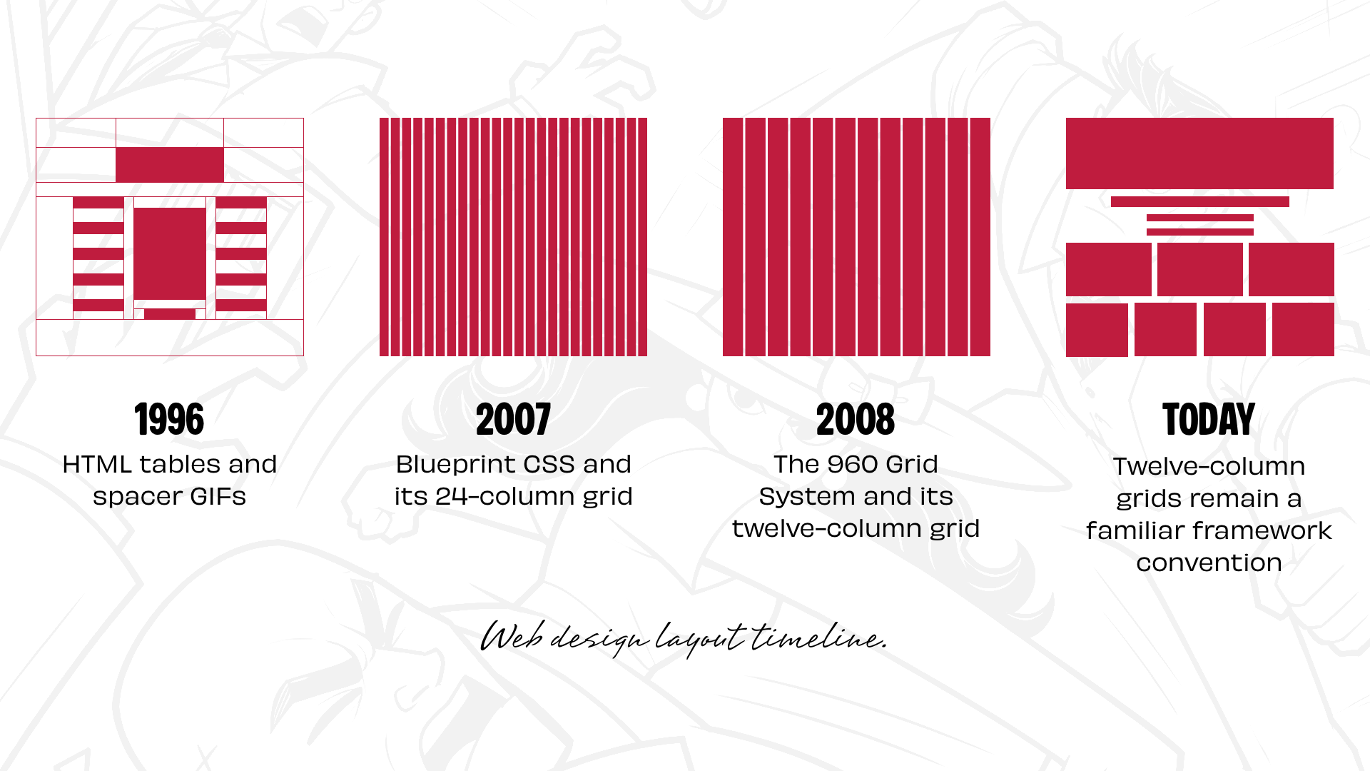
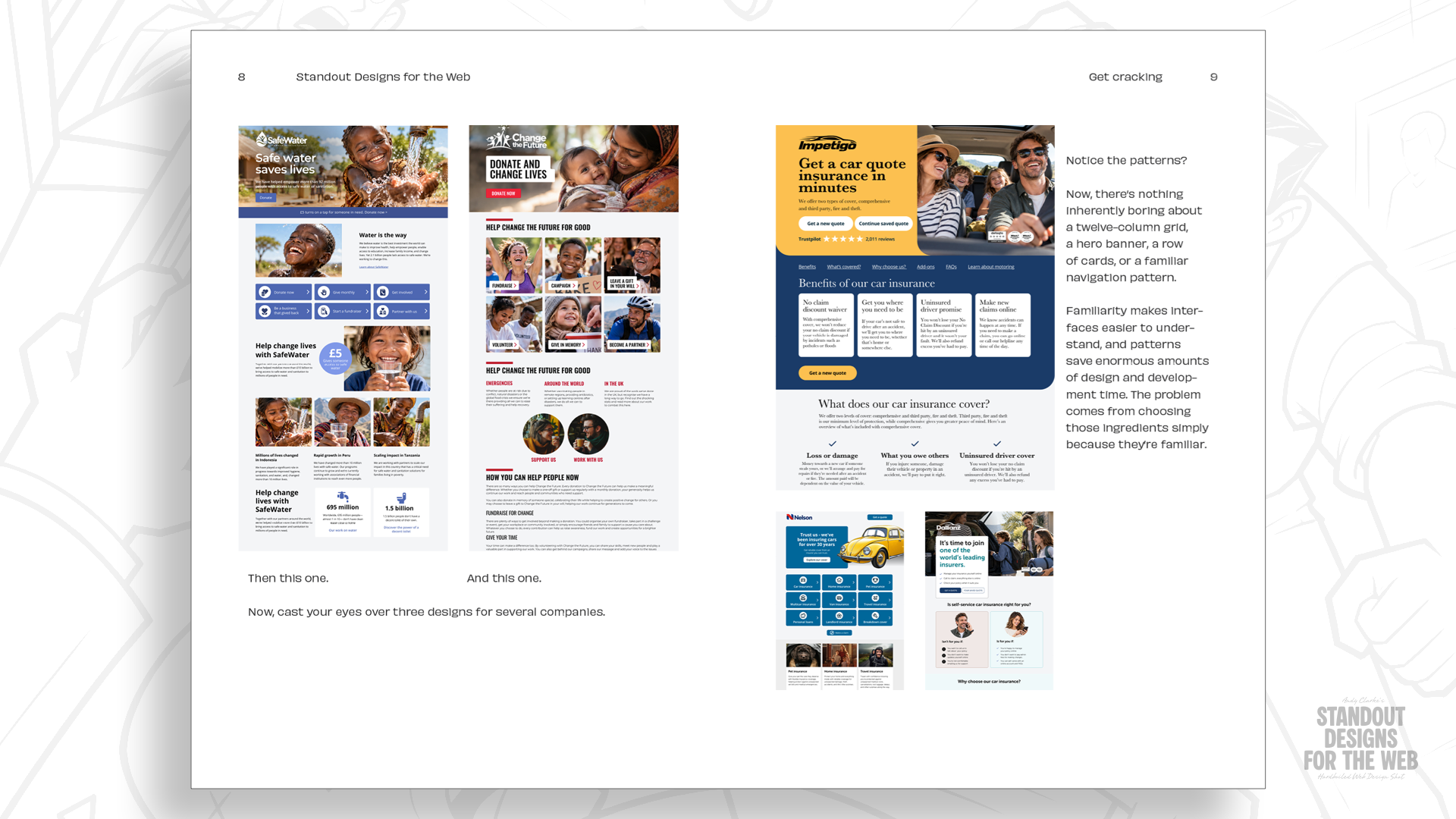
For nearly three decades, web design has operated under the gravitational pull of standardization. From the dawn of HTML tables and spacer GIFs popularized by David Siegel in the late 1990s, to the ubiquitous floats of the CSS era and the rigid, 12-column frameworks of Bootstrap and Foundation, the industry has relentlessly sought predictability. While these structural paradigms democratized site-building and established a shared visual vocabulary for developers across the globe, they have also inadvertently fostered a monoculture of digital design. Today, opening a random selection of corporate websites often reveals a dizzying array of templated layouts: predictable 2-up, 3-up, and 4-up components engineered to fit seamlessly into standardized grids, rendering distinct brand identities utterly interchangeable.
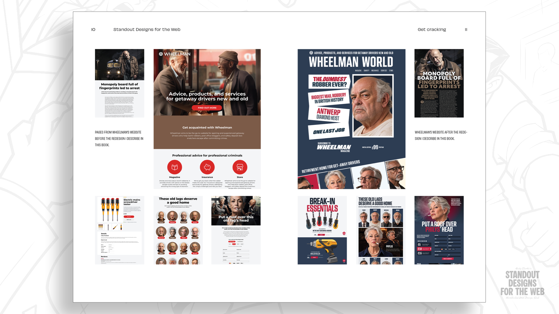
In his upcoming book, Standout Designs for the Web—available now for pre-order through the CSS-Tricks store ahead of its November 20 release—veteran designer and author challenges this homogeneity. Through the lens of Wheelman, a meticulously crafted fictional enterprise catering to the idiosyncratic needs of getaway drivers, the book acts as both a critique of lazy defaults and a masterclass in narrative-driven composition. By exploring alternative structural methods—such as content-first planning, multi-dimensional modular grids, and complex compound layouts—designers are urged to abandon the lazy comfort of familiarity. The ultimate thesis is clear: grid systems should serve as flexible architectural scaffolding to amplify a company’s unique story, rather than rigid molds that flatten brand personality into uniform boxes.
Detailed Chronology: The Evolution of Web Layouts
To understand how modern web design arrived at its current crossroads, one must trace the evolutionary path of structural layout mechanics from the early internet to the modern era of CSS Grid.
The Wild West of Tables and Spacers (Late 1990s)
When the commercial web was in its infancy thirty years ago, page layout was an exercise in creative hacking. HTML was never conceived as a document design language; it was built for sharing academic papers. As commercial interests flooded the web, designers desperately needed spatial control. The publication of David Siegel’s seminal text, Creating Killer Web Sites, popularized the use of invisible HTML tables and transparent "spacer GIFs" to force text and images into designated positions. This approach was brittle, plagued by cross-browser inconsistencies, and fundamentally hacky, yet it laid the psychological groundwork for grid-obsessed layout planning.
The CSS Revolution and Early Frameworks (2000s)
As cascading style sheets (CSS) matured, developers transitioned from tables to floats and positioning models. While CSS offered cleaner markup, it was still not natively engineered for complex two-dimensional page layouts. Browser rendering discrepancies turned simple alignment tasks into frustrating trials.
Relief arrived in the late 2000s with the advent of dedicated CSS frameworks. Blueprint CSS introduced a robust 24-column grid system, quickly followed by Nathan Smith’s wildly popular 960 Grid System, which provided structured 12- and 16-column options. These frameworks provided a vital service: they gave digital creators a shared spatial language, making layout planning and responsive implementation vastly more predictable.
The Hegemony of Bootstrap and Foundation (2010s)
Building upon early grid systems, mega-frameworks like Twitter Bootstrap and Foundation cemented the 12-column grid as the de facto global standard for digital products. The mathematics of twelve are undeniably convenient—easily divisible by two, three, and four—making it the path of least resistance for responsive components. However, this convenience birthed a systemic issue: the 12-column paradigm transformed from a helpful tool into an unthinking reflex.
The CSS Grid Era and the Trap of Habit
The introduction of CSS Grid liberated designers from the tyrannical constraints of linear float-based systems, offering true two-dimensional layout control. Yet, an ironic phenomenon emerged: despite having infinite layout possibilities at their fingertips, modern designers routinely default to dividing the viewport into twelve equal columns, shoehorning content into pre-mapped slots. The resulting designs are often technically sound, but creatively bankrupt.
Supporting Context & Metrics: The Anatomy of "Wheelman"
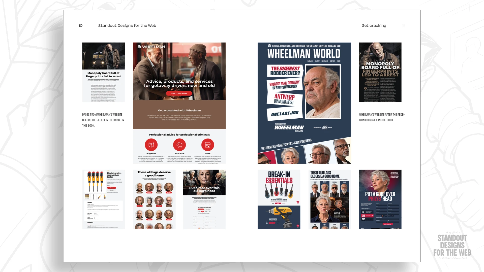
To demonstrate how to break free from the 12-column trap, Standout Designs for the Web introduces a brilliant narrative device: Wheelman. Far from a standard corporate client, Wheelman is a fictional enterprise providing high-stakes products and services for professional getaway drivers. Its catalog includes legal counsel, specialized robbery insurance, break-in hardware, and a quarterly publication chronicling life behind the wheel.
+-------------------------------------------------------+
|                       WHEELMAN                        |
|       "Professional Services for the Mobile Elite"    |
+---------------------------+---------------------------+
|      SERVICES & LEGAL     |       THE SHOP            |
|  - Robbery Insurance      |  - Heavy-Duty Safes       |
|  - Retainer Legal Counsel |  - Custom Ignition Bypass |
|  - Escape Route Mapping   |  - High-Velocity Hardware |
+---------------------------+---------------------------+
|                  THE GETAWAY MAGAZINE                 |
|       "Real Stories from Drivers Who Made It Out"     |
+-------------------------------------------------------+
Deconstructing the Brand Personality
Wheelman presents an ideal design challenge. The company operates in a morally ambiguous space, yet its clientele demands absolute professionalism, reliability, and precision. It is rebellious, unapologetic, and infused with gritty personality, yet it cannot afford to look comical or disorganised.
If a traditional B2B SaaS platform or corporate e-commerce site utilized a standard 12-column layout, it might pass unnoticed. But Wheelman requires a visual identity that mirrors its distinct operational ethos. By starting with the brand’s core narrative rather than an empty grid, the design process shifts fundamentally.
Moving Beyond Linear Columns: Modular Grids
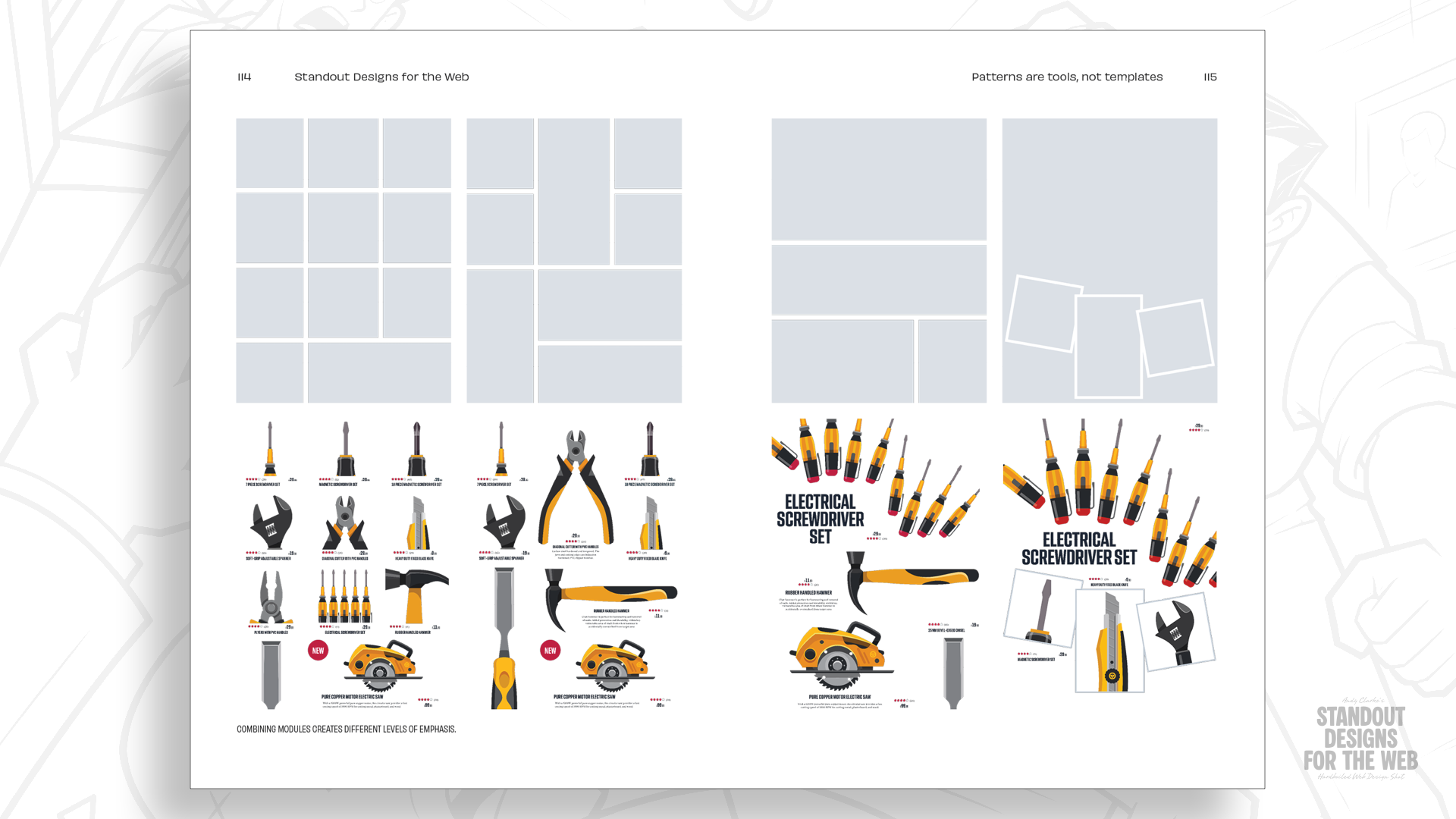
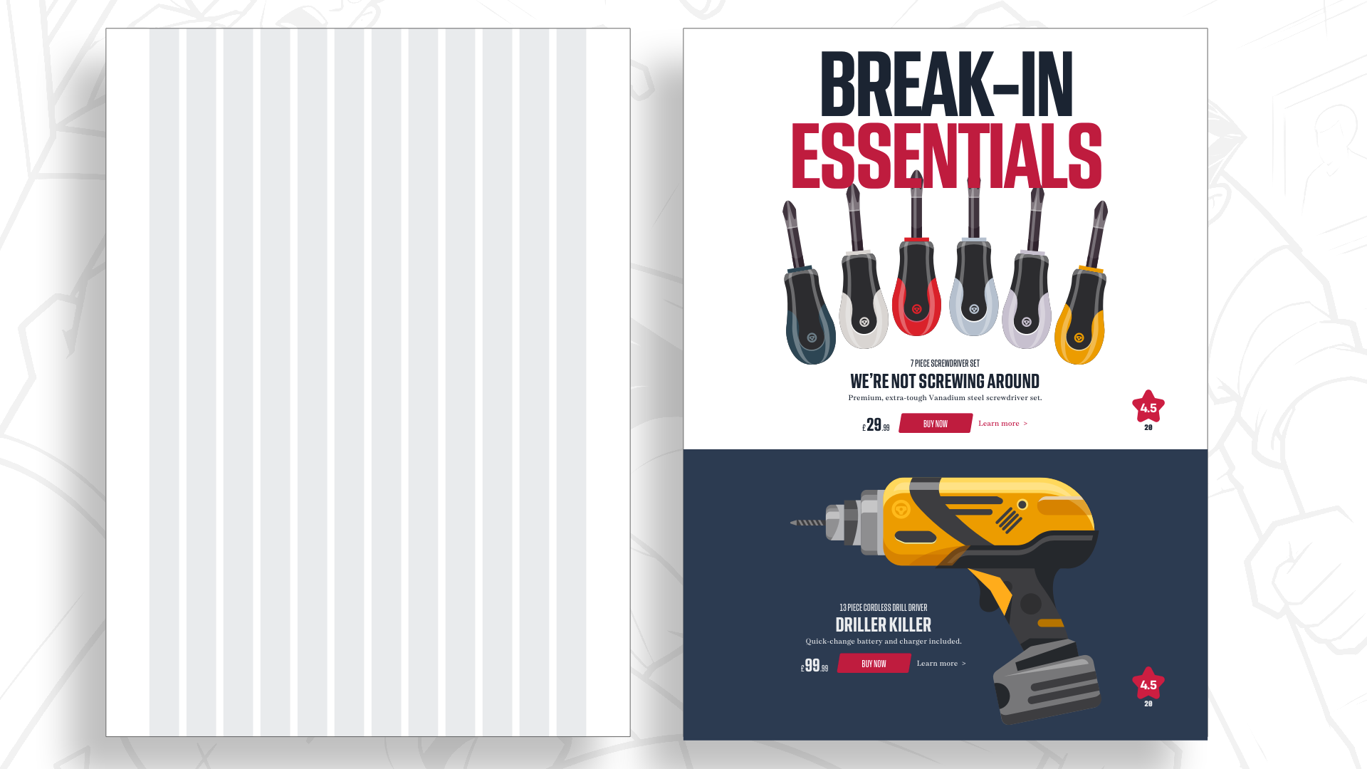
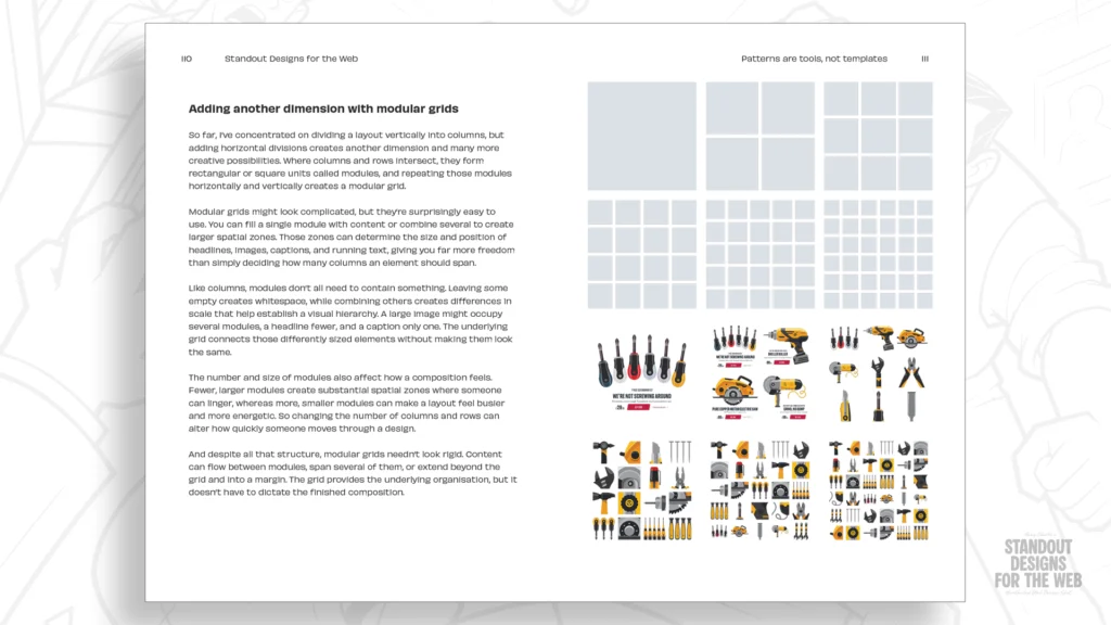
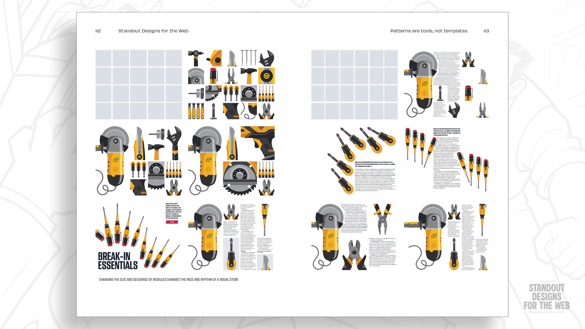
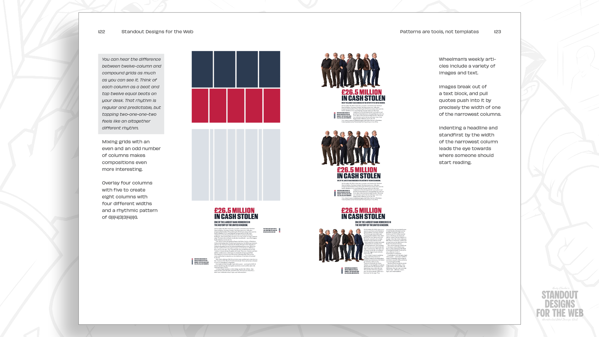
Rather than restricting content to vertical columns, introducing rows creates a secondary spatial dimension, resulting in a modular grid. The intersections of columns and rows generate distinct structural units or modules.
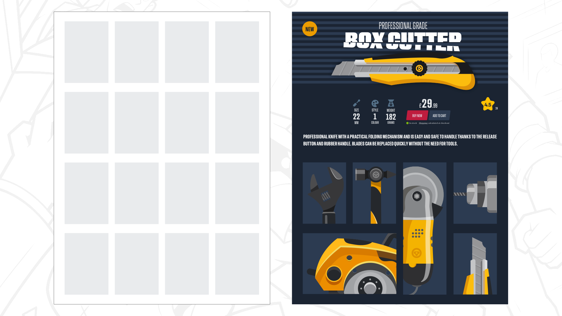
In Standout Designs for the Web, a 4×4 modular grid yields sixteen distinct spatial blocks. By strategically merging these modules—spanning a dramatic headline and hero product image across four modules while isolating pricing tools or purchase buttons into singular units—designers can craft visual drama and clear typographic hierarchy. Alternative products in the shop can occupy asymmetric modules, varying in scale and proportion to make the user journey feel organic, unpredictable, and entirely tailored to the brand’s gritty personality.
The Power of Compound Grids
To maintain unity across expansive platforms—such as a site encompassing a magazine, an e-commerce shop, and advisory services—designers must avoid applying a single cookie-cutter template everywhere. This is where compound grids come into play.
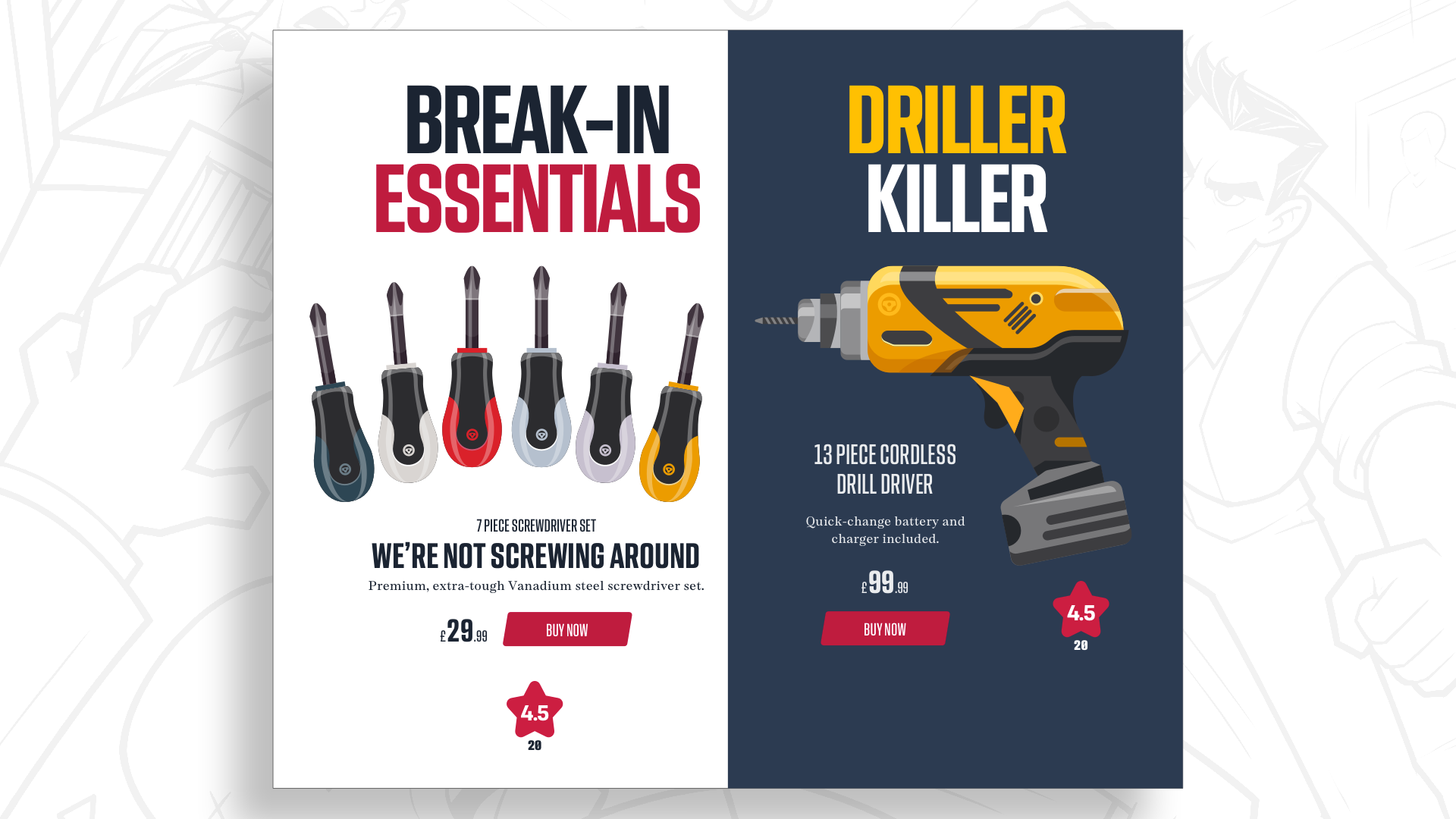
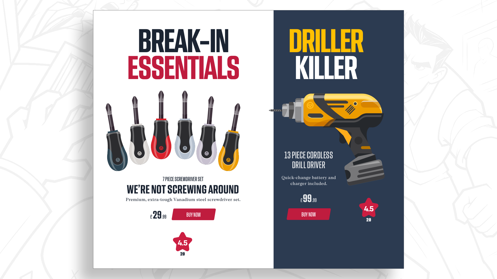
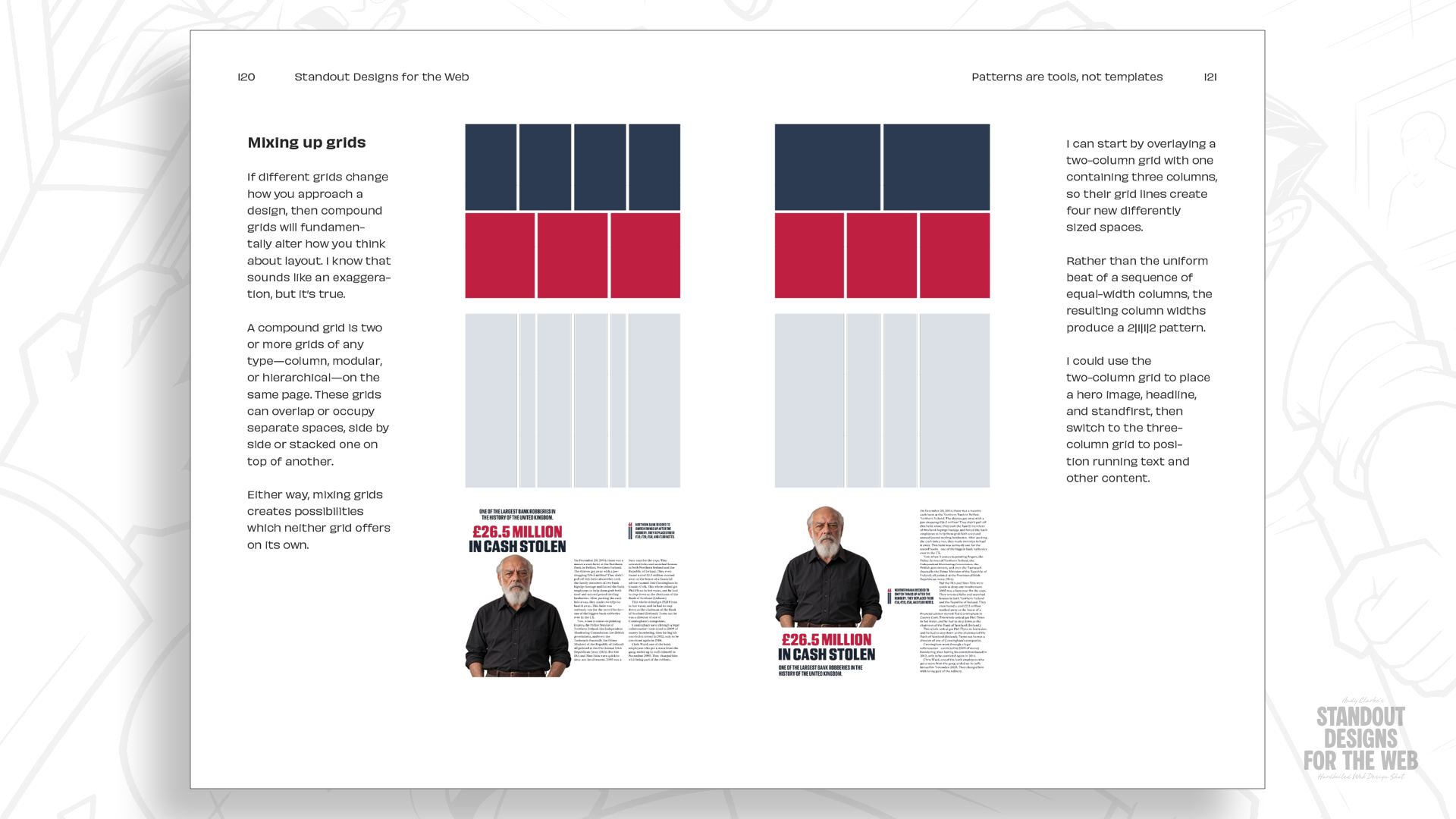
A compound grid overlays two or more disparate structural systems—such as combining a two-column grid with a three-column grid, or merging four- and five-column foundations on a single canvas. These overlapping structures create fresh proportional relationships (such as four columns of varying widths) that allow different content types to breathe. A long-form magazine essay can leverage wide photographic spaces juxtaposed against narrow pull-quote columns, while the e-commerce section retains a punchy, modular product grid. All distinct sections remain visually unified under a sophisticated, cohesive brand language without looking identical.
Official Insights & Design Philosophy
The underlying philosophy championed in Standout Designs for the Web targets the core psychology of the modern creator. When speaking on the genesis of the book, the author emphasises a vital distinction:
"Twelve-column grids are useful, and I’m certainly not suggesting you should stop using them entirely. But they’re only one option among many, and starting every design with the same structure limits your possibilities before you’ve even considered the story your design is trying to tell."
This mindset challenges the prevailing workflow in digital agencies and tech startups, where wireframing often begins immediately with UI component libraries and predefined grid systems. The recommended counter-workflow prioritizes an investigative discovery phase:
Understand the Brand Story: What makes the company fundamentally different from its market competitors? What emotions, memories, or cultural associations should the user walk away with?
Interrogate Content Relationships: Before deciding how to arrange elements, analyze how headlines, imagery, interactive tooling, and whitespace relate to one another in terms of narrative weight.
Select the Structural Tool: Only after establishing the content hierarchy and emotional tone should the designer select or construct the grid system—whether column-based, modular, or compound—that best serves the material.
This intentional approach extends far beyond structural layout. It must equally inform color theory selection, typographic pairing choices, photographic art direction, and interactive micro-interactions. Consistency in design does not mean every page must look like a clone of its predecessor; true consistency lies in sharing a coherent visual language while allowing individual contexts to express their unique character.
Future Outlook: The Next Era of Web Architecture
As we look toward the future of digital product design, the integration of advanced CSS layout specifications—including subgrids, container queries, and sophisticated grid-template areas—means that technical barriers to creative layouts have effectively vanished. Browsers are no longer holding designers back; rather, imagination and habit are the primary bottlenecks.
The release of Standout Designs for the Web arrives at a pivotal moment. As AI-generated templates and automated design tools threaten to flood the web with hyper-generic, template-driven interfaces, the value of human intentionality, distinct storytelling, and bespoke structural design will skyrocket. Brands that continue to rely on lazy, default 12-column frameworks will increasingly blend into the digital white noise, indistinguishable from their competitors.
Conversely, designers who embrace the lessons found in modular and compound grid systems will be uniquely positioned to craft memorable digital landscapes. By anchoring design decisions in authentic brand narratives and treating layout grids as flexible, expressive mediums rather than handcuffs, the next generation of web creators can reclaim the vibrant, idiosyncratic spirit that made the medium so revolutionary in the first place.
Pre-Order Information & Special Offer
Standout Designs for the Web is officially scheduled for publication on November 20, priced at $14.99 for the DRM-free EPUB and PDF editions. Pre-orders are open now through the CSS-Tricks store.
As an exclusive incentive, every customer who pre-orders the book will receive the Hardboiled Client Interview Guide completely free of charge. This practical companion workbook is engineered to help designers, developers, and agency leads ask sharper, more revealing questions during client discovery phases—ultimately uncovering the distinct operational DNA and brand stories necessary to build truly standout digital experiences.