Video game horror has long relied on the uncanny, the surreal, and the extraterrestrial. From the neon-lit industrial corridors of sci-fi dystopias to the exaggerated, shadowy gothic mansions of traditional survival horror, developers typically construct spaces designed to alienate the player. Yet, with Silent Hill: Townfall, developer Screen Burn (formerly known as No Code) has taken an entirely opposite approach.
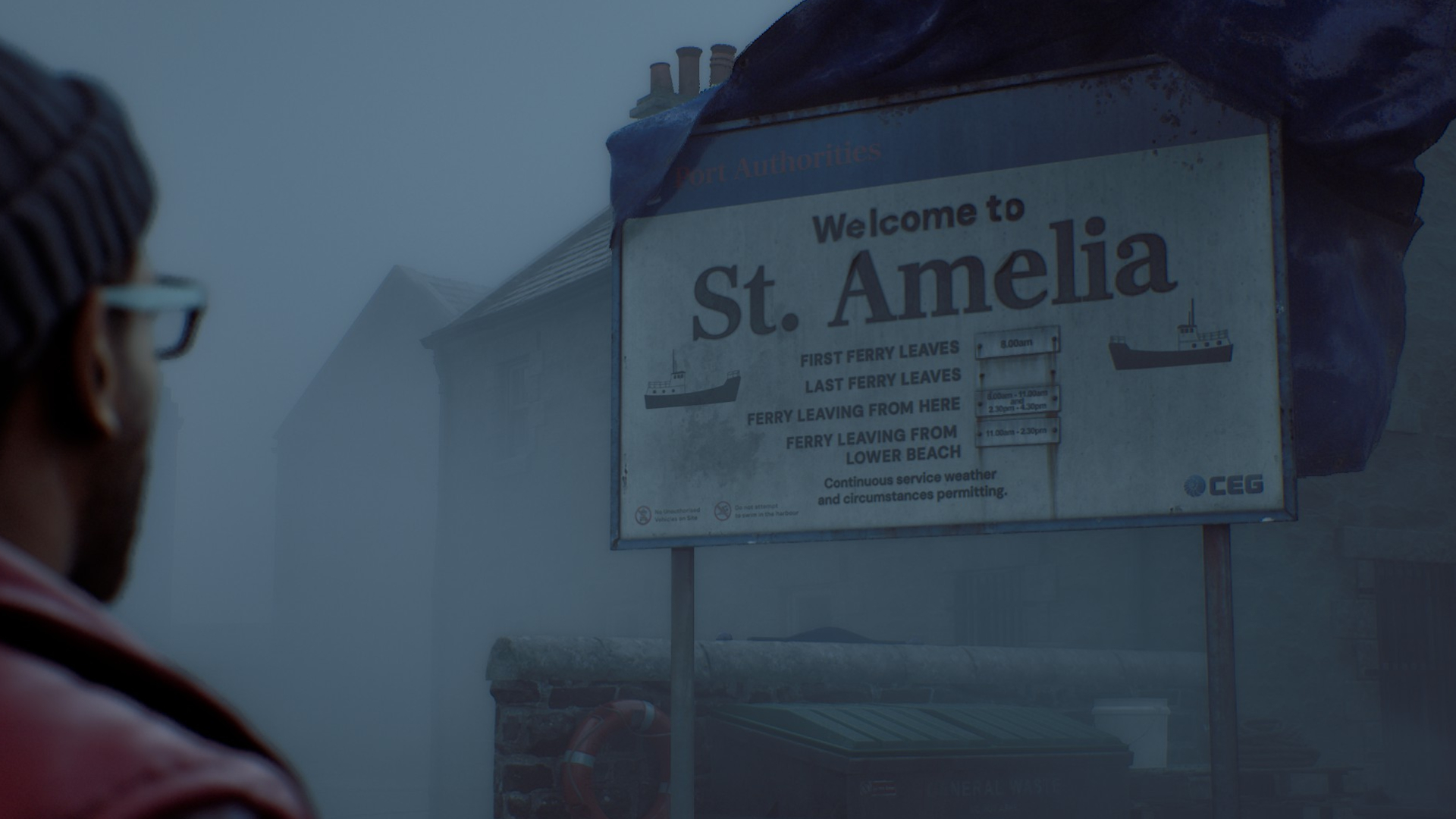
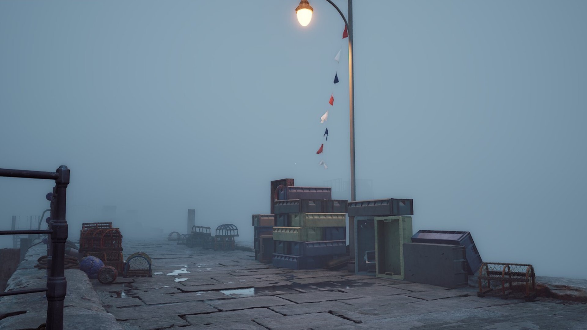
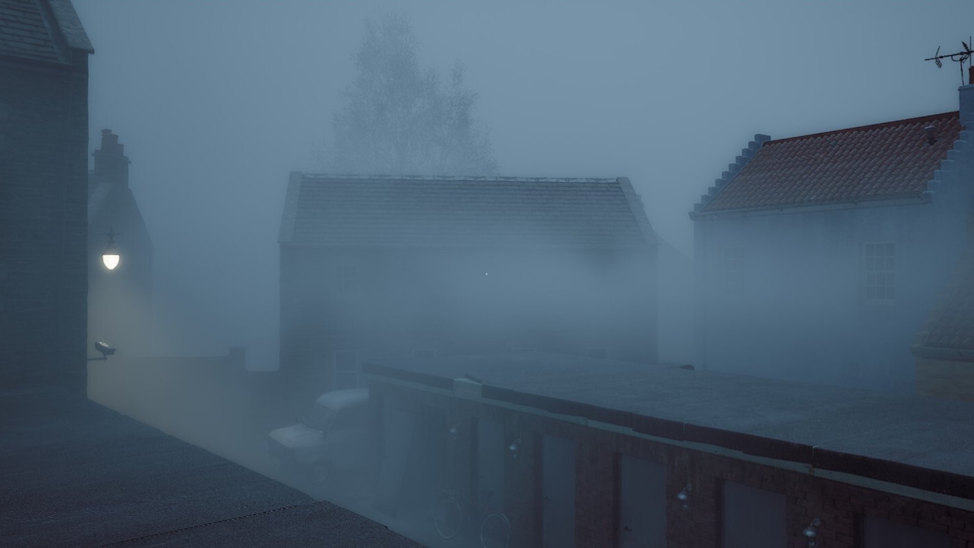
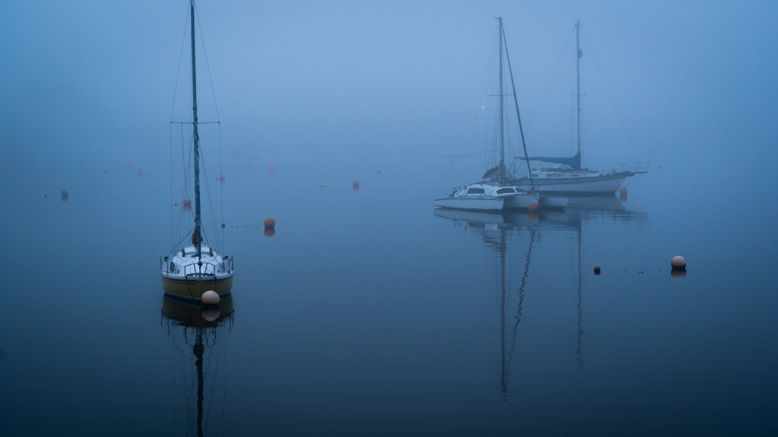
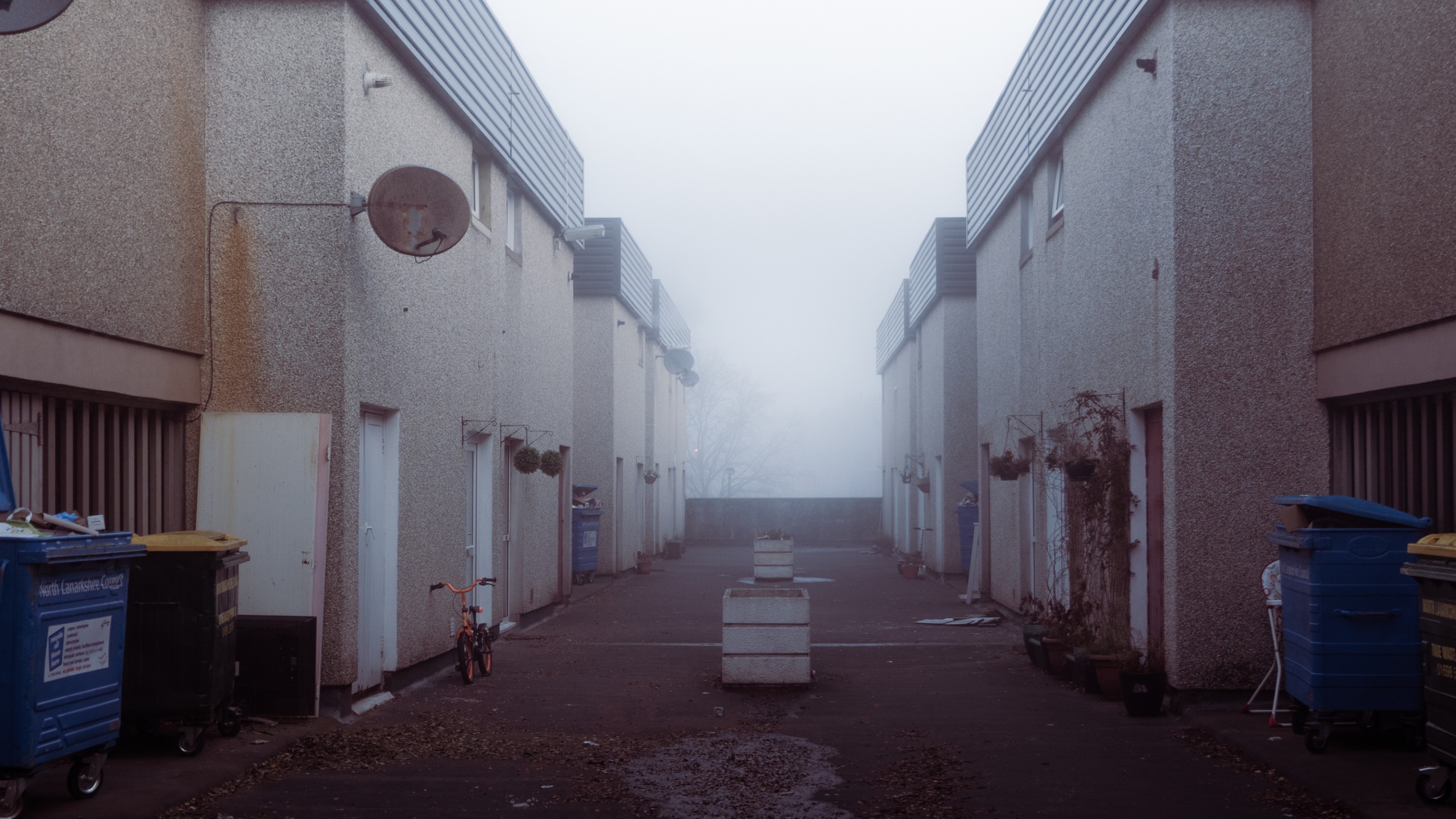
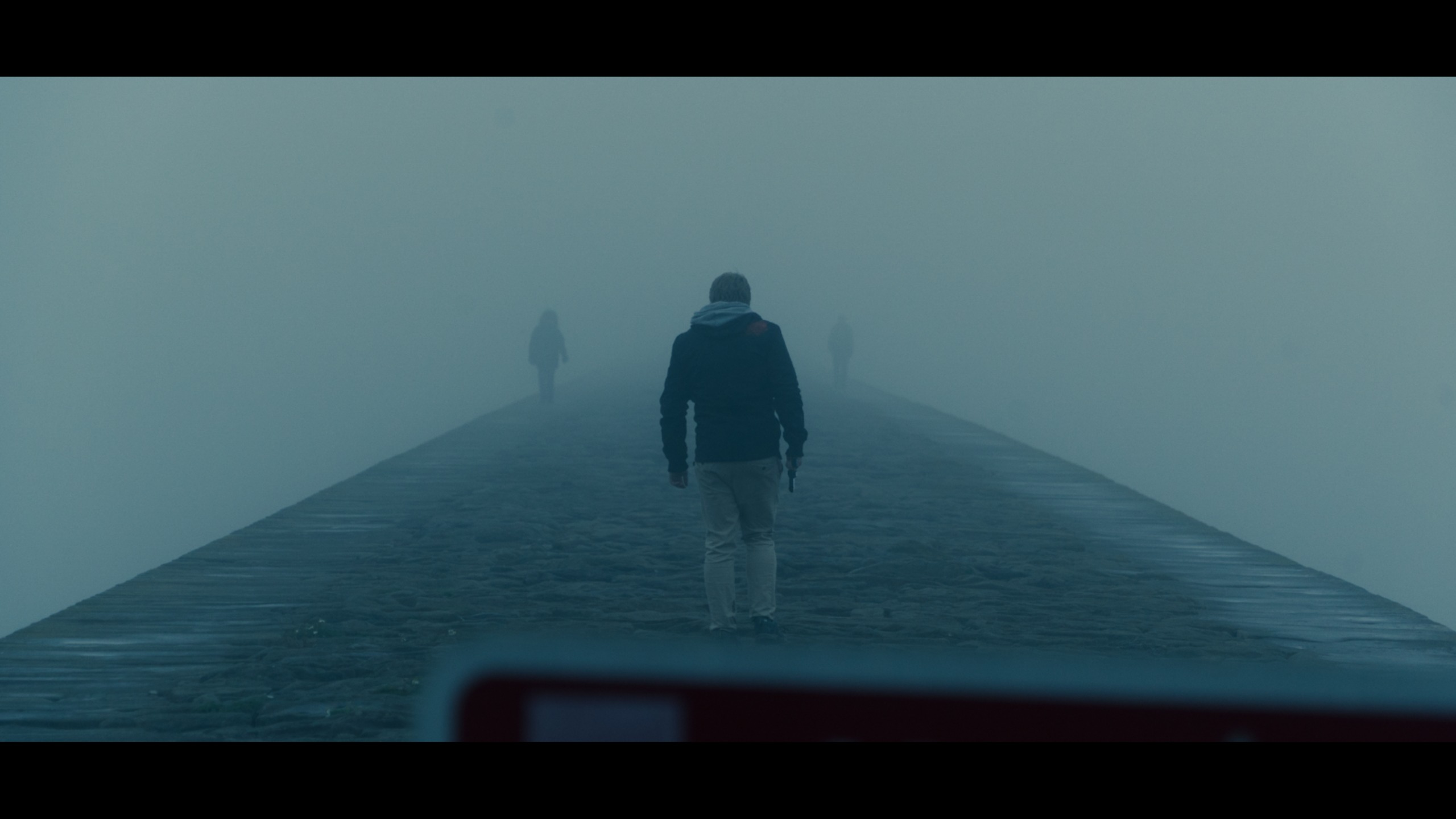
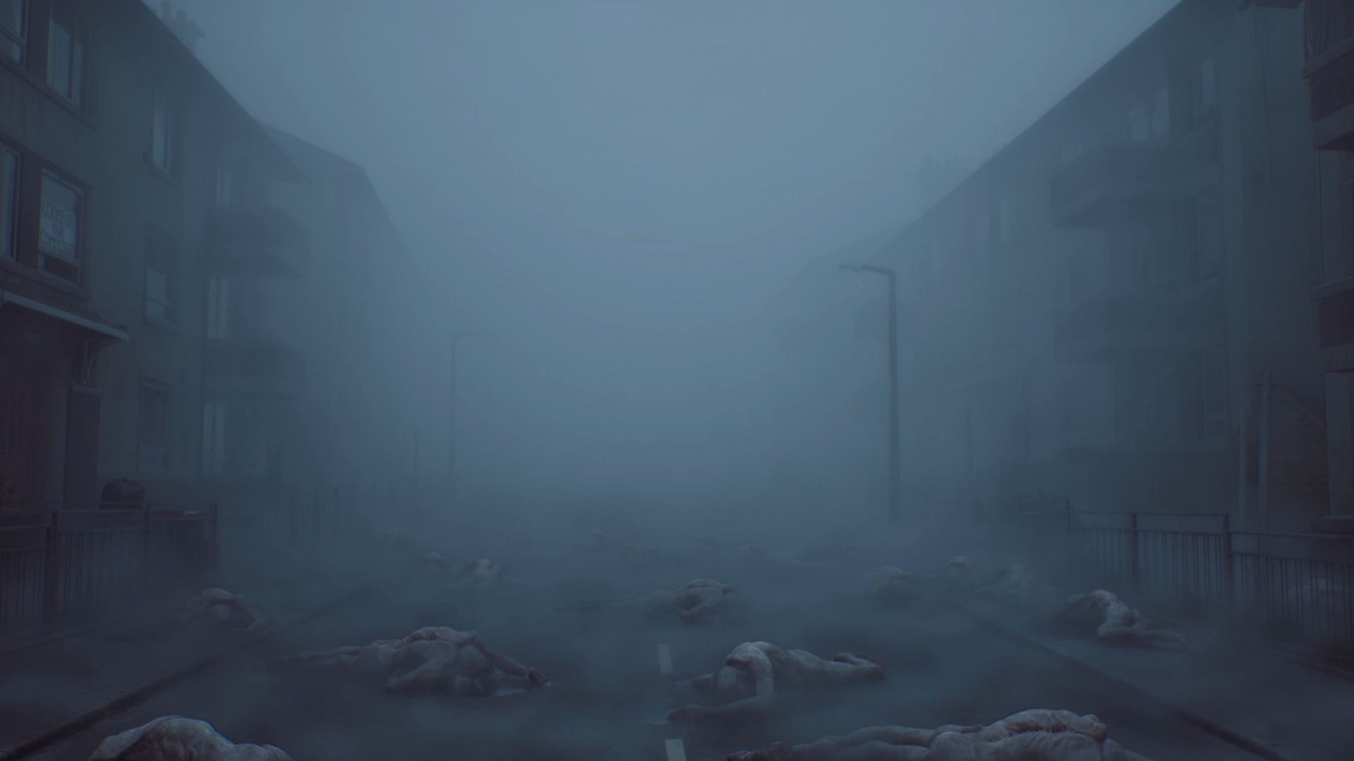
By grounding its fictional settlement of St. Amelia in the tangible, weathered, and deeply nostalgic architecture of late-1990s Scotland and Northern England, the studio has forged a new kind of psychological terror. St. Amelia is not a baroque nightmare castle or an abstract dimension of pain; it is a rain-slicked, grey coastal fishing village that looks and feels intimately, hauntingly real.
This deep dive examines how director Jon McKellan, art director Paul Abbott, and the team at Screen Burn collaborated with publishers Konami and Annapurna Interactive to build St. Amelia. Utilizing advanced techniques like LiDAR scanning, historical reference hunts, and deeply personal generational contributions—ranging from family photographs to 1950s working-class paintings—the developers engineered a masterclass in atmospheric dread. The result is a location so authentic, grounded, and familiar that its eventual descent into fog, trauma, and monstrous distortion feels all the more violating to the player.
Detailed Chronology: From Concept to Coastal Nightmare
The genesis of Silent Hill: Townfall began with a clear, uncompromising vision from its inception at Screen Burn: the team wanted to lean into the lived experiences of their own upbringings.
Phase 1: Conceptualization and the Scottish Pitch
From the earliest pitch meetings with Konami, Screen Burn knew they wanted to draw inspiration from Scottish coastal towns and isolated island settlements. However, the exact geographical identity of the town remained fluid during early brainstorming sessions.
"What wasn’t clear right away was whether we were actually going to say that it was a Scottish town or just a Northern European town, and kind of leave it very vague," director Jon McKellan explains.
Ultimately, the studio realized that committing to a specific cultural identity would elevate the material. The original pitch pitched St. Amelia to Konami as a small fishing village with distinct Scottish heritage—a place that would evoke nostalgic recognition for anyone raised in the UK, yet strike foreign players as an entirely novel, insular environment. Surprisingly, Konami and Annapurna proved remarkably hands-off, welcoming experimentation on a legendary franchise that has spanned nearly three decades.
Phase 2: Fieldwork, Photography, and LiDAR Scanning
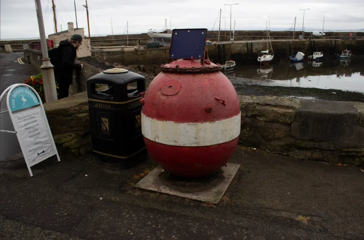
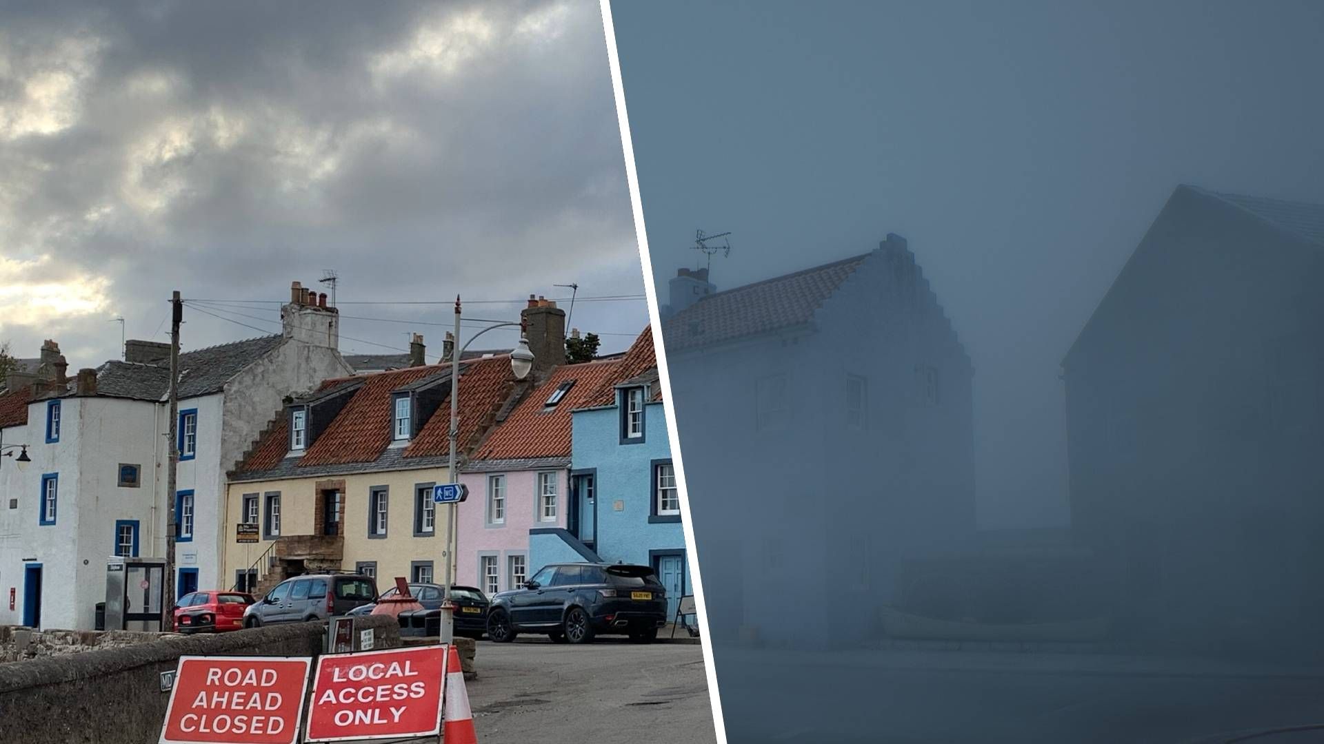
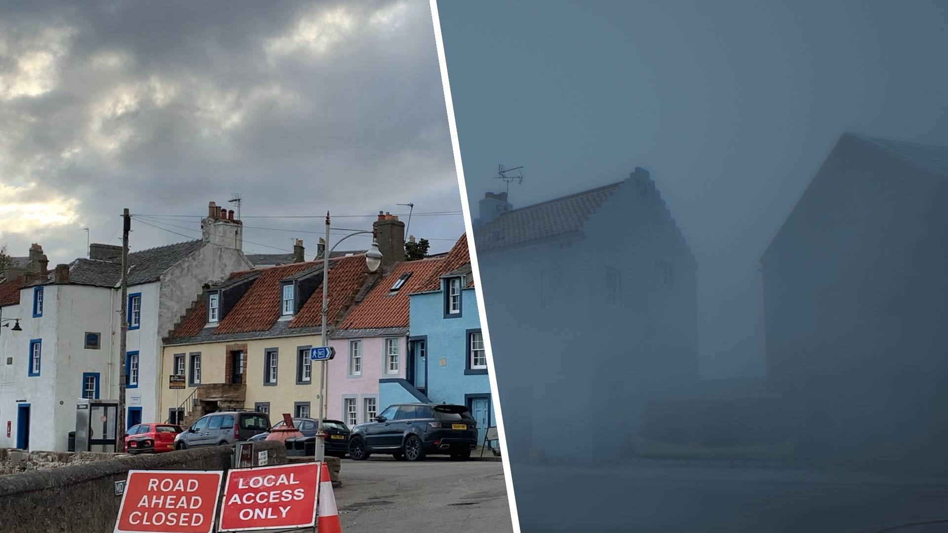
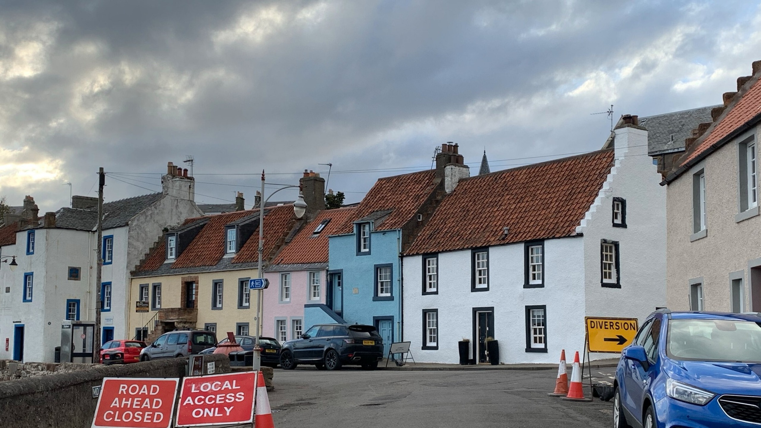
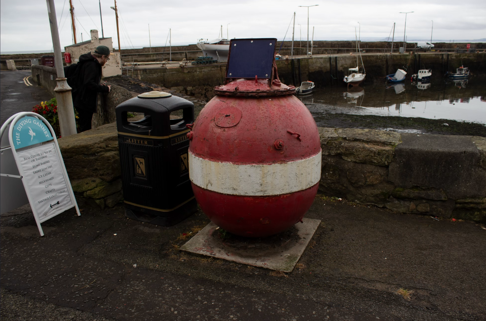
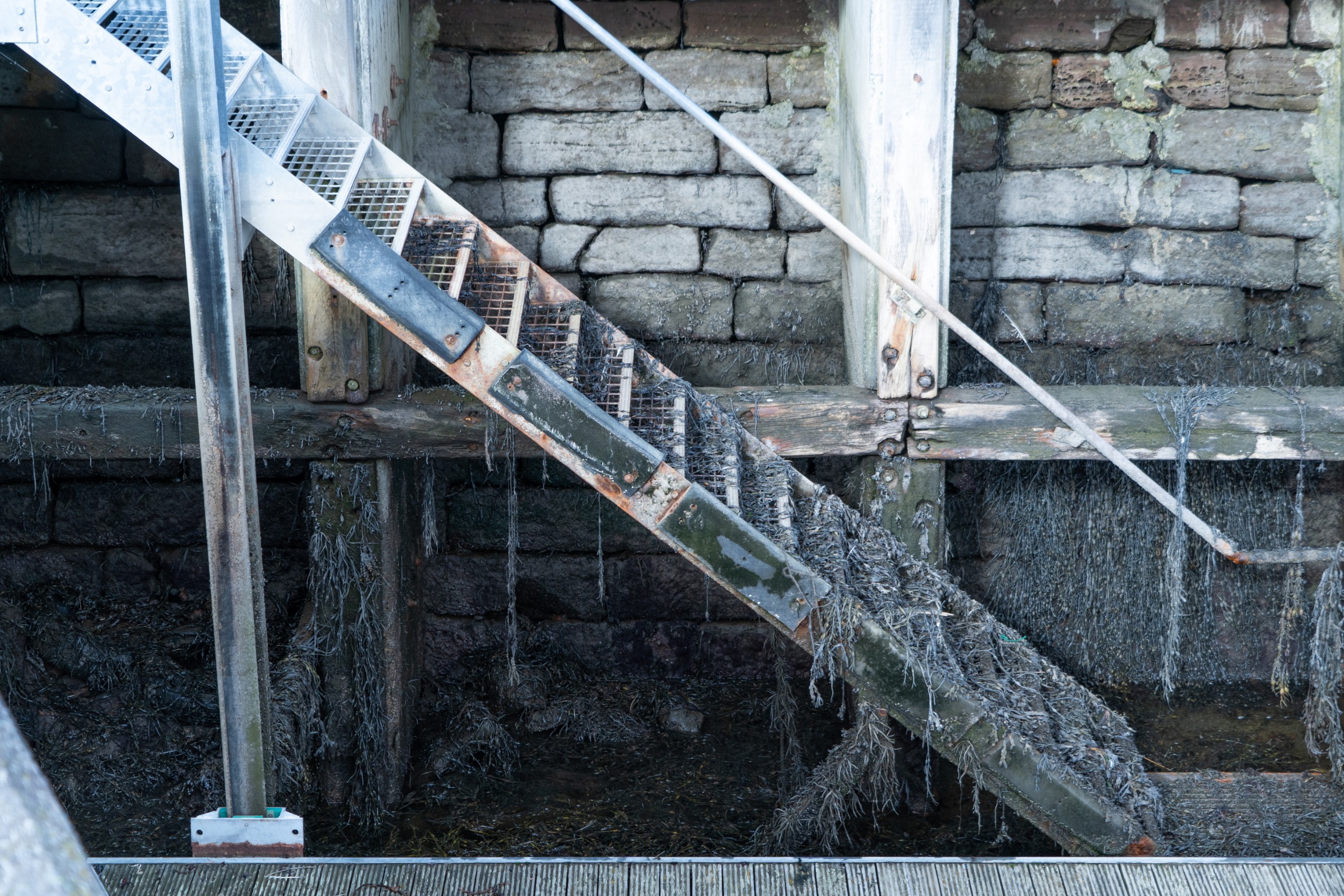
To achieve uncompromising visual and spatial accuracy, Screen Burn embarked on extensive field research trips across Scotland and Northern England. They visited locations such as North Berwick along the east coast and Lerwick in the Shetland Isles—the UK’s northernmost town, situated over 100 miles from the mainland. Another major touchstone was St. Monans on the Fife coast, a tiny pocket town where waterfront houses, maritime reliance, and preserved streetscapes made it feel as though time had stood still.
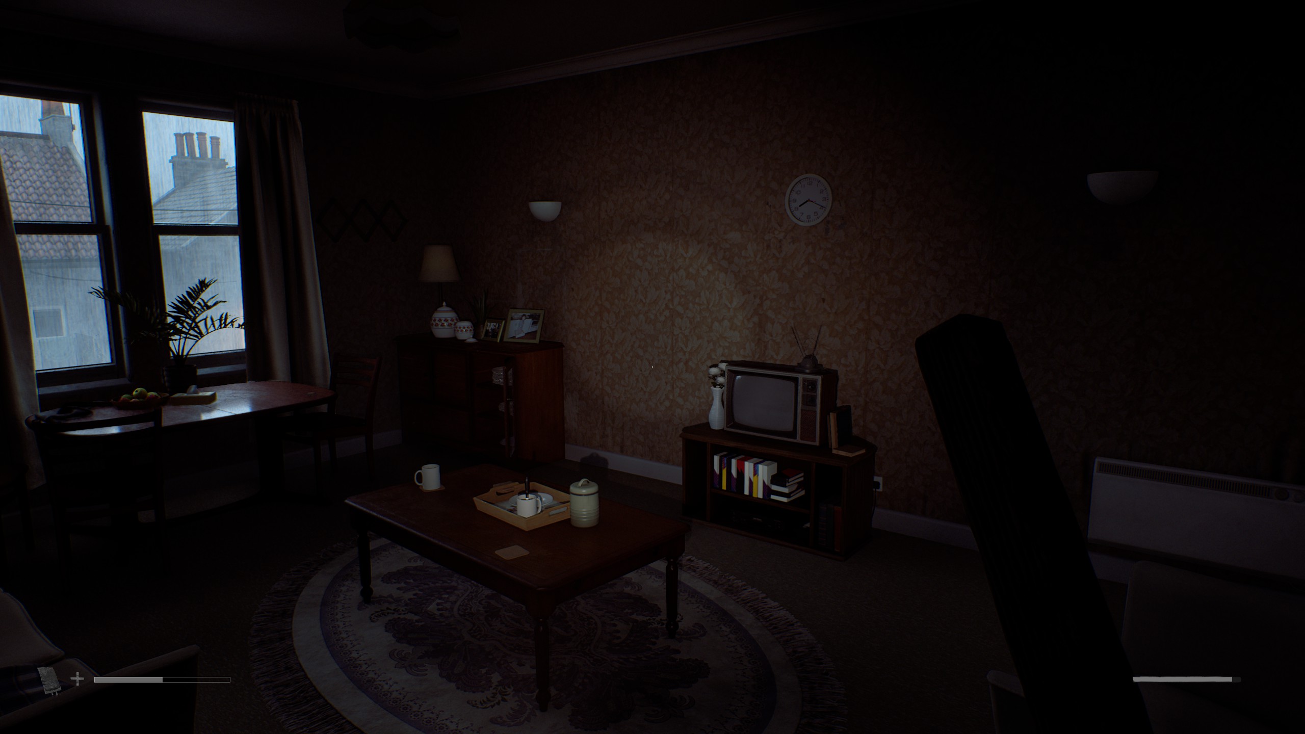
Rather than relying purely on traditional concept art, the team used modern technology to capture reality. Armed with iPhones and digital SLRs, developers walked real-world streets taking thousands of photographs. They integrated LiDAR scanning to stitch together 3D-scanned versions of real environments inside Unreal Engine. This yielded exact 1:1 measurements for everything from road widths to curb depths, ensuring that doors, hallways, and living rooms mirrored physical reality without the exaggerated camera-clearing scales common in traditional action-adventure titles.
Phase 3: The Integration of Gameplay and Narrative
As development progressed, the geography of St. Amelia evolved in tandem with the game’s narrative pacing and first-person survival mechanics. Because old fishing villages radiate outward organically from a central port rather than following modern American grid systems, Screen Burn deliberately chose historical authenticity over simplified game design. The result is a labyrinth of curved streets and tightly packed buildings that feels inherently claustrophobic, transforming even open outdoor fog-filled areas into maze-like pressure cookers.
When players step into the shoes of protagonists Simon and Richard, their movement and interactions are carefully paced. Simon’s inability to sprint upon first arriving in St. Amelia forces the player to absorb the thick, oppressive atmosphere. Stealth mechanics, environmental gating, and subtle visual cues—avoiding artificial video-game tropes like bright yellow paint markers in favor of natural lighting and architectural composition—maintain player freedom while preserving the harrowing tension.
Supporting Context & Metrics: Rebuilding the Late 20th Century
Recreating the specific texture of the British Isles in the mid-1990s required a meticulous approach to prop hunt design and material limitations.
The Aesthetic of the Grey and Mundane
Online searches for 1980s and 1990s aesthetic inspiration are frequently saturated by Americanized neon vaporwave or hyper-stylized Hollywood tropes. Capturing the authentic British experience demanded a different approach:
Color Palette: Dominated by slate greys, wet pavements, navy blues, and heavy concrete structures.
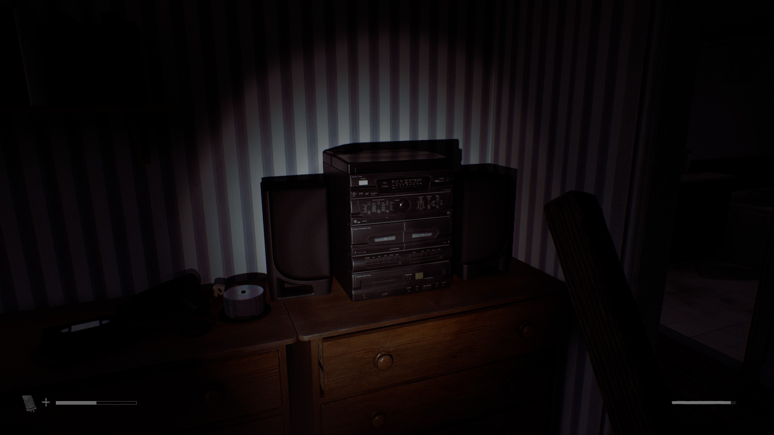
Technology and Packaging: Utilizing scanned archives of 1990s mail-order catalogues (such as Argos) alongside reconstructed office software aesthetics, such as wobbly 3D Word Art found in the local family clinic.
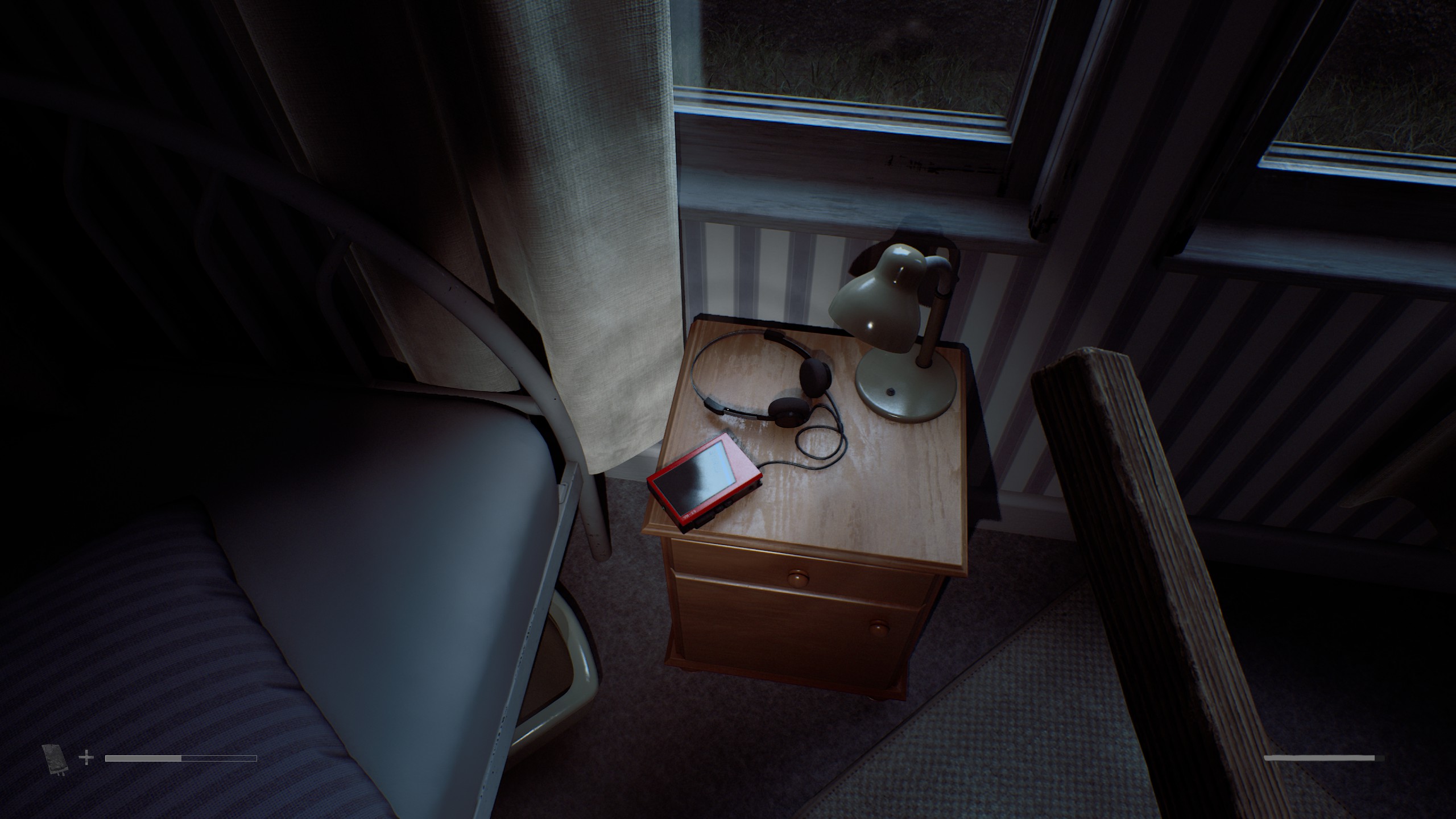
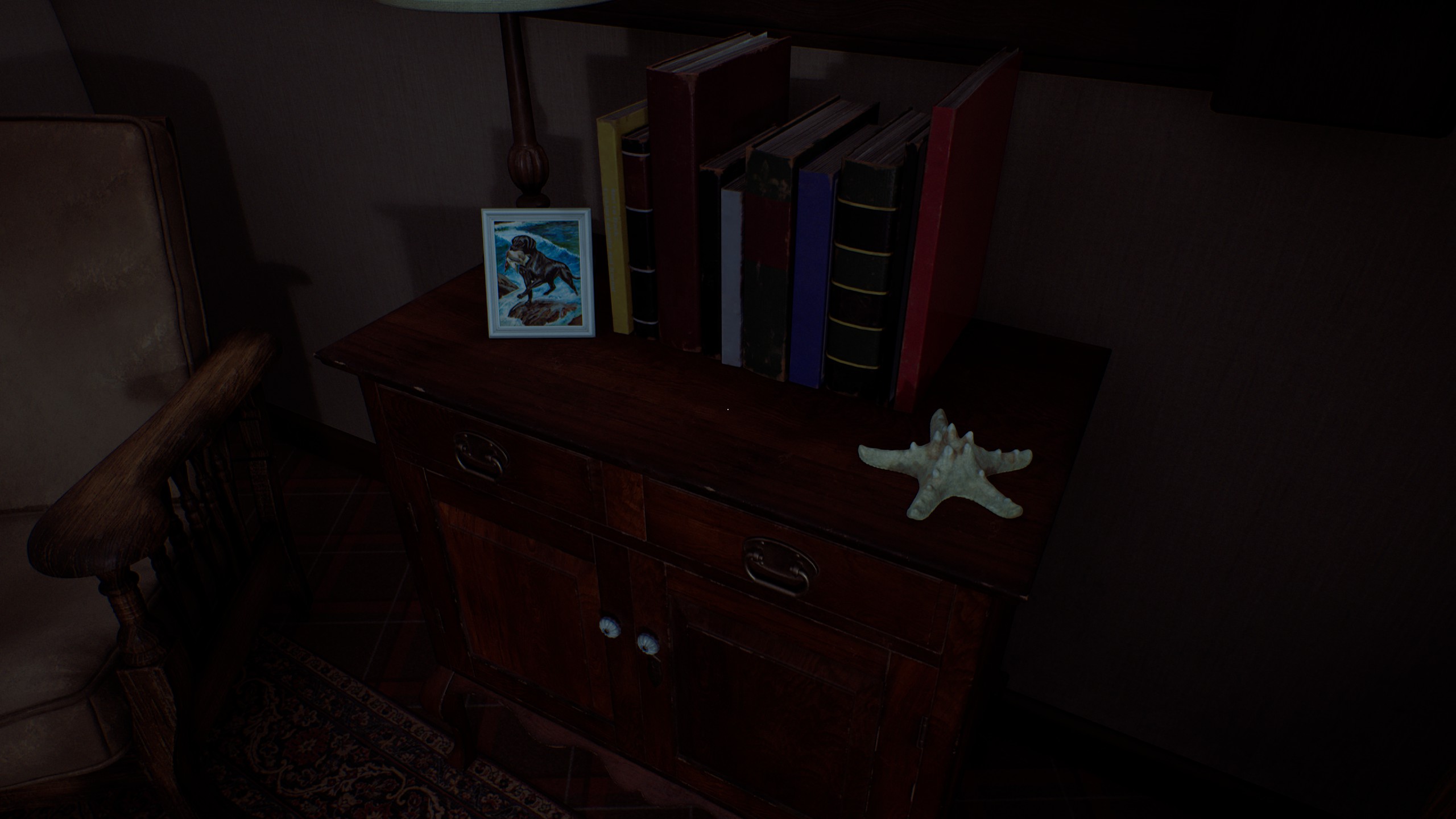
Generational Artifacts: Rather than generating synthetic artwork, the team utilized real family photo albums dating back to the pre-digital era. Notably, the game features genuine working-class Glasgow paintings by Andrew Hall, an amateur artist who died in 1953 and is formally credited in the game. Furthermore, art producer Lee McKellan and the children of the development team contributed original hand-drawn artwork and school papers scattered throughout the town’s interiors.
Architectural Constraints and Corporate Enroachment
The physical isolation of St. Amelia dictated its structural palette. Limited local building materials meant structures were forged from regional stone, naturally unifying the town’s visual identity.
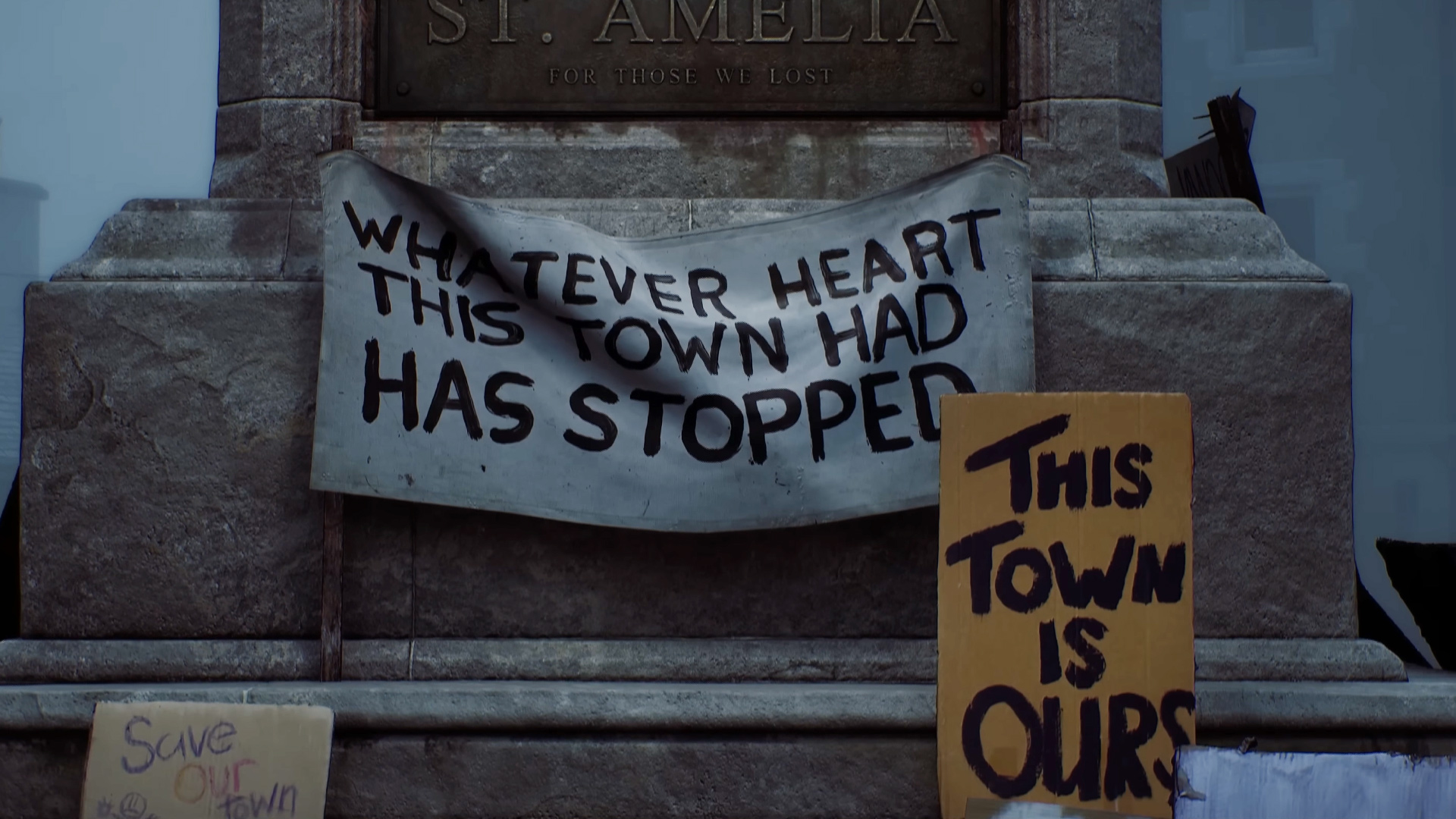
This traditional working-class aesthetic is juxtaposed against the grim reality of modern corporate expansion. The inclusion of CEG—a conglomerate whose funding of local infrastructure like health centers mirrors real-world rural exploitation—introduces a palpable socioeconomic tension. The contrast between pre-CEG coastal heritage and post-CEG austerity (exemplified by the concrete-heavy residential blocks of Clara Woods) gives the town a deeply human, lived-in tragedy.
Official Statements and Creative Insights
"We realised that leaning into things was going to make things much more authentic… It should feel like a very new type of environment."
— Jon McKellan, Director
"You can’t just go and search on the internet for ’90s packaging design, because there’s not a lot of it there. You’ve just got to remember what it was like and then recreate it."
— Paul Abbott, Art Director
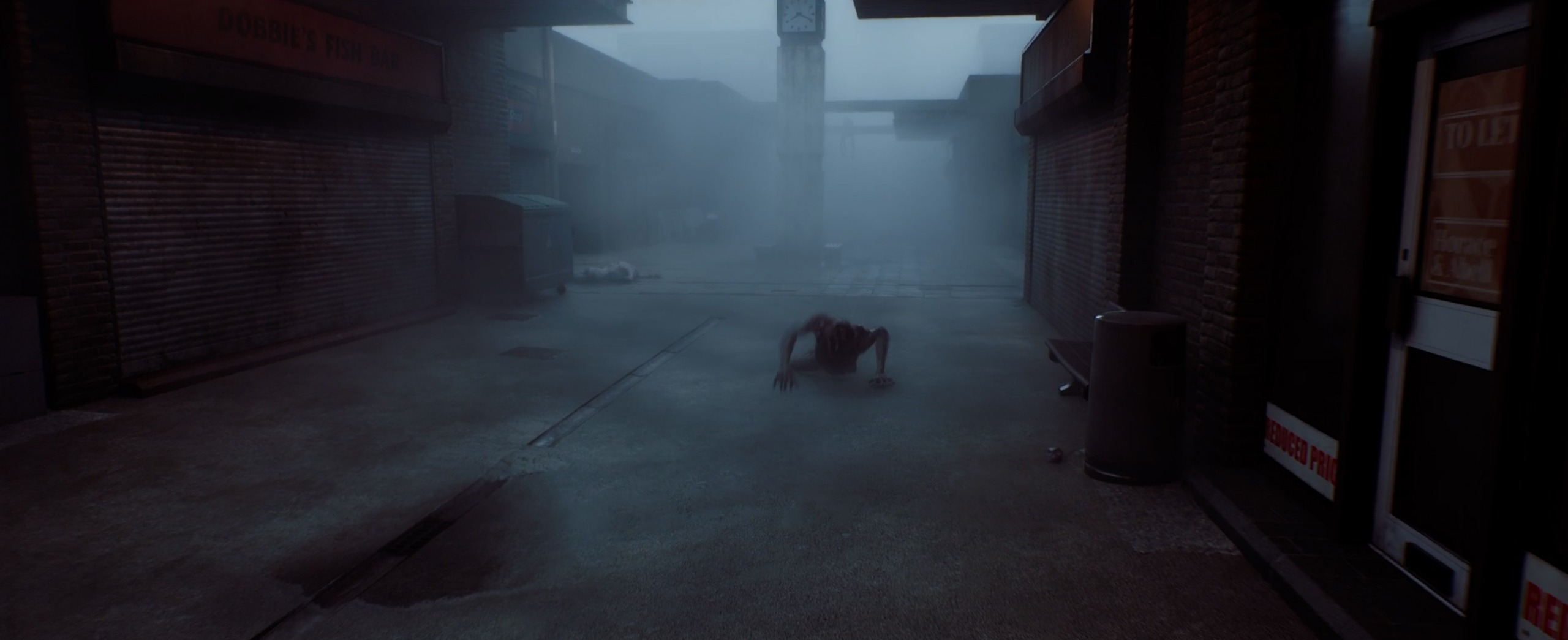
The philosophy behind St. Amelia’s monsters follows traditional Silent Hill psychological frameworks while subverting visual expectations. Characters like the "Sorrowful"—a burned man standing in a hallway—or the "Widows" encountered by Richard, whose veils mimic the mourners of deceased fishermen wrapped in protest signs, look frighteningly human from a distance.
This design choice explicitly challenges players who rely on aggressive combat. As McKellan notes, players who charge through encounters and slaughter every creature with a shotgun are awarded the achievement "Missing the Point Entirely," emphasizing that listening, observation, and stealth are paramount to understanding the town’s tragic narrative weight.
Future Outlook and Legacy
With Silent Hill: Townfall now available to the public, Screen Burn has established a benchmark for how licensed horror properties can be handled with regional authenticity and artistic integrity. By anchoring cosmic psychological terror within the hyper-specific, mundane architecture of a Scottish coastal settlement, the developers have proven that the most frightening horrors are those rooted in spaces we recognize.
The meticulous dedication to 1:1 architectural matching, historical prop recovery, and generational storytelling ensures that St. Amelia will be studied as a triumph of environmental narrative design. As the horror genre continues to evolve, Screen Burn’s achievement signals a shift away from abstract shock value toward deeply grounded, culturally resonant spaces—places so real that players can almost smell the sea salt, damp wool, and fog before the nightmare finally consumes them.