
Executive Overview
Apple’s continuous push to unify its software ecosystem across mobile, desktop, and automotive interfaces has taken a significant leap forward. With the recent rollout of the first developer beta for iOS 27.3, the Cupertino tech giant has introduced a comprehensive array of system-wide upgrades. While much of the early public discourse has focused on iPhone-centric additions—such as vertical tabs in Safari, deep architectural improvements to the Apple Health app, the new "iPhone Duo" one-handed navigation mode, and expanded Siri AI capabilities—the in-car experience has not been left behind.
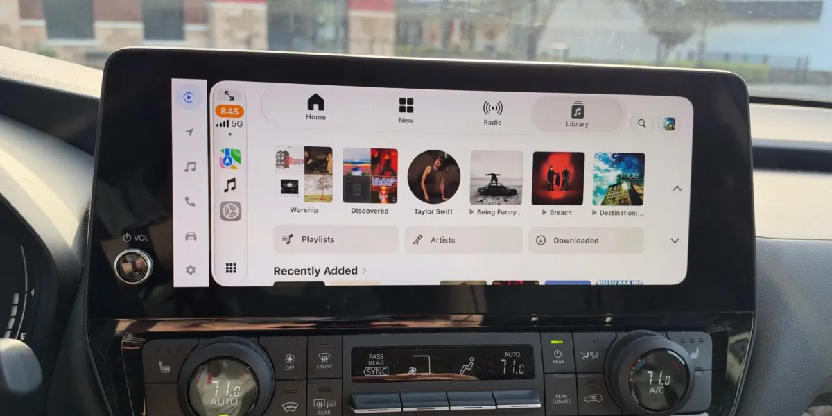
Most notably, iOS 27.3 brings a sweeping redesign to the Apple Music app within CarPlay. Drawing inspiration from modern design language introduced in previous iterations, this update delivers a completely modernized interface characterized by the new "Liquid Glass" tab bar, dynamic color schemes, adjusted visual density, and smarter layout handling.
For everyday drivers and automotive technology enthusiasts, this redesign represents more than just a superficial cosmetic refresh. It is a calculated step toward reducing driver distraction by optimizing touch targets, floating navigation elements above active content streams, and maximizing screen real estate. This comprehensive review examines the mechanics of the iOS 27.3 CarPlay update, breaking down its visual changes, architectural adjustments, and what it signals for the future of in-car infotainment systems.
Detailed Chronology: The Road to iOS 27.3
To understand the significance of the CarPlay changes in iOS 27.3, it is essential to trace the recent timeline of Apple’s software deployment cycle. Over the past several update cycles, Apple has steadily converged the design philosophies of iOS, iPadOS, macOS, and CarPlay, bridging the gap between handheld devices and hardware integrated directly into vehicle dashboards.
The Foundation: iOS 27.2 and the Icon Redesign
The visual groundwork for the current Apple Music update was actually laid during the rollout of iOS 27.2. During that release cycle, Apple introduced a subtle yet telling change: a redesigned Apple Music app icon featuring a striking, clean white background. While this change initially seemed isolated to home screens and app switchers, industry insiders speculated it was a harbinger of a broader aesthetic shift. Up to that point, Apple Music on CarPlay had retained a legacy dark-themed base that mirrored older iterations of iOS, often causing a disjointed visual experience when transitioning from a newly styled iPhone screen to the vehicle’s central infotainment console.

The First Developer Beta: November 2026
In early November 2026, Apple officially dropped the first developer beta for iOS 27.3. Alongside heavy-hitting feature additions for Safari, Health, and Siri AI, the update quietly rolled out the redesigned Apple Music interface to compatible CarPlay units. Testers quickly realized that this was not merely a color swap; it was a foundational overhaul of how users interact with their music libraries behind the wheel.
By adopting the "Liquid Glass" paradigm—a translucent, fluid overlay interface style already making waves on handheld devices—Apple reimagined the CarPlay navigation architecture. The beta release immediately sparked heavy discussion across developer forums and enthusiast communities, as users began analyzing how the new floating elements and denser data layouts perform on varying display resolutions, ranging from compact aftermarket head units to sprawling, ultra-wide factory dashboard panels.
Supporting Context & Metrics: Decoding the Redesign
The Apple Music redesign in iOS 27.3 is defined by three core pillars: the Liquid Glass tab bar, dynamic color schemes tied to system appearance, and an increased data density layout. Each of these elements serves a distinct functional purpose designed to optimize the in-car user experience.
1. The Liquid Glass Tab Bar
The most prominent visual addition to CarPlay in iOS 27.3 is the adoption of the iOS-style "Liquid Glass" tab bar. In previous iterations of CarPlay, navigation bars were often rigidly locked to a specific edge of the screen, consuming valuable vertical or horizontal real estate and forcing users to look away from the road longer to locate precise touch targets.
The new Liquid Glass tab bar features a translucent, layered aesthetic that hovers directly above active content during navigation. Key characteristics include:

- Integrated Icons and Typography: Every tab now explicitly pairs clean iconography with descriptive text, minimizing cognitive load for drivers trying to identify sections like Library, Listen Now, Browse, or Radio at a glance.
- Haptic and Slide Gestures: Drivers and passengers can slide their fingers directly across the bar to fluidly transition between primary tabs without needing to lift their hand to target tiny buttons.
- Contextual Floating: Because the tab bar hovers dynamically over ongoing content lists, it remains persistently accessible. Users no longer need to scroll back to the top of a long playlist or album view just to switch sections.
2. Adaptive Color Schemes and the White Background
Aligning with the app icon overhaul introduced in iOS 27.2, the Apple Music app interface now defaults to a crisp, clean white background when operating under standard ambient conditions. This design choice bridges the visual gap between the user’s primary iOS device and their car’s display.
However, safety and comfort remain paramount in automotive software design. Apple has engineered the interface to be fully adaptive:
- Light Appearance: Utilizes the bright, clean white backdrop for maximum daylight legibility.
- Dark Appearance: Automatically shifts to a deep, OLED-friendly dark background the moment CarPlay detects low-light conditions, headlights turning on, or the user’s system-wide Dark Mode activating. This prevents night blindness and harsh glare during evening commutes.
3. Increased Data Density and Layout Adjustments
One of the most persistent complaints among power users of CarPlay has been wasted screen space. Older versions of Apple Music on automotive displays often featured oversized album art grids and sprawling list views that forced excessive scrolling, which is inherently hazardous while driving.
With iOS 27.3, Apple has recalibrated the layout engine for high-resolution displays. The app now employs a denser overall layout:
- Optimized Grid Views: Within the Library view, the interface is now capable of displaying significantly more albums and playlists within a single horizontal row or vertical scroll pass.
- Display Scaling: The exact presentation scales dynamically depending on two major factors: the physical size and aspect ratio of the vehicle’s in-car display, and whether the user has "Smart Display Zoom" enabled—a setting introduced in iOS 26 that allows drivers to scale interface elements up or down for optimal touch accessibility.
Official Statements & Industry Reception
While Apple typically lets its software betas speak for themselves through release notes and developer documentation, the tech community’s reaction to the iOS 27.3 CarPlay update has been overwhelmingly analytical.

Early commentary from prominent iOS development observers highlights the engineering challenge of bringing a desktop-and-mobile-grade interface philosophy into a vehicle environment:
"Bringing Liquid Glass elements to CarPlay isn’t just about making things look pretty; it’s about establishing visual hierarchy. By allowing navigation bars to float translucently over content, Apple is reclaiming screen estate that was previously wasted on static header bars. It gives the dashboard a modern, unified feel that finally matches the hardware of newer electric and luxury vehicles."
— Leading Automotive Technology Analyst
Furthermore, early feedback from beta testers on platforms like Reddit and developer forums points to a generally positive reception regarding the layout density. Users with modern, wide-screen infotainment setups note that seeing eight or nine album options in a grid rather than four or five vastly cuts down on the physical scrolling required to find specific tracks, keeping eyes on the road where they belong.
Future Outlook: What This Means for the Future of CarPlay
The release of iOS 27.3 and its focused updates to Apple Music offer a revealing glimpse into where Apple is heading with its automotive software ecosystem. As the industry anticipates the broader rollout of next-generation CarPlay—which promises to take over every screen in the vehicle, from the central infotainment cluster to the digital instrument gauge behind the steering wheel—refining foundational apps like Apple Music is a critical stepping stone.
1. Unified Design Language Across Hardware Boundaries
Apple’s ultimate goal is seamless continuity. When a user steps out of their home, gets into their vehicle, and connects their iPhone, the transition between interfaces should feel invisible. By bringing iOS design staples like the Liquid Glass tab bar and adaptive light/dark backgrounds directly into CarPlay, Apple is eliminating cognitive friction. Drivers no longer feel like they are operating a stripped-down, legacy version of an iOS app; they are interacting with a first-class citizen of the Apple software family.

2. Enhanced Focus on Safety Through Intelligent UI
There is an inherent paradox in in-car touchscreens: drivers need access to complex media libraries, navigation tools, and communication suites, but every second spent interacting with a display increases accident risk. Updates like the floating Liquid Glass bar and increased data density are subtle usability tweaks that directly address this paradox. By reducing the need to hunt for navigation buttons or scroll endlessly through bloated menus, Apple is leveraging UI design to foster safer driving habits.
3. Anticipating the Next-Gen CarPlay Era
As automakers prepare to roll out vehicles deeply integrated with Apple’s next-generation CarPlay platform, software stability, modular layouts, and adaptive scaling will be paramount. The architectural updates seen in iOS 27.3 suggest that Apple is stress-testing these new UI components across thousands of existing vehicle configurations.
As the iOS 27.3 beta cycle progresses toward its public release in the coming weeks, developers and automotive engineers will continue to scrutinize how these design shifts perform in the wild. For now, Apple Music users can look forward to a cleaner, faster, and more visually cohesive soundtrack to their daily commutes.